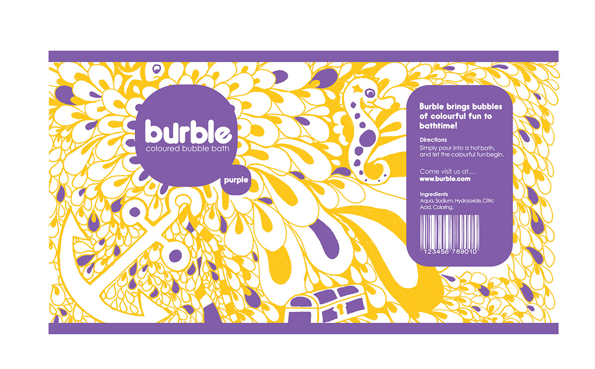
For Burble I wanted to develope hand drawn style illustrations, using a nautical theme that encapsulates the fun and energy of the product expierence. This would be child friendly imagery that would have interesting compositions that would intrigue and attract the viewer. I would develop these in a free and organic style.
To contrast the imagery the brand would a really simple but strong so it would stand out against the imagery, it is simple, bubbly, friendly and also colourful. The packaging had to be vibrant, colourful, eye catching, dynamic and has a feel of fun, be friendly and exciting. The packaging is a round shape with a wrap around label, which works well with the style of imagery used would be more interesting as at first glance all the image is not revealed, thus making the customers pick it up to view the rest of the images. Which works well in packaging design. Each pack would be distintly unique in both visuals and colour as I feel this makes the range very strong. I have created a very strong identity for Burble and this could has the protencail to be extended across other products etc
To contrast the imagery the brand would a really simple but strong so it would stand out against the imagery, it is simple, bubbly, friendly and also colourful. The packaging had to be vibrant, colourful, eye catching, dynamic and has a feel of fun, be friendly and exciting. The packaging is a round shape with a wrap around label, which works well with the style of imagery used would be more interesting as at first glance all the image is not revealed, thus making the customers pick it up to view the rest of the images. Which works well in packaging design. Each pack would be distintly unique in both visuals and colour as I feel this makes the range very strong. I have created a very strong identity for Burble and this could has the protencail to be extended across other products etc


