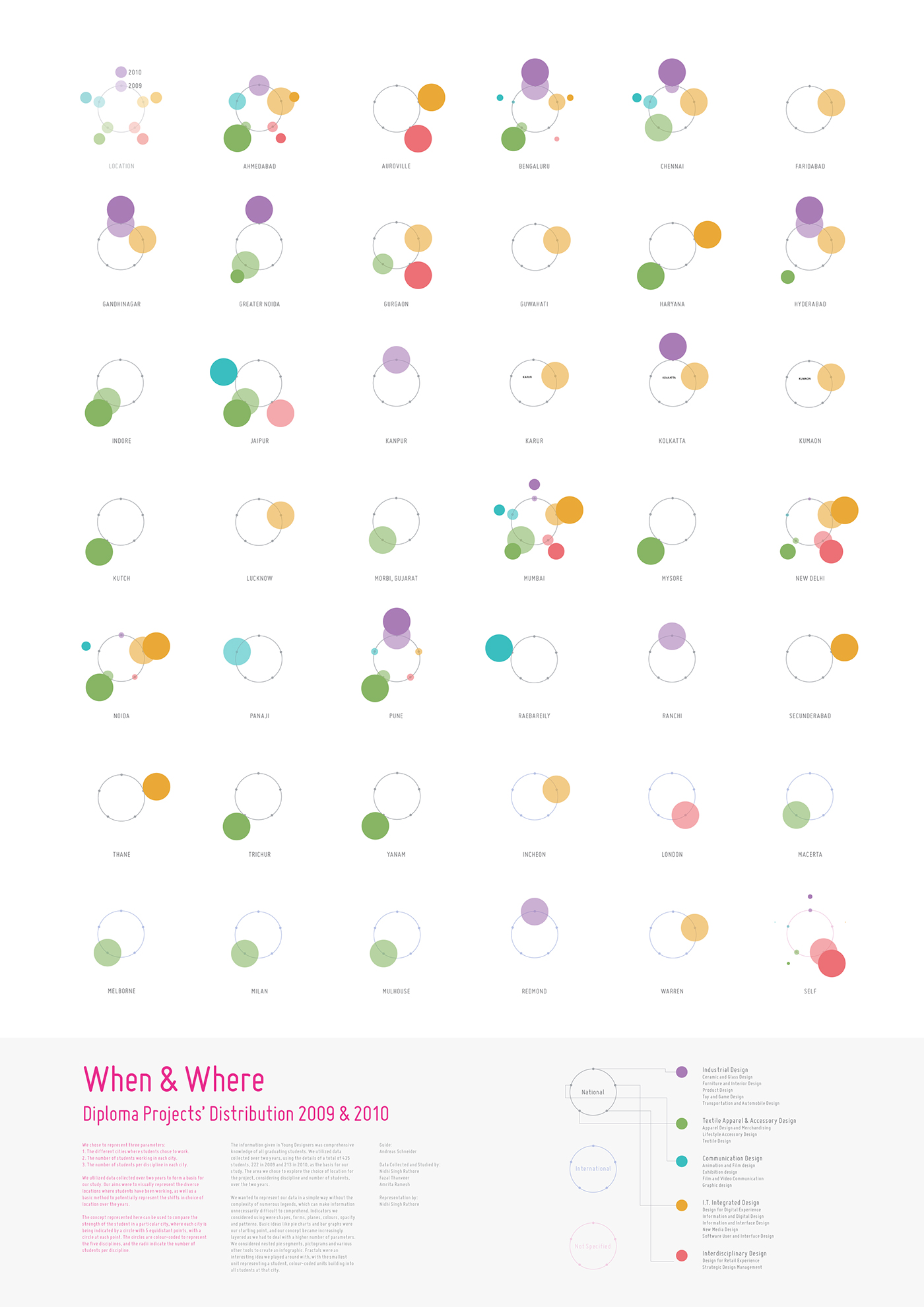
We utilized data collected over two years to form a basis for our study. Our aims were to visually represent the diverse locations where students have been working, as well as a basic method to potentially represent the shifts in choice of location over the years.
Every graduating student registers their diploma project with NID before beginning the assignment. The Young Designers database begins with the basic information and is completed with the details of finished project, as well as guide, sponsor, etc. Thus the Young Designers database keeps a meticulous record of every student having graduated that year.
The information given in Young Designers was comprehensive knowledge of all graduating students. We utilized data collected over two years, using the details of a total of 435 students, 222 in 2009 and 213 in 2010, as the basis for our study. The area we chose to explore was the geographical choice of location for the project, considering discipline and number of students, over the two years.
The first step was to compile the raw data into usable statistics. Our data filtration process then comprised of mainly three phases, the same was then represented as the parameters of the visualization.
1. The different cities where students chose to work.
2. The number of students working in each city.
3. The number of students per discipline in each city.
1. The different cities where students chose to work.
2. The number of students working in each city.
3. The number of students per discipline in each city.

We wanted to represent our data in a simple way without the complexity of numerous legends, which can make information unnecessarily difficult to comprehend. Indicators we considered using were shapes, forms, planes, colours, opacity and patterns. Basic ideas like pie charts and bar graphs were our starting point, and our concept became increasingly layered as we had to deal with a higher number of parameters. We considered nested pie segments, pictograms and various other tools to create an infographic. Fractals were an interesting idea we played around with, with the smallest unit representing a student, colour-coded units building into all students at that city.
We then explored an idea of a network of the locations, each city being indicated by a pentagon, with a circle at each vertice. The circles are colour-coded to represent the five disciplines, and the radii indicate the number of students per discipline. Later on, while refining the represetation I changed the representation to simplify the visual language.
The user the can use the legend shown below to read the data.

The concept represented here can be used to compare the strength of the student in a particular city, where each city is being indicated by a circle with 5 equidistant points, with a circle at each point. The circles are colour-coded to represent the five disciplines, and the radii indicate the number of students per discipline.