Design Brief
//
The project is distrubuted by the Nottingham Trent International College. Students are required to design their own brief according to their own creative field for their final exhibition which will be held in Nottingham Trent University's Waverly Building.
My design brief is to create a brand new visual system, a visual identity for the city of Nottingham; that could organise and simplify communication with the citizens, whilst not losing compromising the traditional identity of the city, and to make a strong, intelligent, informed and significant contribution to the cultural life and identity of the city.


The 5 zone logos
//
The 5 zones logos are introduced by the parksmart map a few years ago, and it's the only existing visual system in Nottingham. I discovered this in my research and I decided that rather than designing a brand new visual system, why don't just do a rebrand to the current system? I then started redesigning the zone logos using different representable icons, buildings, spots in respected areas. For instance, the Theatre Royal and the Corner House in the Royal zone.

The Nottingham logo
//
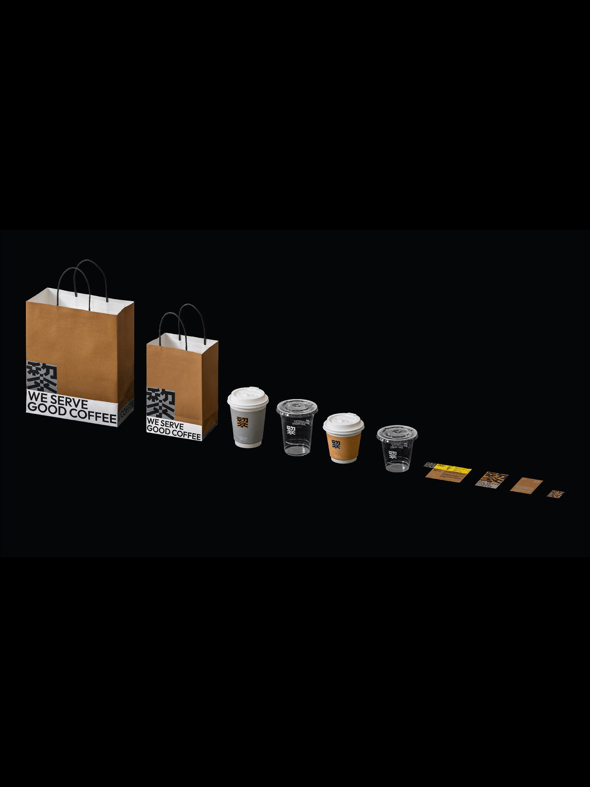
By combining 5 zone logos, we have our brand new Nottingham identity, that can be applied on different media.
Applications and Exhibition Day
//


