


Implementation of new design for CorePM homepage, including scroll-activated slideshow animation.

Needed Update
The existing CorePM website sorely needed structural and aesthetic updates. The contemporary flat style and interactive scrolling hero banner bring this efficient application up to date and in-line with the brand’s guiding principals: efficiency that is simple to use.

CorePM.com homepage

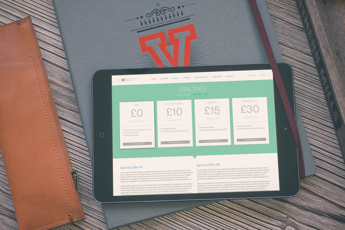
CorePM.com pricing page in action.
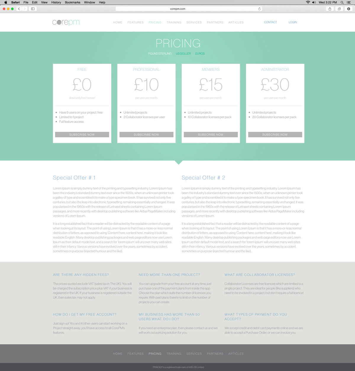
CorePM.com pricing page full layout.

Logo Redesign
The existing CorePM logo employed a dated color palette and details that rendered poorly at small sizes. The updated version provides stronger elements that do not lose clarity on mobile devices, and the color palette evokes a calm sense of control.


