Arkibal Serif
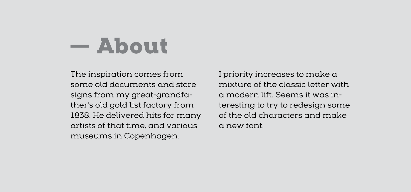
The inspiration comes from some old documents and store signs from my great-grandfather's old gold listfactory from 1838. He delivered hits for many artists of that time, and various museums in Copenhagen. I priority increases to make a mixture of the classic letter witha modern lift. Seems it was interesting to try to reproduce some of the old characters and make a new font. Uppercase “G” was the first letter of the startingpoint. G stands for in danish “Guldramme”, which means “Goldframe”. Arkibal is coming from an almost old danish tradional name "Arkibald", only without "d".
The inspiration comes from some old documents and store signs from my great-grandfather's old gold listfactory from 1838. He delivered hits for many artists of that time, and various museums in Copenhagen. I priority increases to make a mixture of the classic letter witha modern lift. Seems it was interesting to try to reproduce some of the old characters and make a new font. Uppercase “G” was the first letter of the startingpoint. G stands for in danish “Guldramme”, which means “Goldframe”. Arkibal is coming from an almost old danish tradional name "Arkibald", only without "d".
It has taken over a year to design this font.
A special thanks to Magnus Gaarde - graphic designer from Skriftklog.
Arkibal Serif: a modern serif typeface created by Jan-Christian Bruun
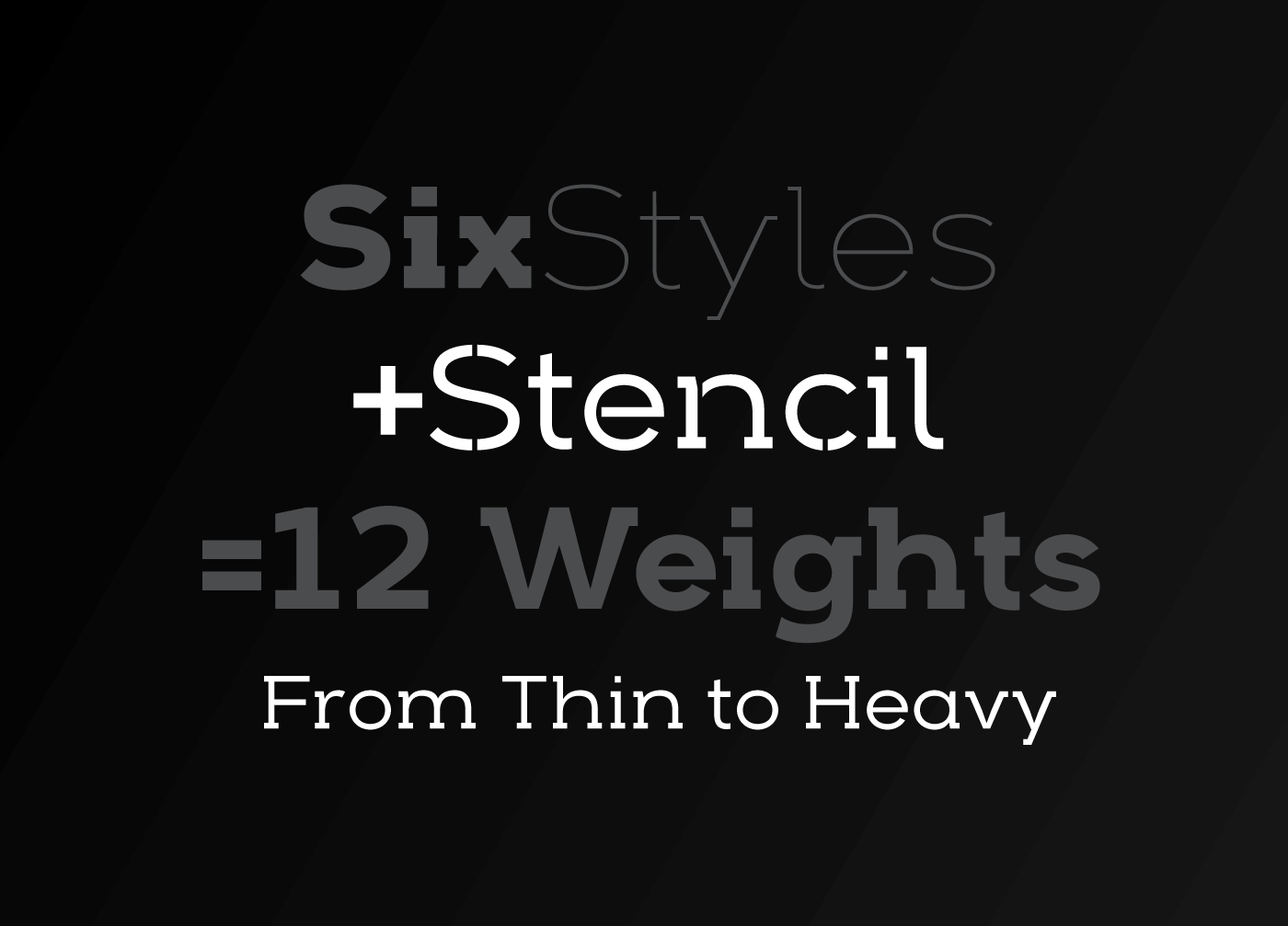
Arkibal is a typeface with 12 stylistic: sans + stencil
Designer: Jan-Christian Bruun
Date: 2015
Style: Thin, Light, Medium, Regular, Bold, Heavy
Format: Opentype
A special thanks to Magnus Gaarde - graphic designer from Skriftklog.
Arkibal Serif: a modern serif typeface created by Jan-Christian Bruun
Arkibal is a typeface with 12 stylistic: sans + stencil
Designer: Jan-Christian Bruun
Date: 2015
Style: Thin, Light, Medium, Regular, Bold, Heavy
Format: Opentype
AVAILABLE AT