


The
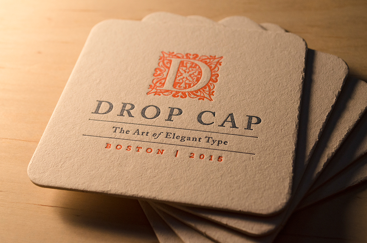
Drop Cap Conference
The Art of Elegant Type
—
“Fine art is that in which the hand, the head, and the heart of man go together.”
John Ruskin
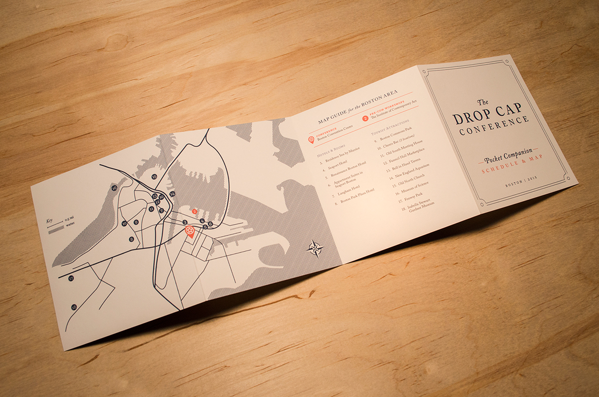
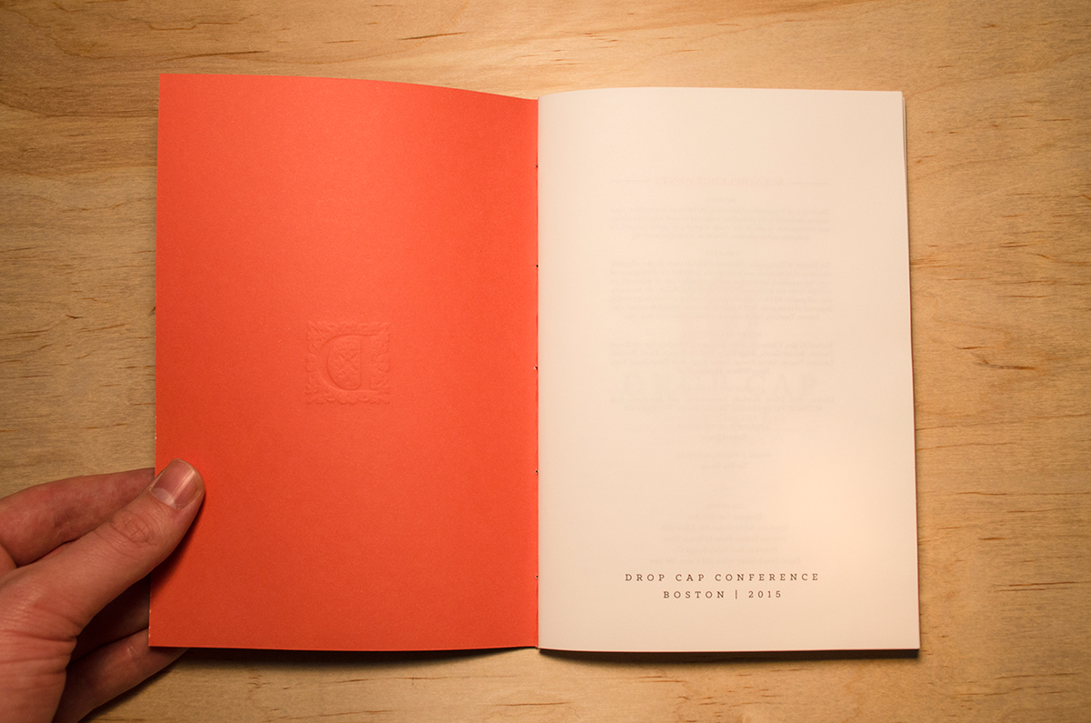
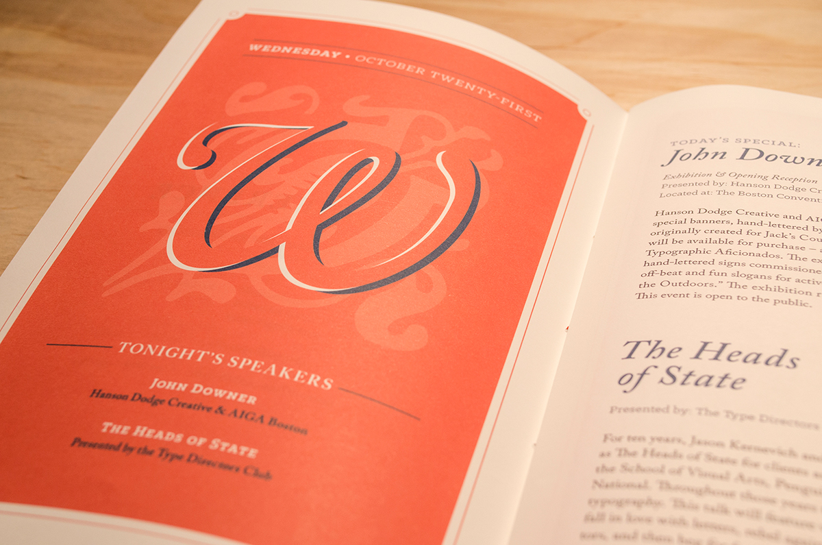
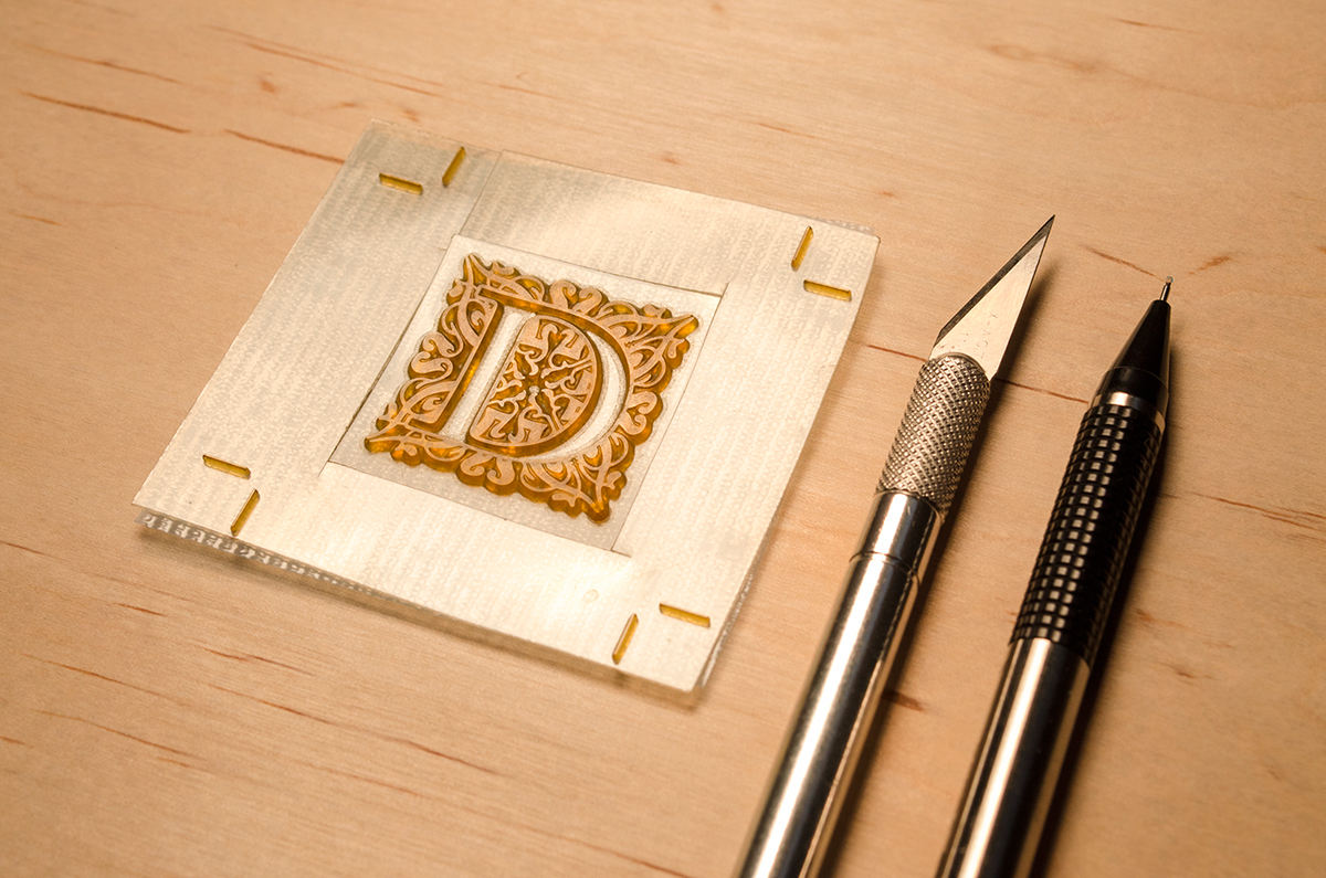
This was a student project for my Advanced Typography class. We were given the opportunity to create promotional materials for an upcoming design conference, with the theme and location open-ended. The name "Drop Cap" is a reference to the medieval practice of hand-illumination of large ornate letters to indicate the beginning of a new thought in writing. The illustrated letters were often very elegant and detailed. My branding theme was centered on the concept of beautiful classical typography and ornamentation. I chose the city of Boston, Massachusetts to host my conference because of its historical significance. I used uncoated paper for all of the printed pieces and I debossed several of the materials to give them a classy and sophisticated feel. The debossing was done with polymer plates on a traditional letterpress machine. The typography treatments throughout the materials were inspired by print pieces from the 18th and 19th century. The program book was hand-sewn with bright orange thread to complement the dark blue cover.


Colophon
Designer: Gabriel Schut
Typefaces: Adobe Caslon Pro, Klinic Slab
Paper: French Smart White 80# C, 70# T
Polymer Plates by Boxcar Press
Printing and Embossing by Rust Valley Design Co.
Thanks for viewing!


