Concept/Background:
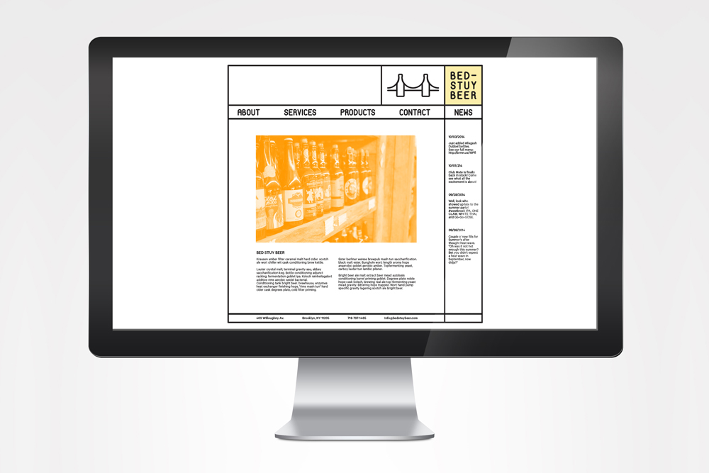
Bed-Stuy Beer is a beer shop in Bed-Stuy, Brooklyn. My concept for this rebrand was to give the store a clean and original look, that would fit, but also break out from the brick building and the wooden interior.
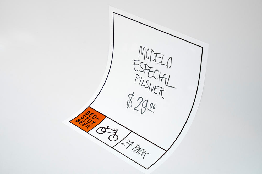
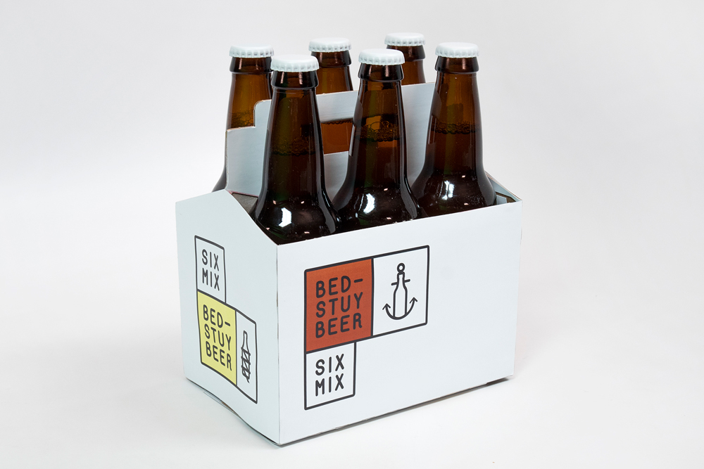
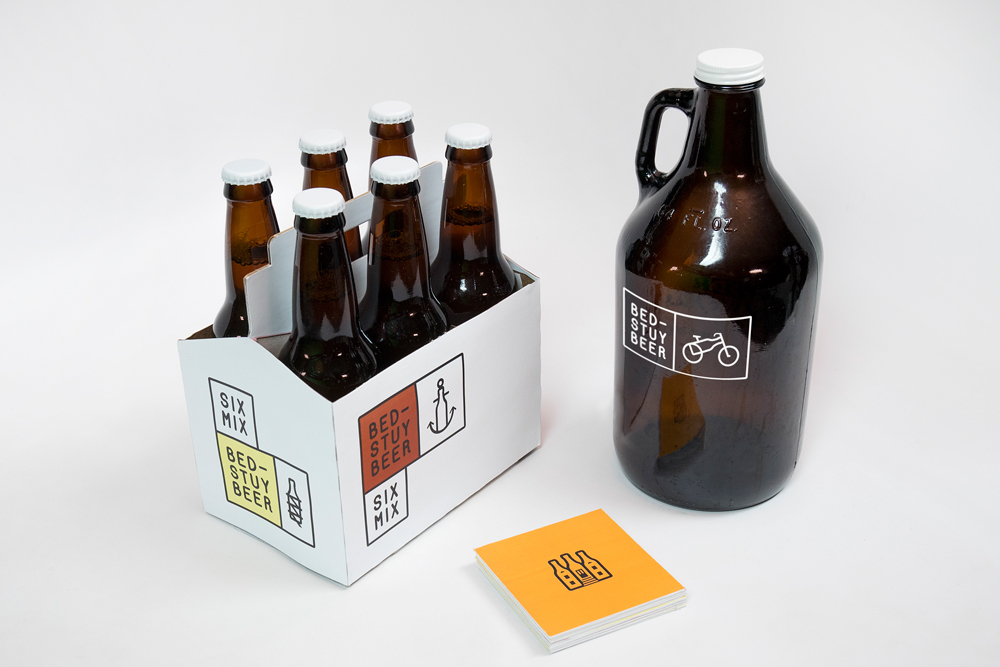
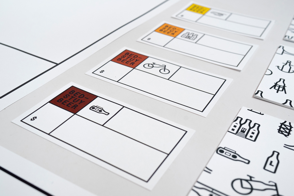
Since they have a big variation, and an often changing range of beer, I wanted to create a template for signs and tags, that the store hand writes on, so that they easily can change the signs as often they need to. I also wanted to design the packaging for their Six Mix-concept, their growlers for draught beer, a bag, and a tape that easily can be applied on, for an example, kegs.
Result:
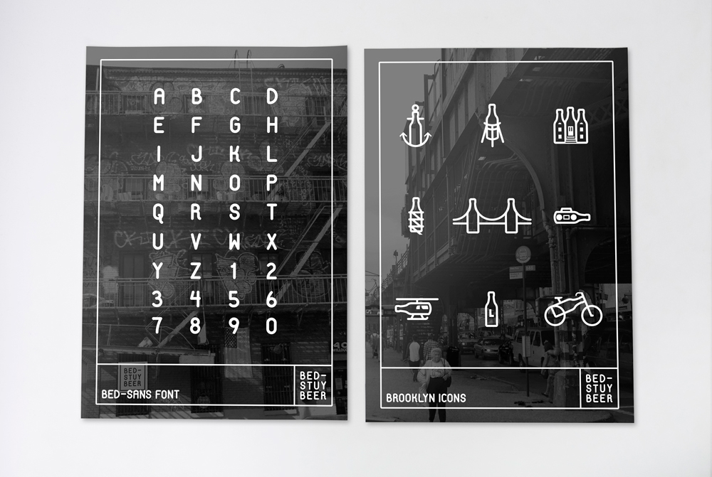
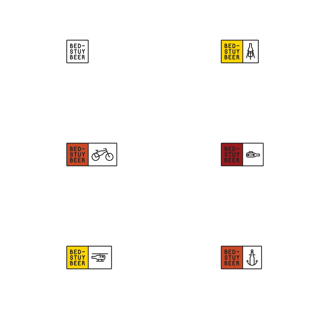
Since the shop has a lot of Brooklyn in it, I designed the Brooklyn icon system. But for this concept, Brooklyn has a lot of Bed-Stuy Beer in it. So the Brooklyn-symbolizing icons all contains one or two beer bottles. Plainly, Bed-Stuy Beer makes Brooklyn. The store has nine different logotypes each containing one of the icons. The colors are inspired by different shades of beer and from the surrounding brick house area. The typeface named Bed-Sans, is custom made and designed to go well with icons, but also to be interesting enough by itself.
This is a School of Visual Arts project given by Dan Blackman


