

This summer, my rollerblading team (AnpInline) joined forces with another one from a nearby town (Roller Macherio),
which decided to take this chance to renew its team image.
As the first step of the redesign, I analyzed the two previous logos of both teams.
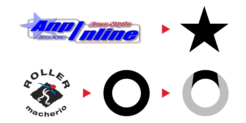
After I sythesized the star and the circle/arch from the two teams logos,
I began building elements of the new one over those two shapes.


The final result resembles american logos of NBA/NHL teams, from which I took inspiration,
while keeping the original colors of the teams and some geometrical elements of their old logos.


After designing the main logo I went on defining the black and white versions,
as well as the rules for printing on colored or black surfaces.

Last step was the design of training and competition uniforms:
for the first ones, I decided to keep a single color background and print for the athletes
and a colored logo on a blank t-shirt for coaches;
while for the competition uniform I worked on a pattern inspired by the logo itself.

Finally, the uniforms were printed just in time for the new competitions season beginning:

Thanks for watching!
If you liked this project please consider liking it also on my portfolio website.


