Oh, okay, Hello.
This is the official second Editorial from the lifestyle magazine I am developing. This piece is called ‘Guilty Pleasures’ It is basically a love letter to my vice-kitsch, tacky, low-fi design.
This is the official second Editorial from the lifestyle magazine I am developing. This piece is called ‘Guilty Pleasures’ It is basically a love letter to my vice-kitsch, tacky, low-fi design.
This spread was a LOT of fun to develop. Based on an idea that had been kicking around my head for the better part of a year. I have been wondering, just how far can you push the rules of ‘good’ graphic design? Is there a point of no return? What would the worlds worst design actually look like?
At first, I was trying to break all the rules, as an example of ‘how not to design’ but the further in this saccharine comic sans nightmare, the more I started to see a strange gaudy allure that I just couldn’t help but exploit to breaking point.
So first off, let me apoligise to the designer tutors/mentors that have taught me, you might want to look away now. Bcuz its going to be a bumpy ride ahead. This is what 2 years of design school looks like (:
Everyone else just follow me.

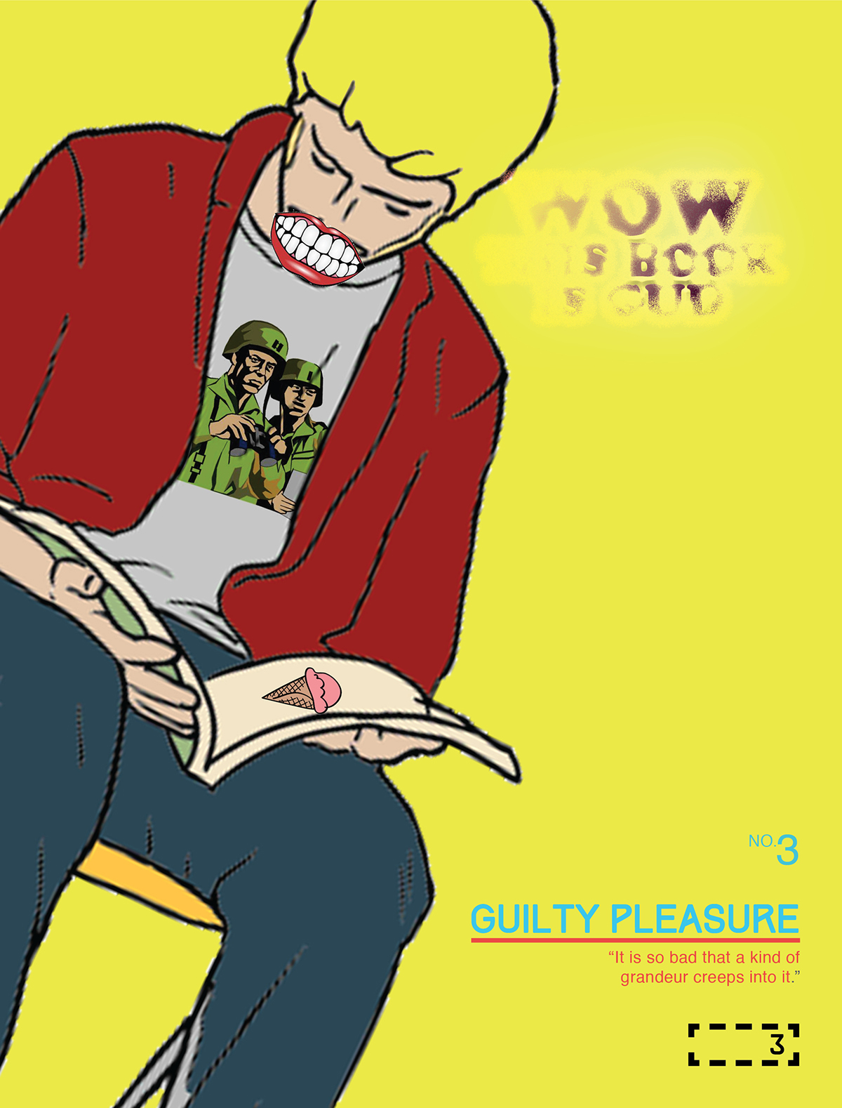
This is an advert for the editorial. It will appear in the issue before this article. It is a 'sneak peak' that gives some visual clues to the next issues content.
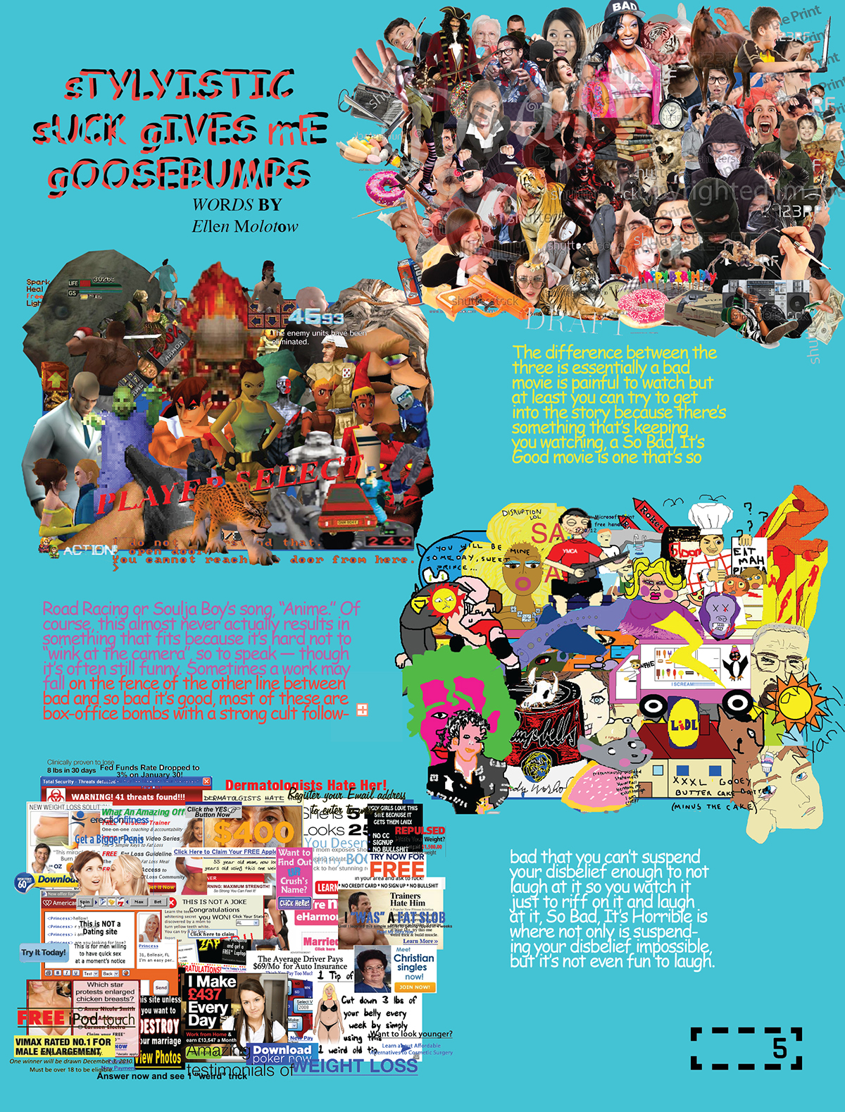
I feel this image sums up the entirety of the editorial well. It seems simple on face value, but look closer. Yes it is reclaimed clip art, used in a digital collage like manner, so what? But note how smaller elements of the design have higher resolution than the main image. That was very intentional. I am fascinated at the way we freeze-frame and pixelate our culture, there is literally a clip art for everything- from pizza to divorce. Aspirin to foreplay. We have captured an essence of humanity in a medium that will probably get seen more than traditional art means due to its lax copyright legal side and simplified nature that allows more people to relate to it. Simplicity is a mirror.
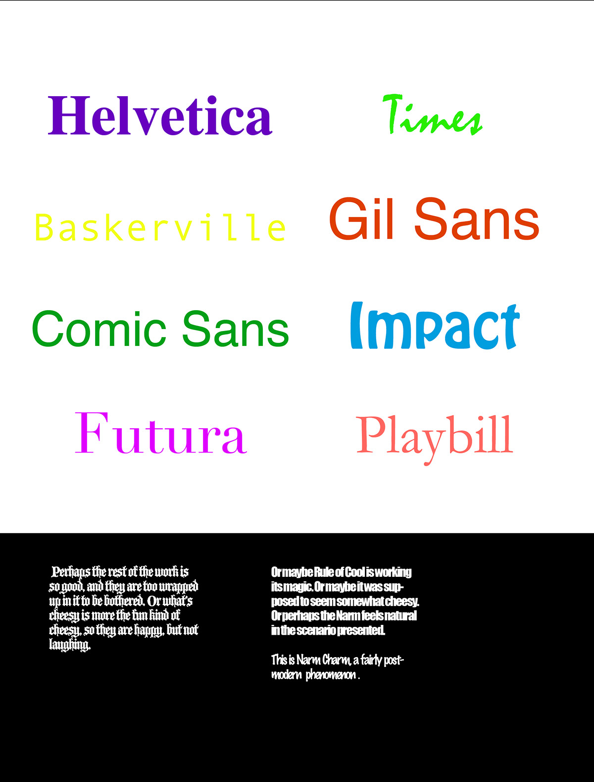
The text was an experiment, I applied wild variables of every text filter without checking the outcome til I had applied them all. I like the idea of handing aesthetic control over to the computer, no human interference.
The text was an experiment, I applied wild variables of every text filter without checking the outcome til I had applied them all. I like the idea of handing aesthetic control over to the computer, no human interference.

So the first spread. I wanted to be a thorn in a vein from the start. I wanted to use as much colour as possible, distract the readers eye all over the page so they aren’t really sure exactly where to start.

There are a few design NONOS here, comic sans (so underrated) awkward text kerning/tracking, unnecessary text wrap, ugly overall structure, rainbow gradients…. The intention here was to make it look like it was designed by an enthusiastic designer with no actual training, experience or knowledge of design.
The clip art, I have modified to reflect how an interesting bit of print can light up a dreary afternoon. I don’t want readers to forger that this is about fun. Not about perfection, following rules or even good taste.
The clip art, I have modified to reflect how an interesting bit of print can light up a dreary afternoon. I don’t want readers to forger that this is about fun. Not about perfection, following rules or even good taste.
oh yeah... umm... if you see any spelling mistakes, they were intentional okay.
Note the indesign text overflow icon?
The imagery is heaps of dated/amateur/ugly design that we may be regularly exposed to, but it is rarely commented on. I chose 4 elements that I felt are unique to the last decade.

Stock Imagry with the water marks left on. Design/illustration students will know what i'm on about!

Here are some dated computer game graphics. I didnt want to jump straight into 16-bit town, so i got some ugly 3D glitchy stuff in there. A bit of a mixed bag.

MICROSOFT PAINT! ..... nuff said.

Internet adverts. A pet peeve of mine. I know they are intentionally badly designed to give a realistic feel, specifically the ones offering quick sex with local ‘moms’ (mums.) Quick fixes and snake oil miracle cures.


If your considering trying to count the 'bad designs' stop now. Because it gets Nintendo hard from here on in. There are so many. Some subtle. Most as obvious as modern societies reliance on social networking.
Dat drop shadow tho!
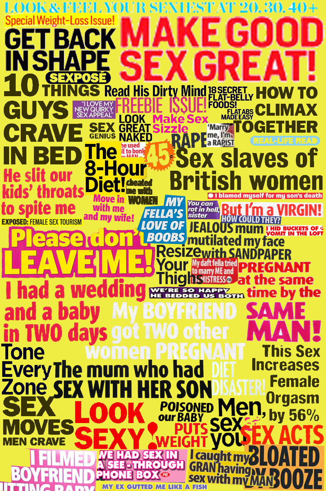
These typographic illustrations were roughly ripped from the headlines of various magazines. I love the sensationalism/rampant sexism/ guilt lead self improvement feel from them, I knew one day I would be doing something subversive with magizine covers.
They send out a barrage of mixed messages, exhausting the consumer into a state of blind conformity.
They send out a barrage of mixed messages, exhausting the consumer into a state of blind conformity.
womans lifestyle magizines- Celeb gossip, weight loss and true life horror stories.
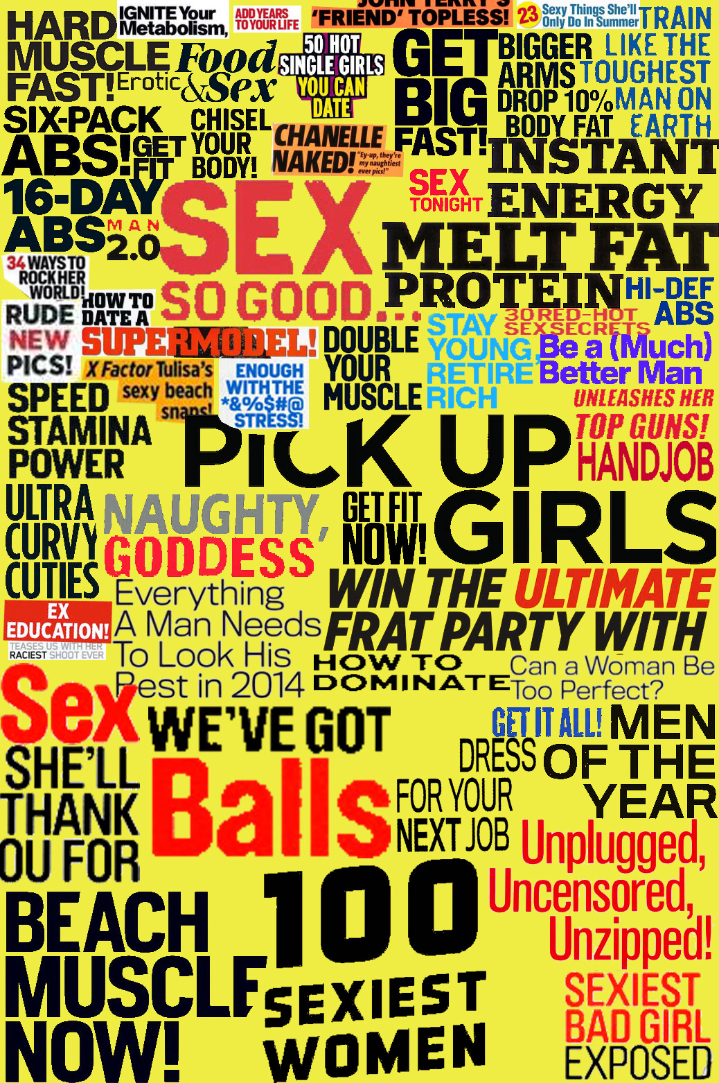
Lads Lifestyle magizines- Sex, build muscles, sex.

Onto the next article of this editorial. How comfortable is this to read? If this was a real publication, this article would be written by a suscriber. I think the readers of a magazine should get to talk a bit too sometimes.

Can you spot the secret message?
Graphic designers HATE HIM! learn one weird trick that local edinburgh man used to get results FAST 100 percent legit.
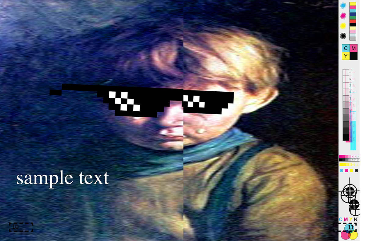
So this is a double page spread pull out centerfold kinda deal.
Bonus points if you recognise the painting.
You know how designers are taught to be careful type-setting too close to the bounding of a print, as visual information can be lost? This is a play on that.
Well screw you, it made me laugh.

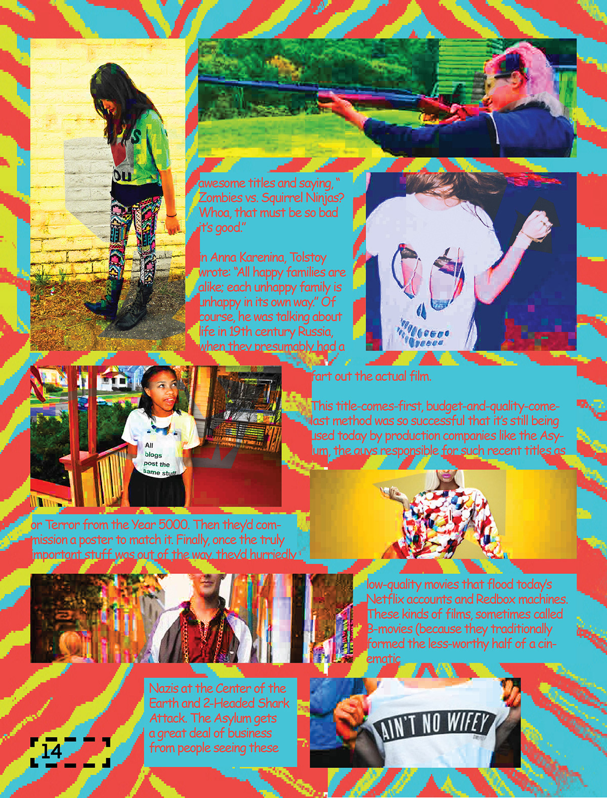
Here we are at the last article of the editorial. This is the fashion segment. I really like the effect I used on the photographs. I wanted it to look low resolution, with elements of good quality. A mixture of good and bad, and a wee bit ugly.
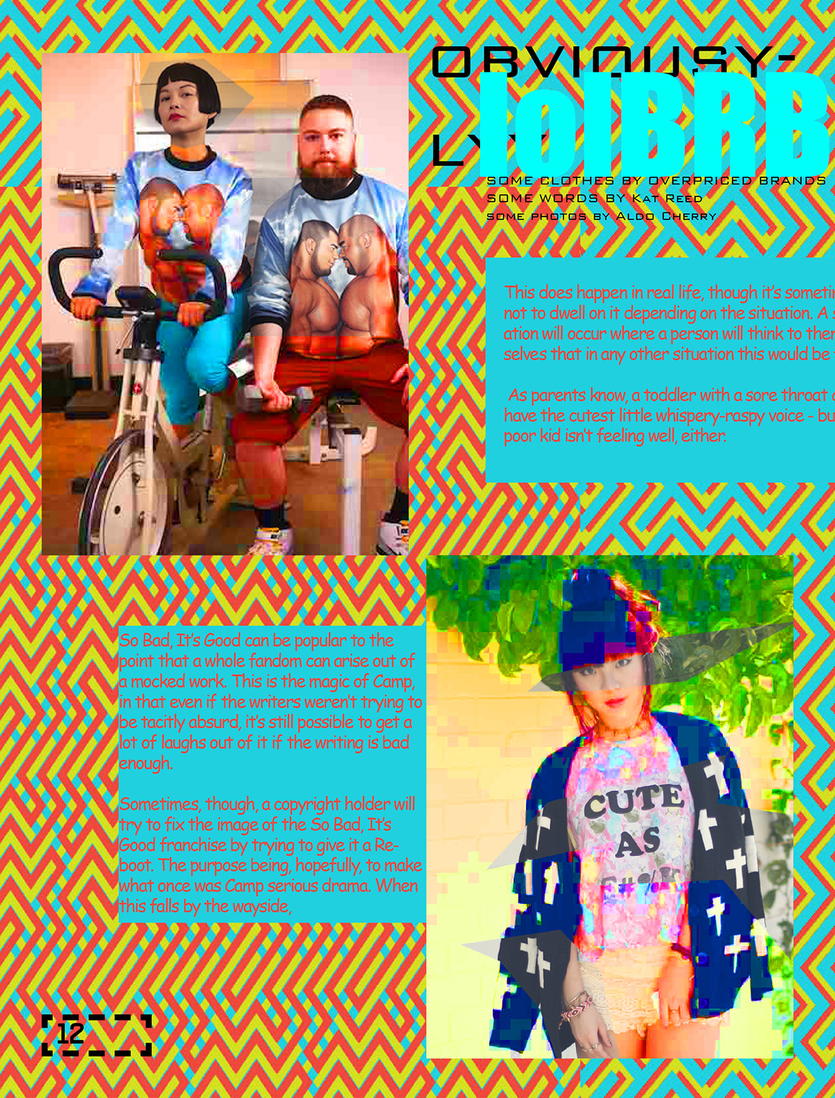

I ... uh... I meant that BTW.


I HAD SO MUCH FUN DESIGNING THIS! Honestly, Ive got a bit of a sore jaw from smiling. True story bro.
You may not have liked this project, maybe you felt it was too far, too ugly, or thought I had finally cracked. Well, thats just like... your opinion man. I had a lot of fun making this, I feel ive learnt some cool stuff on the way. And i finally got to put that idea of SO BAD ITS GOOD design to rest.
At the end of the day, this project was about trying to catch a feeling, rather than communicate an idea. I was trying to capture the zeitgeist of my generation (millennial) I felt the best way of doing so would be to try and capture the ‘quick fix, low key, meme laden, hyper-stimulated, ironic, nostalgic’ feeling of a generation raised on the Internet.
The beautiful savage nature of youth is a curse. You only truly appreciate it once its gone.

