This editorial is part of a magazine I am producing. The magazine is called ‘Your name here’ (working title) It is a lifestyle magazine aimed at the youth market.
This editorial is actually an advertorial (for want of a better term) When aiming at a youth market, the actual advertising needs to be disguised as decent content.
Basically, this editorial has been commissioned to imprint the idea of ‘ALL CITY’ a clothing brand I am developing. What this editorial offers is; interesting articles and useful information that isn’t trying to sell a particular product, rather a state of mind, a lifestyle that relates to the qualities of the brand ALL CITY.
I feel the best way to market towards the youth is- give them something shiney too gawk at. Then lightly sprinkle the advertising in a discreet and not too pushy way.
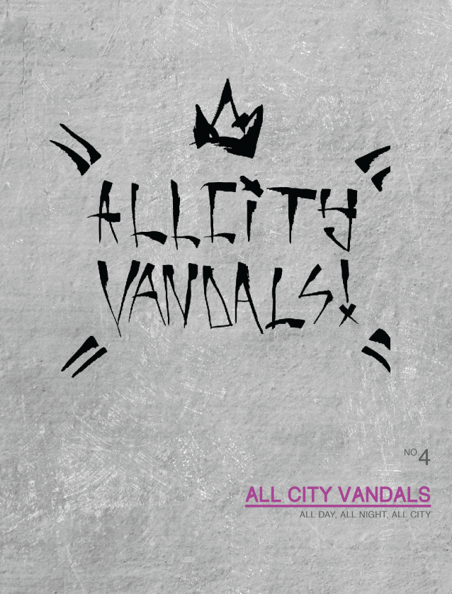
Each editorial piece has a ‘front cover’ that is supposed to summarise the entirety of the editorial and give a clue to the theme/content.
For this, I used a sweet acrylic paint marker. A lovely bit of kit I would suggest you try if you haven’t already.
For this, I used a sweet acrylic paint marker. A lovely bit of kit I would suggest you try if you haven’t already.


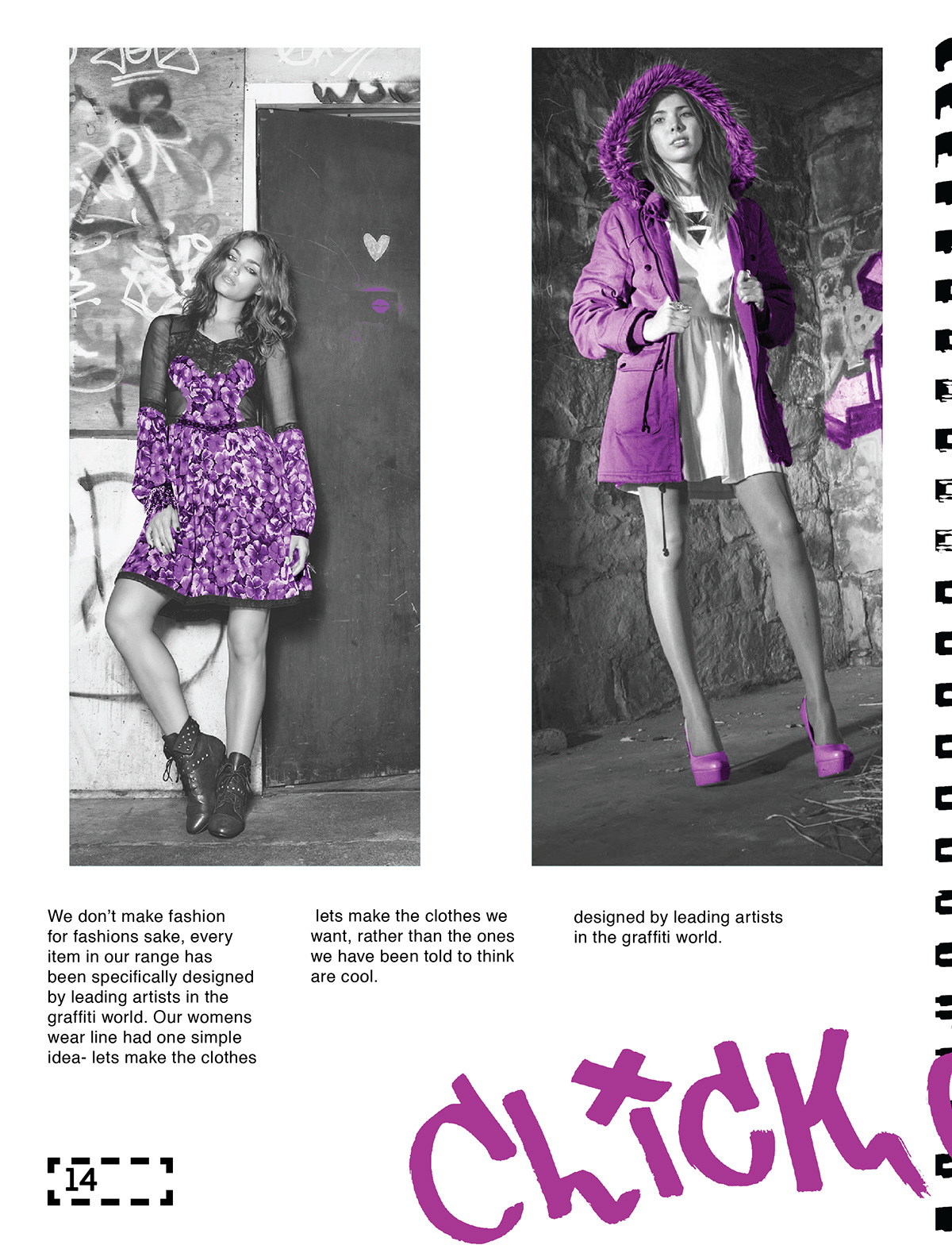
I took photographs from all over the internet, put them in black in white then added the colour purple to areas of interest, this was to give the photography a uniform feel.
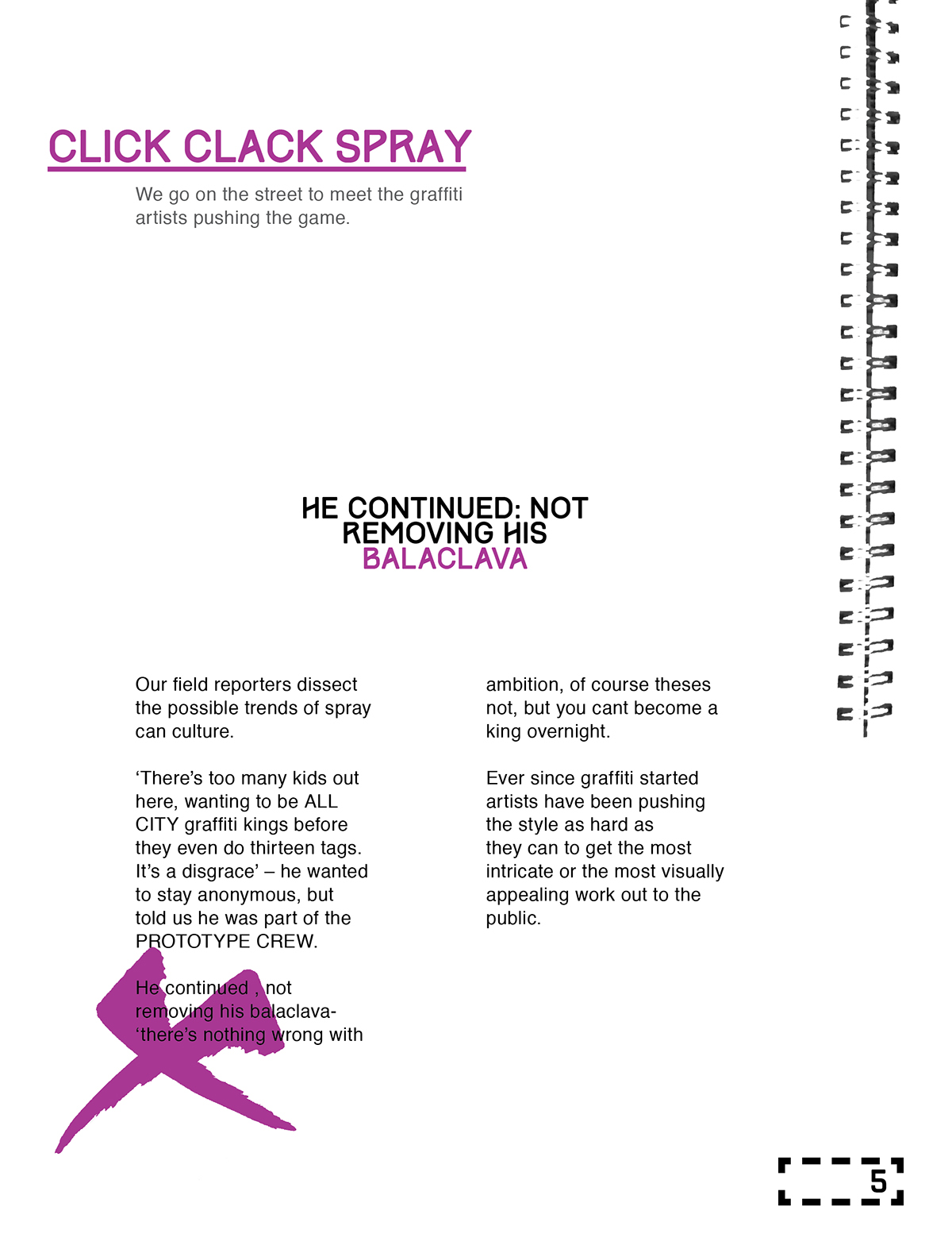
The abstract black shape at the side of this is actually the spine of a sketchbook. When I was importing the photograph scans from the sketchbook I noticed the spine was a very interesting visual element that wouldn’t feel out of place in a magazine. I am interested in the idea that an element of the design can be revisualised in an unusual manner- in this example; the bounding of the actual magazine is parodied as the wire bounding found in many art sketchbooks.

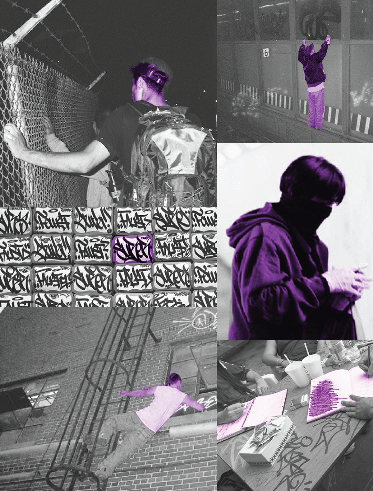
My aim for the images was- to have a raw undiscovered talent feel to it. Like the personal photographs of a young artist. Unframed, amateurish, but a certain daringness to be present, this was running through my head as I was selecting and editing the photographs. I hoped that I could capture the feeling of Graffitti culture convincingly without being too obvious.


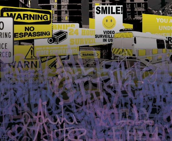
This is a full-page advert. Notice that it isn’t selling a particular product. Just associating the brand with the magazine content/genre.
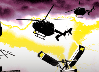

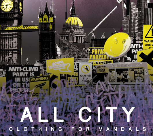
A lot of thought went into this illustration. I used the colour yellow to symbolise the dangers a graffiti writer faces- police, security cameras, street lights ECT. All these rigid man made objects.
The purple tones are saved for the sea of tags (symbolise unity between graffiti writers) The sky is also purple, nature is above and below man kinds structures, more fluid and natural in contrast. I think this shows graffiti as being a natural occurrence, and all this paranoid security is unnatural and bright. It is supposed to be how a graffiti writer may perceive the urban environment.
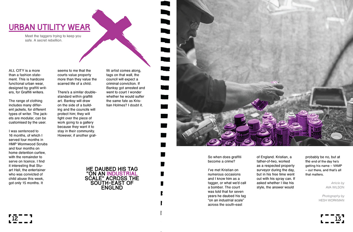
The second article is to give the brand some street credibility. We tell the readers a little about the brand- who is involved, what they do, why it started ect. Basic information on the ALL CITY brand.

Here we show the passion behind the brand, its story so people can tell it’s a genuine effort and not some huge faceless corporation trying to buy into a fad. This is real people with real passion.


A short fashion shoot to show some of the clothes that are available from all city. It isn’t a hard sell- there isn’t prices on display. Its just to let people know what kind of clothing the brand ALL CITY are producing.


First article was about the future of graffiti ( to draw in reader.) Second article was to tell readers about the brand, this Third article is just something fun they might tell their friends about.

For me this is the most interesting article in the entire editorial. Not because it was me who wrote it, but because, it is not a sale. It is just some interesting information. Good content. We are providing relevant and useful information for free.


The reason for this is, we cant go in too hard on the ALL CITY sale. Providing readers with clear concise information that they can use in real life, and even better- share with there peers, creating the opportunity for word of mouth advertising to flourish; this kind of street cred would be invaluable for this brand.


So that’s it! This is not the final piece, just a taster of the lifestyle magazine I am developing. There will be subtitle changes from this to the final publication. I just wanted to put this online for criticism/ feedback. Feel free to tell me what you think! Your opinions are valuable to me.
Thanks for viewing buddy!