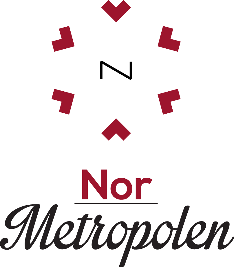
Nor Metropolen is the new name for Julemarkedet i Spikersuppa (Christmas marked in the heart of Oslo). This is a redesign of the old Logo they had, wich did not reflect what they stood for. I experimented with Negative space. Also the Logo Type, NOR is the landcode for Norway. This is because the christmas marked is also visited by alot of turists. Logotype Translation: North Metropolis (NOR Metropolis). Also the square hearts that you see in the logo is from a something we call Marius Genser in Norway, it is also my 5th element.
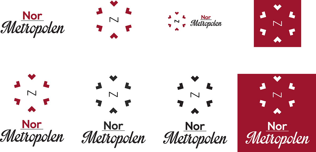
Different ways the logo can be used.
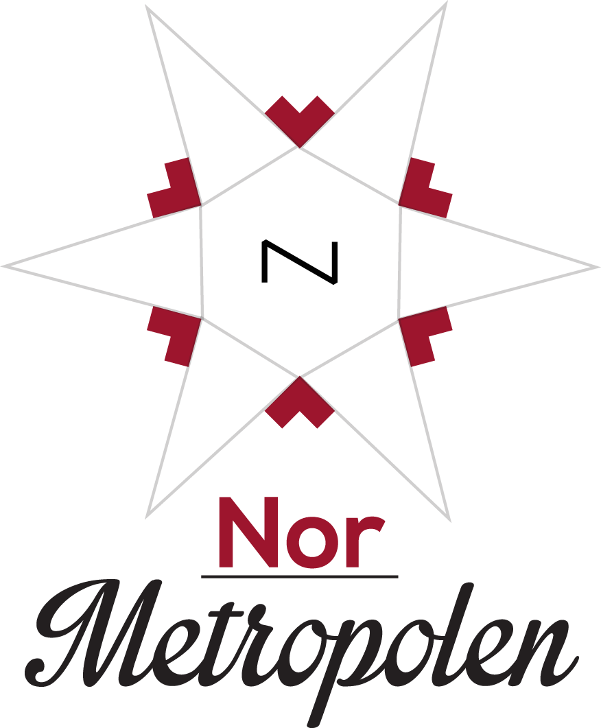
Hidden symbol in the logo, Its symbolising the North star and also part of an old compas i found inspiration from.
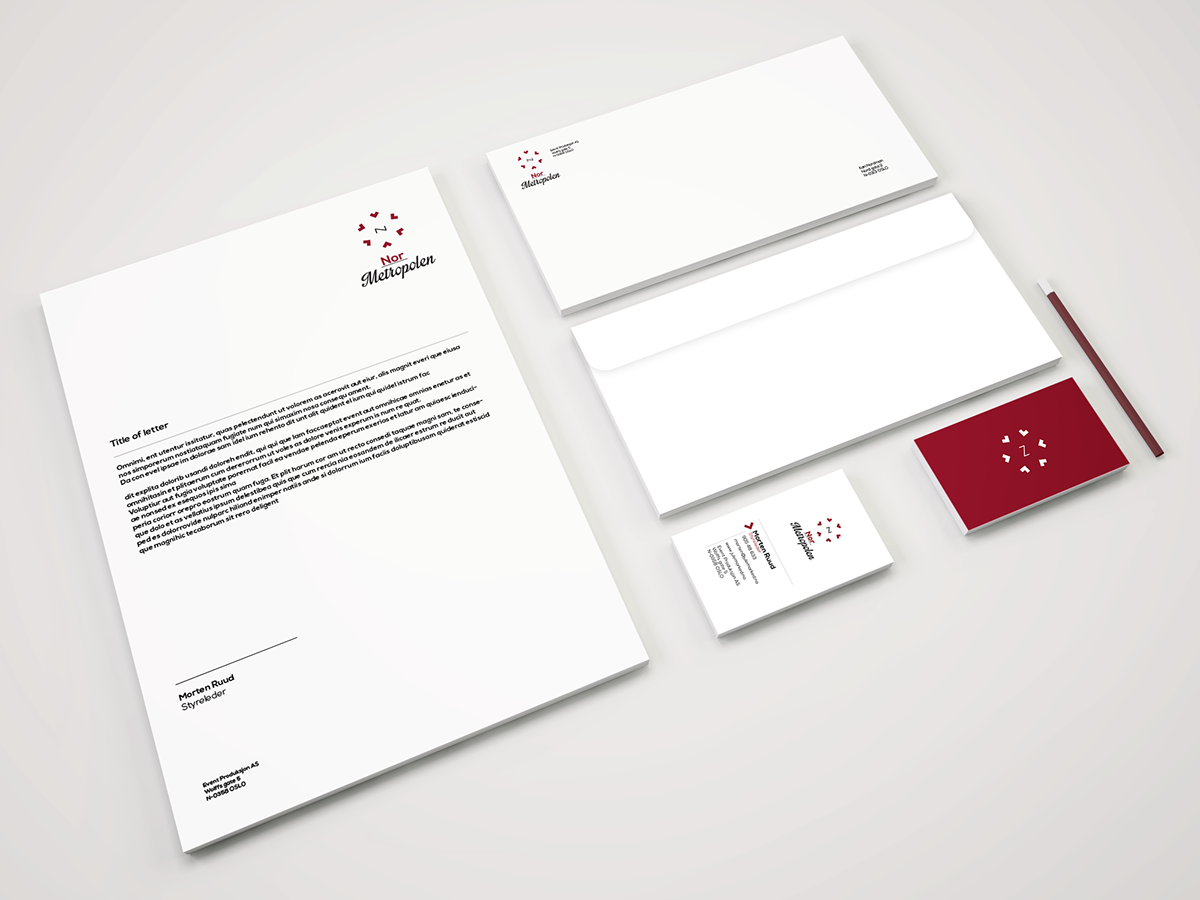
This is just a mockup of the webside:
http://normetropolen.businesscatalyst.com/
http://normetropolen.businesscatalyst.com/