

The school Santa Maria, is a higher education institution.
The objective of the institute was to create a new visual communication starting from the mark giving the values that represent the vision and mission of the institution.
The objective of the institute was to create a new visual communication starting from the mark giving the values that represent the vision and mission of the institution.
I started from the historical context and making a brainstorming on what should be an educational institution. Since the school is named after one of the caravels of Columbus I associated all the famous journey that has prtato the discovery of the Americas so I brought the brand communication on "the trip" that I used as a keyword in the brainstorming.
So the school is it? In the end it is just a real journey of obstacles, errors, expertise, discoveries, labors and learning, then the trip of Christopher Columbus is the appropriate metaphor!
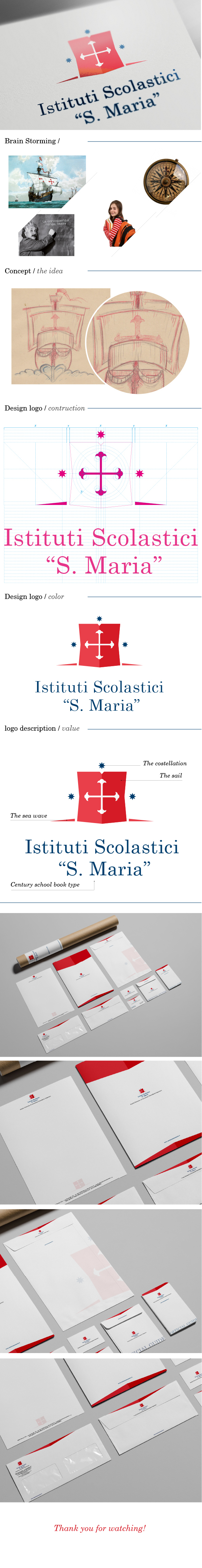
The brand is in fact the main sail of Santa Maria that in this case as the principal value derives its travel, then there are stars that signify the orientation, and the waves are placed under sail the waves breaking on the bow ship which means going forward and overcome obstacles.
The main colors i used are red is blue.
the red tenacity, fortitude that are required for high school career and then the blue for truth, intelligence, constancy and stability.
In the end there is the use of the character, which is a "century School Book", which according to its characteristics and historicity and more than appropriate!
www.dodcreative.it


