Maintaining meaningful connections with old friends is hard.
Staying in touch with friends is difficult. You get busy, you spend time with people nearby, and the friends that aren't physically present slip your mind. While some friendships may end due to changing values or other reasons, many simply end because its hard to regularly catch up with someone in another city. In recent years, social media has made this easier. Seeing status updates on Facebook or getting Snapchats allow you to maintain a connection with someone with minimal effort.
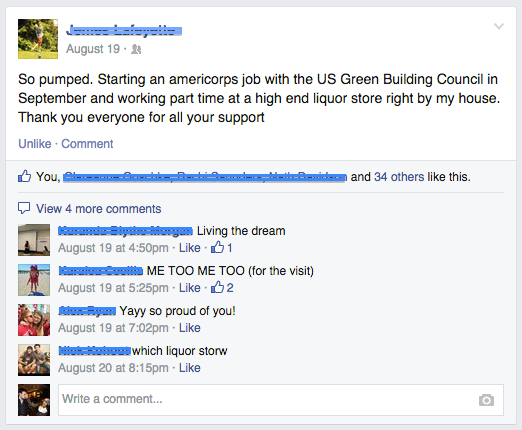
Facebook statuses like this let us keep a connection with old friends, but only on the shallowest level. The connection is passive, devoid of actual communication and emotional connection.
The connections we keep over social media, however, are not enough. We lose conversation and interaction - the crux of meaningful relationships. See more about the problems with maintaining friendships over social media in the great video below.
A video explaining some of the problems with maintaining friendships over social media. I did not create this video, it just illustrates the point well.
Technology isn't the problem.
Technology can be used to enhance or degrade the quality of our lives. Facebook, for example, can absolutely be used in ways that enhance our relationships and improve our lives. It can also, however, waste your time and shallow your relationships.
As a designer, I see it as part of my responsibility to create designs that afford a usage that enhances lives. The app below is my attempt to create a subtle and non-invasive technology that helps the user maintain meaningful connections with old friends.
Catch Up Introduction
Catch Up is a mobile app that helps you maintain meaningful connections with your friends. It is intentionally designed to encourage conversation and active interpersonal interaction with friends you don't regularly see often.
The app allows users to specify how often they want to catch up with their close, but distant friends, then simply reminds them when that time rolls around. It helps the user keep track of their friends as they scatter around the world, and encourages a maintained and meaningful connection.
Check out the low fidelity interactive prototype I made below to get a better idea of the concept.
A low fidelity, interactive prototype I used to demo the concept and gather early feedback.
Research
I did both generative and evaluative research for this project. My generative research consisted of interviews with people who had distant friends. One of the assumptions I was able to verify with this research was that a big part of the reason people don't stay in touch is simply because it slips their mind. They just got busy and didn't think about it. Once contact had been initiated, however, several interviewees reported setting up times to Skype or talk.
My evaluative research consisted of two prototyping phases. The first prototype is the one in the video above. I used it to test the concept with users and to gather feedback.
Second, I asked several friends to adopt a method almost analogous to what the app would do (I also tried it). I had them set up their calendars with recurring events reminding them to catch up with friends that they had trouble maintaining contact with. This essentially accomplished the same thing (with a few caveats).
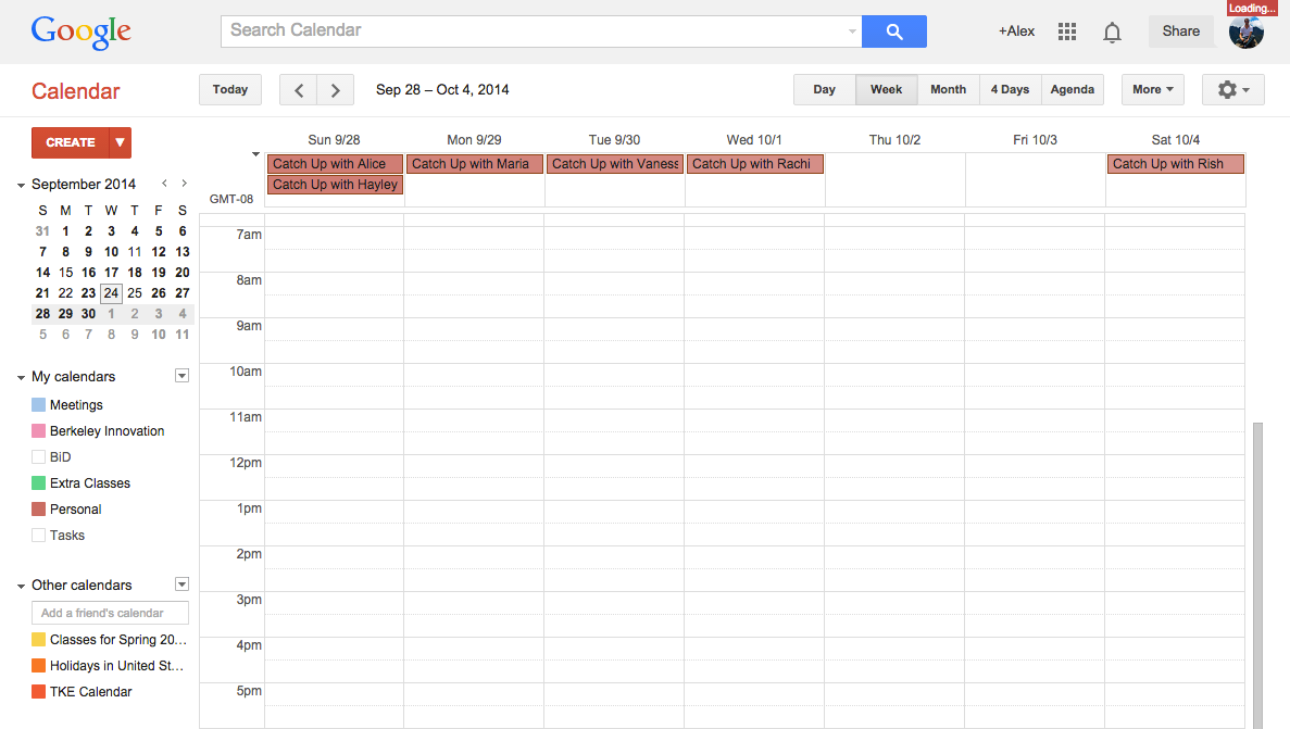
A screen shot of my Google Calendar with "Catch Up events" at the top. This prototype helped me test my concept without investing a significant amount of time.
In general, those who visited their calendars regularly really enjoyed having these events. Several of them contacted the friends when they saw the event and initiated a conversation. While this prototype wasn't perfect, it allowed me to test the concept in a real world setting in a very cheap medium.
Design Decisions
The app is intentionally designed to be simplistic, with only key functionality included. I modeled the 'Friends' page in the fashion of a to-do list. Clicking the 'plus' icon allows the user to add new friends from your contacts. Tapping one of the circles marks that you have caught up, and resets the time to catch up with that friend. When it is time to catch up, the circle turns green and shortcuts to texting and calling your friend are revealed. The user can also click on each friend to view more information and edit their settings.
There is no interpersonal communication or social network within the app. It simply reminds the user to connect. This decision takes the focus away from the platform of communication, and puts on the relationship. It also forces the user to return to the app after catching up in order to deliberately mark that he/she caught up with a friend. This design decision is based off of a research insight that indicated that friends were often able to initiate contact, but frequently failed to follow through with the promise of catching up.
I also include the time until the next catch up with all friends. This small token of information helps the user understand more at a glance, rather than having to browse through each individual friend.
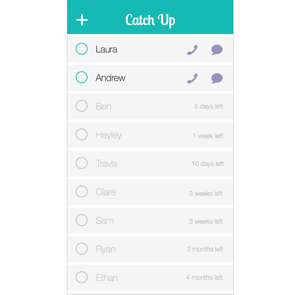
The individual friend page is designed to give more information about that friend and allow you to edit how often you want to catch up.
The primary interaction on the page is designed to be setting how often the user wants to catch up with the friend. The design of the partially circular slider puts the emphasis on the number in the center, and serves as a signature interaction for the app.
The page below is actually a page to add a new friend from your contacts, as you can see by the call to action at the bottom to add the friend.
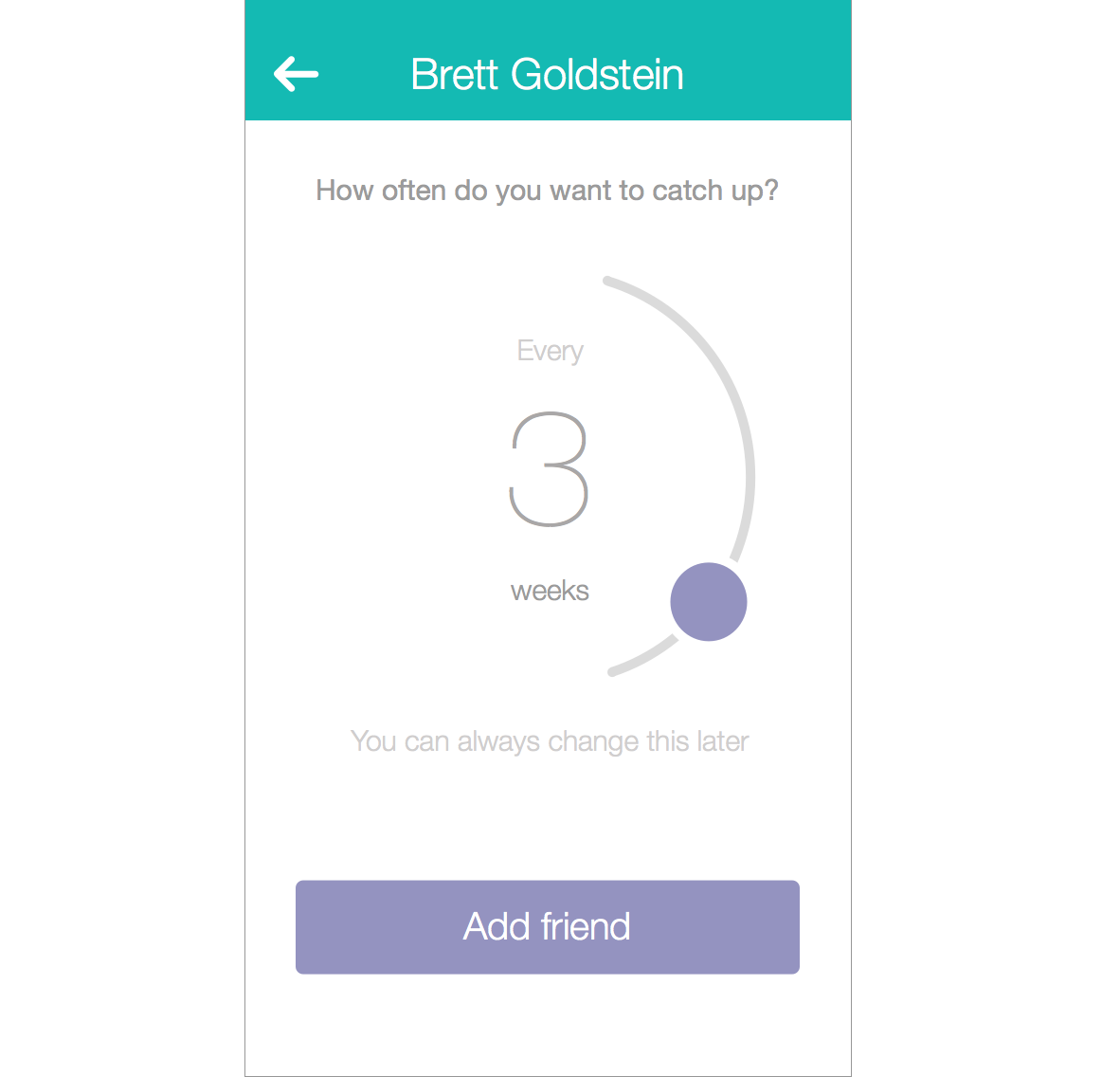
Add a new friend from your contacts.
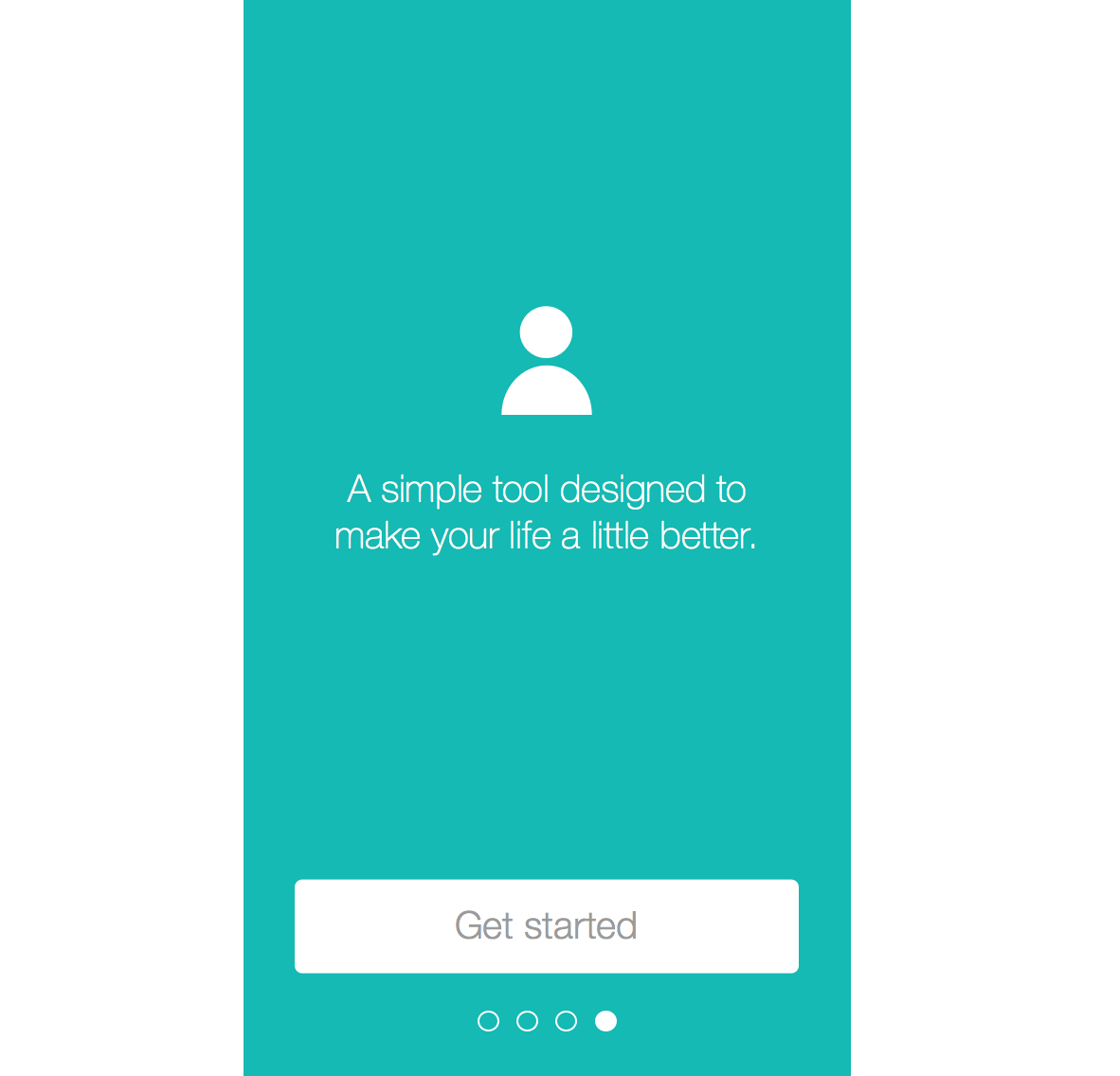
I also designed the first time experience of the app, that guides the user through opening the app and adding their first friend. I received very positive feedback about this during usability testing.
I went through many iterations to come to this final design. I've included a few of them below in a screenshot to view how the design changed over time. As you can see, it started off much less visually driven. Through feedback and iteration, I went through many more changes until I reached my final design.
UPDATE: As you can see from the screenshots above, these designs have been iterated on further. Based on feedback I refined the visual language and clarified some of the interactions. I replaced the graph with a slider based on usability testing and an evolved understanding of what was important to users. I also consolidated everything that was stored in the settings button onto this page.

Iteration 1: Not the best way to display the information. I pushed myself to make it more visual.
Iteration 2: My first stab at displaying the information visually, and adding a call to action at the bottom.
Iteration 3: Moving more toward my final design, I improved the hierarchy and placement of elements on the page and made small visual tweaks.
Iteration 4: I struggled with what the 'Catch Up' button should do. I tried separating the indication of actually catching up with the button, which simply initiated contact. I also played with adding more color.
Iteration 5: Based on feedback, I made the color more bold to improve contrast on the screen. I made the button at the bottom look more like a button, and solidified my design decision that the button would initiate a text with the friend, but not mark that the user had caught up with that friend. I also added the micro-text at the bottom to help guide the user.
Iteration 6 (not shown above): I refined the visual language and hierarchy of the page. Based on usability testing I made several significant changes including replacing the graph in the middle with a slider control.
Final Design

The app shown on an iPhone screen.


