


Fraka is a band from Montreal, QC. They created something they call "C-Pop" : a blended mix of caraibbean, haitian, african, and pop musics.
They recruited me to create their new logo and brand identity.
They opened for Arcade Fire at Parc Jean Drapeau (Montréal, QC) and went on TV for Belle&Bum show (TéléQuébec).
They recruited me to create their new logo and brand identity.
They opened for Arcade Fire at Parc Jean Drapeau (Montréal, QC) and went on TV for Belle&Bum show (TéléQuébec).
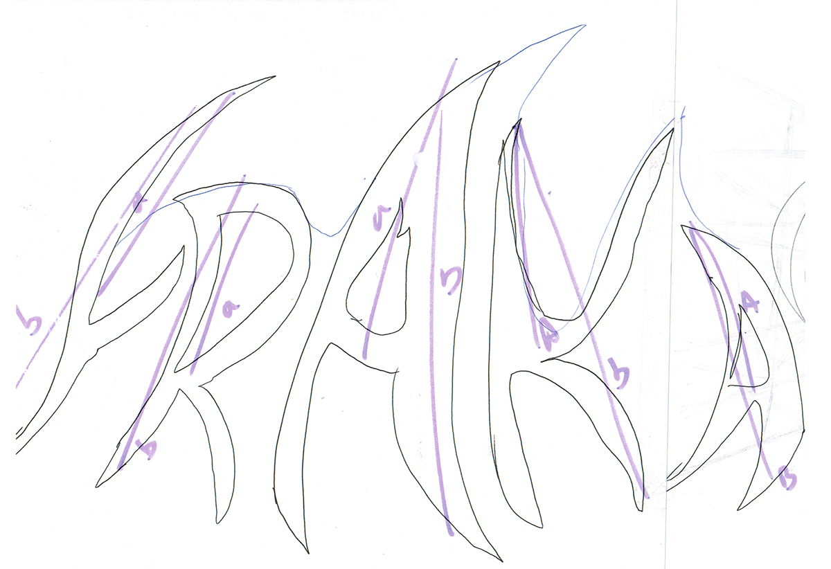
First quick draft of the logo idea.
I wanted to do some golden number proportion while designing a logo that will transmit the same emotions as the band music : joyful, colorful, explosive,...

I created a grid to help me design the first draft. I always start on paper.
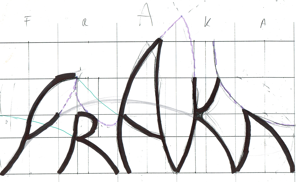
Once I was happy with the draft, I outlined the letters with a Sharpie in order to scan my paper draft and create the vectorization.

Rather than auto-vectorizing, I prefer to recreate the lines. I used a combination of several ellipse shapes to get to the same result I designed. Those ellipses were sorts of guidelines for me before creating the curves with the pen tool.

Vectorized base of the logo.

Using a custom stroke, I wanted to create a finger-painting effect. Something naive and primal. Something that will suggest the Haitian origins of the band and this primal energy.

Text only was too solitary for me. I wanted to create a design that will accompany it and bear it.
From a single flame shape, I created this Panache. It's just a shape gradient but it suggests so much more. Fire, Energy, Phoenix, Color, Carnaval,... It's the perfect expression of the music of the band.
For the color, I simply Googled "haiti art" and get inspiration for the recurrent colors.
From a single flame shape, I created this Panache. It's just a shape gradient but it suggests so much more. Fire, Energy, Phoenix, Color, Carnaval,... It's the perfect expression of the music of the band.
For the color, I simply Googled "haiti art" and get inspiration for the recurrent colors.

Extracted of the Brandbook : the 3 parts of the logo.
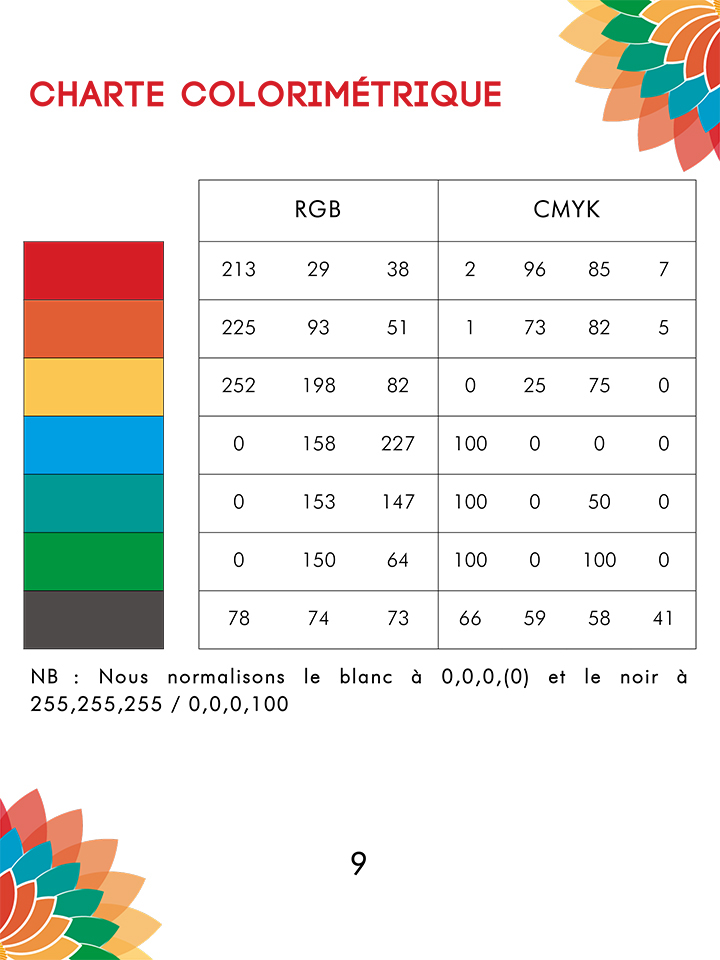
Extracted from the Brandbook : Color chart
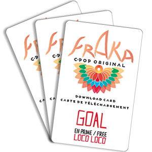
Application of the logo : Dropcards

Application of the logo : Website.


