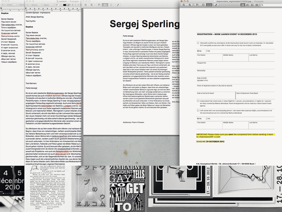
Impressions Sergej Sperling spread is an editorial illustration to introduce the artist's work in Markus Weisskopf catalogue of it's private collection. Part of a book designed by Basel-based studio
9--6 in Switzerland. Editorial, Experimental, Royal and Conceptual.
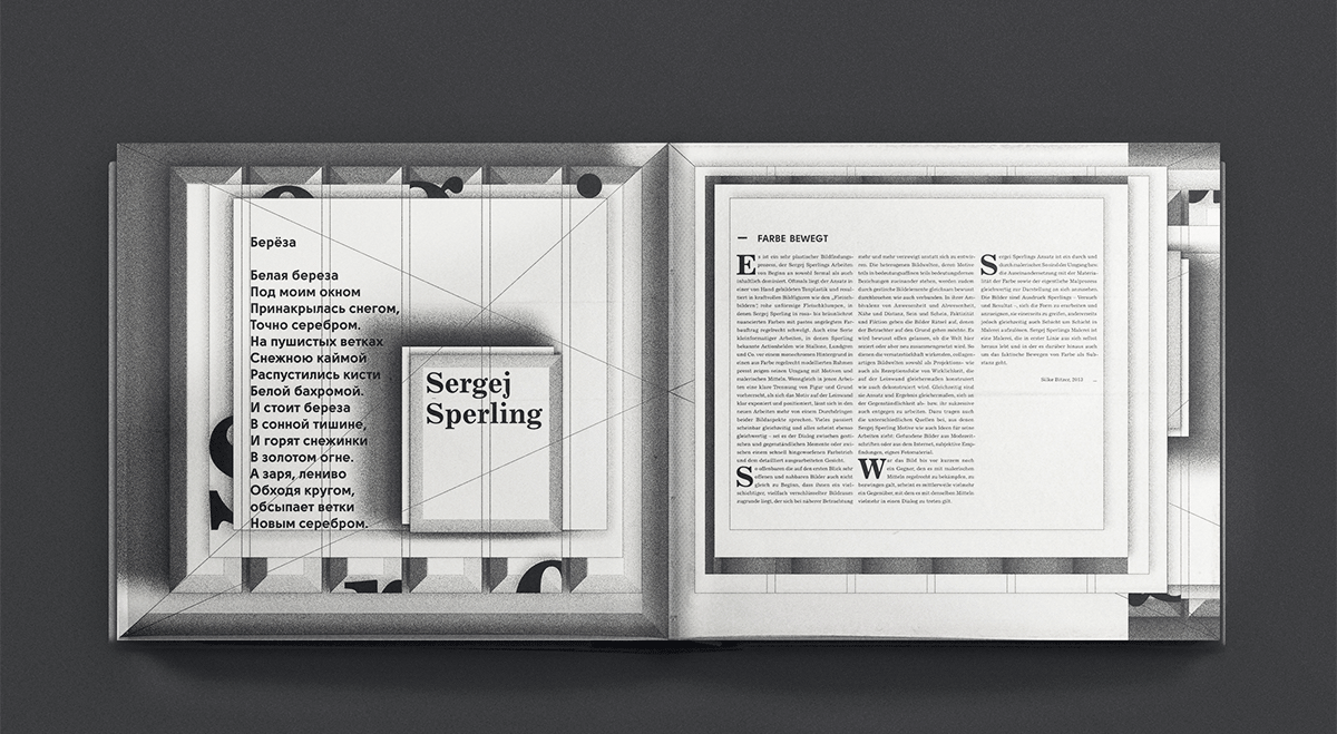
Based on two ideas, the transparency of the technique and the transparency of the framing as part of the graphic object, while still remaining contemporary and experimental, we built the spread on the same exact principles related to editorial design and it's connection to the arts.
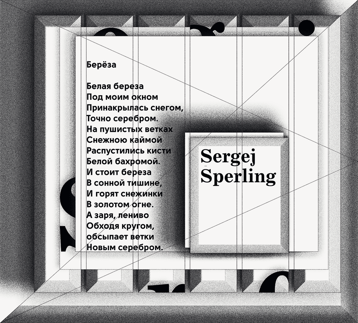
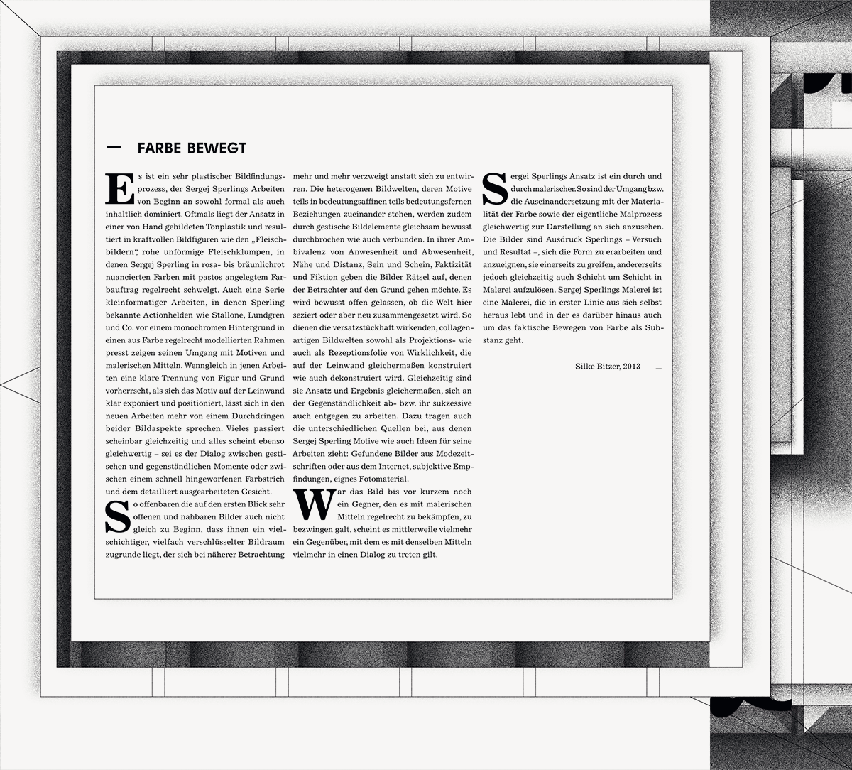
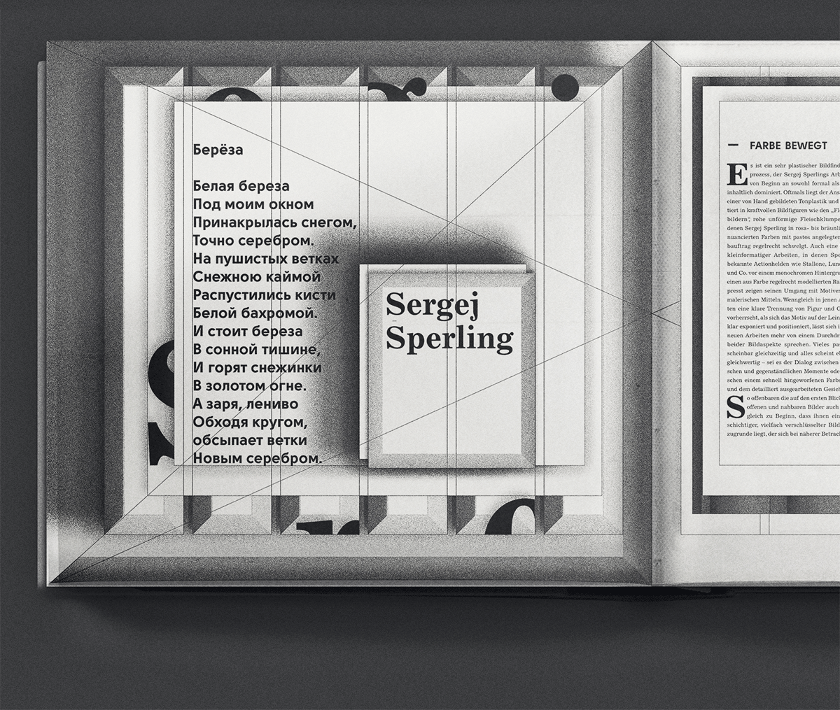
As such, we wanted the text blocks and info to be sustained by a graphic suggestion of the depicted frame. We wanted the reader to be inside the philosophy of the artist before he actually sees he's work. Therefore, the spread is framed on its own, and in a way to suggest, between the two pages, the idea of being part of a series - showing his approach to paintings in a series format.
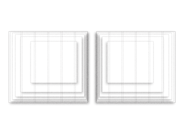
In addition to the framed suggestion, we gave depth to the spread by being transparent in regards to the editorial composition, to showcase history and craft, to have a straight connection to Sergej's understanding of the painting and brush technique. The result: the frame around the text blocks is not just a frame. It is transparent of the editorial technique. The spread, the text blocks, and the grid, are built on historic principles. Not just Jan Tschichold's studies on page composition, but its subdivisions as well, as a way to obtain several text areas to layer, in order to have the frame and the grid in the page format chosen, so that everything on the spread is perfectly balanced and locked in the golden ratio — a way to be in the same composition idea of history of the Sergej's series of paintings of pop icons, drawn on a square canvas, framed, and centered.
In addition to the framed suggestion, we gave depth to the spread by being transparent in regards to the editorial composition, to showcase history and craft, to have a straight connection to Sergej's understanding of the painting and brush technique. The result: the frame around the text blocks is not just a frame. It is transparent of the editorial technique. The spread, the text blocks, and the grid, are built on historic principles. Not just Jan Tschichold's studies on page composition, but its subdivisions as well, as a way to obtain several text areas to layer, in order to have the frame and the grid in the page format chosen, so that everything on the spread is perfectly balanced and locked in the golden ratio — a way to be in the same composition idea of history of the Sergej's series of paintings of pop icons, drawn on a square canvas, framed, and centered.
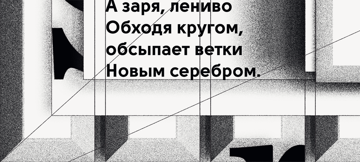
In the end, part of the grid and composition lines, is left to be visible, as a way to leave the designer's paint stroke, just like Sergej's allows the viewer to see with its usage of acrylics.
Sustained by the graphic elements that built the grid and the layout, the text elements were also a subject of understanding. To be coherent with his very impactful and very crafty approach to painting, the graphic elements that built the spread are drawn simply with the shadowing of the grid elements, and the text forms that build his name - the title. These elements are essential to the mood-setter approach, but on a different note: they can be removed without compromising the textual information, and it's composition in the page.
To highlight the experimental vibe of the whole project, the typography chosen is on its own transparent to the contemporary usage of type, combining in the same page a Solomon Sans (Fontfabric), characterized by the excellent legibility and overall purely geometric forms, very modern, and Excelsior (Linotype) a transitional font with a lot of characteristics of the old style fonts and their historic letterforms (i.e. Baskerville).
From coherence to the conceptual,
Ladies & Gentlemen:
The Royal Grannies present!