Project: WANBANG ENERGY Branding Upgrade
Category: New Energy
Service: LOGO Design | VI Design
Date: 2023
Category: New Energy
Service: LOGO Design | VI Design
Date: 2023
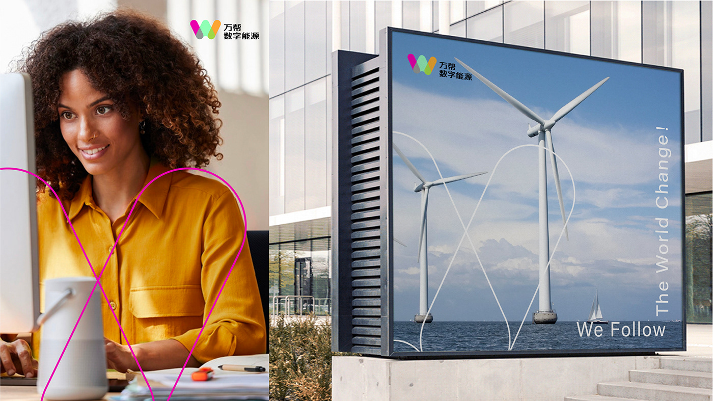
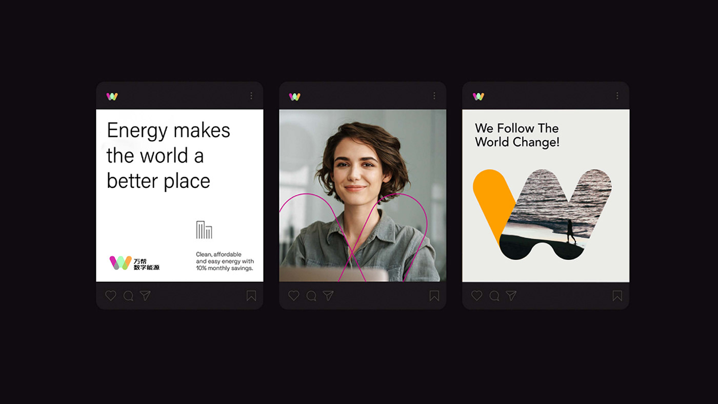
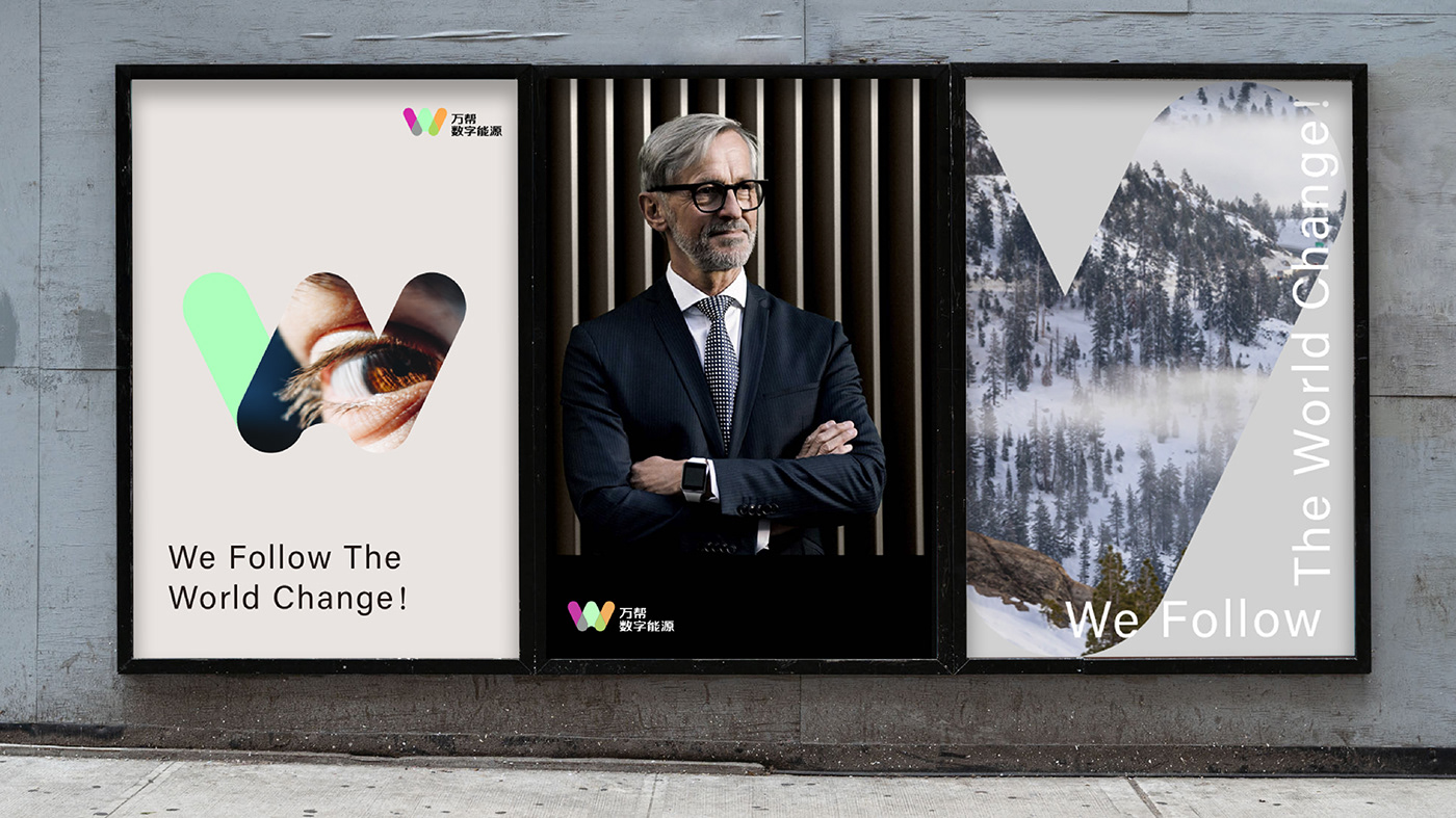
We ingeniously incorporated the full spelling of "Wan" – "w, a, n" – into the capital letter "W," creating a distinct visual emblem for the brand. To further reinforce the brand identity, we adopted the vibrant colors associated with our sub-brands "Merry Charge" and "Star Charge." This deliberate choice establishes a seamless connection and cohesive visual experience, enabling audience to instantly recall their interactions with the brand. Additionally, it enhances the perception of reliability and trustworthiness associated with the brand.