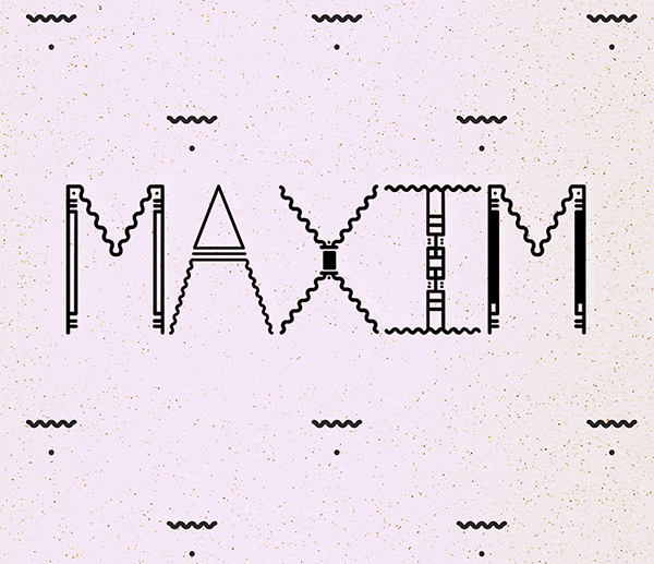
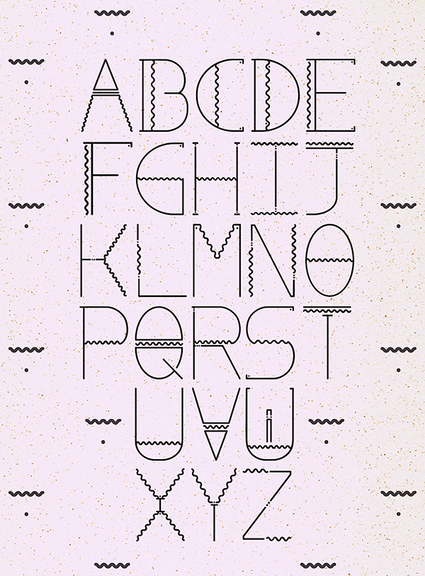
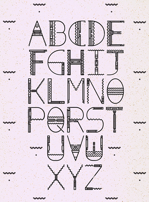
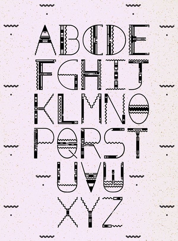
Created as part of a university project late last year, Maxim is my first 3 weight typeface. A concoction
of various basic elements such as lines, wiggles, and dots, Maxim is available in the OTF format.
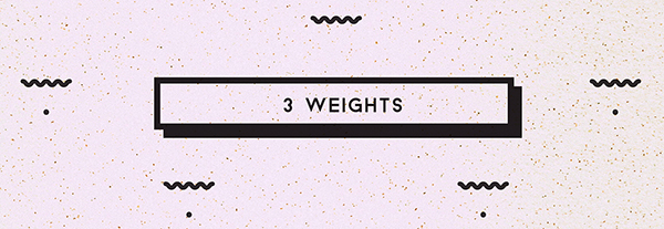
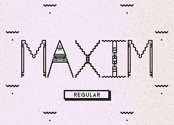
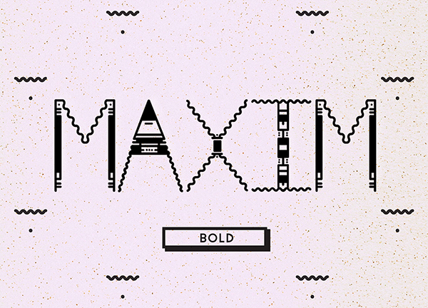
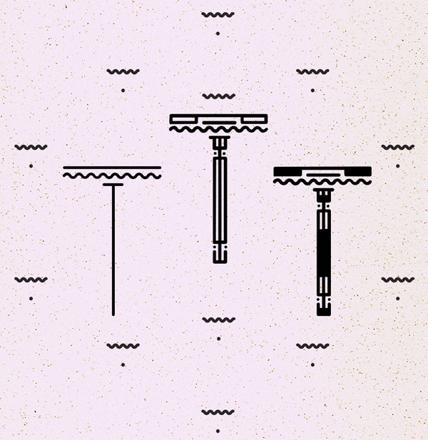
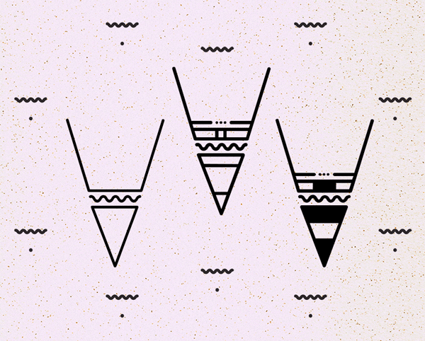
Maxim comes in 3 weights, Light, Regular and Bold, suitable best used as a display typeface, for titles and
Maxim comes in 3 weights, Light, Regular and Bold, suitable best used as a display typeface, for titles and
large font size, and looks particularly good when printed as the detail is shown at a higher rate.
This typeface was created in the sense of showing my fondness of playing with shapes and geometrics.
This typeface was created in the sense of showing my fondness of playing with shapes and geometrics.
I had a lot of fun varying the structure of each letter, especially when it came to creating the letters for each weight.
I hope you enjoy using this, as much as I did creating it.
Thanks for looking!