The DC Metro (Redesign)
Information Design & Signage
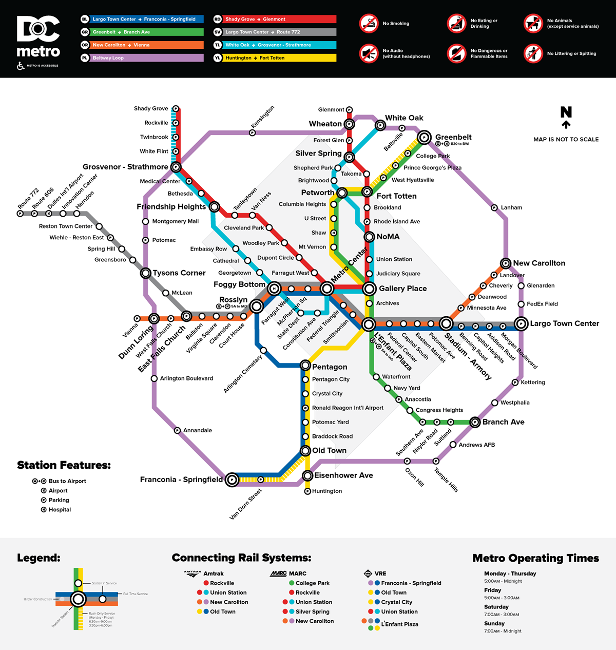
While in college, I redesigned the DC Metro Map making it more friendly and appealing for tourists who were visiting and wanted to know how to get to all of the district's historic spots.
When I moved here (and became I regular commuter on the train), I found that the number of commuters on the train far outweighs the tourists and I decided to take a different approach.
When I moved here (and became I regular commuter on the train), I found that the number of commuters on the train far outweighs the tourists and I decided to take a different approach.
As I did previously, I removed a lot of the clutter that sits behind the current metro map and focused solely on the routes. There is a subtle outline just to ease any confusion about which stations are in DC and which are not.
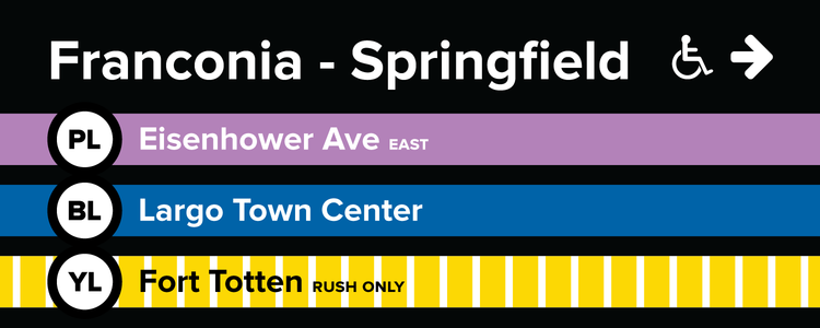
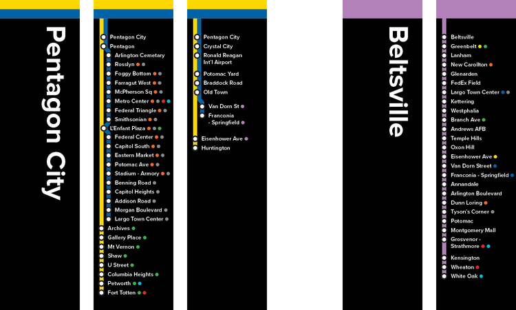
This week begins operation of the first phase of the Silver Line. This new map includes that new line and the phase that will be completed by 2018. I've also added two lines that I think would help train congestion: teal and purple. The teal line follows a similar path to the red line (and adds a few stations), which has some of the heaviest congestion during rush hours. The purple line, that I (with others who support the concept) dubbed the beltway line, has been proposed before with the high amount of people who ride the current lines from end to end and could speed up traffic for those looking to go from Maryland to Virginia (or vice versa) without going through downtown DC.
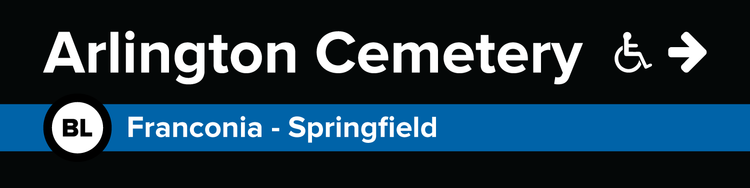
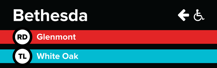
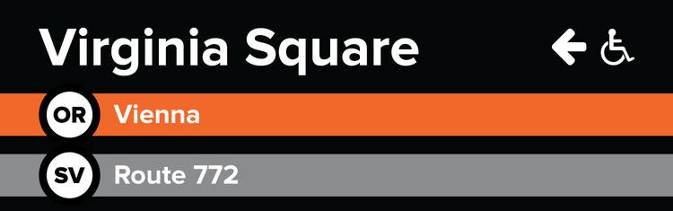
Some station names are shortened and I decided to eliminate all of the stations that included the colleges/universities in the name (such as Archives, Shaw, NoMA, Brookland, etc.). The bold colors chosen are not just to attract attention - they also make it easy for someone who is color blind to read and understand.
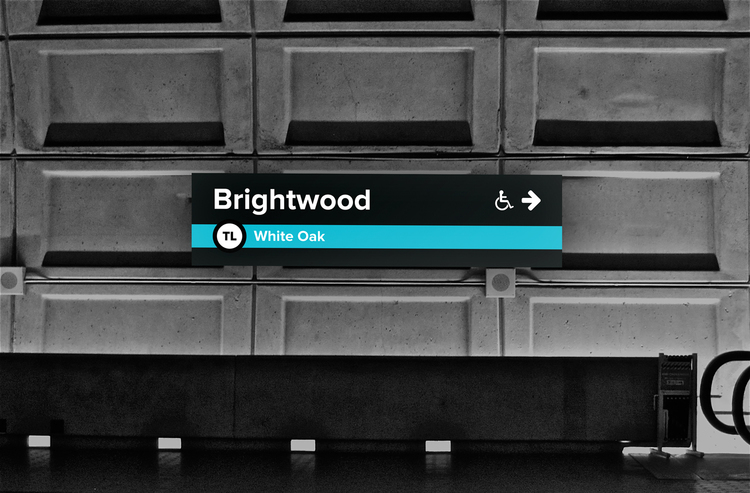
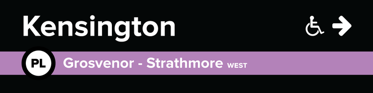
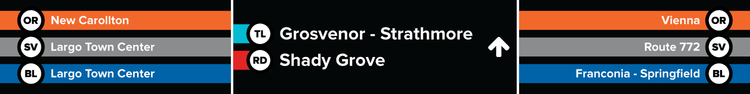
Signage is similar in size to the current signage throughout the stations, but is designed to make it easier for consistency, adding new stations to the signs (and making the new stations their own signs), and making it easier for more people to read both inside the trains and on the platforms - even across the platform.
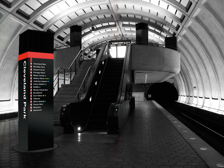
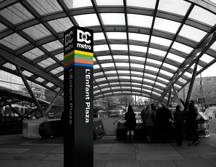
The new pylon designs are meant to wrap around current ones, but are easier to see in crowded areas around stations making it easier to identify from a distance.