THE CONCEPT
Hedon is a new-wave craft beer company, established in 2014. The renaissance of micro breweries in Hungary is reaching a new level, bringing more and more customers into the world of quality beers. The brand has an expanding range available in special beer shops and craft beer pubs.
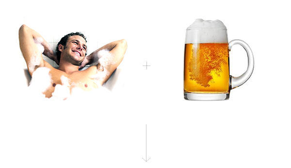
Their name derives from “hedonism” so we chose the figure of a typical hedonist for the logo. That’s how this beer-bathing guy was born, who enjoys his life and lives for the moment.
THE LOGO

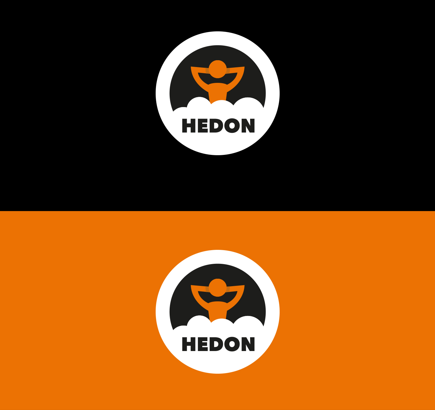
TYPE AND COLOR

PICTOGRAMS

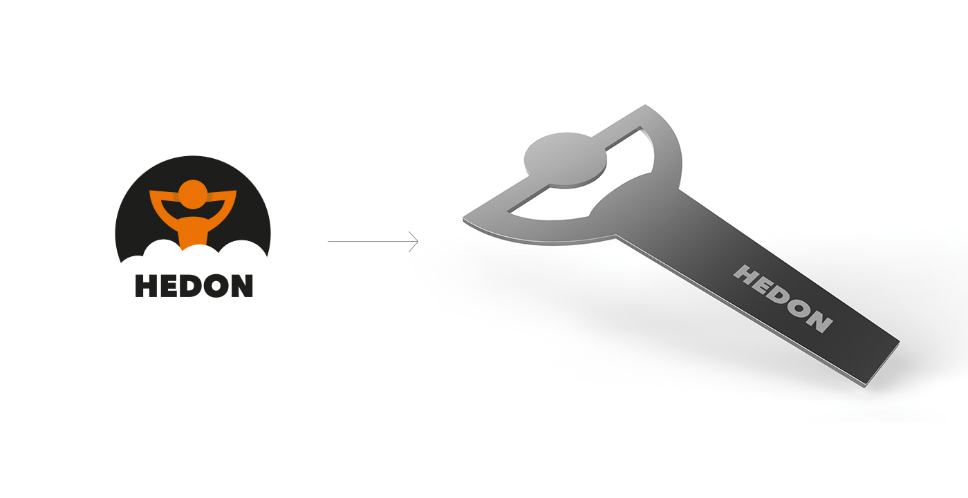
BOTTLE OPENER
bootle opener based on the logo.
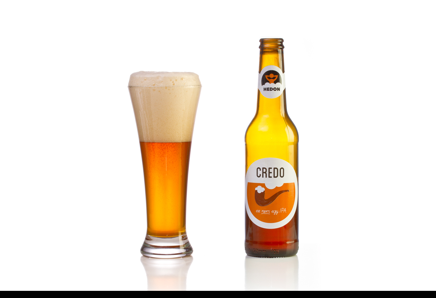
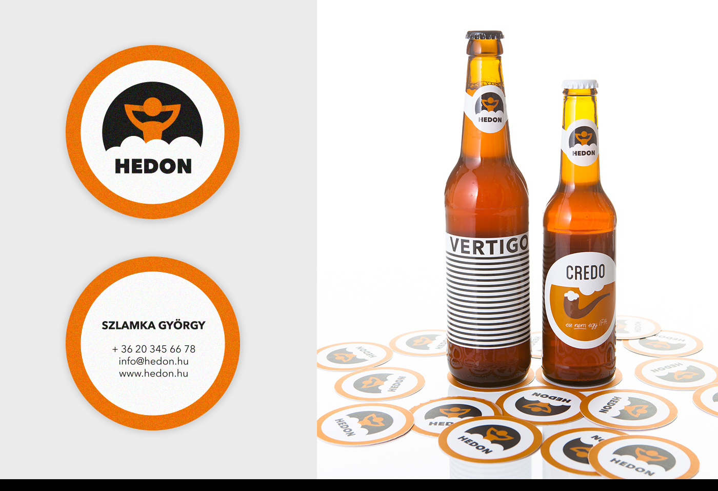
CREDO package design
Credo was the first beer by Hedon and it had a label based on a hungarian pun. The slogan is “Ez nem egy IPA” (=“It’s not an IPA”) because this beer made with just one malt, not as the original IPA beers. So this label reflects on the famous painting of Magritte “Ceci n’est pas une PIPE” = “Ez nem egy PIPA”. We redesigned the label to be the part of the brand identity with an individual and pleasing look.


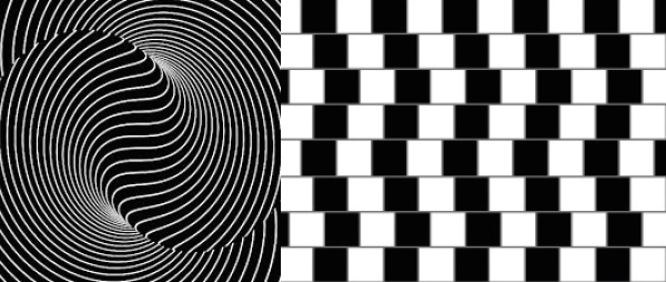
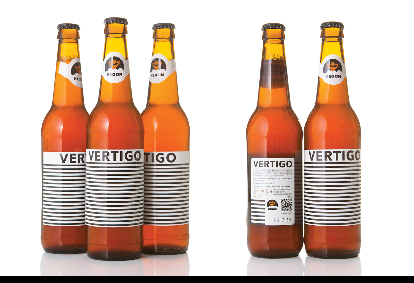
VERTIGO PACKAGE DESIGN
Vertigo is the second beer by Hedon. Because of the meaning of "Vertigo" we designed a label that makes you dizzy when you look at. The graphics were inspired by optical illusions, and though being very simple and minimal it catches your eyes.

BUSINESS CARDS
Hedon's business cards can function as beer mats too.
PHOTOS: Eszter Galambos


