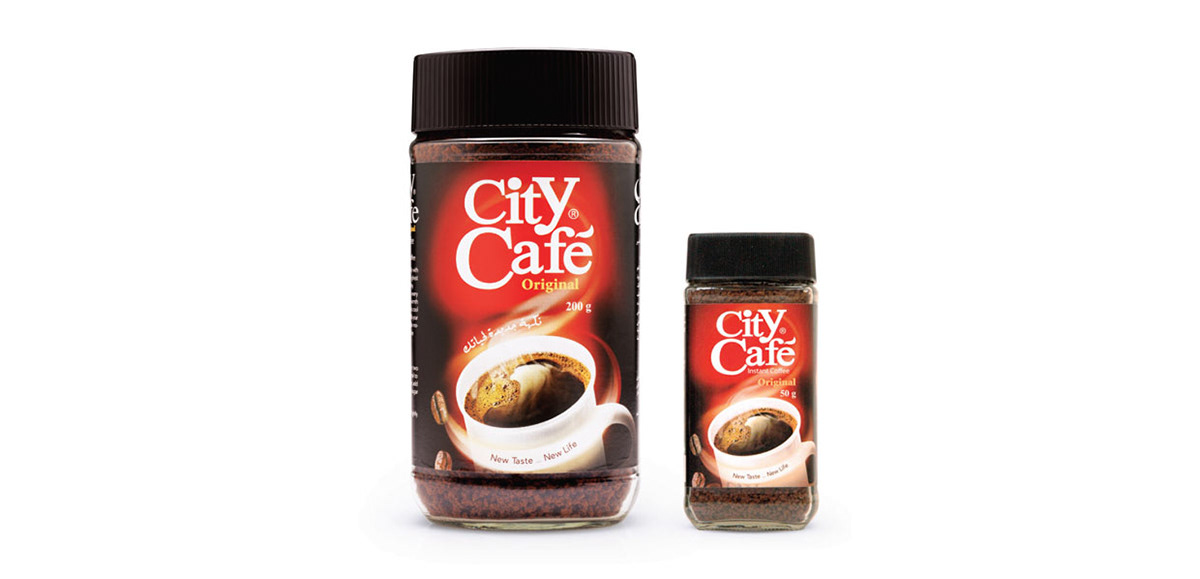
The old packaging
Brief
Create a new packaging for City Cafe, the new packaging has to look fresh, modern, stylish and bold that represents the power of young people.
Solution
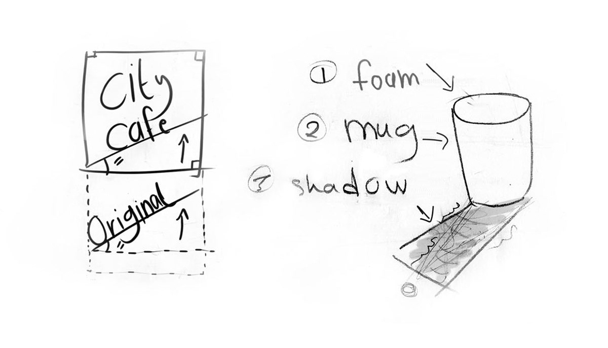
here main visual elements/aspects have been amended in the brand. Firstly, The logo has been rotated 15 degrees and positioned in a square. Secondly, the logos's color has changed from red to orange. Thirdly, the red mug has changed to a bright orange mug.
The bright orange mug on each pack/sachet/box has a unique shadow/signature to express the differentiation between the five main categories Original, Hi mix, Creamer Original, Creamer Light and Cappuccino, the Cappuccino category itself has five flavours Original, Vanilla, Caramel, Hazelnuts and Chocolate.
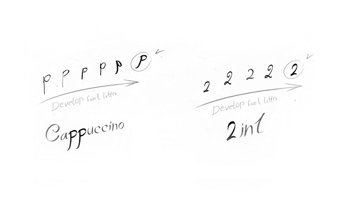
The typography - Free hand
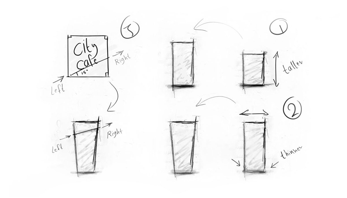
Main pack's shape development
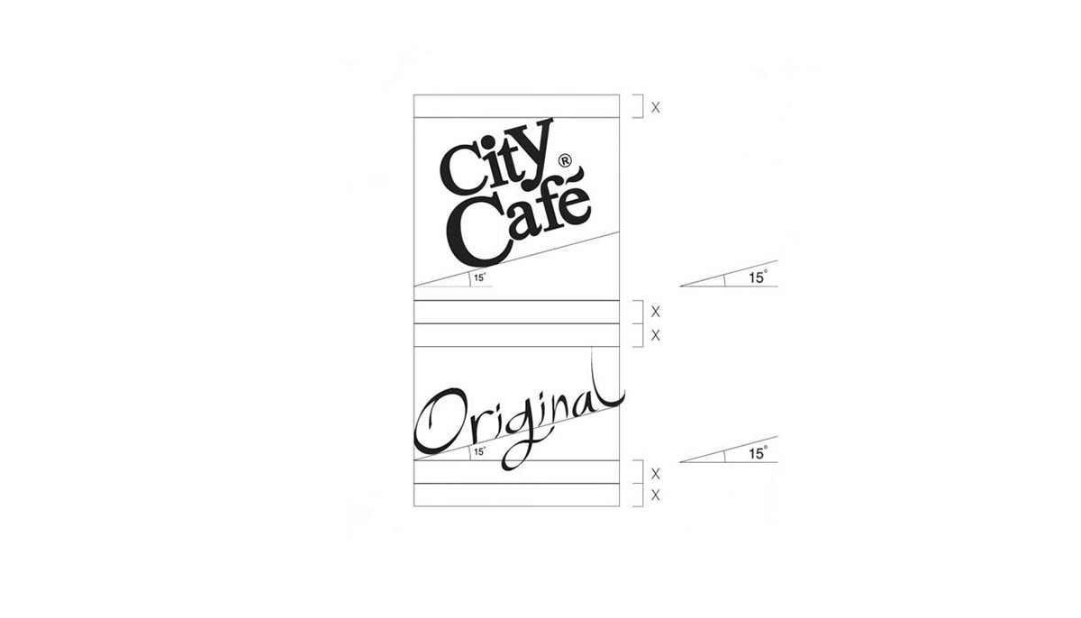
Structure - Label relationship
Required designs
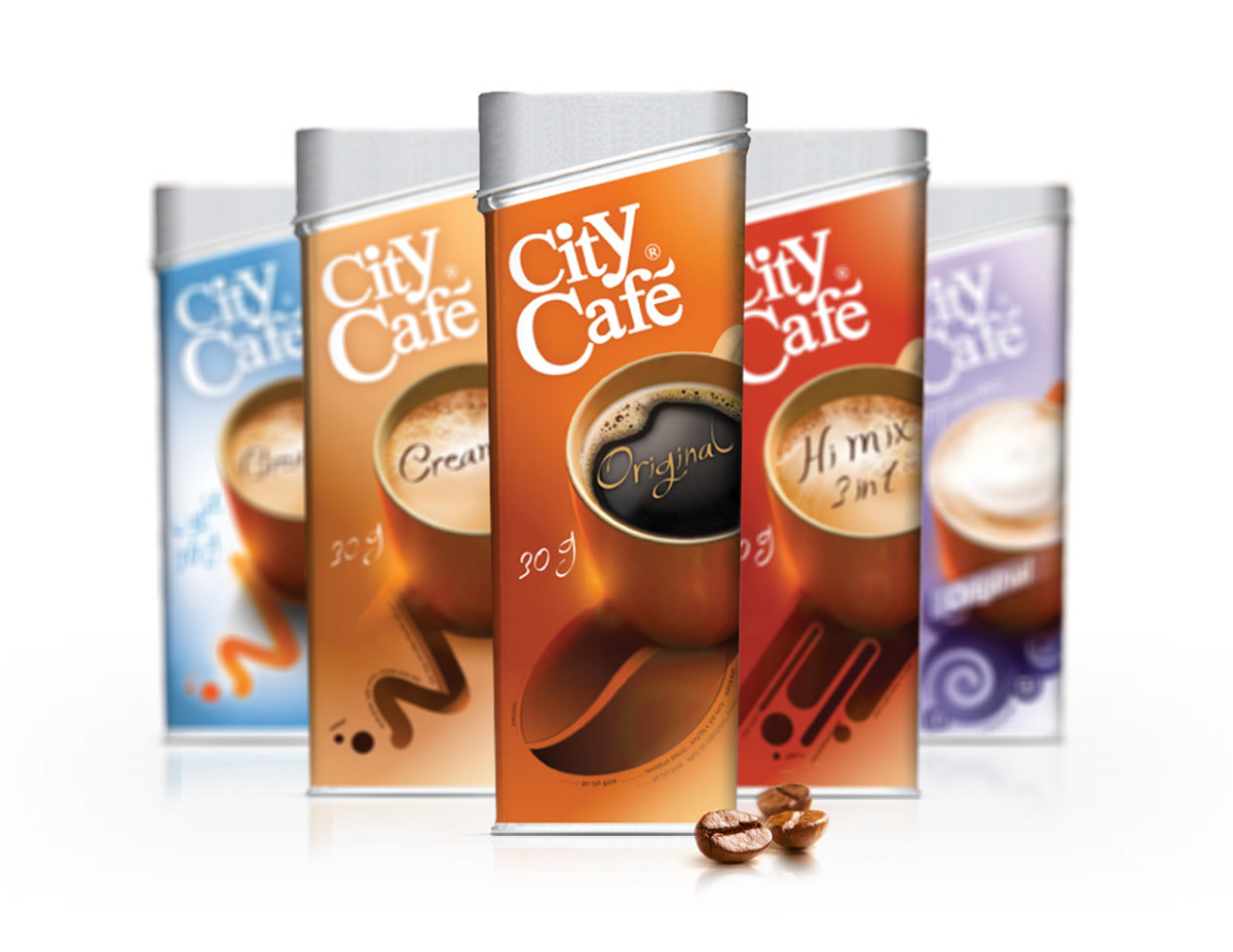
A set of nine packs with full SKU.
Five main categories: Original // Hi mix 3 in 1 // Creamer Original // Creamer Light // Cappuccino
Five cappuccino categories: Original // Vanilla // Caramel // Hazelnuts // Chocolate
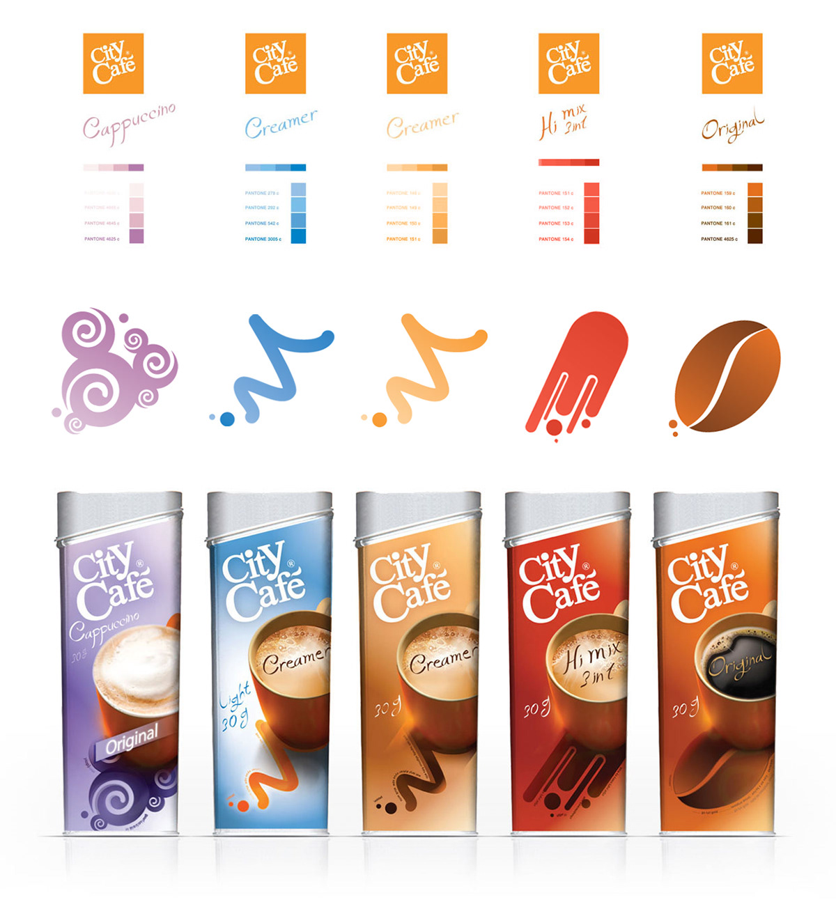
color scheme and products' signitures
Cappuccino // Creamer Light // Creamer Original // Hi mix 3 in 1 // Original
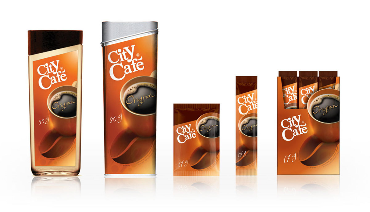
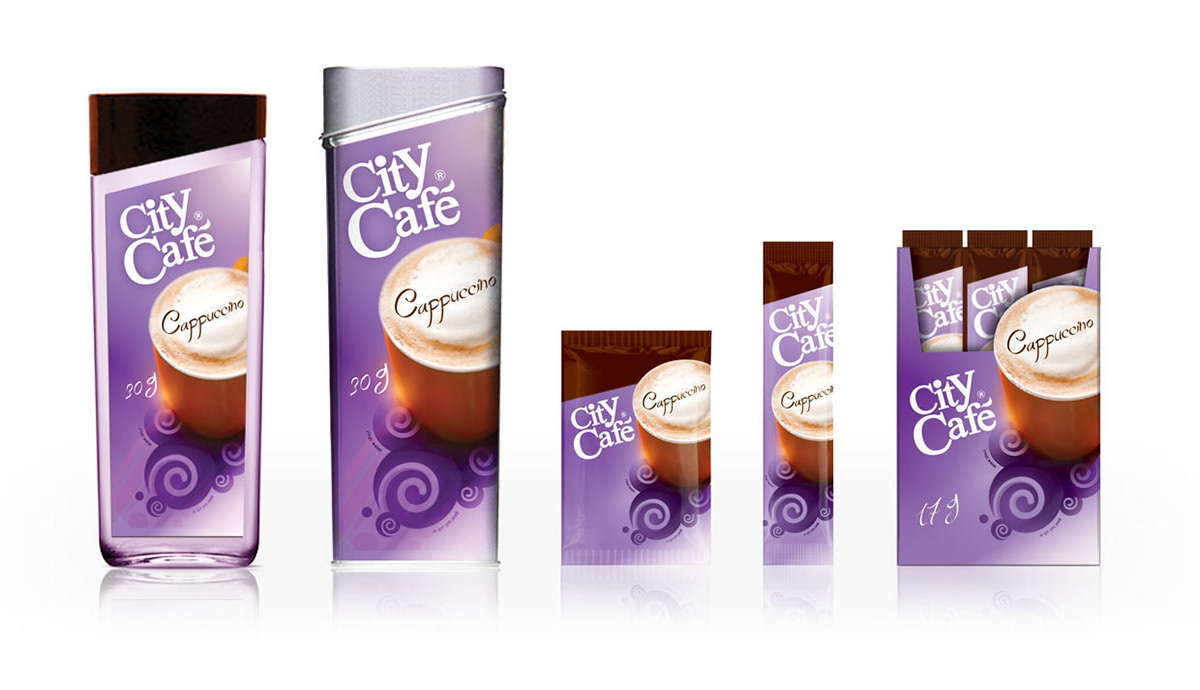
SKU: glass // tin // sachet // products display
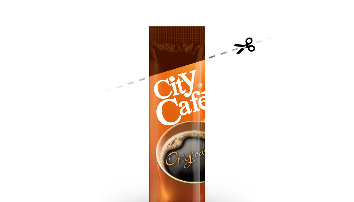
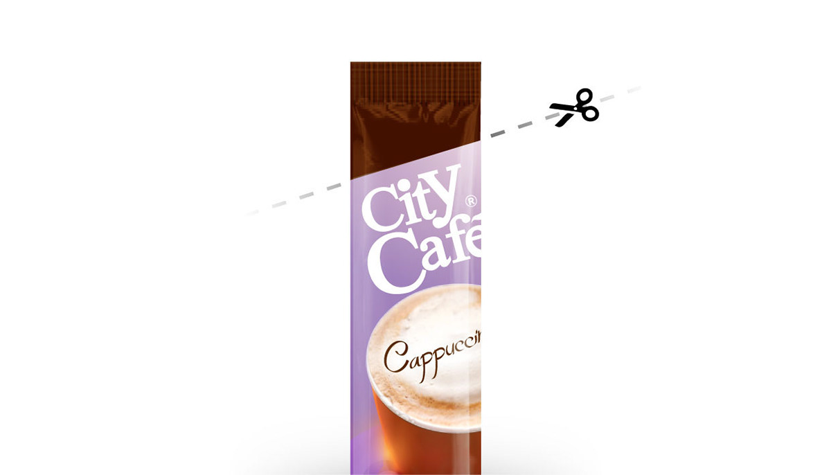
Sachet - how to open
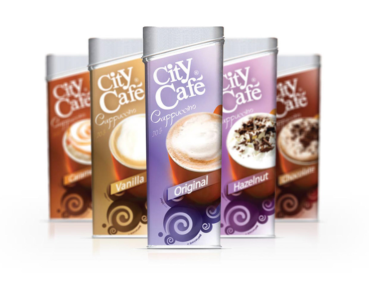
Cappuccino family
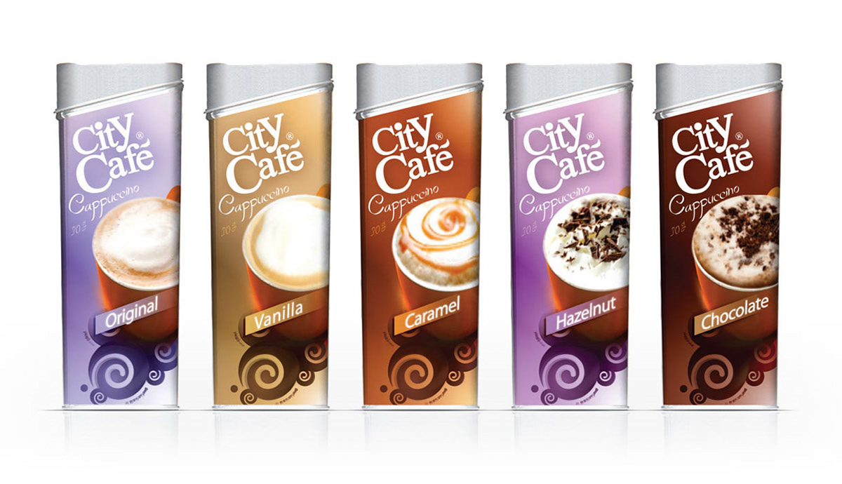
Cappuccino Original // C Vanilla // C Caramel // C Hazelnuts // C Chocolate