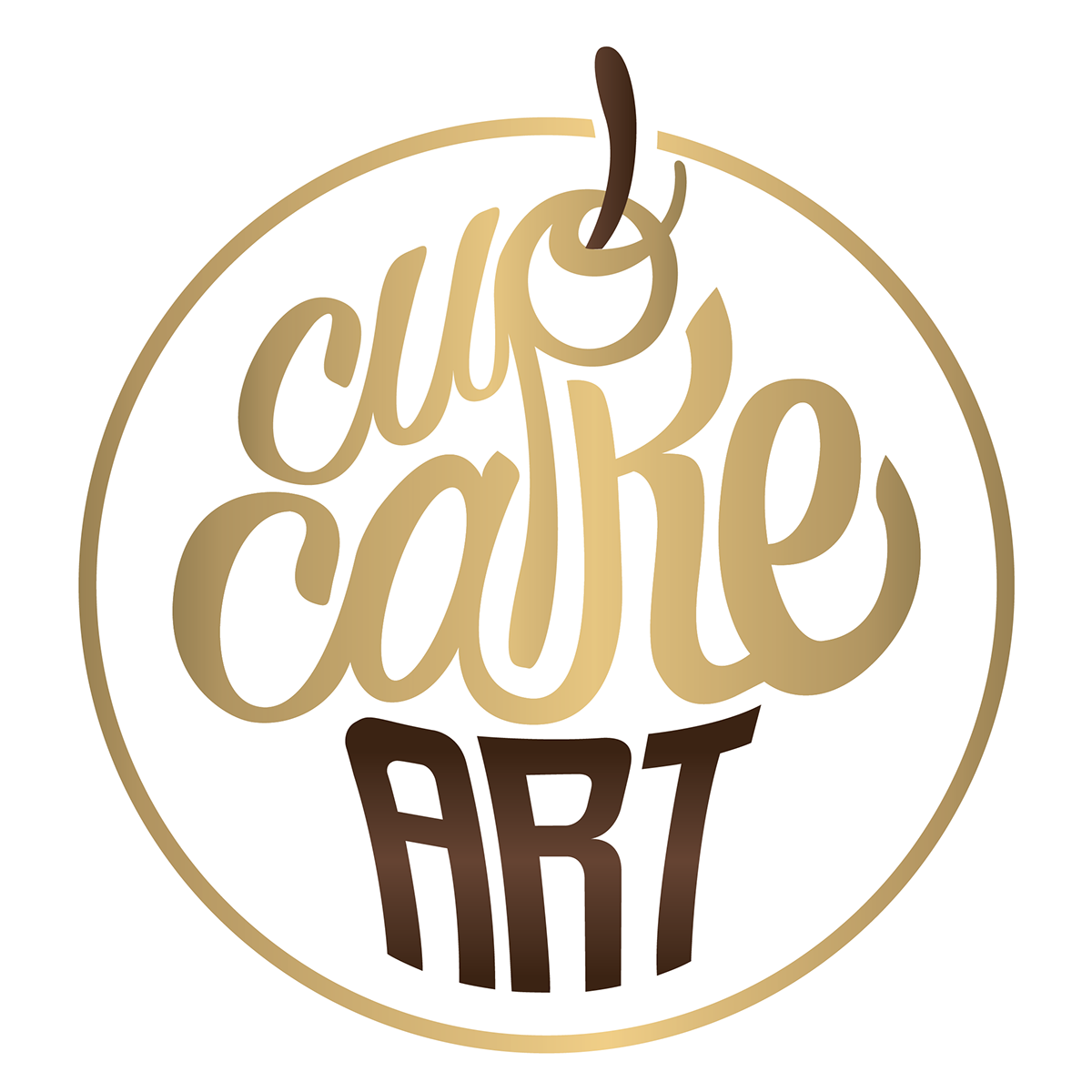
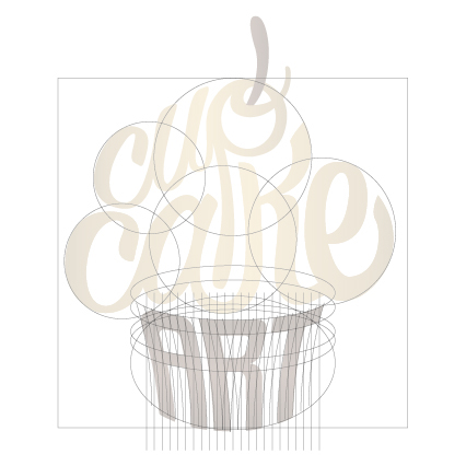
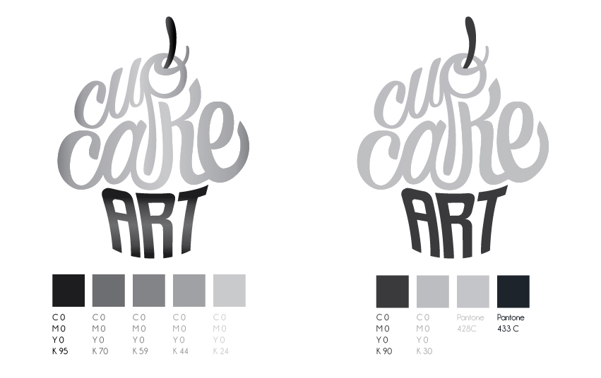
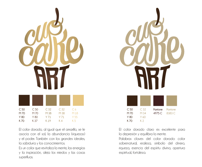
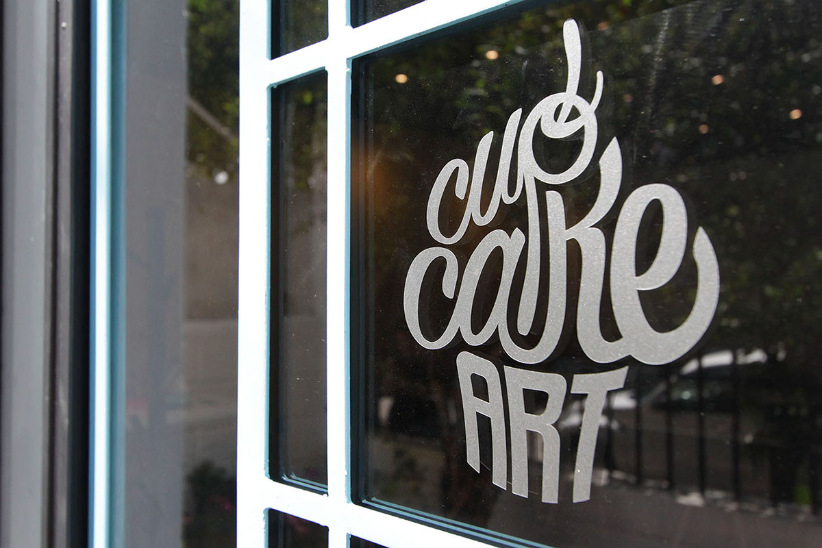
BRAND IDENTITY
The inspiration comes from the origin of the brand: The cupcake. That small and soft bunn with a sweet frosting.
The typography of "Cupcake" is conformed by soft lines that resemble the fondant that is used in the cupcakes, while "Art" in the bottom part obeys to straighter lines to resemble the cupcake paper liners.

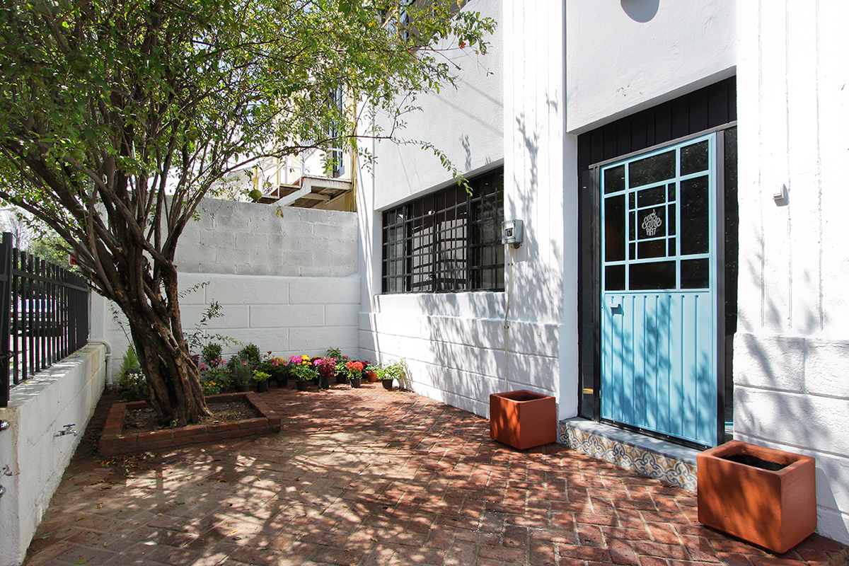
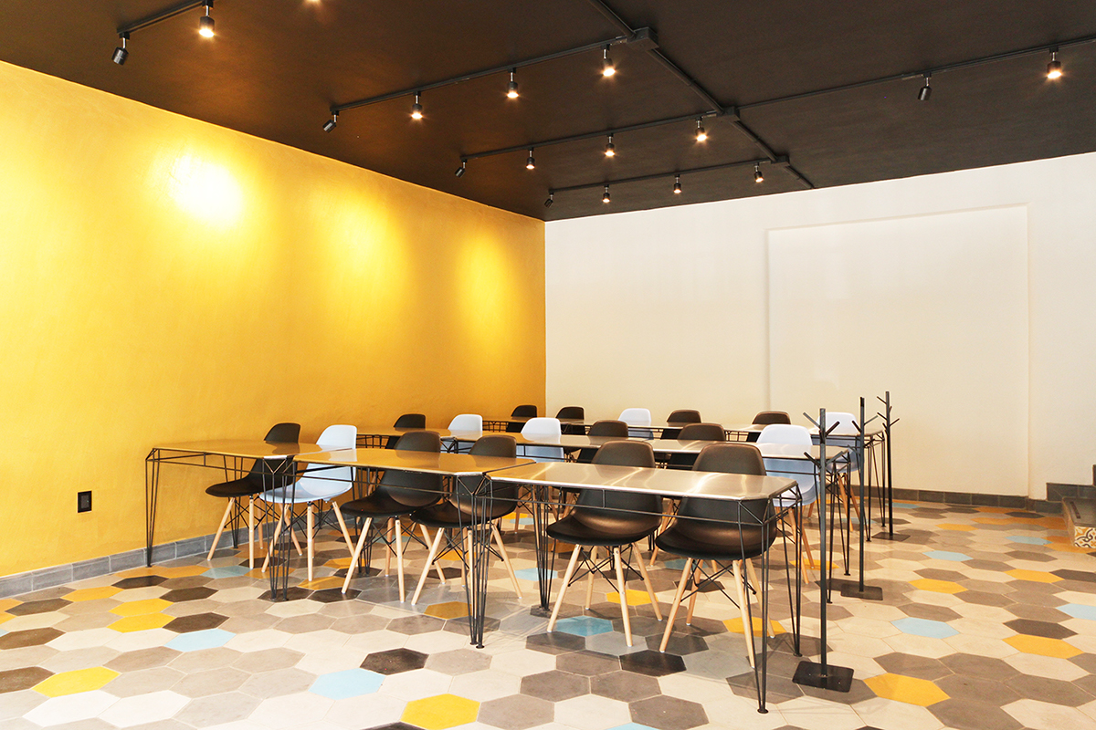
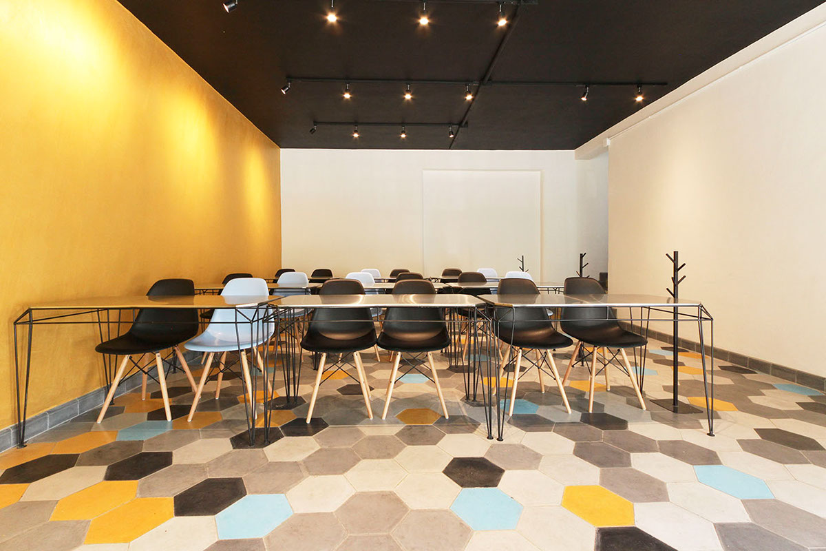
WORKSHOP DESIGN
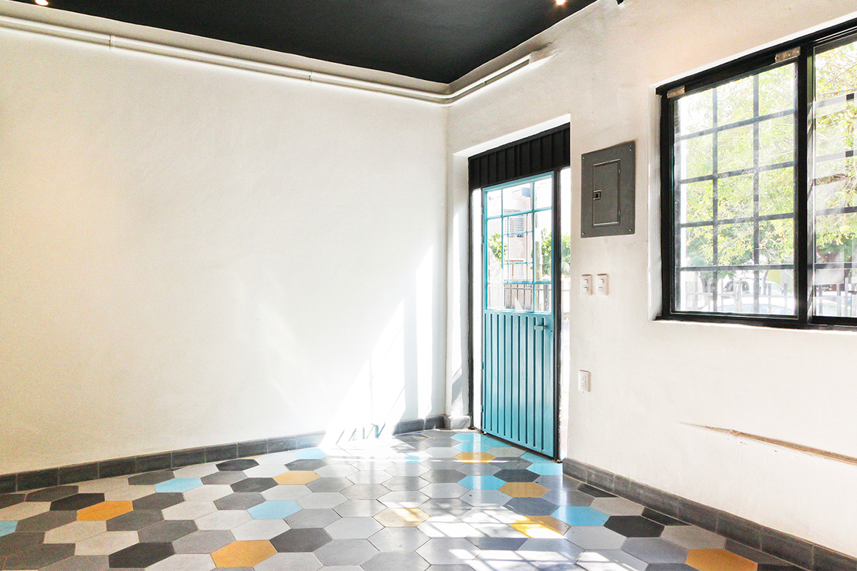
Remodeling of a house to create CupcakeArt's workshop. The groundfloor is the classroom,
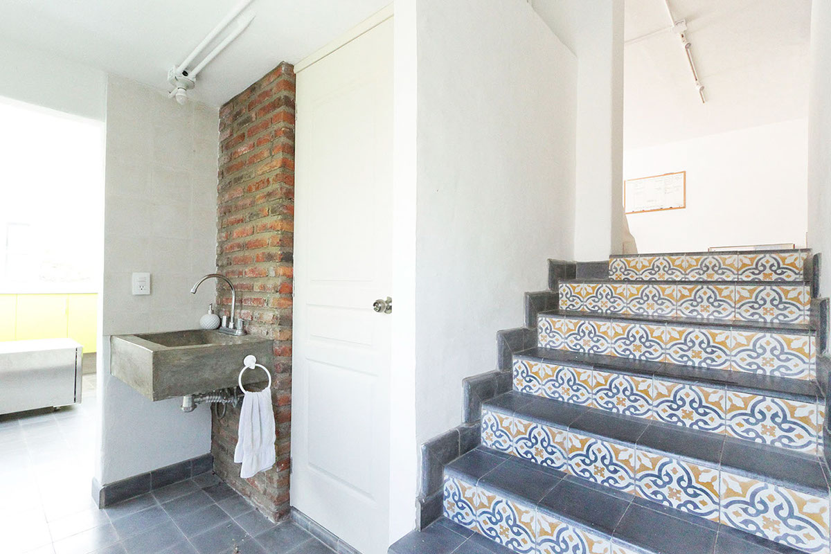
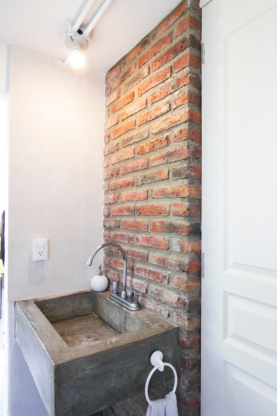
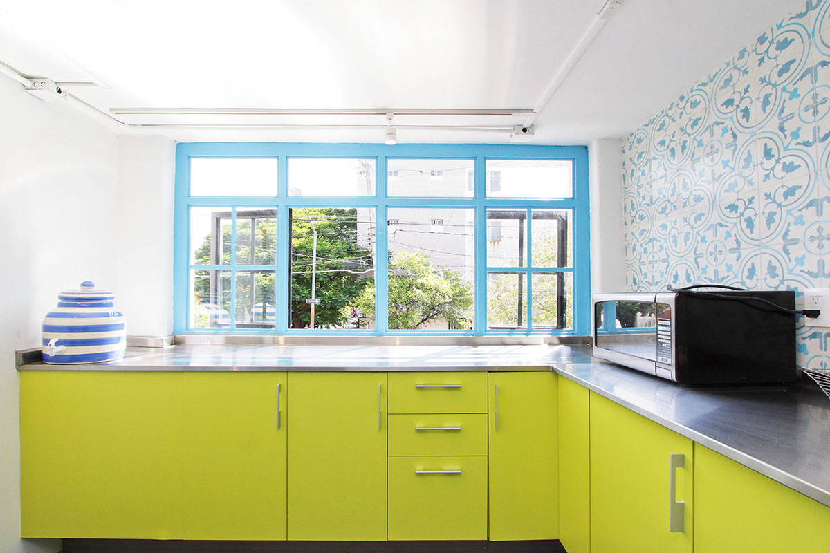
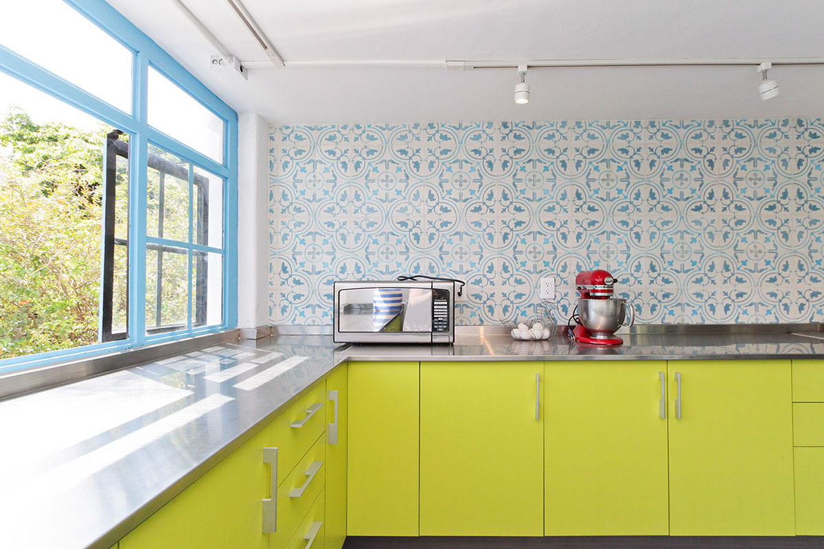
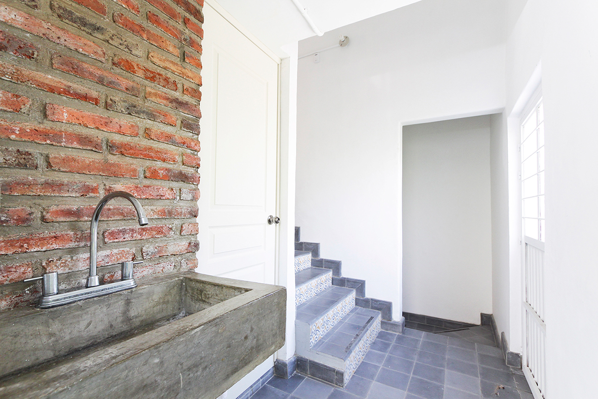
in the first floor is the kitchen and bathroom, while in the second floor will be the office and workspace.
The project was determined by the space, which was in really bad shape, as well as a restricted budget.
Walking away from the pastel colors, pinks and french style that cupcakes are related to, the concept was to create a modern space, translating mexican details into a modern style.
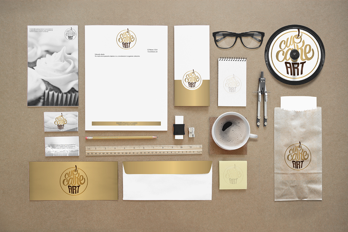
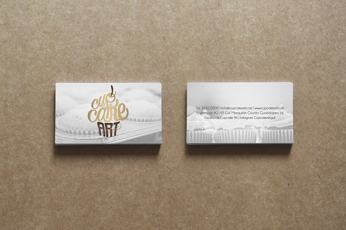
Following the design that I did of the brand identity, gold was chosen as an accent color, to give the space a warm light, while differentiating the brand and the space form most of similar shops in the city.
Yellow and blue complemented gray and black; while green just gave a vibrant pop to the kitchen space.
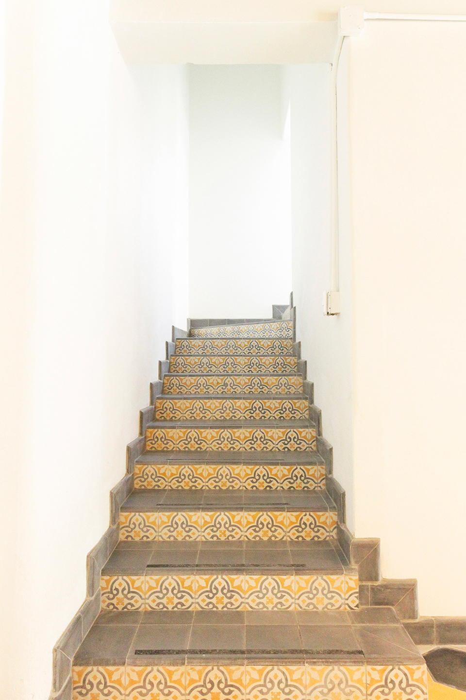
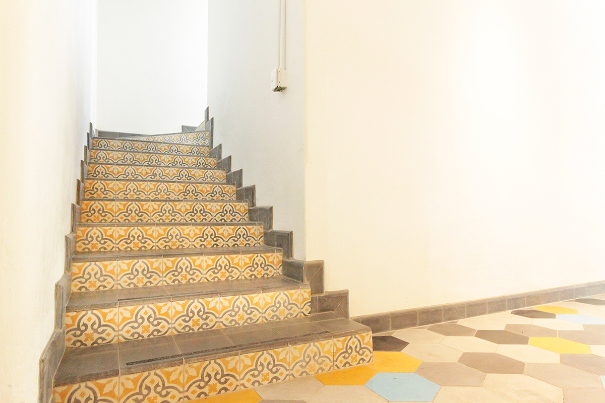
Mexican handcrafted tiles were used through out the whole house, creating different patterns to enhance the main area for clients, the height of the stairs, give the kitchen a traditional twist and the bathroom a fresh sense.
In collaboration with: Estudio MOBA


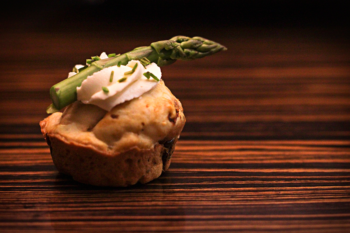
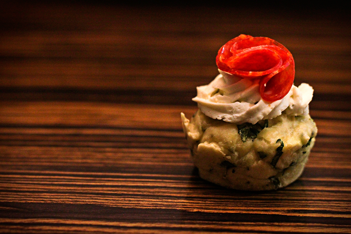
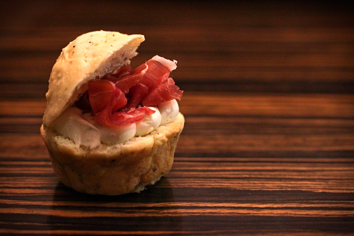
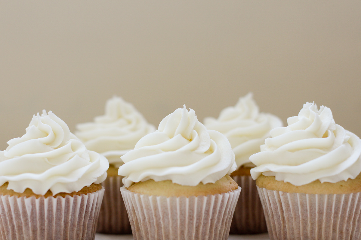
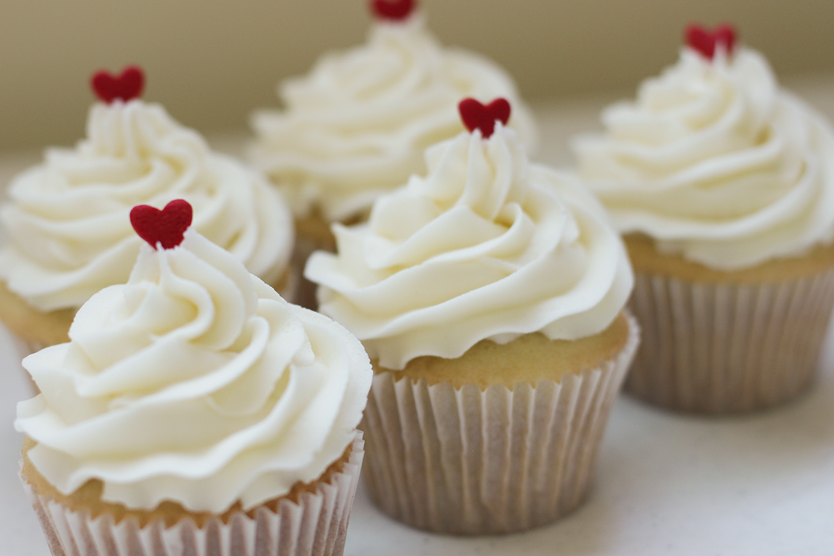
PRODUCT PHOTOGRAPHY
Photos taken to promote the salty cupcakes workshop.