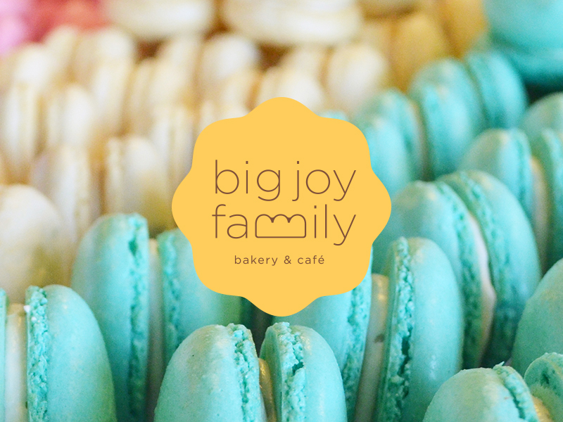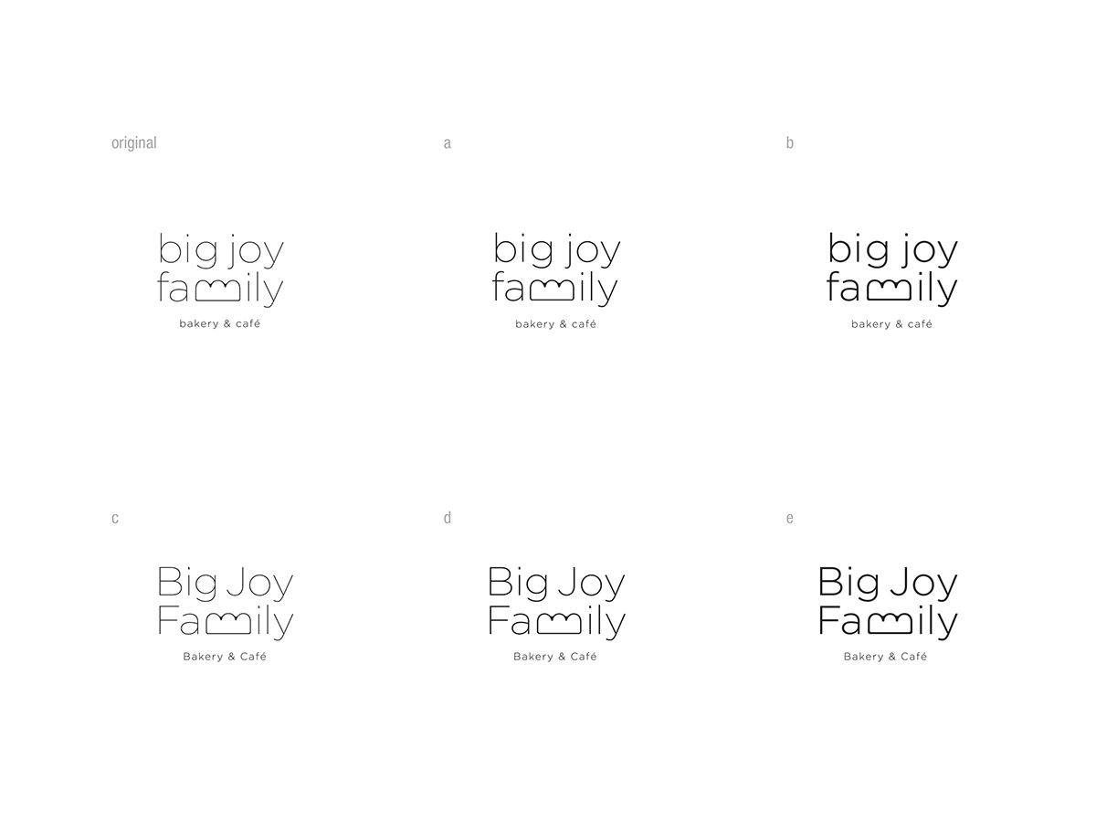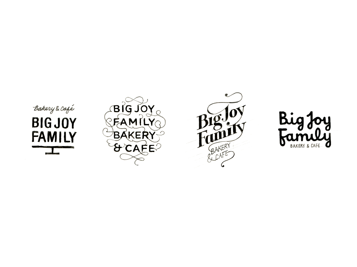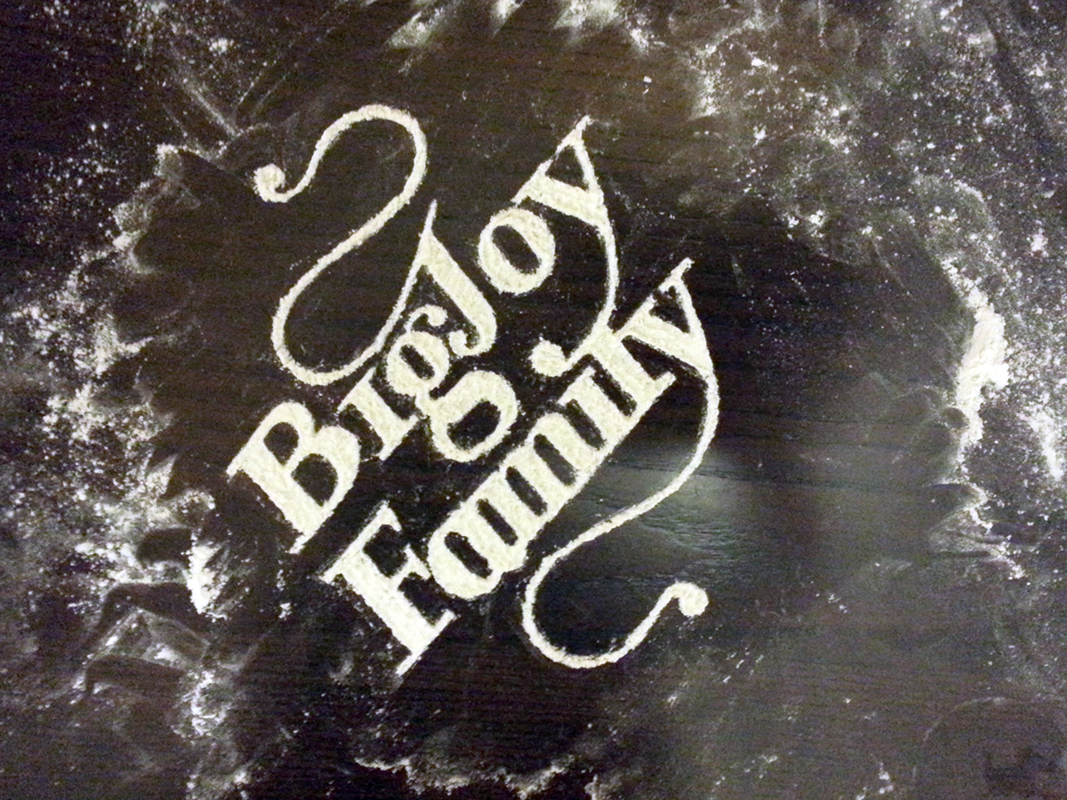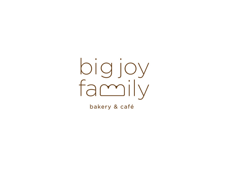

“Big Joy Family” is such a name that is not indicating what they are about. It was quite challenge to me for the round of initial sketches. The problem was that the drawn symbols of objects that can be found in the bakery could go with any bakery brands. Since the name means a lot to them, I started to focus more on the logotype rather than drawing a symbol mark. Through out the base typeface study, I came up with this idea of drawing ‘bread’ with lowercase ‘m’ of ‘family.’ This was simple idea yet perfect solution for them because it is a mom and pop shop with their three daughters—the “big joy” was the three girls to the parents.