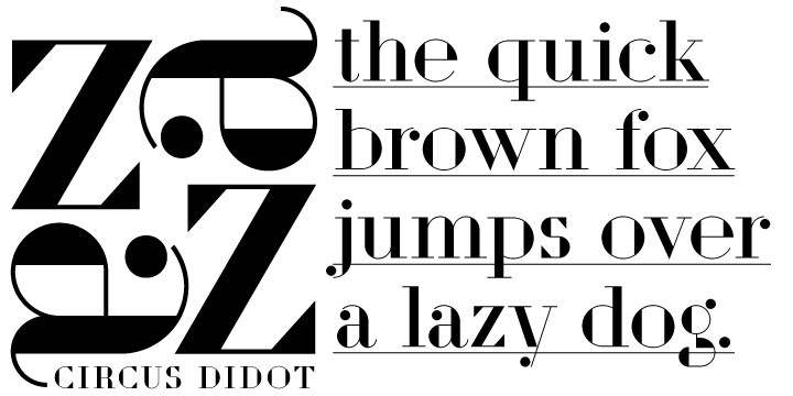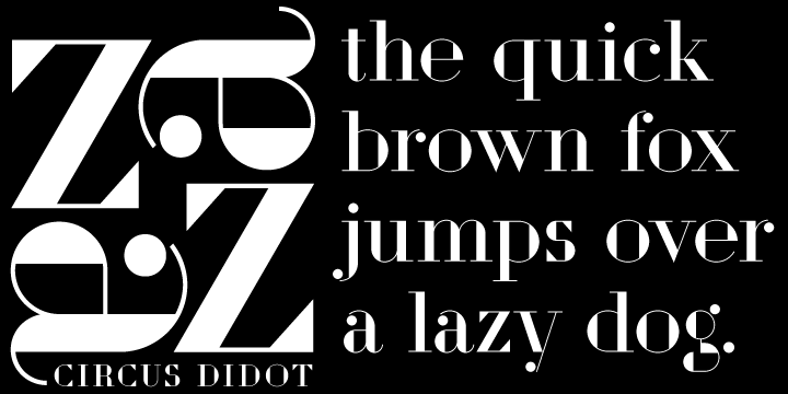
Circus Didot.
links:
A typeface I made for ParaType type foundry. Analyzing the shapes of characters author placed basic geometric figures — triangles, rectangles, circles… above the contours of letters.
Resulting constructions staying recognizable letters at the same time bore a resemblance to pictures of Russian avant-garde artists from 20th century. This discovery has brought an idea to design a typeface where the tendency of a modern serif type to rationalism and geometry is realized in maximum possible extent. The prototypes for the project were taken from the works of Didot, lettering experiments of Russian constructivists and art deco artworks.
The technique of juggling with shapes and overall grotesque approach to the design explains the selection of the name for the font.
links: