Neon lights and advertising typography in eastern Slovakia till 1989
Samuel Čarnoký / Radoslav Sinčák
–
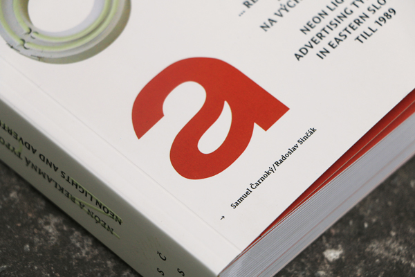
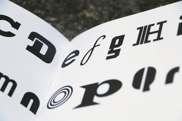
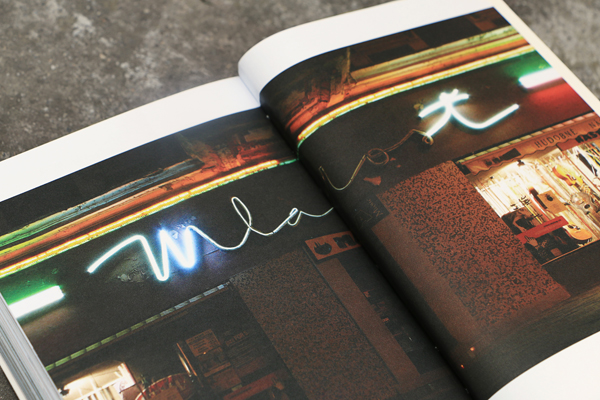
The interests of authors of this book were combined by personal relationship to typefaces and public spaces from the perspective of an architect and graphic designer. It is the aesthetic and visual quality of urban typography, which is often discussed because architecture and public space we live in today are without respect and affection devalued by the enormous amount of visual smog and cheap advertising. Our attention was thus with a sense of nostalgia and retro inhale drawn to disappearing, but still visible spirit of the past time. The content of the publication is therefore concerned with advertising typography period roughly from the 60s to the end of the 80s of the last century (during the cold war period) in towns of eastern Slovakia. The concept of the publication is divided into two parts. The first one is a documentary research and the second part is filled with our subjective conclusions. 26 towns symbolically correspond to the 26 letters of the alphabet. The publication is not only a visual record, but also a typographic primer you can browse as well as read. The special surprise is the phosphor print on the book cover shining in the dark.
NEONa on Facebook
Samuel Čarnoký / Radoslav Sinčák
–
The interests of authors of this book were combined by personal relationship to typefaces and public spaces from the perspective of an architect and graphic designer. It is the aesthetic and visual quality of urban typography, which is often discussed because architecture and public space we live in today are without respect and affection devalued by the enormous amount of visual smog and cheap advertising. Our attention was thus with a sense of nostalgia and retro inhale drawn to disappearing, but still visible spirit of the past time. The content of the publication is therefore concerned with advertising typography period roughly from the 60s to the end of the 80s of the last century (during the cold war period) in towns of eastern Slovakia. The concept of the publication is divided into two parts. The first one is a documentary research and the second part is filled with our subjective conclusions. 26 towns symbolically correspond to the 26 letters of the alphabet. The publication is not only a visual record, but also a typographic primer you can browse as well as read. The special surprise is the phosphor print on the book cover shining in the dark.
NEONa on Facebook