Looking Back to Look Ahead
The first commercial for the Japanese luxury automobile INFINITI showed a flock of geese, rather than a car. It was a daring launch for a challenger brand, and an origin story BMD considered rich with possibility. Looking to reconnect with aspects of their Japanese heritage, they asked BMD to align INFINITI with its cultural roots and sensorial experience.
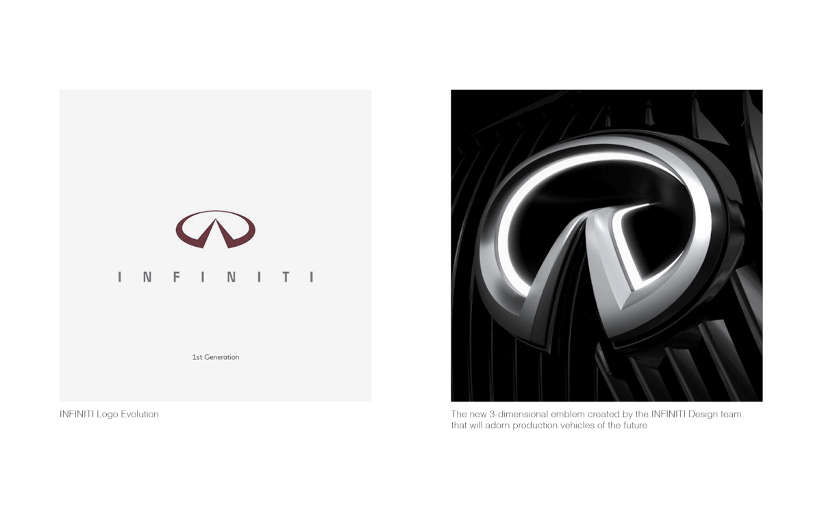
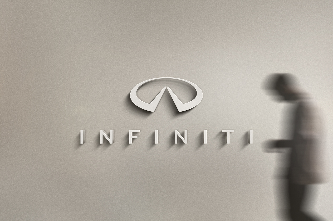
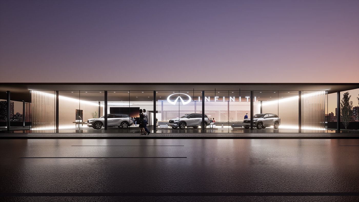
We focused our initial work on clarifying and strengthening the logo’s signals. A new 3-dimensional emblem on future vehicles meant the 2D logo needed a refresh. The original 1989 logo’s elegant geometry inspired our work, which emphasizes the brand’s signature reference: the road ahead. The refinements are subtle but important. The mark now telegraphs the forward-facing nature of the brand and a sense of possibility.
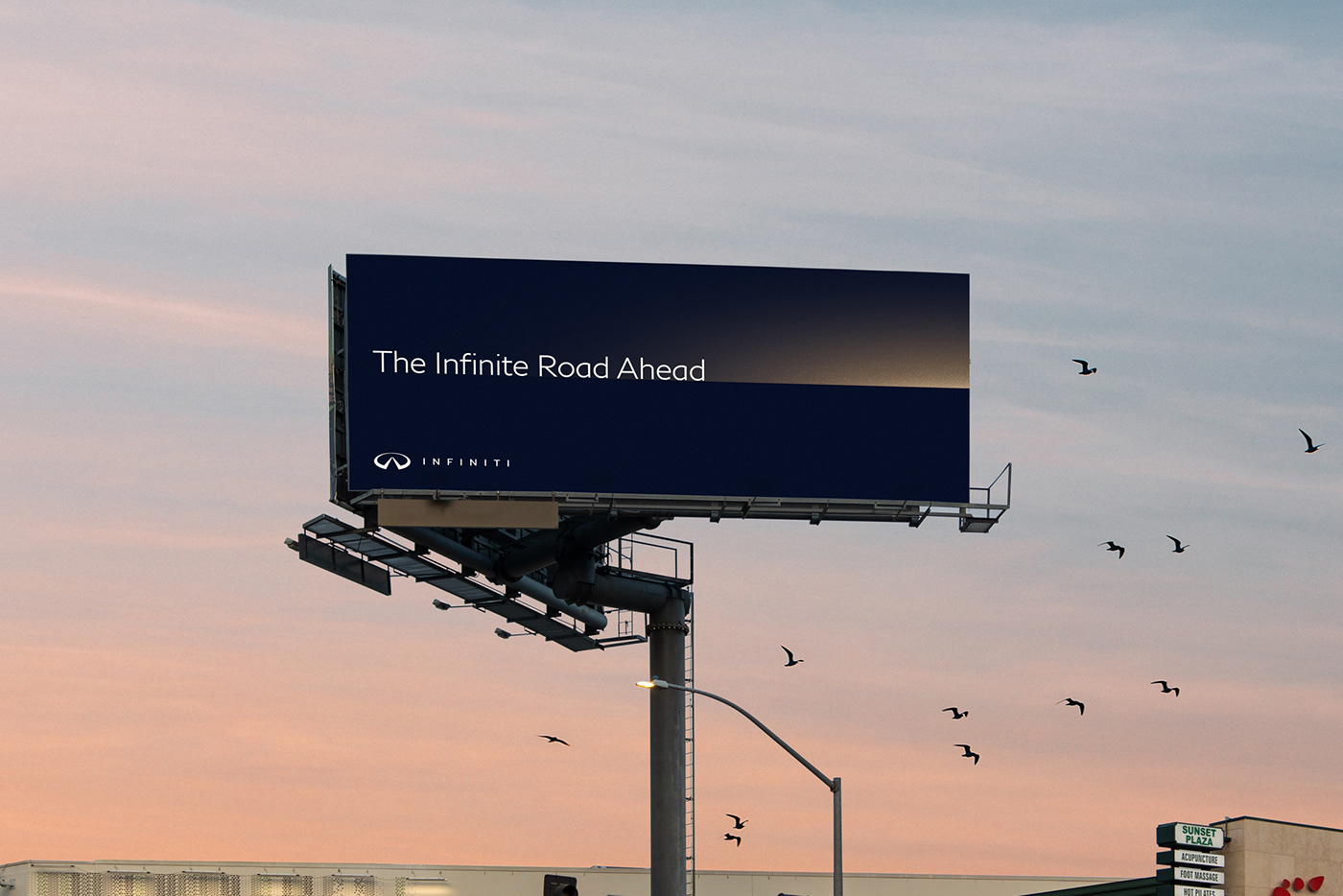
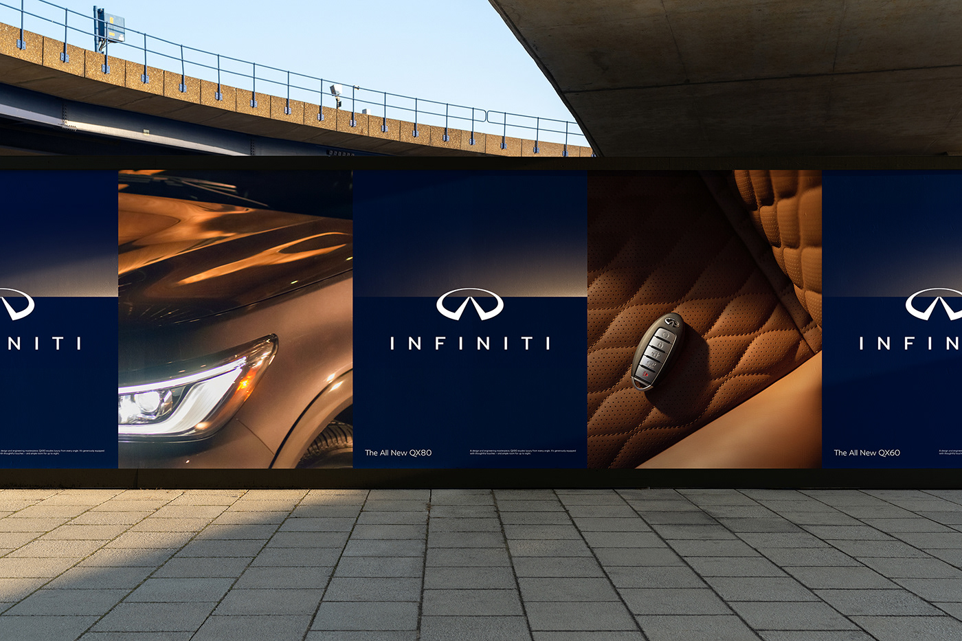
A tactile and evocative horizon graphic, in still and in motion, helps extend the story within the logo and adds an experiential feel across communications. Traditional Japanese color, taking its cues from the natural world, set the stage for the palette. A deep blue alongside warm gold evokes a midnight summer sky. The bespoke INFINITI font provides a distinctive communications typeface while giving the refreshed wordmark a clarity and sense of continuity. The brand’s icons borrow their shapes and sharp lines from the distinctive notch of the logo.