a! Burger
啊! 汉堡
—
Inherited and enhanced the brand connotation, transformed it into a stronger and more vivid symbol, and created a connection between people and the brand.
Adoodoo, as the top one traditional special-occasion gift pastry brand in China. every year it delivers millions of pastries to different families across the country, to celebrate their happy moments. At the company’s tenth anniversary, Adoodoo was eager to renovate the brand, aimed to deliver a newer and younger image that is more effective in communication.
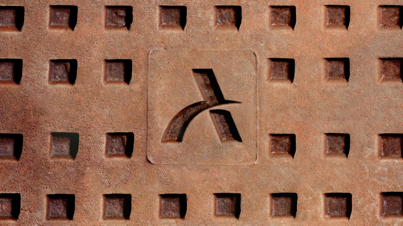
Nowadays, communication has been visualized and symbolized. Being a major online retailer, to have a better and more effective way to communicate with customers is crucial. The previous branding was only built with Chinese characters, which limited the communication significantly. Based on the brand’s Chinese name, the fonts was redesigned and a unique symbol got extracted from the previous logo. The extracted symbol perfectly corresponded to the meaning of the brand name, which means “more hearts” or “endless love”. The integration of the symbol and the characters brought another level of significance to this logo, with this, design built a young and vibrant image with a consistent language. It reinforced the potential of the new symbol by integrating it into different brand medias, such as products, packagings and interior. With this simple and innovated visual style, design finally achieved the purpose of this rebranding, which is to create a youthful and modern brand image that also excelled in communication.
—
啊!汉堡是一家年轻的创新汉堡品牌。品牌的定位以契合当下年轻人健康,自由,随性的生活态度,来配以美味且无负担的汉堡产品。啊!代表美味的惊喜,同时代表的是随性的自然表达,设计将字母a与汉堡的主体进行了趣味的融合,合二为一,构成了品牌独一无二的视觉符号。在应用延展上,设计通过对符号的变形,叠加,组合等手法,塑造了具有明确识别,且强化了品牌轻松,自然无负担的核心定位。
—


