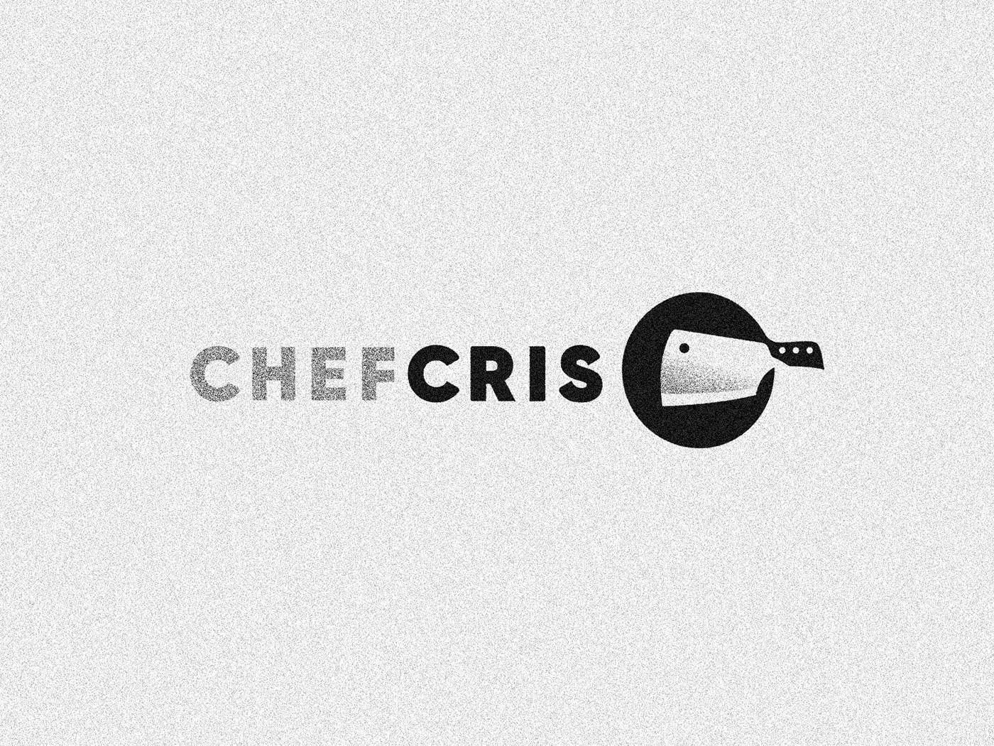
Chef Cris ✦ Logotype
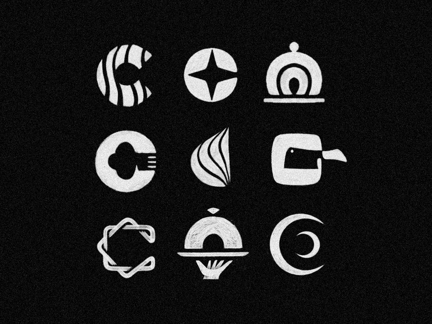
This is some sketching exploration on a C-Chef logo I'm working on, the idea to achieve something sober and bold, professional looking and still a unique take, since this field is full of the same ways of representing cooking/gastronomy... It's so hard to get away from the classic tools and stuff, I hope I could get close at least!


After some refinements you've seen in the previous shots, here is the final version for Chef Cris logotype. It ended up in this more, let's say, sharp version of the symbol using a modified version of Gilroy Heavy type.
Have a look on some of the logo variations!


PS: I think this grainy effect is appropriate to his business, but since I know some of you like to see it in a more clean vision, here the no effect version as well as bonus :)