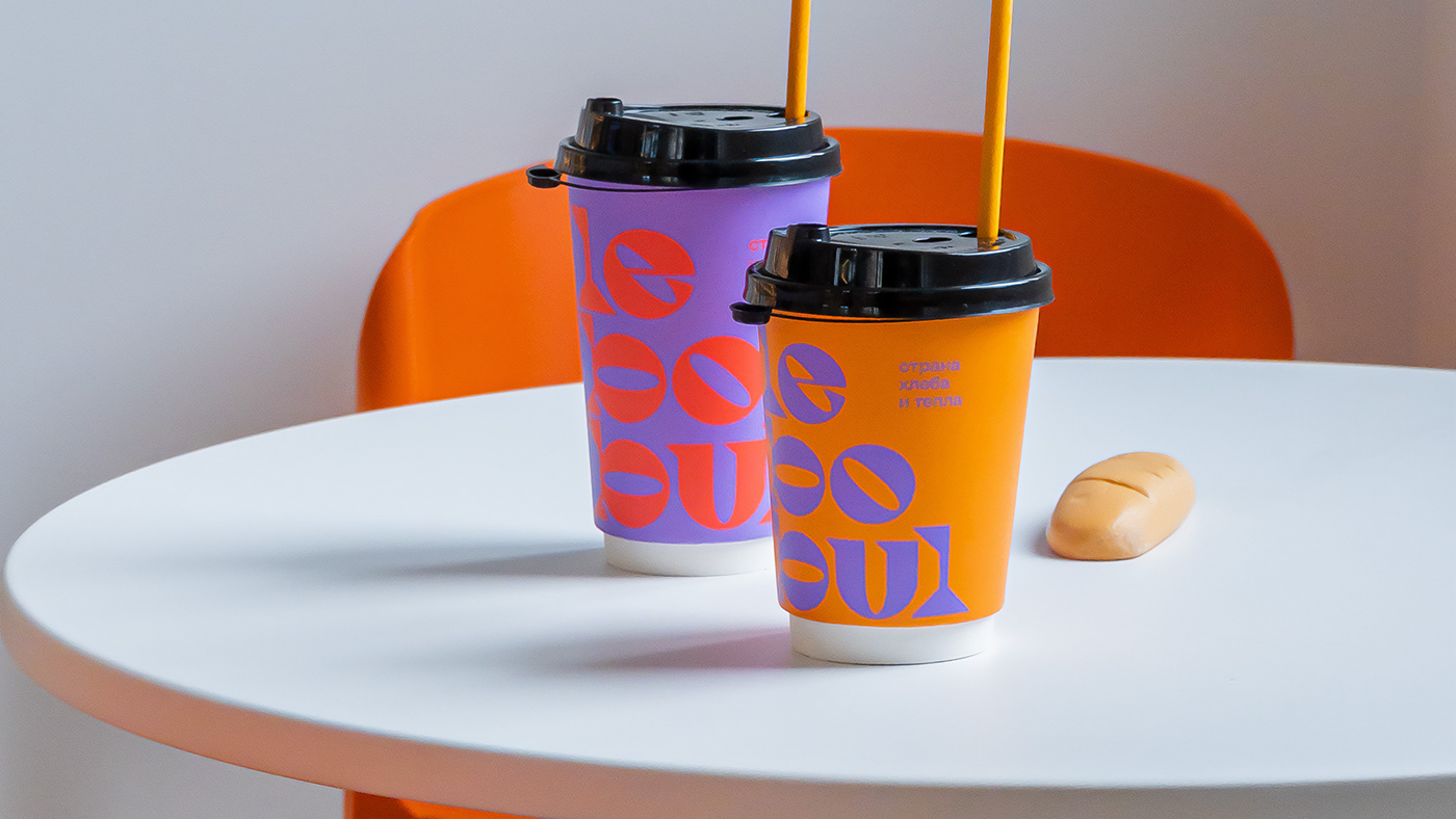
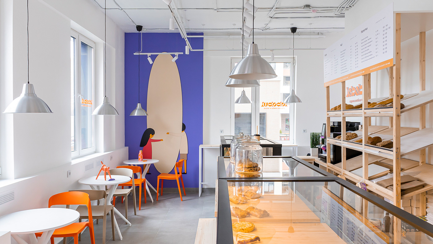
Lebobul is a new bakery in one of the residential complexes in Moscow, designed for modern families with children who value time and attitude towards people around them. We decided to create the concept of the country - a tiny but very warm corner in the city, where you are always welcome and you could relax and unwind.



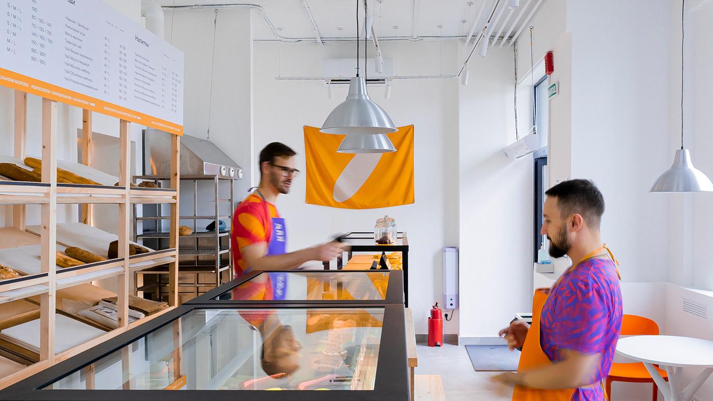


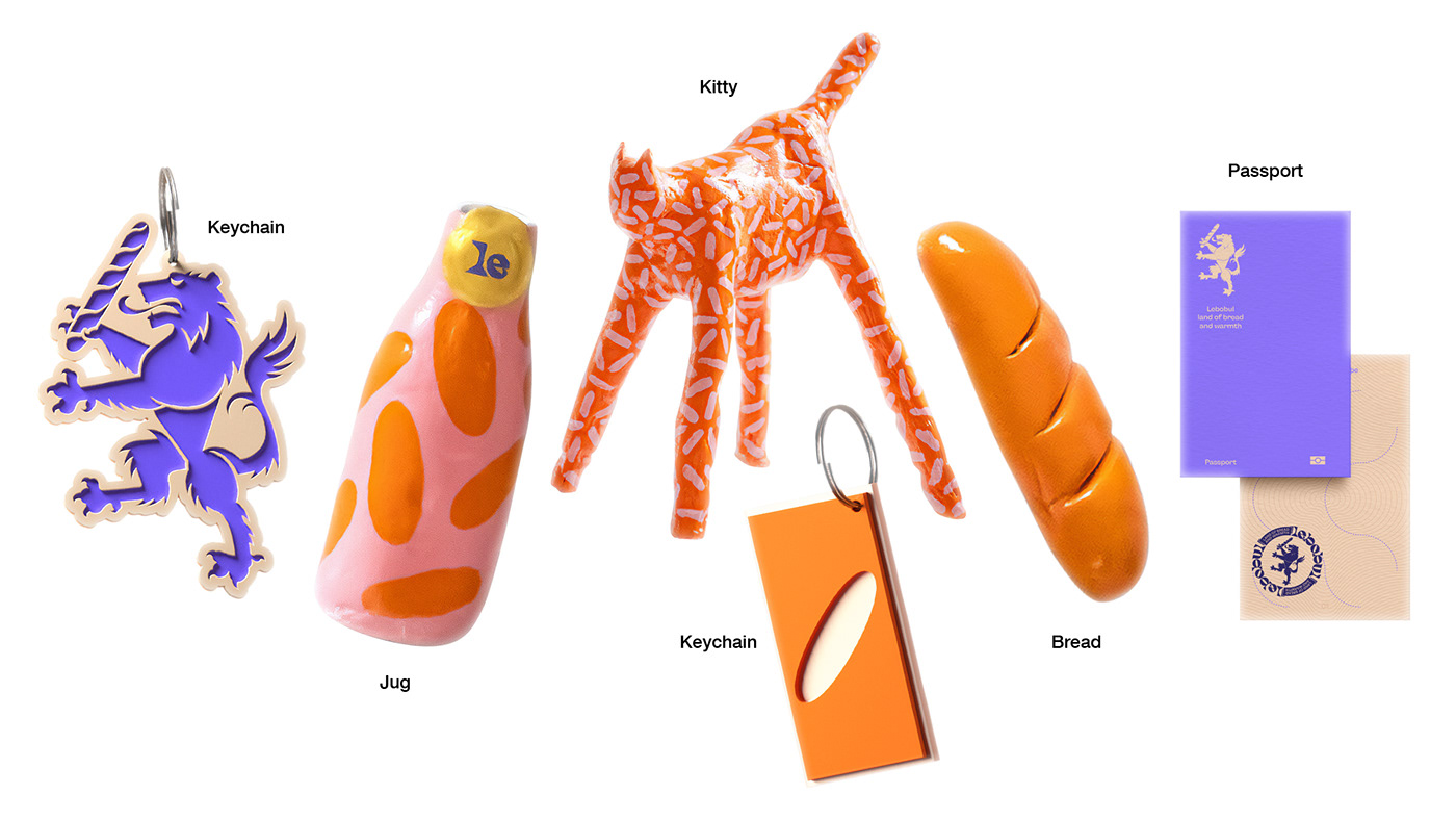
The name was coined from the Russian word Hlebobulochnye (eng. bakery), and the typography of the logo is built from the symbols of the flag and bread. For the pattern, it was decided to take the same symbol, but on two scales - large (bread) and small (grains). Flags, its own heraldry, pottery sights, souvenirs and passports made this image unique.
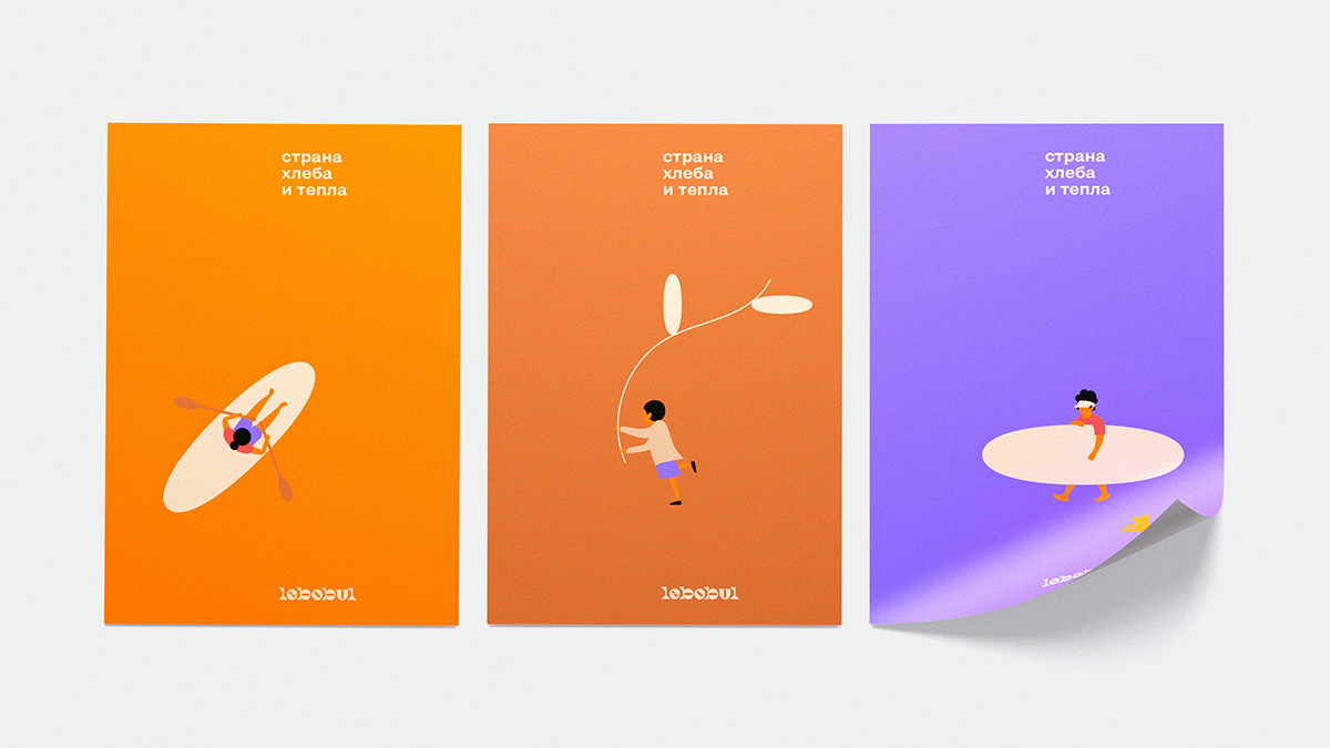
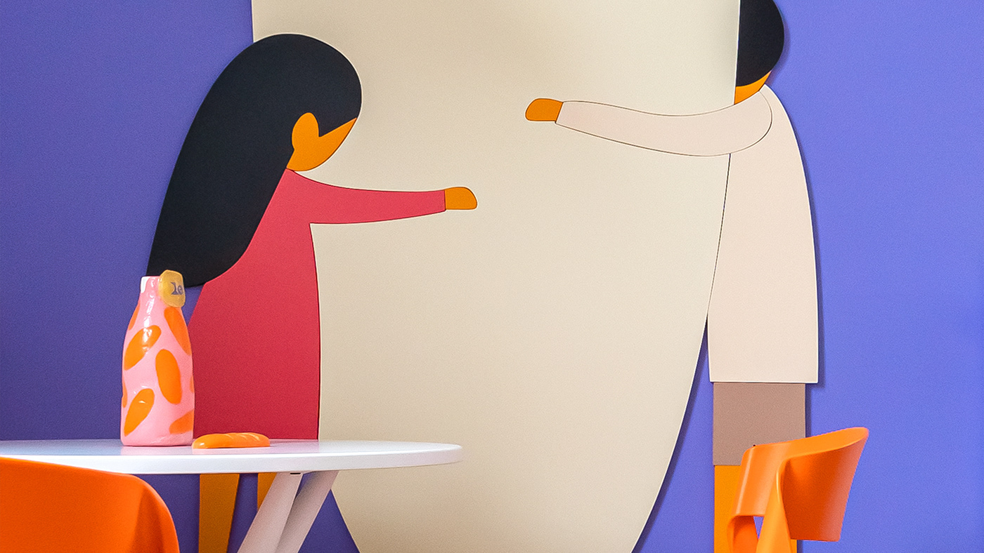
Most of the identity is corporate illustrations that are found on all surfaces of the bakery, whether it is packaging or an interior element. Really kind, sometimes funny, and somewhere with a touch of nostalgia, images resonate in the hearts of visitors to the bakery.


Neizvestnie team
Designer: Nikita Ivanov
Illustrator: Andrey Uhanev
Copywriter: Sasha Fedoseeva
Interior designer: Alina Romanova
Designer: Nikita Ivanov
Illustrator: Andrey Uhanev
Copywriter: Sasha Fedoseeva
Interior designer: Alina Romanova
2020. Neizvestnie
#graphicdesign #branding


