


Polnische Spezialitäten
Year: 2013
Services: Viusal identity, Print Design, Webdesign, Web development
Services: Viusal identity, Print Design, Webdesign, Web development
Case study
Polnish Spezialitäten is a Polish company selling and promoting the highest quality Polish products on the German market, both on the their stores and Christmas fairs. The offer includes top quality cheeses, cold meats and sweets - mostly candy and chocolate.
Our task was to design the full range of branding materials for company including not only the logo, or basic materials stationary but also stands and cars.
Thanks to the trust bestowed on us we had a lot of creative freedom. This allowed us to create a professional brand style clearly referring to the Polish origin of the products and traditions.


Logo design
The final logo is a sign of a very unusual, well-memorable design. It represents two crossed knifes – for cheese and meat with addition of traditional banner and universal note – from Poland.
We also took care of its simplicity so the client will not have any problems in reproduction in many types of materials nor size.


Tents, banners and car fleet
One of the primary places the customer promotion are all kinds of Christmas and the occasional fair. We designed a series of banners and two types of tents which are used on such an occasion sale.
Since the all the offered products are delivered to stores several times a week we have also proposed branding for vans or food trucks. The brand is becoming more and more recognized by customers what in a longer term will translate into sales.


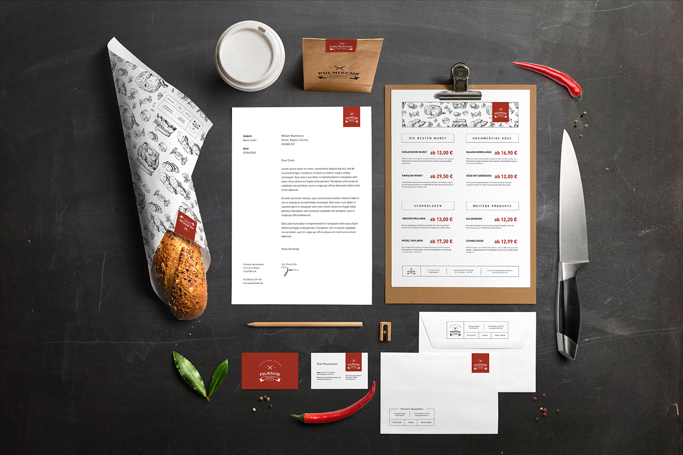
Bag, wrapping paper and stationary
Method of packaging products, paper bags, loyalty card or business card is a permanent promotion tool used by the customer. We took care of their consistent and interesting look.
The basis of the image became the logo placed on the red ribbon in corners of the materials, and the whole background filled with delicate stylized hand-drawn images of the offered products.


Worker shirt and posters
When designing a corporate shirt we wanted to introduce an element of curiosity. So we used only a portion of the sign with the crossed knives for cheese and meat, and the words - from Poland. The wole professional and clean look is complemented by two characteristic red labels with full logo.
On the occasion of the sale of periodic fairs have become very useful information and advertising posters. These posters were designed in a way to resemble something traditional, professional and unique.


Webdesign
The last element is of course a website. Its design and style refers to the column layout of newspapers. The design is very clean and professional as whole brand. As for the user interface is intuitive and simple enough even for not young person.