The rebrand introduces a modern and personal feel to this established flower delivery service, aiming to attract a wider market. The unique and simple logo symbolises a graceful and elegant brand which networks globally, delivering beautiful floral gifts.


A striking and simple delivery van design, promotes the brand further. When moving, the bird on the side
seems as though it is flying.
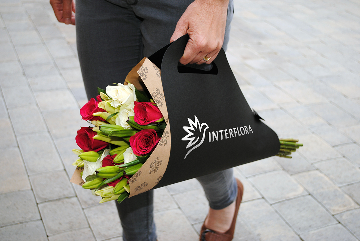
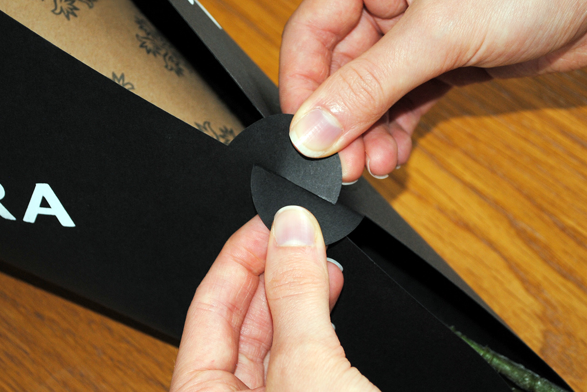
The packaging stands out from usually boxed or bagged designs. It's design is simple, dynamic and unique. The carrier
is strong, flat-pack, 100% recyclable and can hold varied size bouquets, for practicality and easy use. An interlocking mechanism holds the carrier together and keeps the flowers in place. The brown paper flower wrapping gives the identity
an organic and personal feel. The printed pattern created of the logo, provides a decorative and floral element to the design.


The Interflora service is used by florists worldwide as part of their own floristry business. It is important that this is clear for customers and passers-by. Florists would wear pin badges on their unifrom to represent Interflora, and would also
place a sticker on their window, The simple bird mark is memorable, and easy to recognise.


Appropriate flower care is very important to maintain the beauty of your flowers. A care and handling guide is delivered
with each bouquet for the customer's use. Individual cards enable the florist to select those needed specifically for the customer's bouquet, providing a more personal and caring experience.


A brand guideline is very important to maintain the effectiveness of the brand identity and message. Each florist who uses the Interflora service would receive a brand guideline book, to ensure they understand how to use the brand correctly.


