


"Design a consumer technology/gadget magazine for adults that is all inclusive (gender neutral, age neutral, income neutral etc)."
My outcomes:
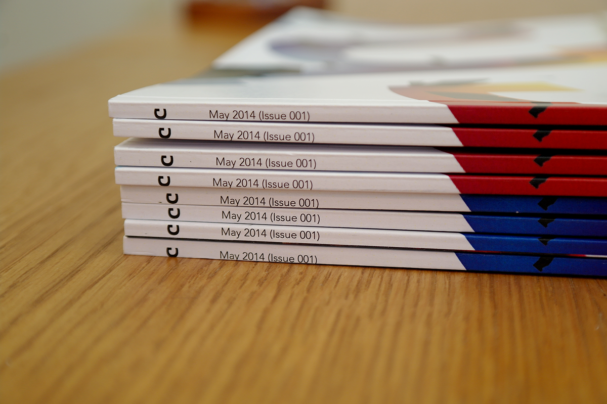
- A 'Full' version magazine.
- A 'Teaser' version magazine.
What made me choose this subject?
One of the main issues I have with current technology magazines is that they all seem to follow a trend, this is the first page of Google Images (15/04/14) when you search for "gadget magazine":
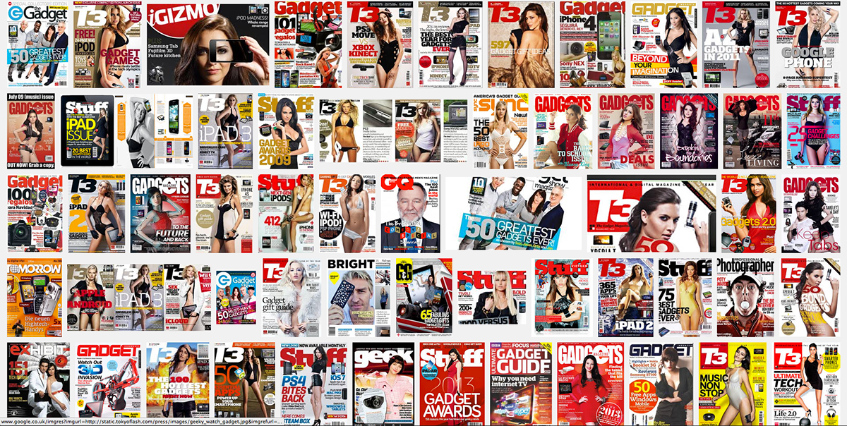
See the trend yet?
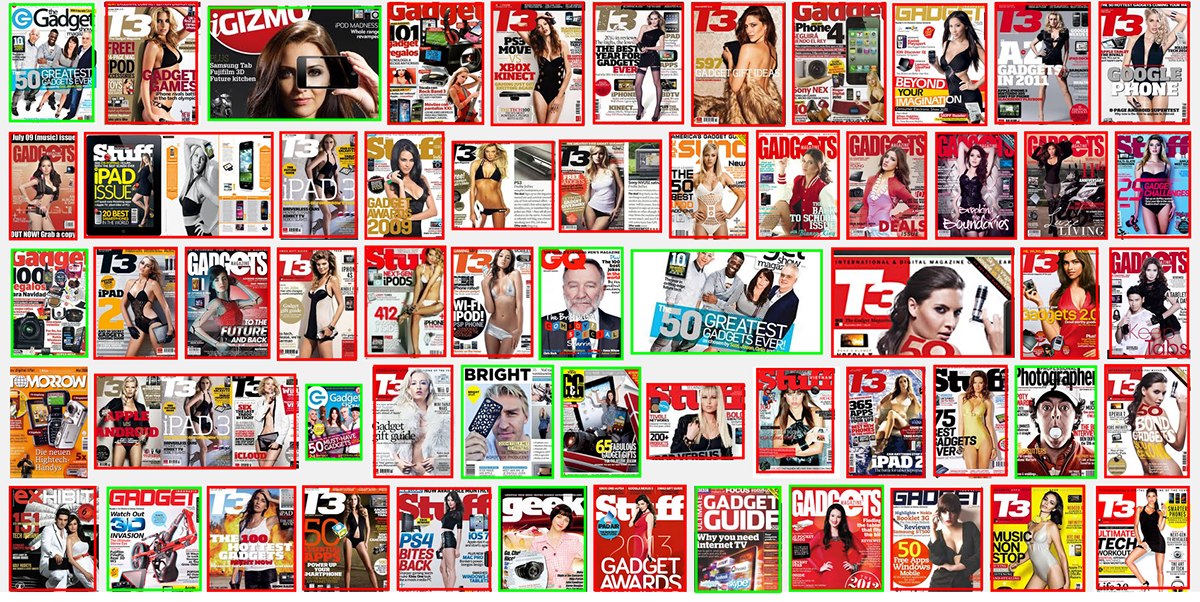
In red are all of the images that show gadget magazine covers using the sexualisation of women. In green are covers using non-sexualised imagery.
There are only 12/58 covers not using the sexualisation of women in these results alone, that's only 20%.
I find it strange that the market of technology magazine is so saturated with imagery of scantily clad women possibly holding a gadget. Surely in this day and age we can accept that straight men don't need this imagery in a technology magazine to buy it and that there are people who aren't straight men who are interested in technology too?
Other issues I looked at:
1) Advertising is disruptive to the reading experience:
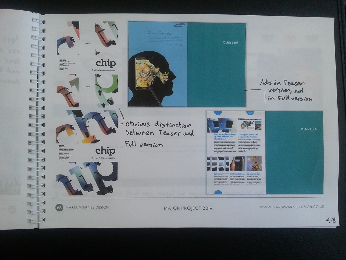
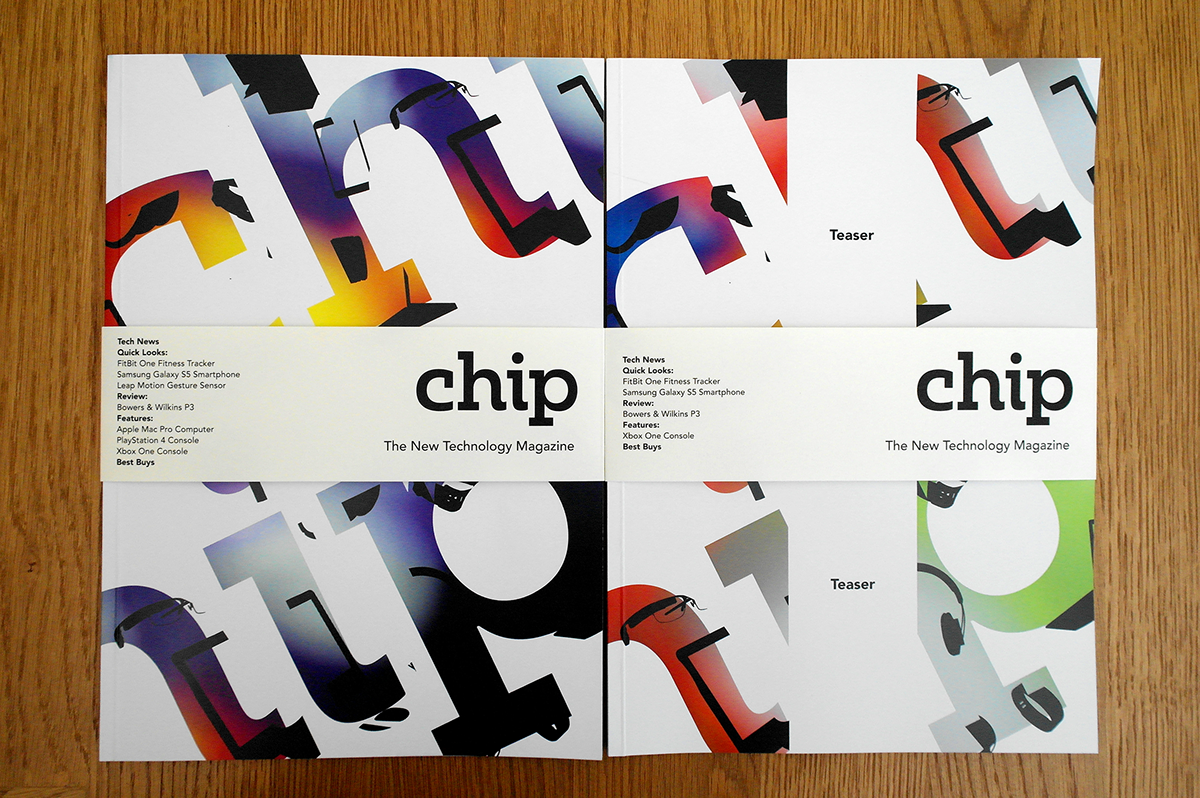
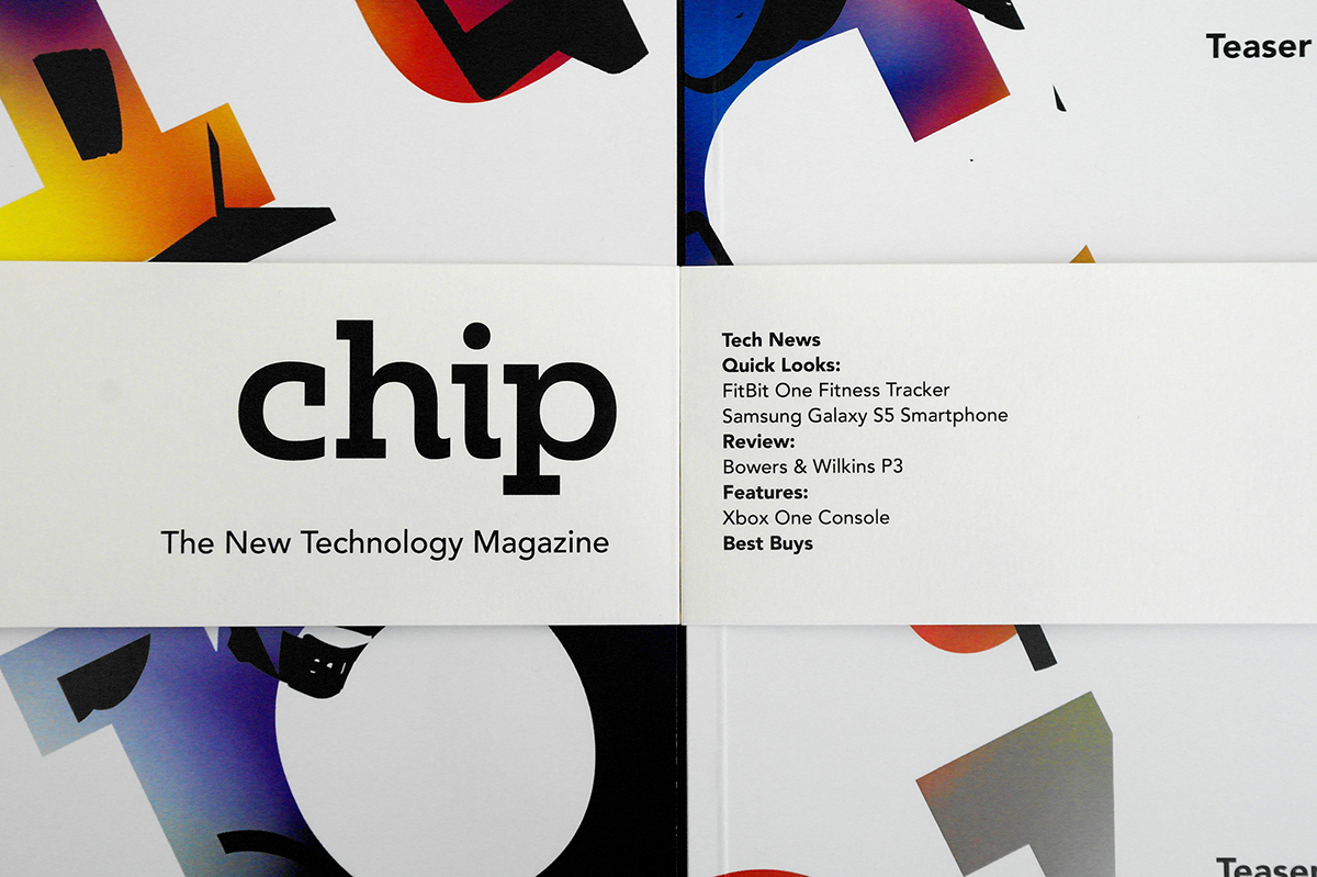
I created a system where there are two versions of the magazine; a 'Full', higher priced version with no advertising and a 'Teaser', lower priced version with advertising.
2) Top 5/10 lists tend to focused on higher incomes:
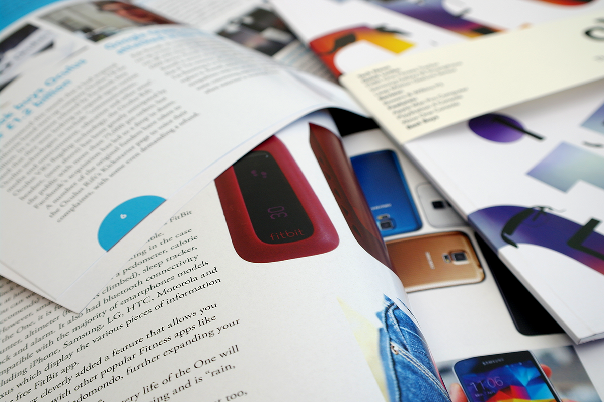
I split my 'Best Buys' section into three; 'Budget', 'Midrange' and 'Luxury' so accomodate a wider range of incomes.
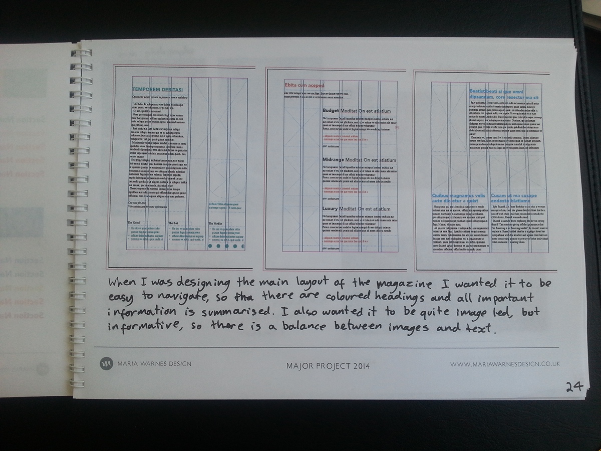
3) Pages tend to be cluttered and hard to navigate:
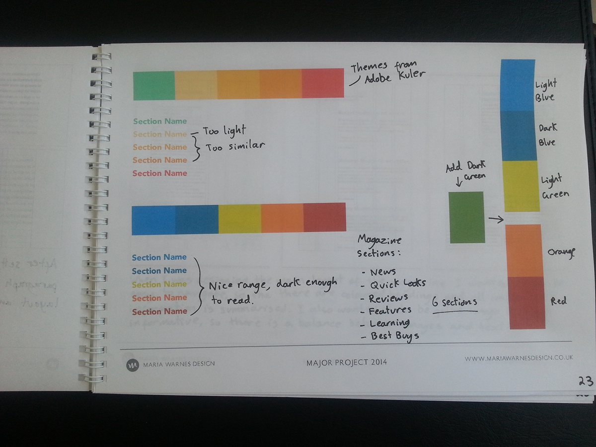
I reduced the page layout down to the essentials and created easy to follow text arrangements. I also added a colour scheme for each section, making it easier to know which section you are in and making it easier to navigate between them.
4) Text tend to contain lots of jargon:
I reduced the use of jargon to as little as possible and when it was necessary I explained it.
5) Reviews tend to only reflect one opinion:
I designed a system where there would be 3 reviews of different ages, countries and backgrounds.
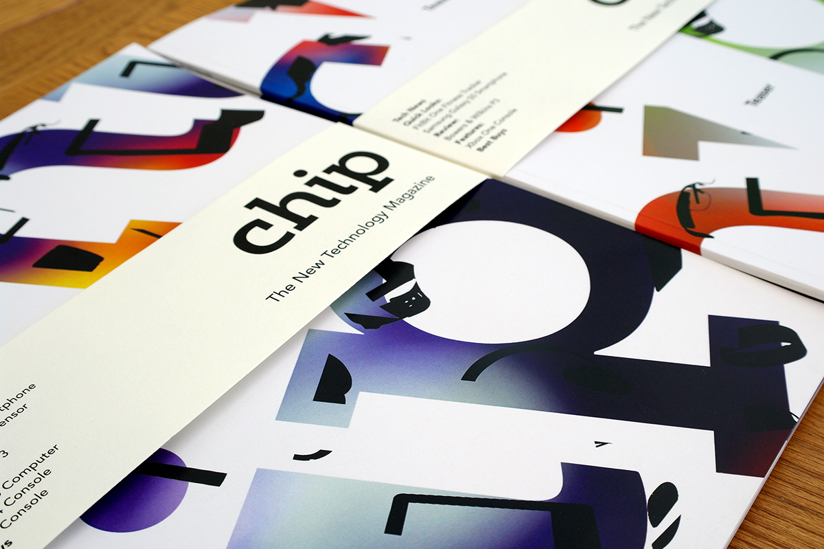
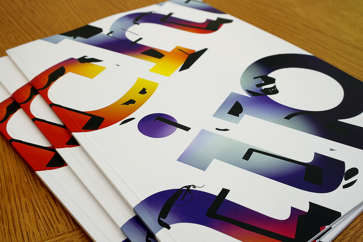
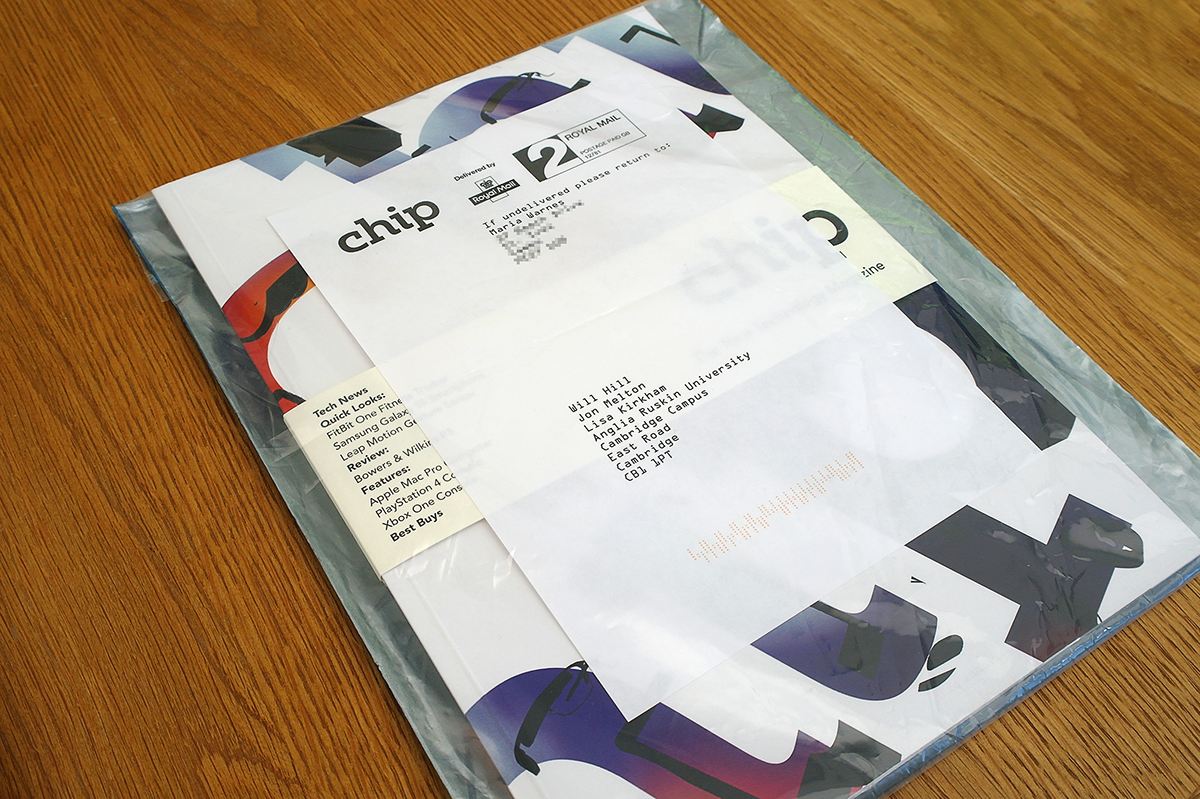
6) Cover artwork is distrupted with titles and straplines:
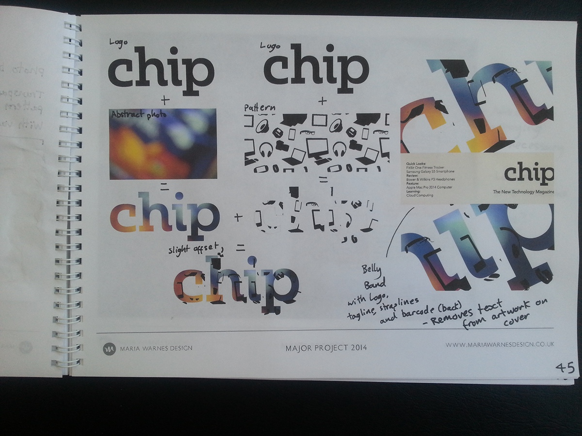
I removed all additional text from the cover and added it to a belly band, making it removable.


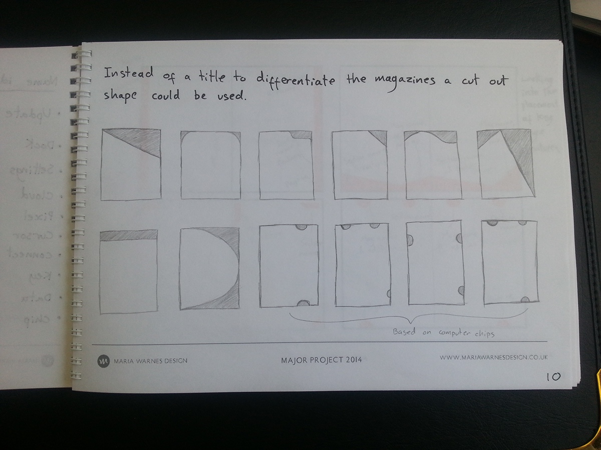
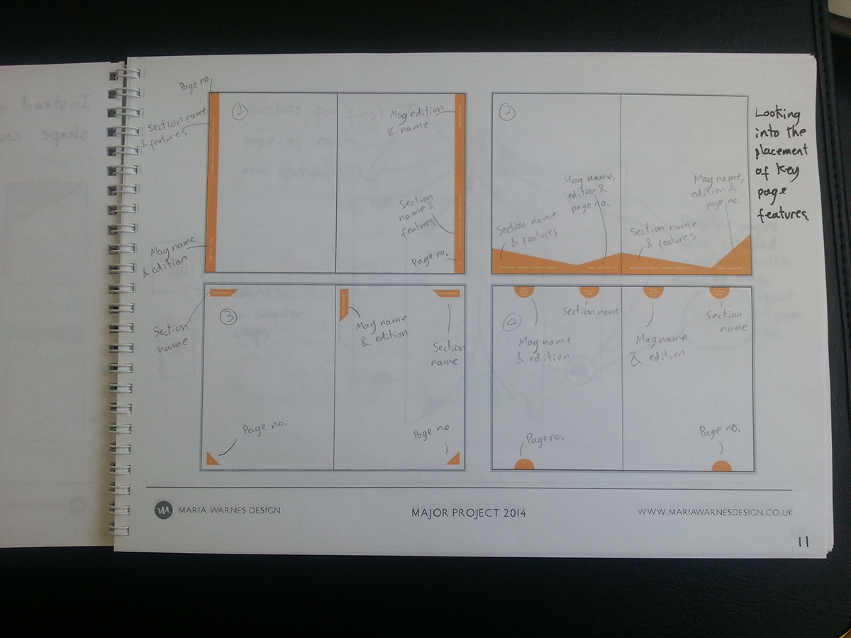
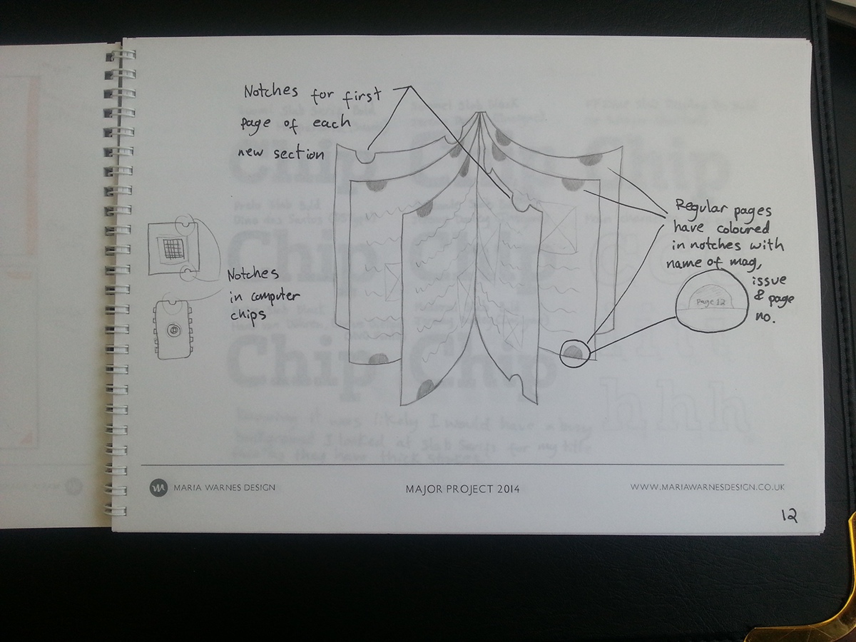
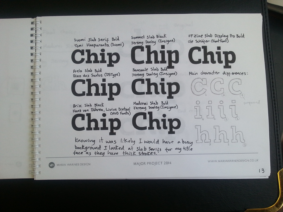
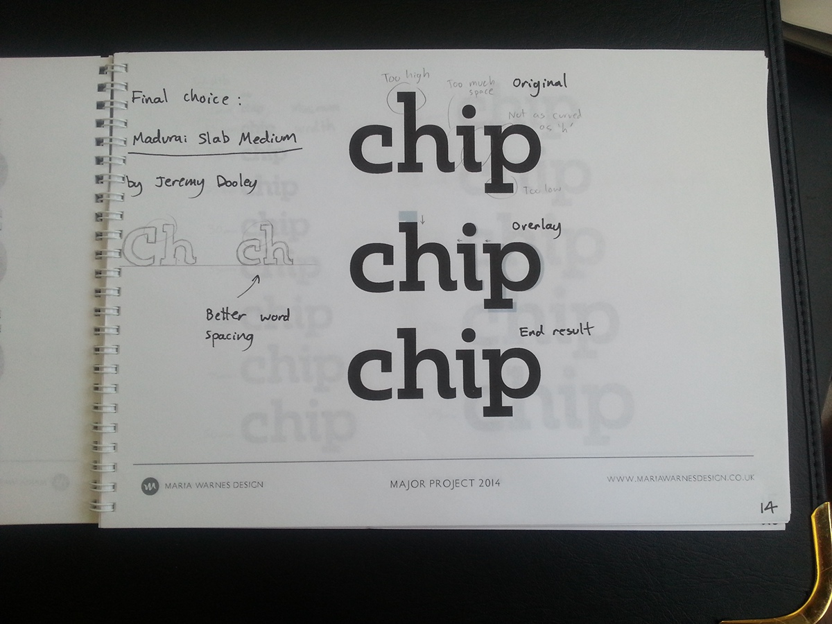
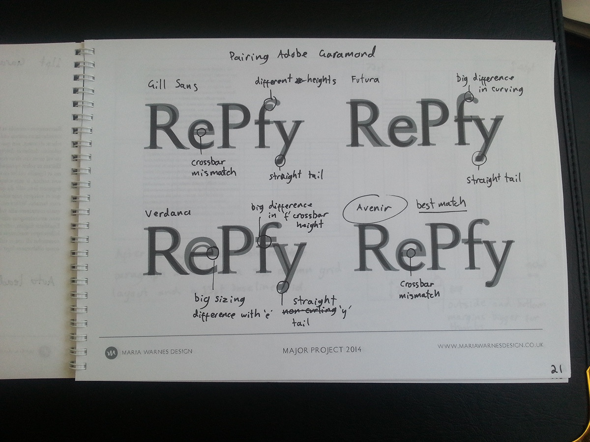
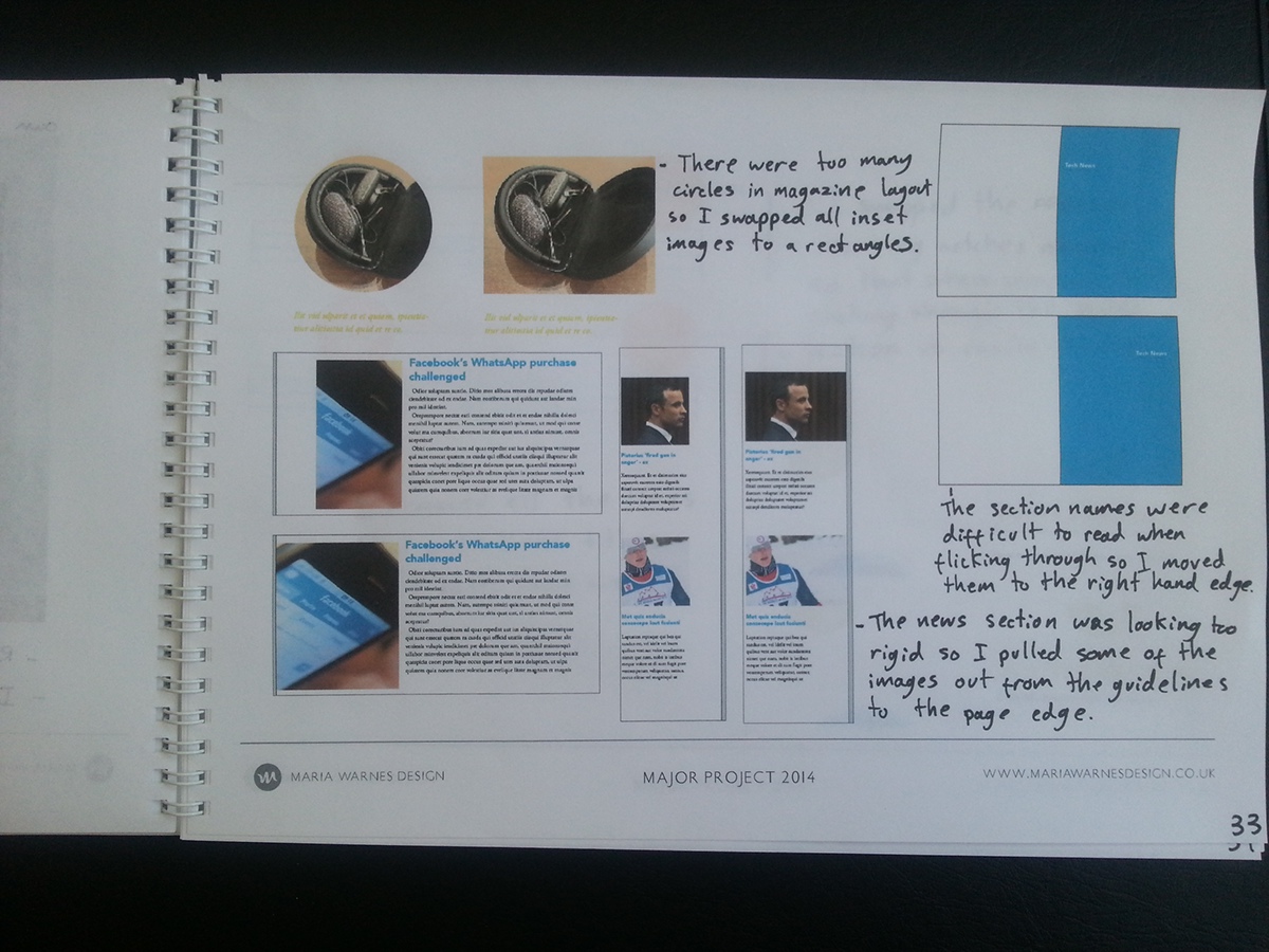
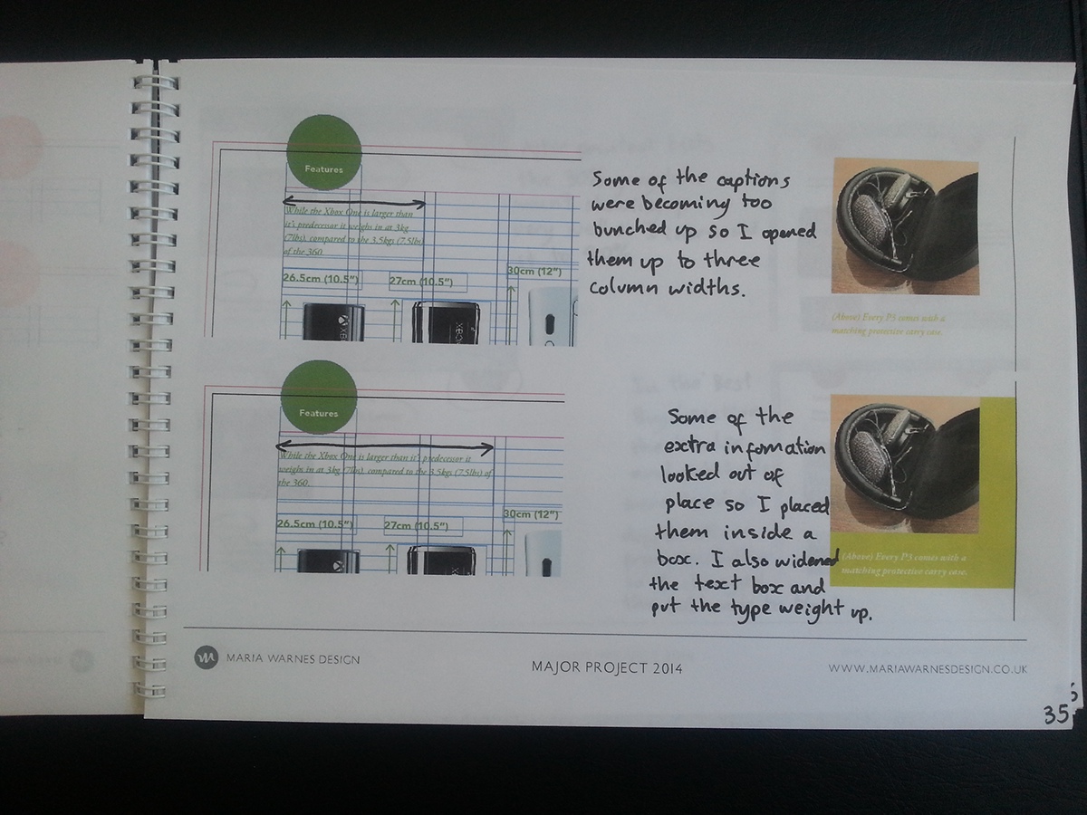
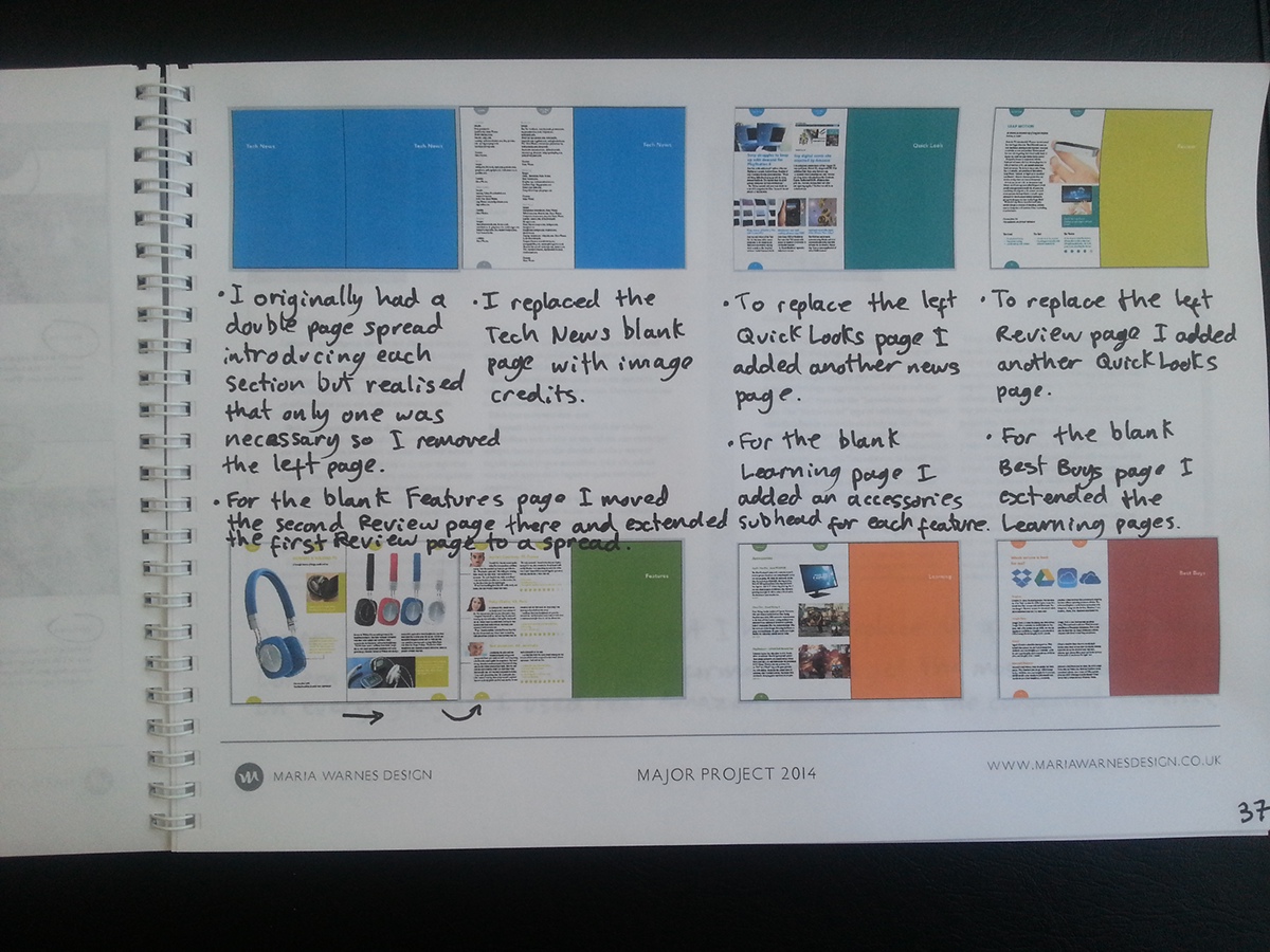
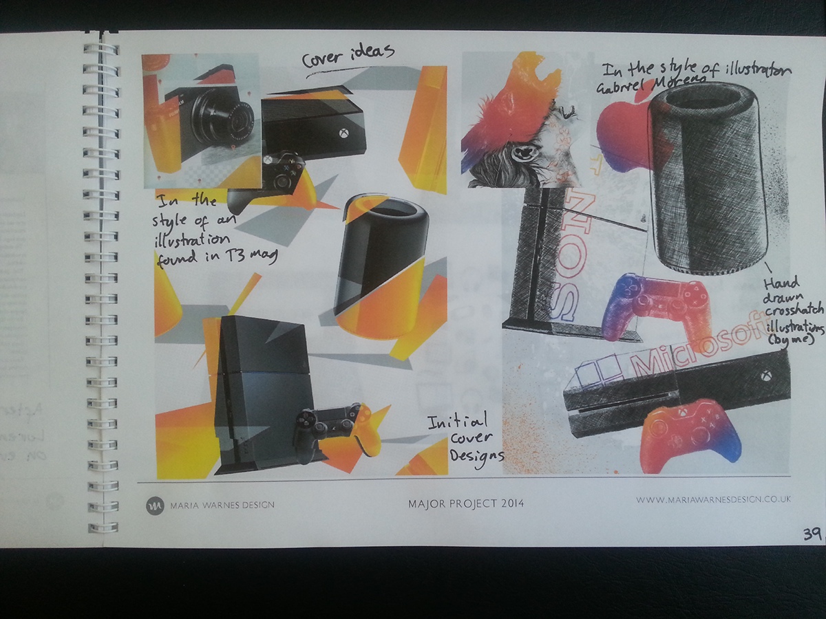
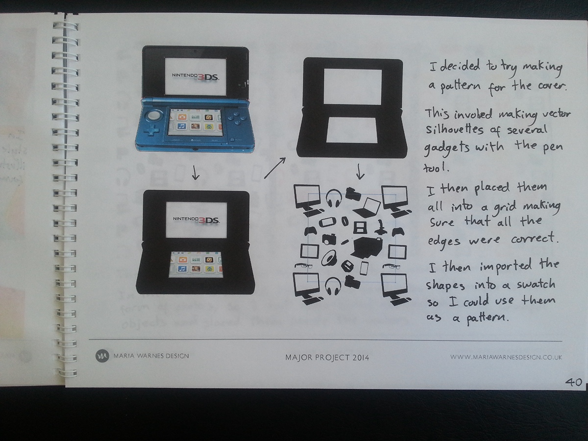
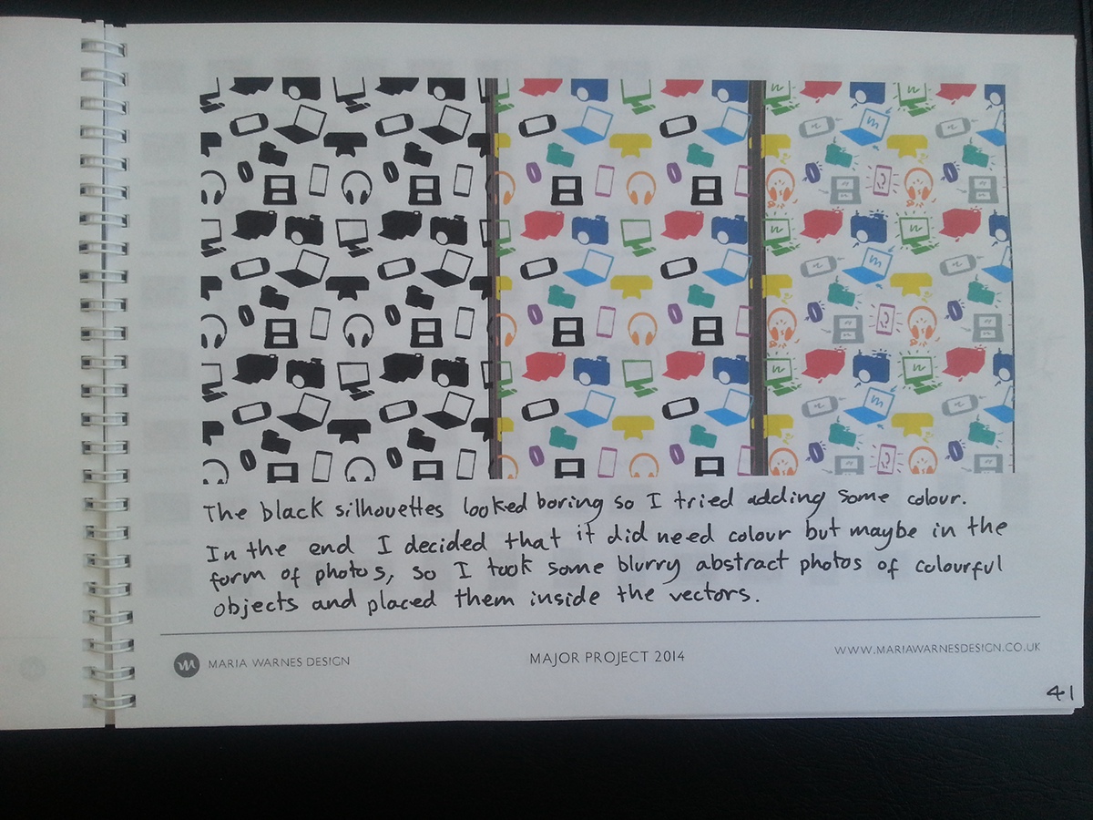
Some images from my workbook: