

Art, Branding & Logotype Update 2014
By Jeroen van Eerden
By Jeroen van Eerden
The last few years I've really set ground as a freelance designer. With Behance, I was able to present my works to a broad audience, land some awesome projects and to find new inspiration everyday. In this project I would like to show you a couple new works and some exclusive insights about my working process.
Like every project, I begin by sketching concepts. This process is very freeform. The drawings are quick and loose, and all over the page. I try to generate a lot of ideas quickly, exploring as many different visual concepts as I can. I will play with shapes and forms in multiple configurations until something interesting takes place, or another idea emerges. It’s a difficult process to describe, but I think this may be my favorite part of logo development.
After I create sketches, I evaluate the ideas and then start exploring more refined versions that integrate type and color. Sometimes I even do some more sketching and experimenting in Illustrator. It's a fun way for creating new shapes and work on the latest techniques i've been experimenting with.
In this project I also included a couple logo grids to explain how I've work with the symmetrie for each design. All these logo designs are done in Adobe Illustrator CC and Adobe Photoshop CC. I also like to work with my Wacom Bamboo as well. Especially for the more detailed graphics.

_
Fysiosportief logo development
Logo design for a Dutch sport physiotherapy company called 'fysiosportief'. They asked me to come up with a new refreshing logo for their business. The client preferred the type to be custom and as friendly looking, easy to read and a little twist integrated in it that shows some sort of speed and dynamic. The icon is a combination with the letter 'F' together with a running human. Also tried to perfect the balance by adding that same shadow effect from the typo. See the included grids for the construction development.


_
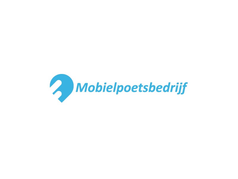
Mobielpoetsbedrijf branding development
Logo designs for Mobielpoetsbedrijf. A Dutch company specialized in mobile vehicle cleaning. Here are some of my proposed concepts. In lots of these concepts I've tried to combine elements like; water, liqued, road, speed, mobiel, pinpoint, connection, cleaning.
The first one in this list was chosen to be the final one.


_
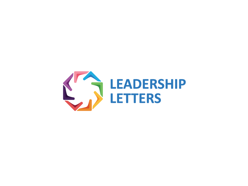
Leadership Letters branding development
Logo development for a American company called SGA. Leadership Letters is a platform who helping followers of Jesus to become better leaders in the church, business, education and government.
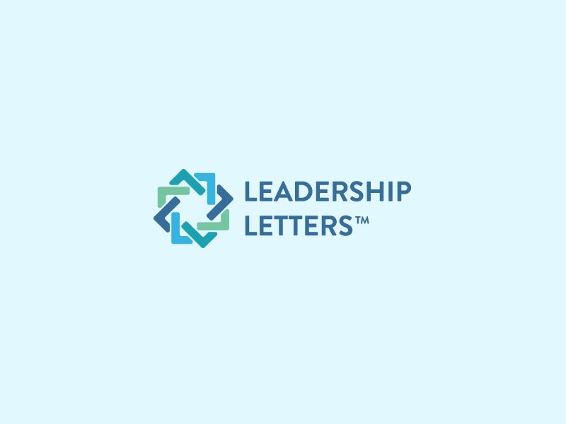
Leadership Letters branding development
Logo development for a American company called SGA. Leadership Letters is a platform who helping followers of Jesus to become better leaders in the church, business, education and government.

_
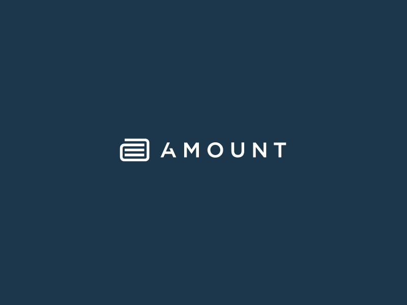
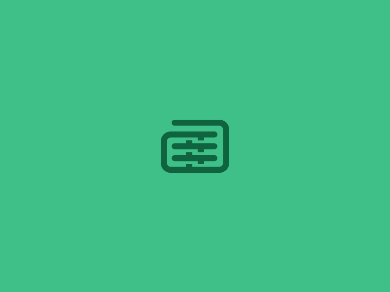
Amount logo development
Logo development for Amount. A online loan company, aiming to be the Apple of the Loan industries.
In these concept I've used elements like: lowercase 'a', wallet, coins, share, connect, trade, loan. The chosen logo is shown on top.
Amount logo development
Logo development for Amount. A online loan company, aiming to be the Apple of the Loan industries.
In these concept I've used elements like: lowercase 'a', wallet, coins, share, connect, trade, loan. The chosen logo is shown on top.

_
Add My Window logo development
Logo development for Add My Window. Add My Window is a young innovative advertising platform that brings together home owners and advertising agencies. They are up to 40% cheaper then traditional outdoor media while still providing top locations throughout the large cities in the Netherlands. By using existing windows spaces they can create a cheaper and effective distribution channel for advertisements. Add My Window cuts costs and lets home owners make an extra buck with their (unused) window space.
In this concept I've include a pinpoint mark, together with a window frame around it. In the '+' mark in the pinpoint the topframe also gets connected with it. Typography is slightly customized. Wanted to get a good attention point in the middle of it to show some sort of connection.

_
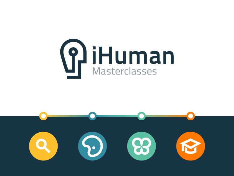
iHuman branding development


_
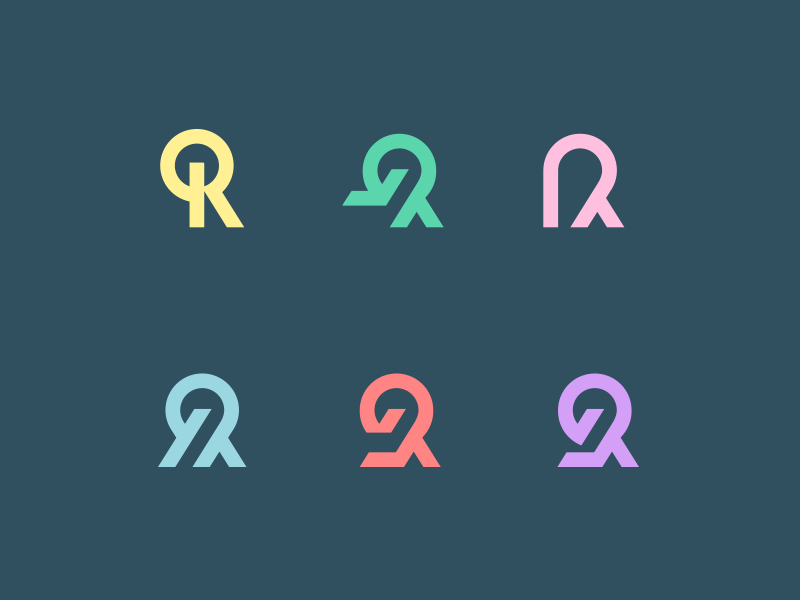
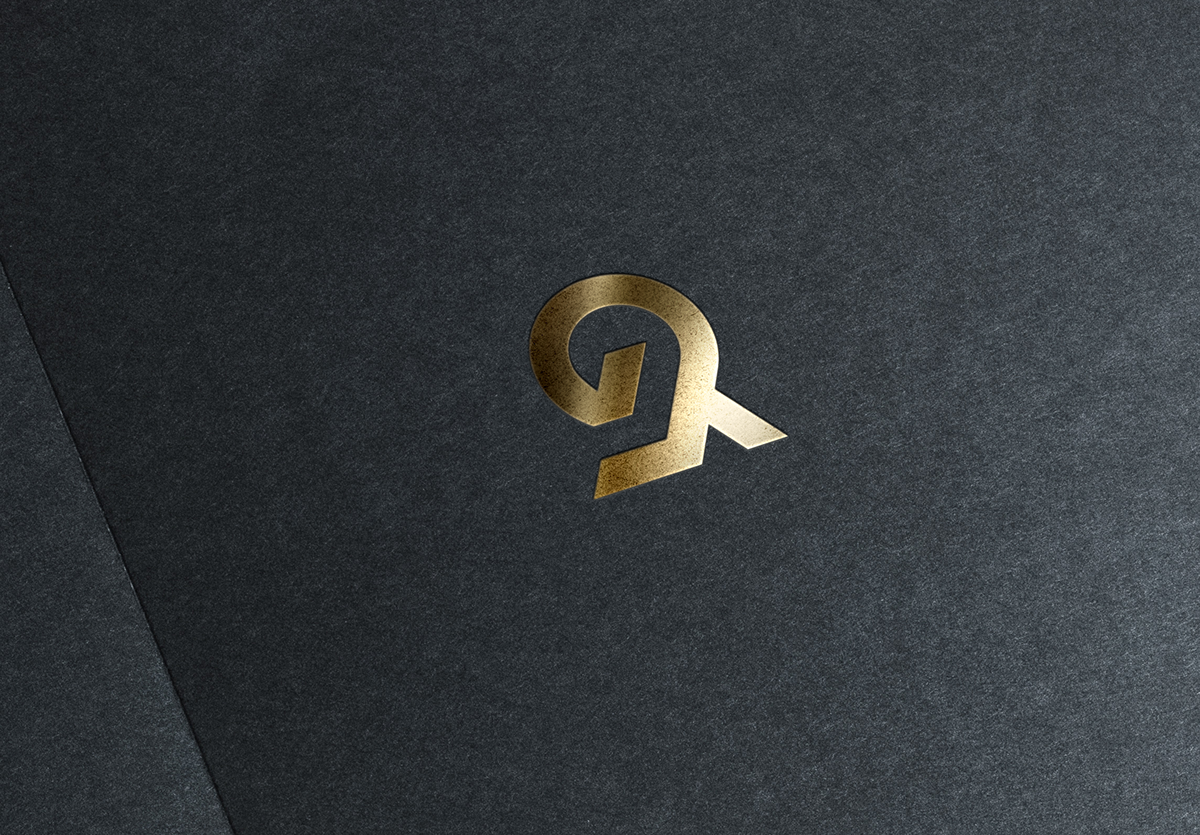
R monogram development
Logo development for a huge known succesful American investor (can't say the name yet). His name starts with a 'R' and I wanted to create a unique looking 'R' monogram. Thi first version in this list was chosen to be the final one. The grid shows the perfectoin of the allignment and symmetries. The second shot was a letter exploration, picked the red version to make it more balanced and clean.
Logo development for a huge known succesful American investor (can't say the name yet). His name starts with a 'R' and I wanted to create a unique looking 'R' monogram. Thi first version in this list was chosen to be the final one. The grid shows the perfectoin of the allignment and symmetries. The second shot was a letter exploration, picked the red version to make it more balanced and clean.

_
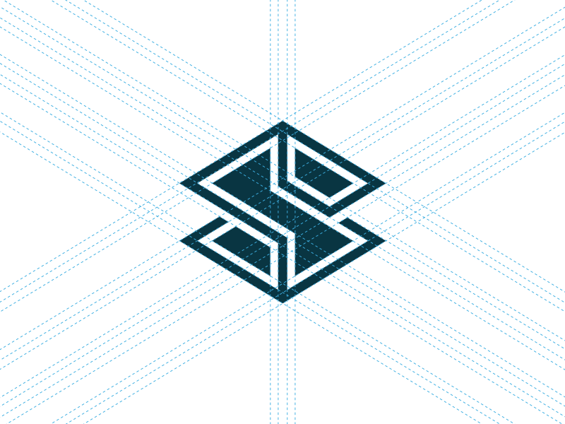
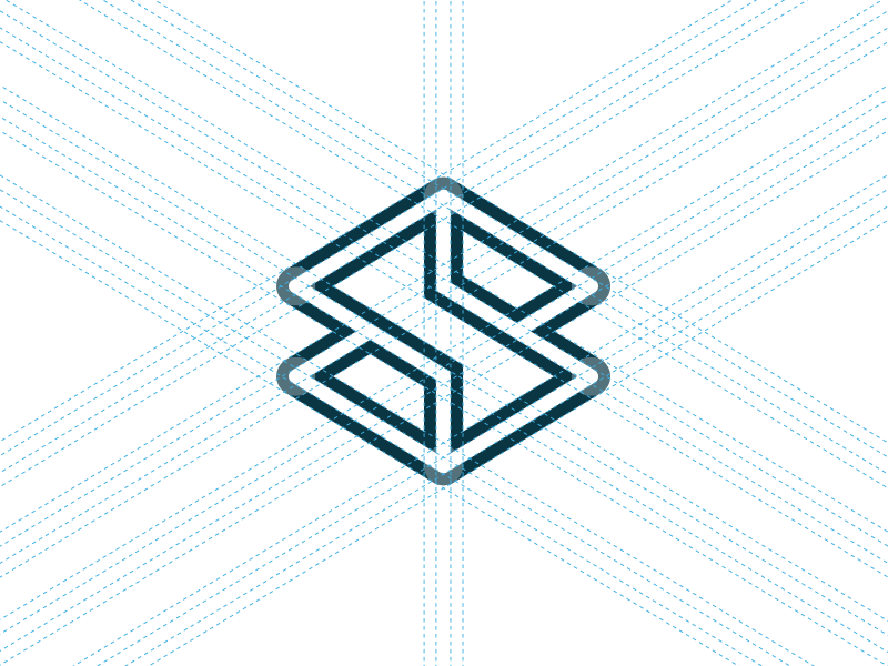
S mark development
S mark exploration. Aiming to be abstract and precise. These grids are always very useful in creating those perfect symmetric lines in graphic constructions. These marks are currently unused conceps and available for purchase. Contact me if you're interested.
_
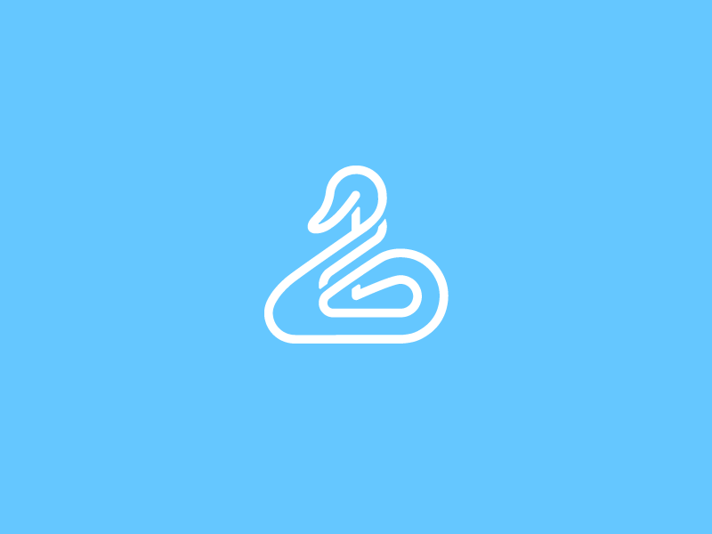
Swan line work
I've tried to create a complex and abstract looking swan just for fun. This icon/mark is currently unused and available for purchase. Contact me if you're interested.
_
Global mark development
Tried to get as many cultures in one shape, regarding the coloring choices.

_
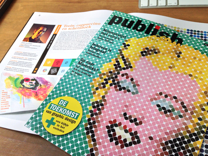
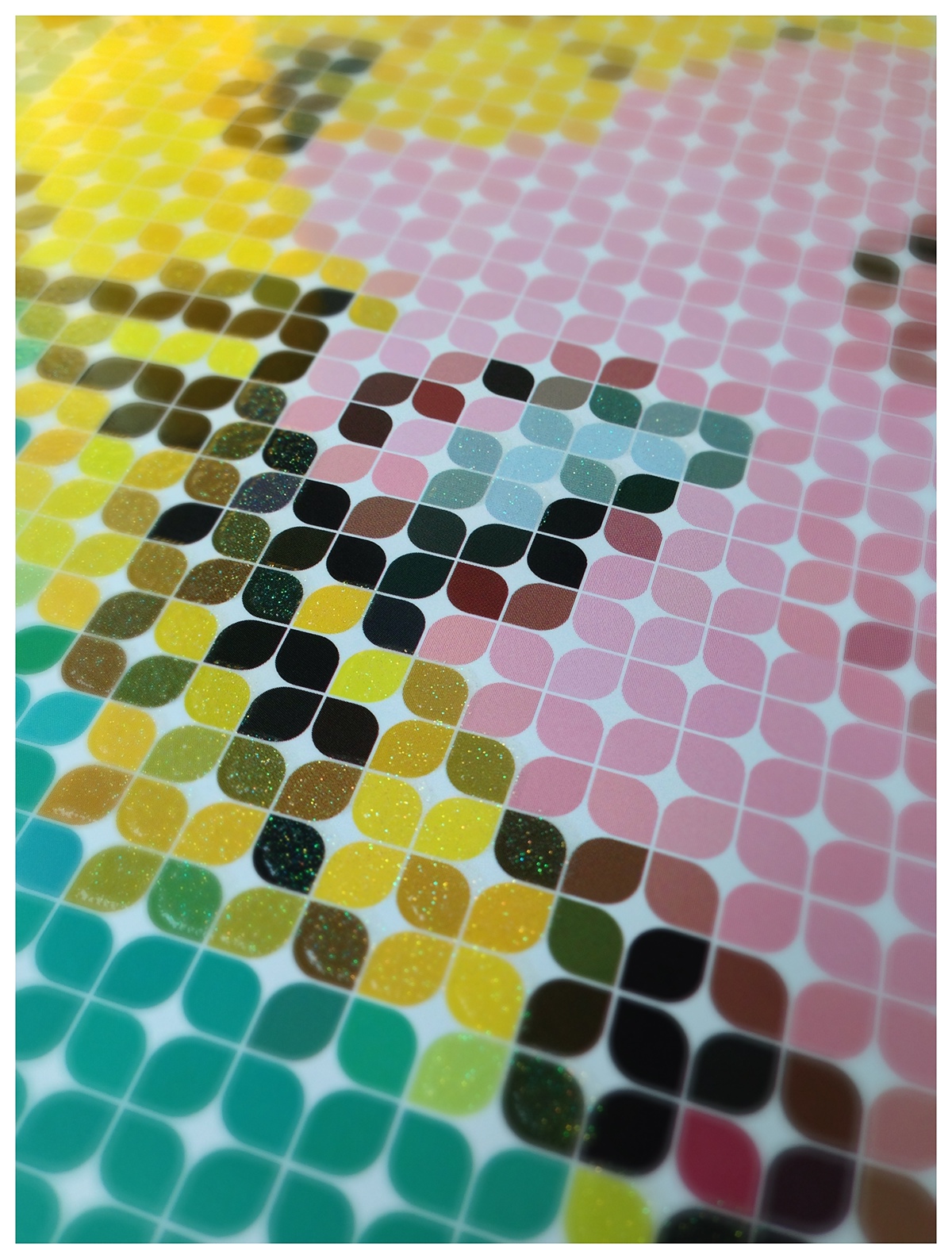
Publish Magazine cover + interview
For a Dutch creative magazine I've been asked to create a suitable cover illustration. Because the subject was 'retro' I've worked on a Andy Warhol painting to get it in a more modern kinda way. In this magazine there is also a inteview given about my development as a freelance designer.
They used a unique kinda ink on the cover to let some colors stand out in a funky way. In the second shot there's a close-up from the cover that shows the glitter on the cover work.
__
THANKS FOR TAKING THE TIME
TO CHECK OUT MY WORKS!
WOULD LOVE TO HEAR YOUR THOUGHTS AND/OR SOME
LOVE BY CLICKING THE APPRECIATE BUTTON!
WANT TO WORK WITH ME? I WOULD LOVE TO HEAR YOUR STORY!


