This is my first project with a local tea brand in Bangladesh.
Explanation:
The Aroma Vine tea package design has been expertly crafted to convey the brand's dedication to providing the freshest and most flavorful tea blends. The rich, dark green color scheme evokes the lush and vibrant hues of nature, instantly creating a sense of refreshment and vitality in the mind of the customer. This carefully chosen color palette also serves to highlight the brand's commitment to using only the finest, all-natural ingredients in their tea blends.
The Aroma Vine tea package design has been expertly crafted to convey the brand's dedication to providing the freshest and most flavorful tea blends. The rich, dark green color scheme evokes the lush and vibrant hues of nature, instantly creating a sense of refreshment and vitality in the mind of the customer. This carefully chosen color palette also serves to highlight the brand's commitment to using only the finest, all-natural ingredients in their tea blends.
The reddish-brown color used in the design is a perfect match for the color of the tea itself, subtly indicating the rich and full-bodied flavor of the blend. As the tea leaves are released and steeped in hot water, their color and freshness gradually infuse the brew, creating a truly invigorating and rejuvenating experience for the customer.
The image of the tea leaves and tea cup is a powerful visual representation of the connection between nature and the home. It reminds the customer that every cup of Aroma Vine tea is a reflection of the natural beauty and bounty that surrounds us, and that they can enjoy this connection every day from the comfort of their own home.
(Slogan provided by the client.)
(Slogan provided by the client.)

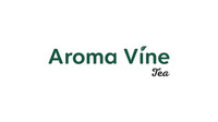
Explanation of the ''Aroma Vine Tea'' logo
The Aroma Vine logo has been thoughtfully designed to incorporate a tea leaf sap, which is an unmistakable symbol of the brand's commitment to producing the finest tea blends. This subtle yet powerful detail ensures that customers can identify Aroma Vine's products as tea-based at first glance, reinforcing the brand's reputation for authenticity and quality.
The Aroma Vine logo has been thoughtfully designed to incorporate a tea leaf sap, which is an unmistakable symbol of the brand's commitment to producing the finest tea blends. This subtle yet powerful detail ensures that customers can identify Aroma Vine's products as tea-based at first glance, reinforcing the brand's reputation for authenticity and quality.
The logo's rich, dark green color perfectly matches the color of tea leaves, effectively communicating the freshness and purity at the heart of Aroma Vine's products. The elegant and flowing lines of the design create a sense of refinement and sophistication, underscoring the premium quality of the brand's offerings.
The carefully chosen typography is clean and understated, providing a clear and concise expression of the brand's values and mission. The overall effect is one of timeless elegance and understated beauty, perfectly capturing the essence of Aroma Vine's commitment to crafting exceptional tea blends.
In short, the Aroma Vine logo is a masterful representation of a brand that genuinely understands the art of tea. With its expertly crafted tea leaf sap, rich color scheme, and refined design, it stands as a testament to the brand's dedication to authenticity, quality, and excellence.