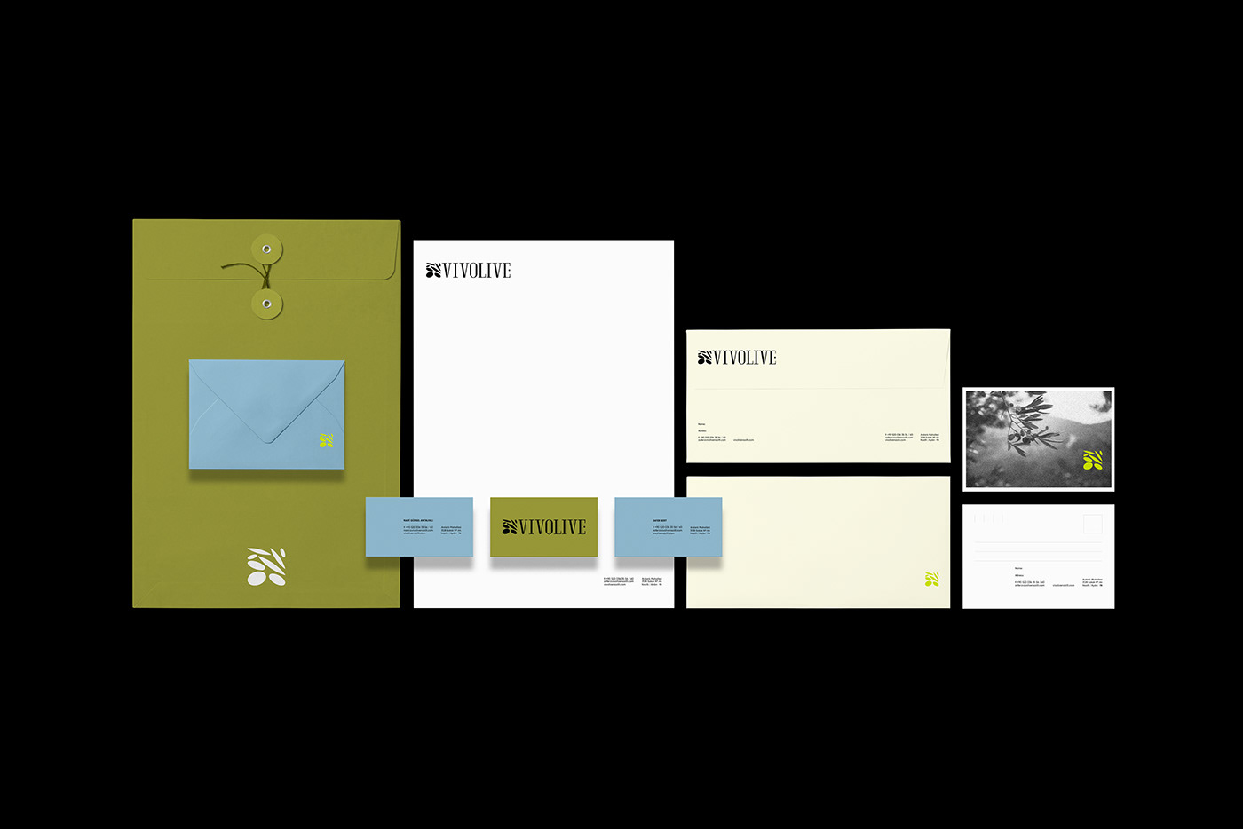
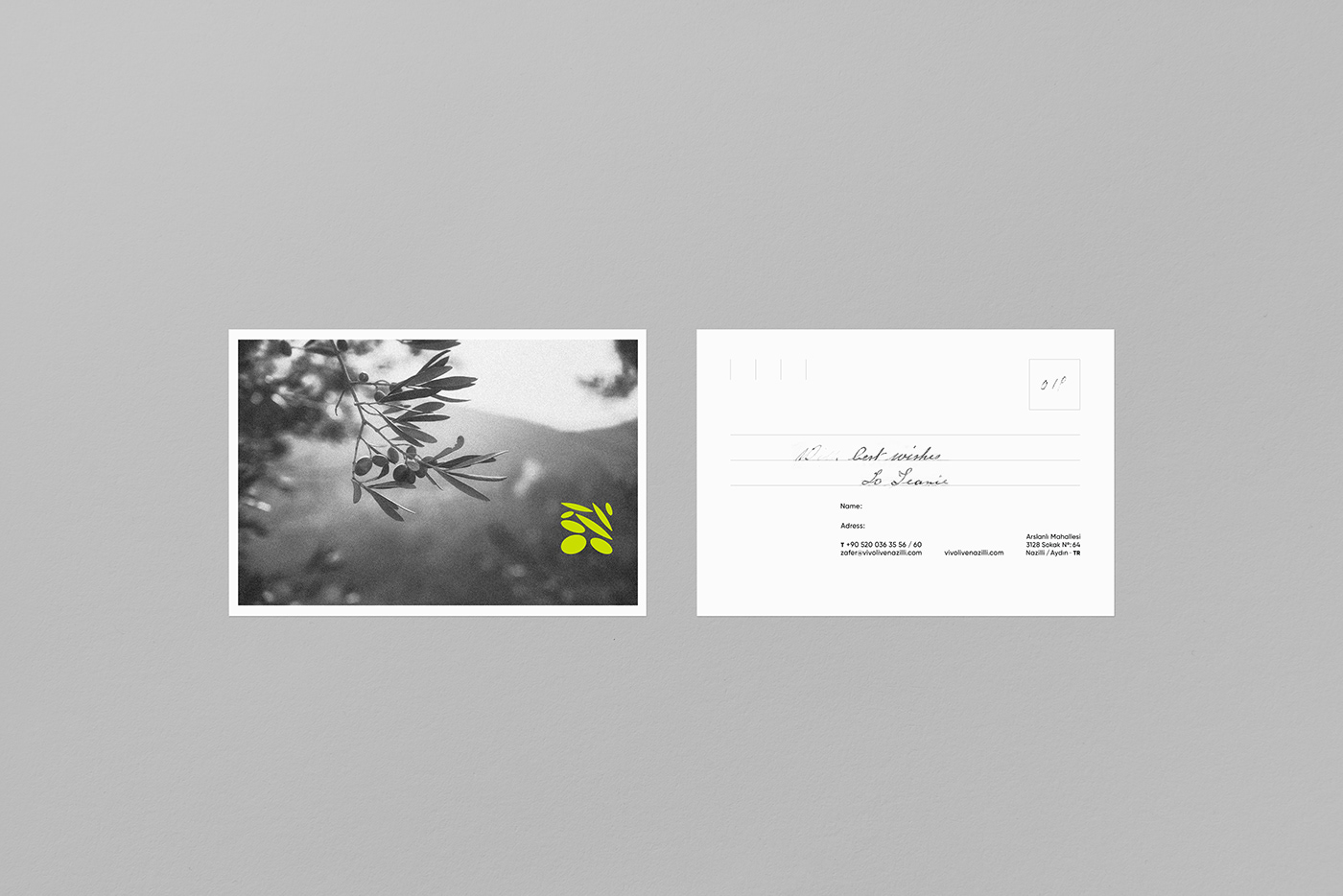
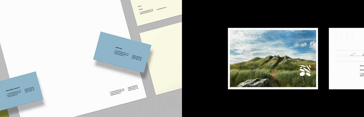
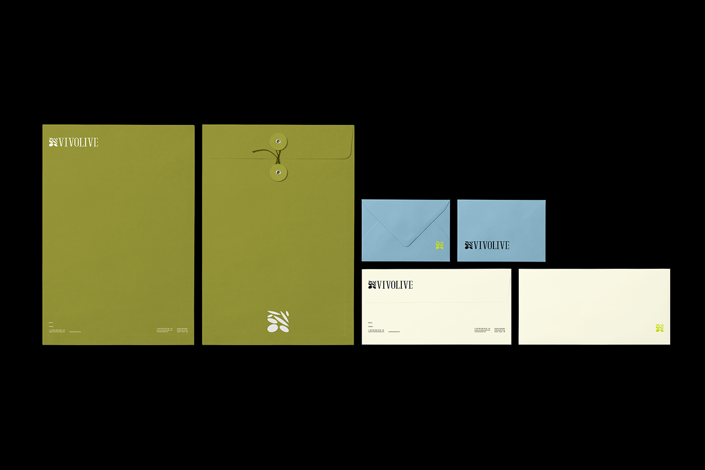
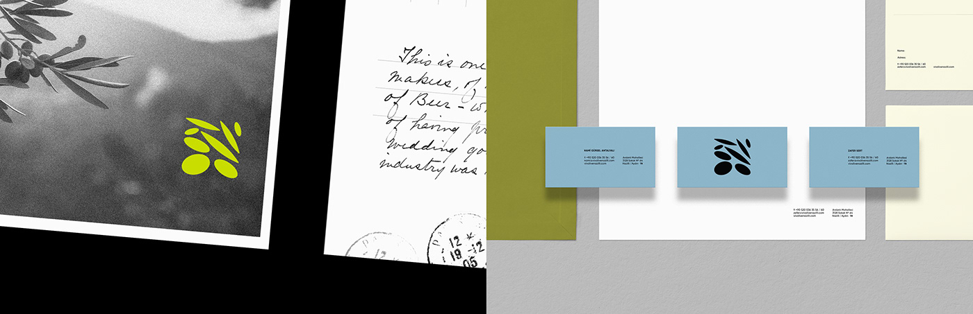
Vivoline is a newly established olive oil brand based in Turkey. Its concept was to create a modern reflection of the combination of olives and olive leaves collected from the tree. The brand mark plays the role of simple and stylish. The integration of asymmetrical parts in a square form allows the emblem to capture a distinct dynamic.
Design the brand identity of this new factory was designed with an innovative and modern concept. The main message: is natural and modern. Vivolive's inspiration comes from nature, olive trees and soil. A logotype design with a condensed and serif typeface was created. In the color selection, besides the green tone, which can be classic for an olive brand, blue was preferred. This blue colored accents communicating a modern touch to the corporate were added to the identity.
-
X X M M I I I