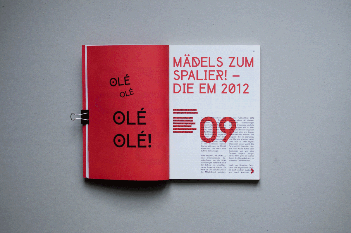
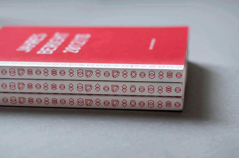
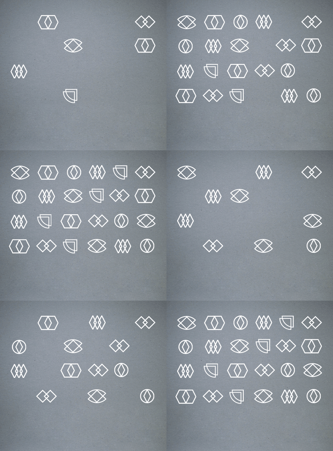
I was asked to redesign the visual appearance of an Austrian secondary school.
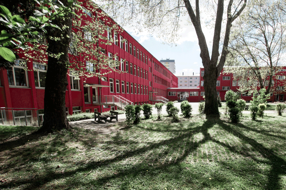
They wanted a more modern, refreshing and recognizable presence. As the colour
of the schoolbuilding itself is a very recognizable red, the building became the
basement for the branding.
They wanted a more modern, refreshing and recognizable presence. As the colour
of the schoolbuilding itself is a very recognizable red, the building became the
basement for the branding.


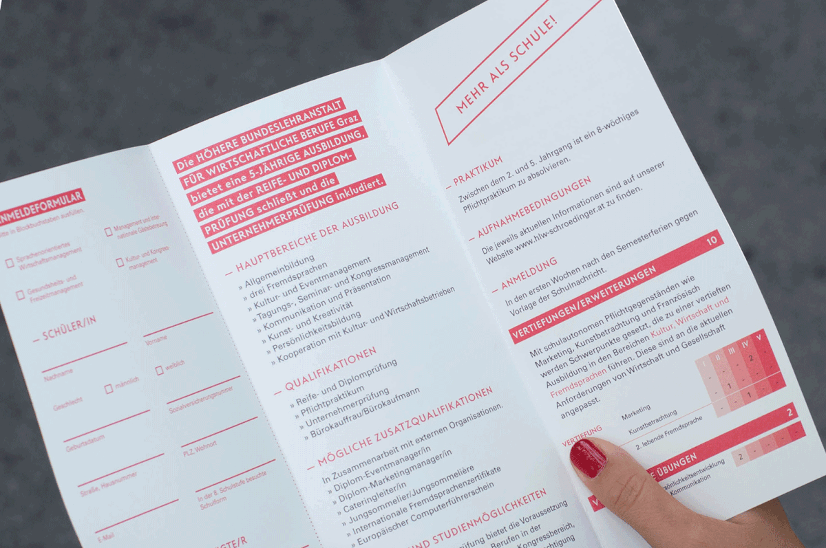
Besides the annual report we also did posters and flyers for the yearly Open House, invitations for festivities and the whole redesign of the school's fair stand, including informing brochures and posters, balloons as booth eyecatcher and give aways,
roll ups and of course the exhibition wall.
roll ups and of course the exhibition wall.



Within the field of the redesign of the school's visual appearance we also did workshops
with the pupils. The goal was to work out a new Annual Report layout which shows the newly created Corporate Design in a playful mutable but sustainable way.
with the pupils. The goal was to work out a new Annual Report layout which shows the newly created Corporate Design in a playful mutable but sustainable way.


