

Organic by John Patrick
Project description
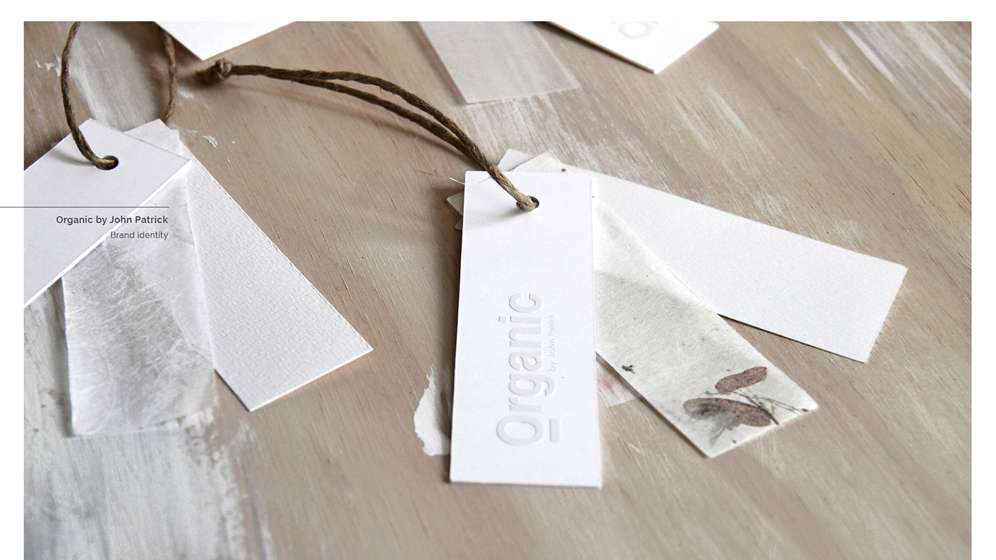
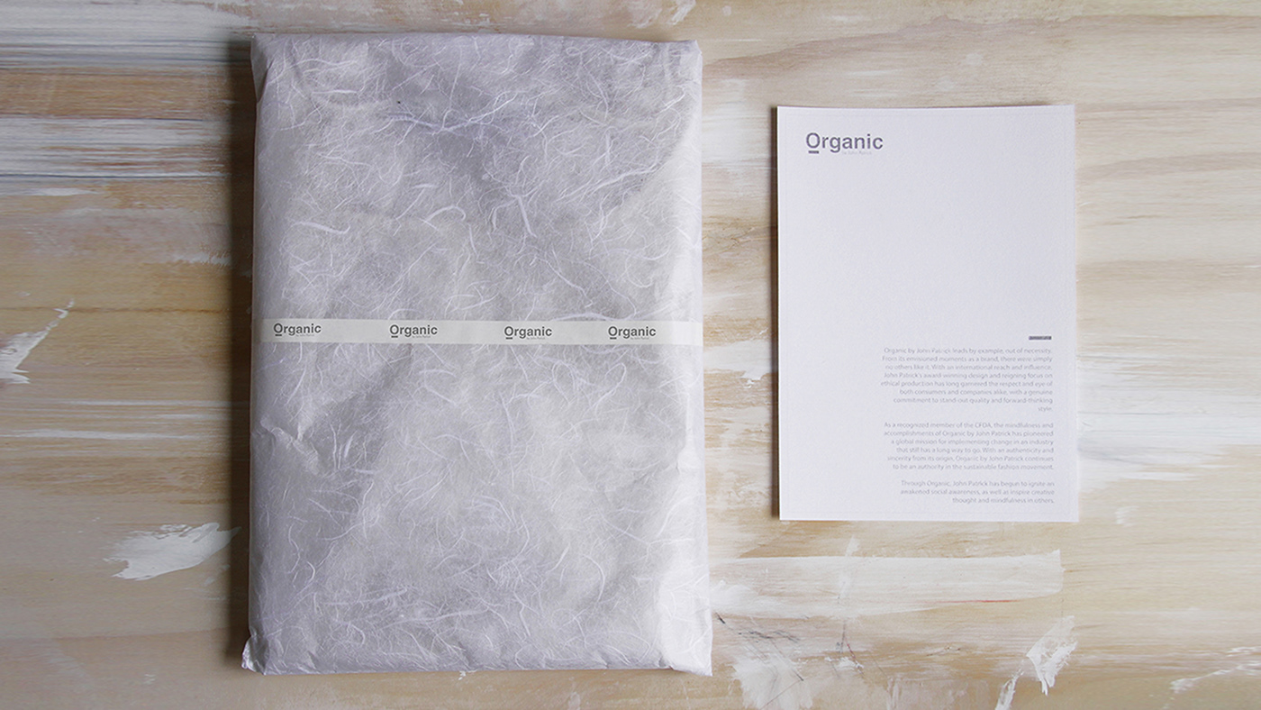
Organic's new image symbolizes the brand's two most important aspects: luxury and it's commitment to nature and social awareness. The logo consists of two sans serif fonts, which provide luxury and modernity to the brand, eliminating unnecessary and superfluous decorations. The main color is white, symbolizing purity, allowing the application of the logo in black to 90% at times.


Credits
Client: Self project
Branding & Packaging design: Raúl Teruel
Photography: Raúl Teruel and Manu Campa


