


LOOK BOOKS FOR PRESS & PR
Designing look books each season, to act as a preview for the press ahead of official collection launches was a key part of my role.
The look books need to be designed in a way to clearly communicate what is new, whilst also remaining inspirational and in line with upcoming brochures.
Using a more editorial style of design, featuring a lot of cut outs is also preferred when communicating with the media. As these type of images will be requested for usage a lot more.
As well as adapting the usual design guidelines for this format, balancing the flow of images coming through from shoots due to tight deadlines is also key.
As these look books are digital files to be emailed, creating a balance between the amount of information included and image quality is needed to keep the file under a cer tain file size.
DESKTOP & PHONE EMAIL DESIGN
Creating email designs from marketing briefs has been part of my role throughout my time at The White Company. Ensuring each design is formatted for both desktop and mobile is essential. As well as ensuring all content is up to date and accurate.
Collaboration across teams to ensure the accuracy of all information before sending to the customer is key. As well as curating images that have been approved for digital usage from the DAM and cross checking what has been used in brochure and throughout online content to demonstrate consistency across the brand.


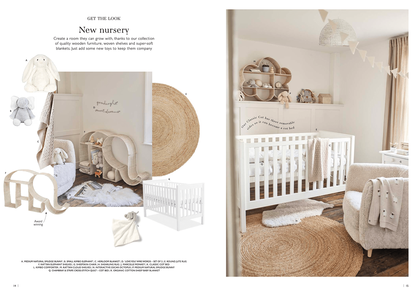
BROCHURE DESIGN
The core of my role was conducting seasonal competitor research, then designing brochure spreads in line with the learnings and wider business strategies. Presenting my proposed stories and concepts to the Creative Director and key stakeholders for sign off to create final designs, implement and handover to relevant teams.
I worked closely with the shoot team to plan the photography content needed for each brochure
and assist with art direction. I collaborate as part of a wider creative team to ensure all brochures are finalised and print ready, with correct product and marketing information. The volume of which, requires a high attention to detail.


FRAGRANCE SUSTAINABILITY ICONS
Using illustrator to create icons in the brand style for fragrance packaging. These are to be used to communicate new sustainability features, as well as the lifespan of some products. I created these icons as vector graphics, to ensure they are crisp and clear no matter how large or small they need to be.


