


The Árpád pálinka manufactory wanted to reimagine a new label in order to make their products more visible to consumers. The new design using bold, eye-catching colors and fonts to draw attention to their packages. The new label include various colors that clearly represent the different tastes in the line, making it easy for consumers to identify them. Additionally, the new label include clear and concise descriptions of each product, as well as any relevant information about their ingredients, benefits, or usage instructions. Overall, the goal of the new label is to make the product line more visible and appealing to consumers.


The label inspired by the rich heritage and culture of Hungary, with a focus on the traditional production methods and ingredients used in making pálinka. The design is elegant and sophisticated, with a clean and modern aesthetic that reflects the high-quality of the brandy. The label feature the brand name prominently, along with a distinctive emblem or symbol that represents the essence of Hungarian brandy. The label contains small colour markings that reflect the taste and smell of the brandy. Using color lines to indicate different fruit flavors can help consumers quickly and easily identify the flavor of a product. Different colors can be associated with different flavors, making it easy for consumers to distinguish between them. For example, red might be used to indicate cherry flavor, yellow for pear, and blue for plum. This allows consumers to quickly scan the label and choose the flavor they prefer without having to read the fine print. Additionally, using color lines for different fruit flavors can add a visually appealing element to the product's packaging and make it more attractive to consumers. The overall design is eye-catching and memorable, helping the brand to stand out on the shelf and appeal to discerning consumers.
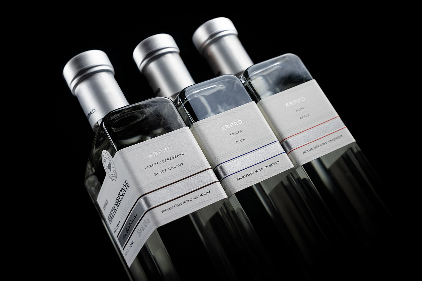
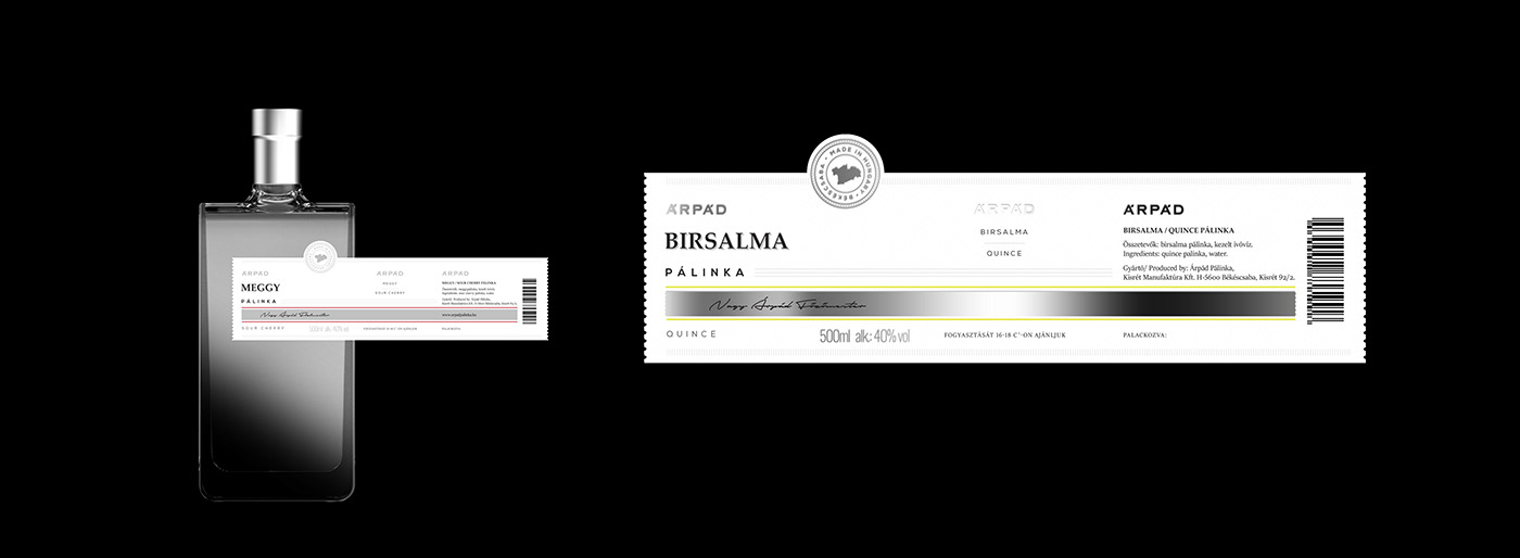
It is important to write the flavors on the rectangular side of the bottle, where they are visible on shelves, because this makes it easier for consumers to find the flavor they want. When products are arranged on shelves, the rectangular sides of the bottles are typically facing outwards, making them visible to consumers.


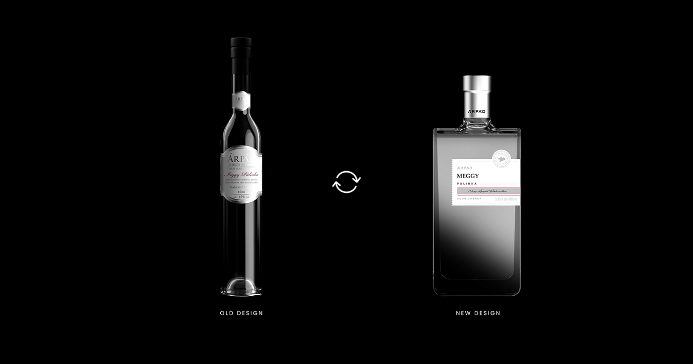
The use of the silver color for the label design of the Hungarian brandy reflects the luxurious and premium nature of the product. Silver is associated with elegance, sophistication, and refinement, making it an ideal choice for a high-end brandy. The metallic shine of silver adds a touch of glamour and opulence to the label, making it stand out on the shelf and appealing to discerning consumers. The color also evokes the smooth and silky texture of the brandy, as well as its crisp, clean flavor. Overall, the silver color adds a sense of luxury and quality to the brand, making it an excellent choice for the label design.

The use of a square bottle instead of the old long bottle for a Hungarian brandy adds a modern and contemporary twist to the brand's packaging. The square shape is more geometric and symmetrical, giving the bottle a clean and minimalist aesthetic that appeals to modern consumers. The square shape also allows for more efficient packing and storage, making it more practical and convenient for distributors and retailers. Additionally, the square shape makes the bottle more distinctive and memorable, helping the brand to stand out on the shelf and catch the attention of potential customers. Overall, the square bottle offers a fresh and modern alternative to the traditional long bottle, helping the brand to stay relevant and appealing in a competitive market.


A stamp-like decoration on a label can add an attractive and decorative touch to the packaging of a product. It can also help to create a cohesive branding strategy and establish a unique visual identity for the product. Additionally, a stamp-like decoration on a label can help to differentiate the product from similar items on the market and make it stand out on store shelves. By using a stamp-like decoration on the label, manufacturers can enhance the aesthetic appeal of their product and make it more appealing to consumers.


THANK YOU FOR WATCHING!
IF YOU WANT TO SEE OUR OTHER WORKS LIKE US ON FACEBOOK
IF YOU WANT TO SEE OUR OTHER WORKS LIKE US ON FACEBOOK


