27four is a diversified global financial services provider. They invest money innovatively, help pension funds make the right decisions and support small independent asset managers. The company aims to create sustained capital growth for its clients and society.
The brand identity harnesses the bold and brave brand spirit to create a striking and unique visual language. The design language of the brand uses circles as a graphic device to symbolise mutual value visually. Symbolically, a circle represents cycles, transition, time, potential (embryo, life) and wholeness. A circle has no beginning and no end, representing the ongoing transformation and never-ending progress of the business.

The Logo
Our logo is made up of different pieces of a circle coming together to form a whole. This is symbolic of:
> Individuals collectively growing together
> A collection of growing funds represented as charts
The logo is dynamic and is designed to look like it is in motion, representing constant change and growth affected by dynamic markets.


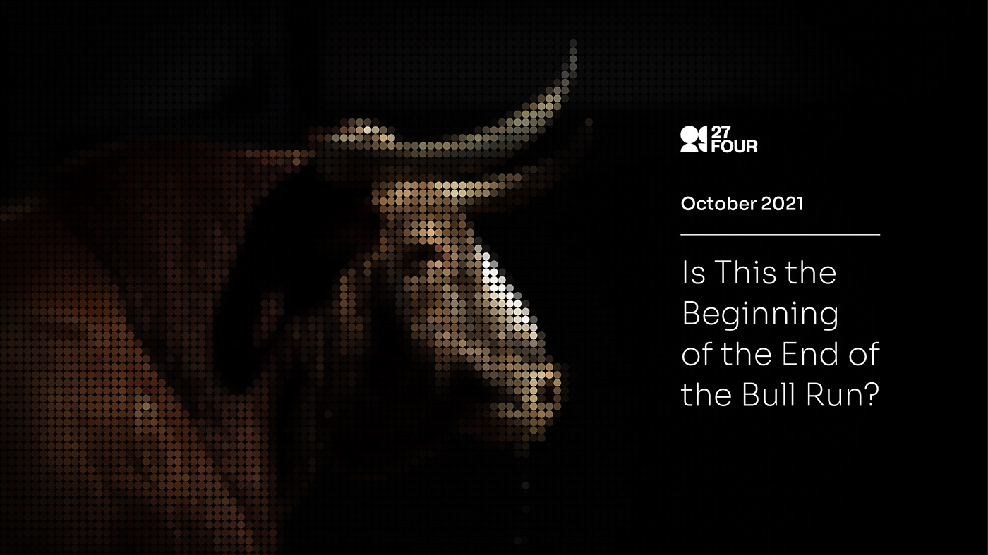
Image Treatment
27four believe in mutual value creation, which means the success of the collective depends on the success of the individual, and this is also true the other way around. In this treatment, each circle represents the individual. We use multiple circles in a compact grid to illustrate the power of the individual building the whole – one cannot exist without the other. Images are then masked into the circles to create a unique and visually intriguing visual representation of mutual value.


Folders and Website:

Identity Manual


