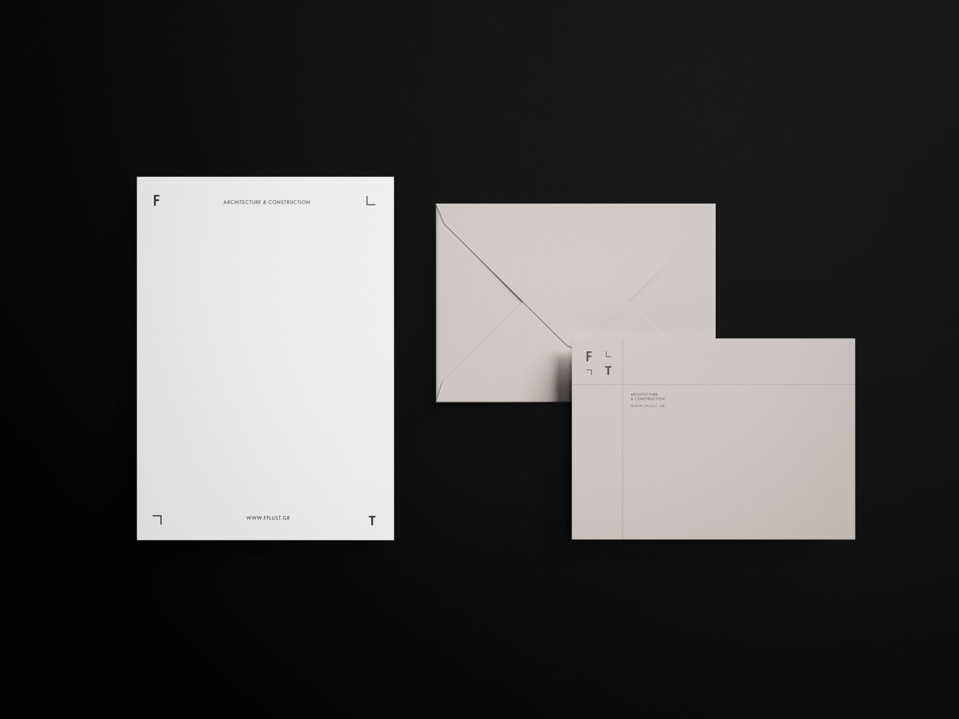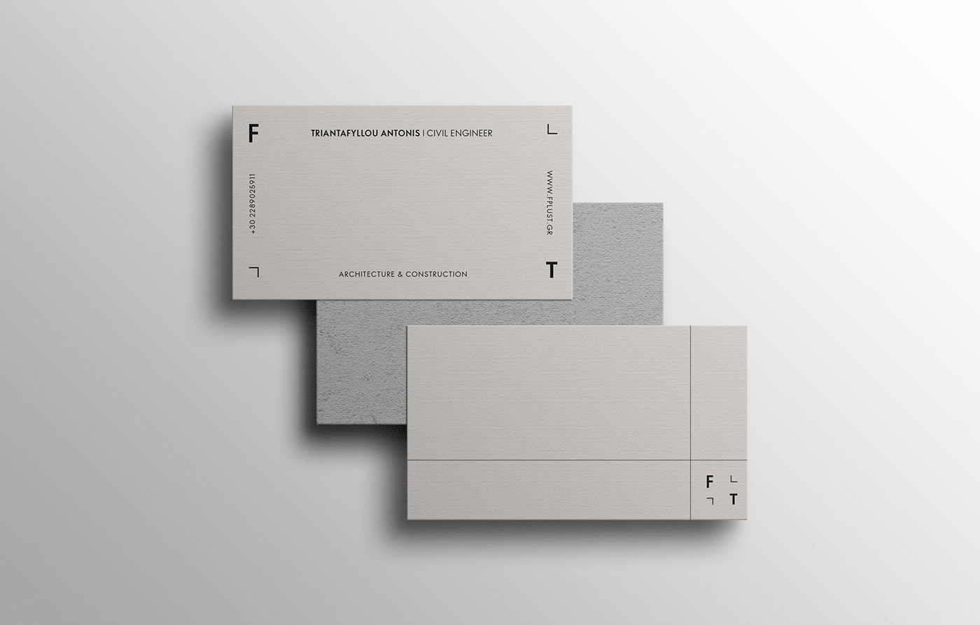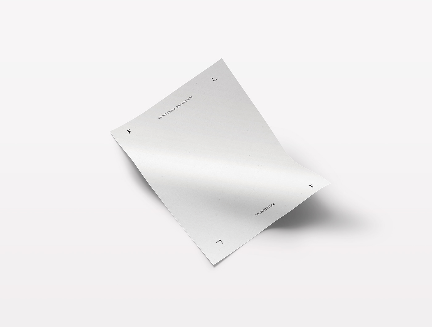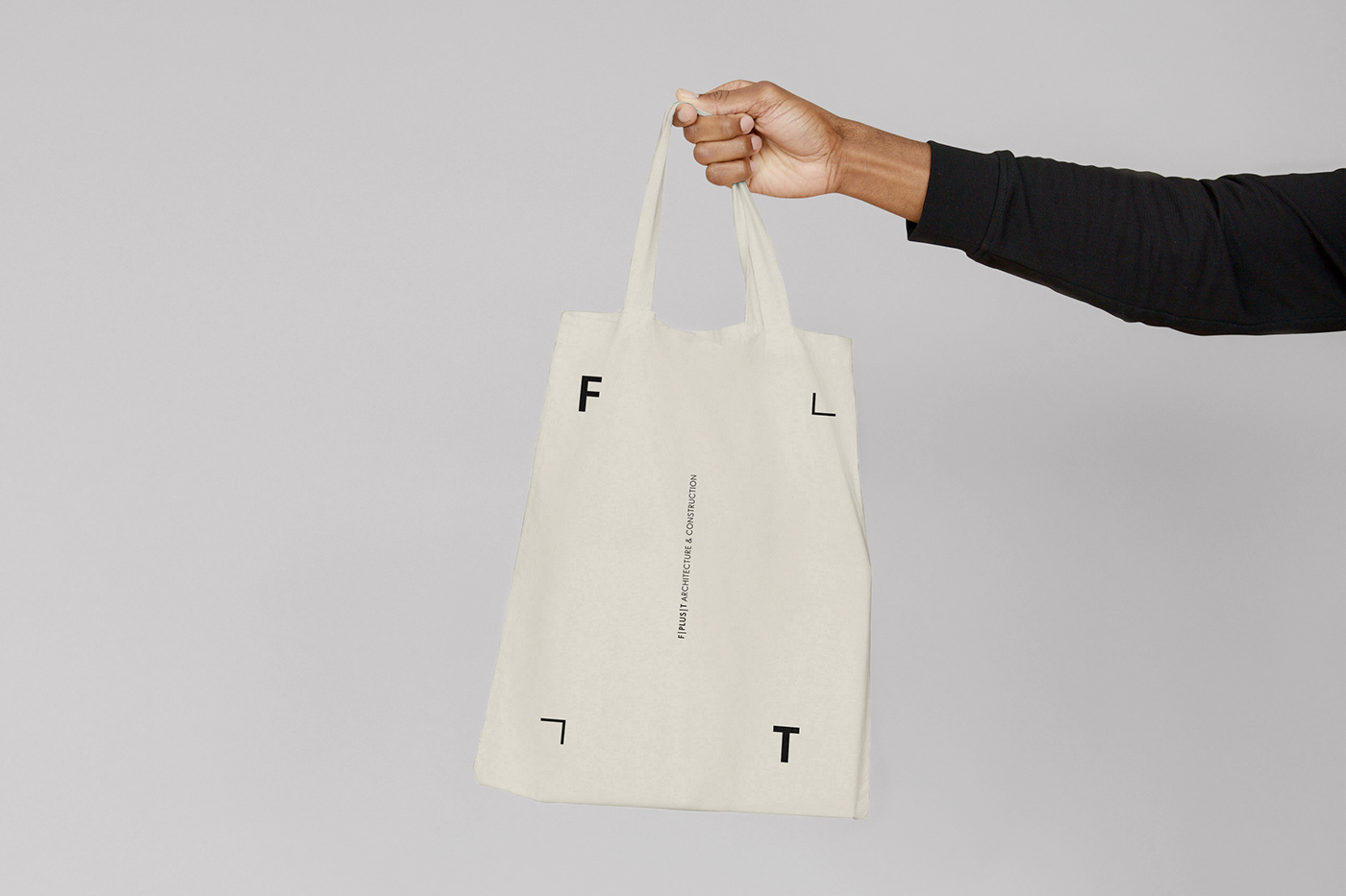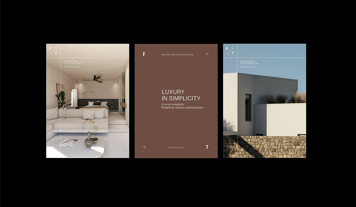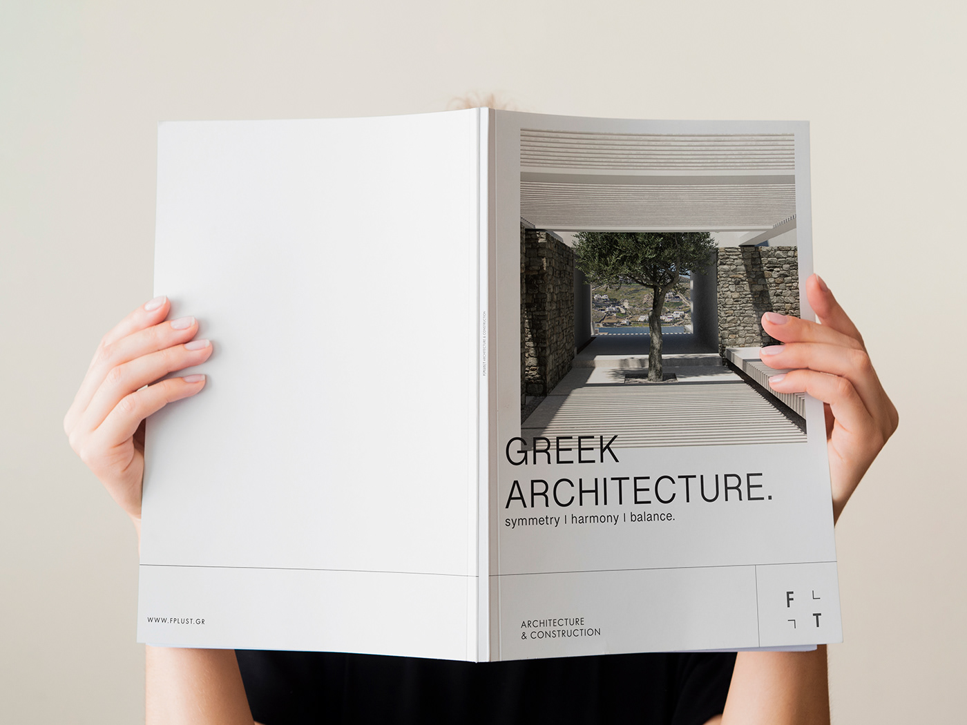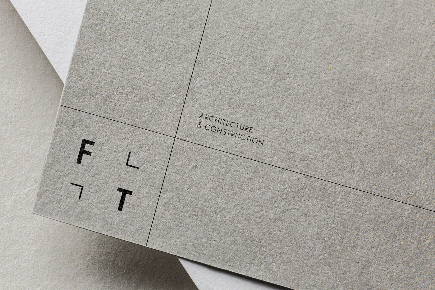
F plus T is an Architecture & Construction firm, based in Greece. The business is split over two main offices, in the island of Mykonos and in Athens. It is composed of an Architect and a Civil Engineer. Their buildings are contemporary with a goal to be timeless and respect the particularities of locality, understanding landscapes and settlements. Essentialism and minimalism are the main characteristics of the brand. When it comes to the actual logo, it takes inspiration from geometrical elements and also from the floor plan (layout) that architects use to create their designs. To make it more personalized, the initial letters of the surnames from each member of the firm ( F and T ) have been used together with the symbol “+” (plus) splitted, creating two corners. At the end there is a squared formed, balanced logotype, that reflects stability and integrity.
The name of the firm - F plus T - in Greek language, could be read as one word fplust - efplusti (εύπλαστοι in Greek) and it means ductile. Following that, the logotype could easily break in four parts, depending on the needs of the layout. A line system presented through the identity, that could adapt each time to the needs of the layout, underlines all architectural values. Modernism, stability and flexibility at the same time.
Black and white are the hero colours of the logotype, to give space to the actual hero. To the images of their creations and designs. The logotype could be used on each corner of the design, based on the layout. Earthy colours are the secondary logos of the brand giving a more eco friendly sense.