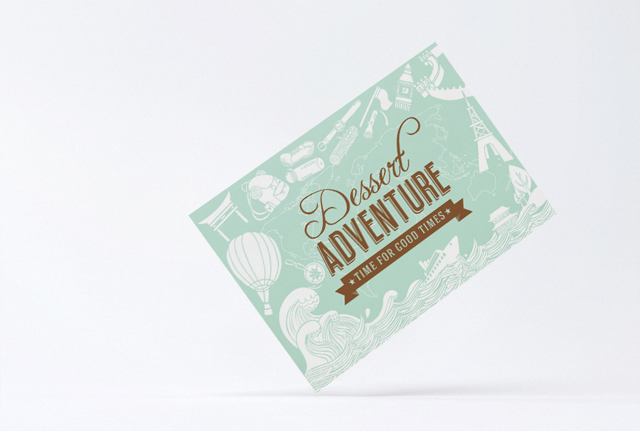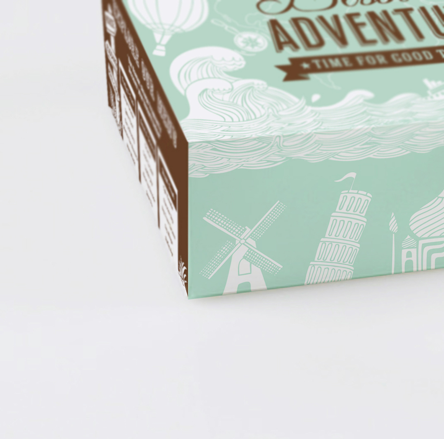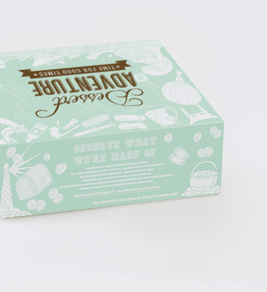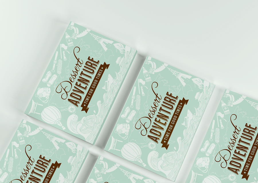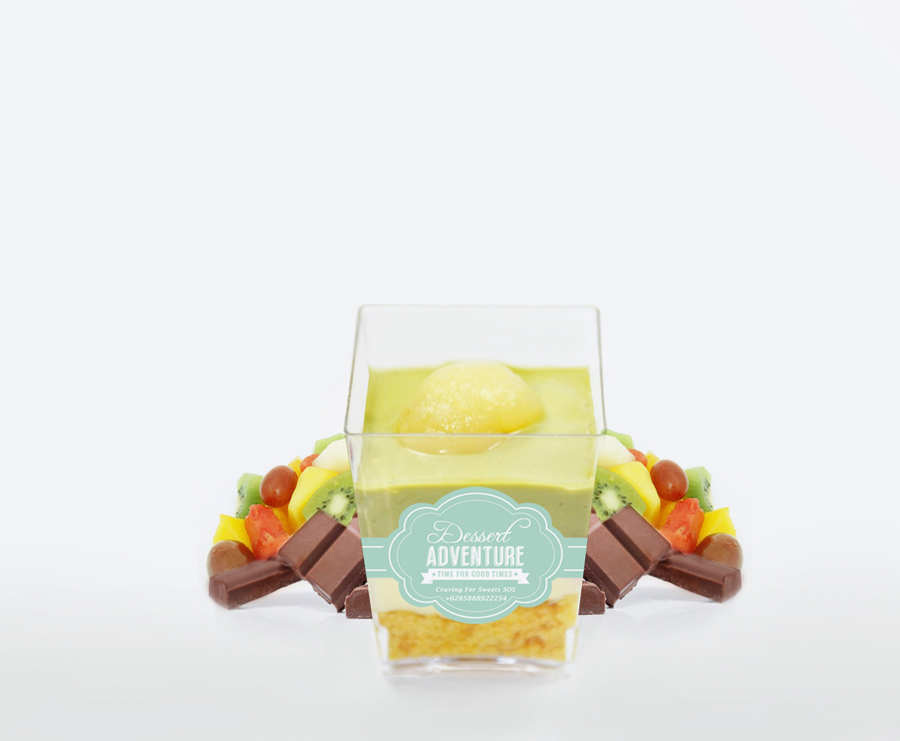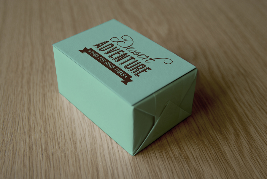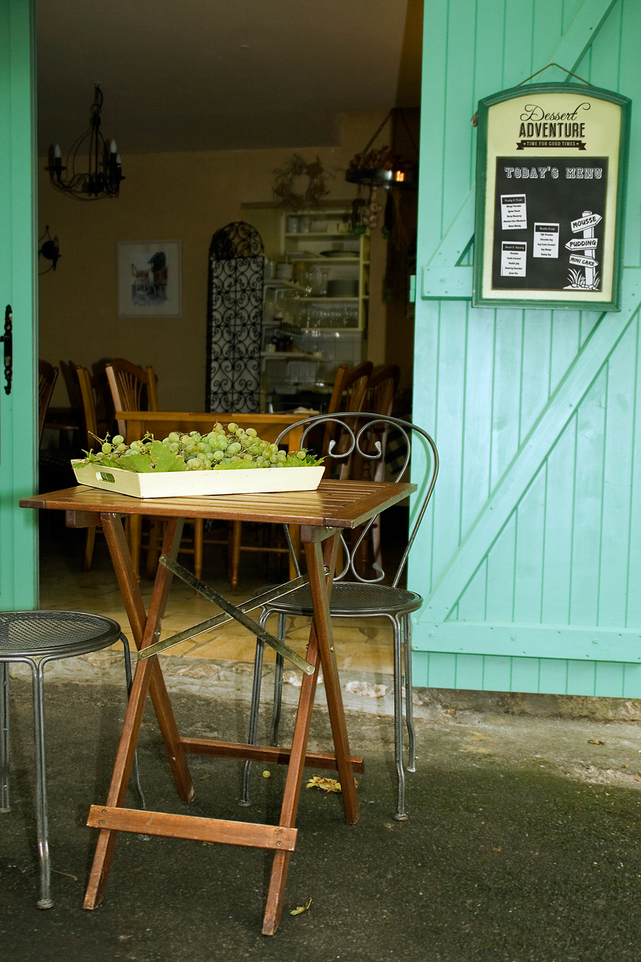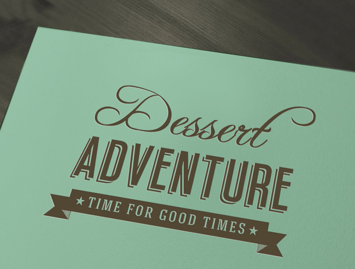
Dessert Adventure is an dessert shop specializing in European-Asian taste based in Jakarta, Indonesia. Its prime focus is mousse, pudding and mini cake. Inspired on the "adventure" image, the packaging box designed with a full illustration in each box side.
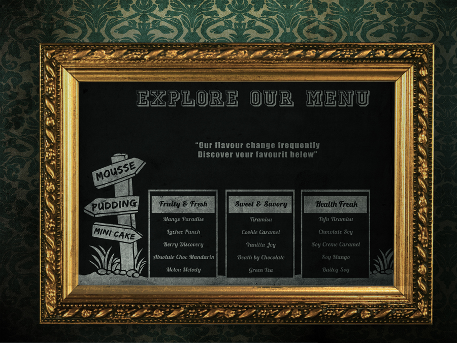
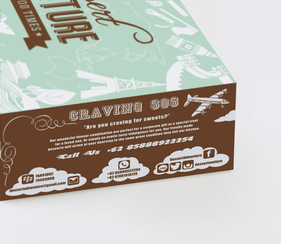
The box is not just for a dessert storage, but the package designed as well as a media promotion. It provides the consumer with clear and specific information (whether consciously or subconsciously). Each side of the package box contain a full information about the company profile, starts from menu list which written in flavor theme for all products, how to used, ingredients also how to get it, include social media page and contact number so the package its like" adventure box" for consumers. Doodle style used for the illustration with flat colors, flat style which popular trend these days.
These design style able to make the logo more lively and fun while using only two colors,brown and tosca. The use of two type color are also saving in the production process. Color perception tends toward modern vintage but still provide an exclusive association of earthy ,natural ,healthy and enhance it appeal. Tosca color commonly used on limited edition products. The green color itself is a favorite color for Indonesia country where the largest Muslim population in the world. The copy writing also can not be separated from the " adventure" image, as the use of the word " Explore , S.O.S , Observe,etc ". The Taste of European-Asian image shown in famous building illustration. Overall the package box reached the ultimate goals, its stimulates the consumer to explore a variety of products, attract, to stand out among competitors, to avoid consumer confusion, stimulate interest awareness and affect a consumer's purchasing decision in the blink of an eye.