
TERRITÓRIO 63
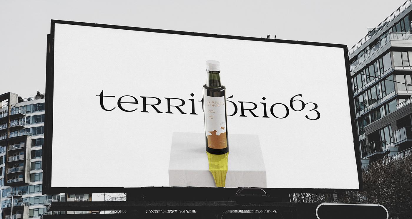
VISUAL IDENTITY / PACKAGING
VISUAL IDENTITY / PACKAGING
EN Território 63 is an Extra Virgin Olive Oil from the family farm Coimbra Martins Costa, an olive oil boutique that cultivates and selects handcrafted olives in order to extract a premium and unique product, with the freshness, aroma and vitality of the Brazilian Pampa. After reflecting about the business’ goals, emerged the need to improve its presentation in the market, transmitting the history, tradition and dedicated production, worthy of the family reserve.
PT Território 63 é o Azeite Extra Virgem da estância familiar Coimbra Martins Costa, uma boutique de azeites que realiza o cultivo e seleção artesanal de olivas a fim de extrair um produto premium e singular, com o frescor, aroma e vitalidade do Pampa Brasileiro. Após uma reflexão sobre os objetivos do negócio, surgiu a necessidade de aprimorar a sua apresentação no mercado, transmitindo a história, tradição e produção dedicada, digna da reserva familiar.
CLIENT: COIMBRA MARTINS COSTA IND. OLIVICOLA
YEAR: 2020

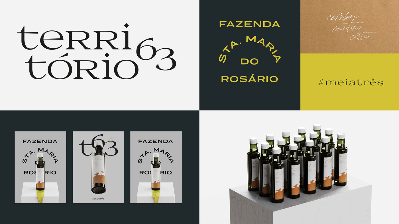

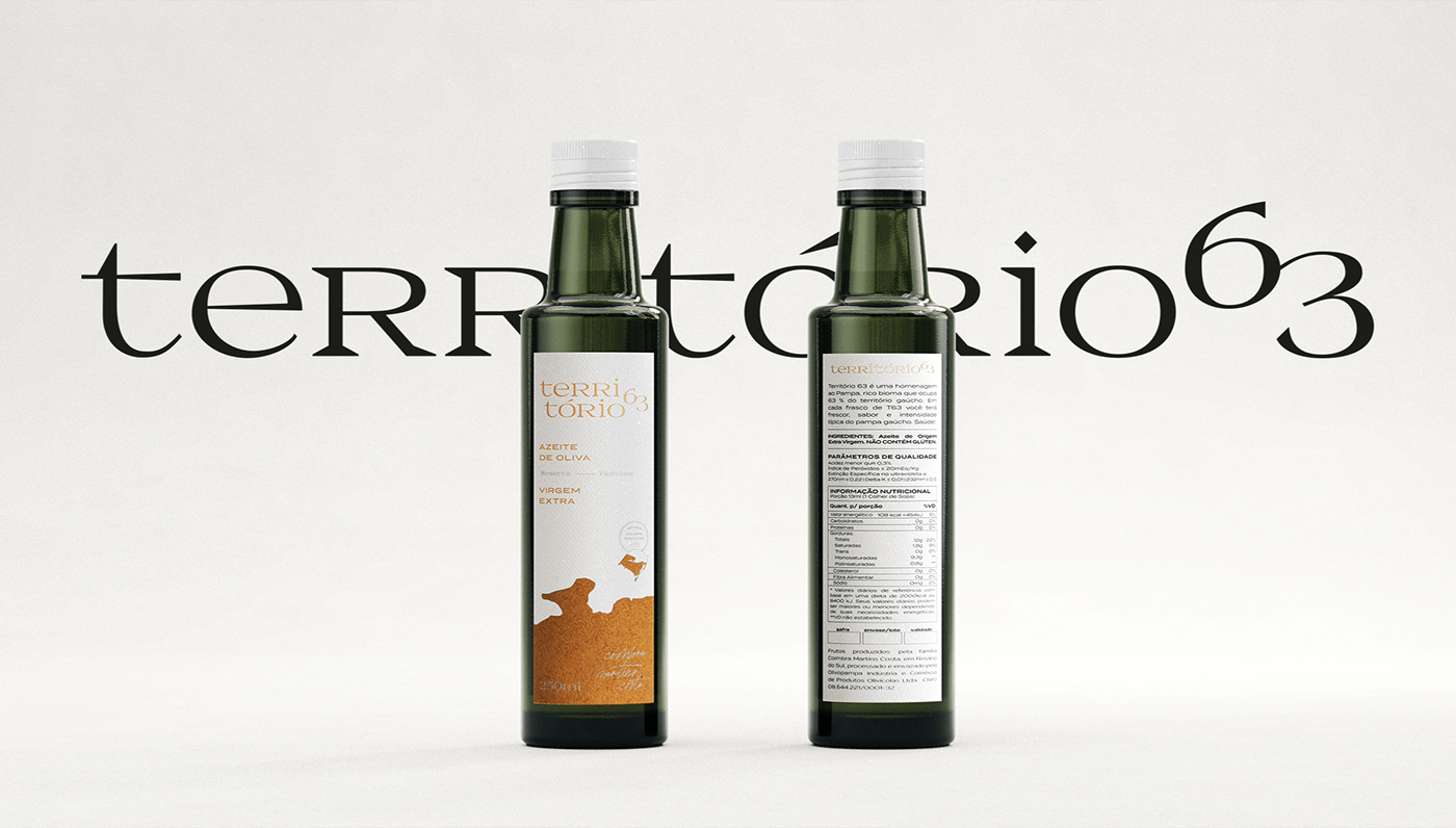
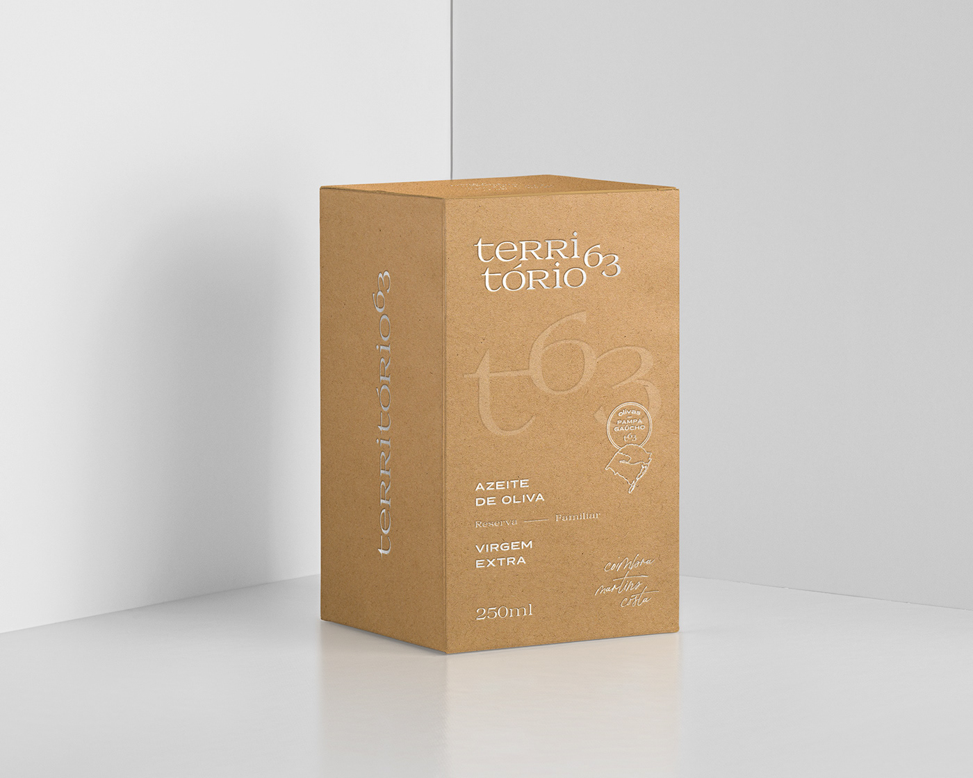
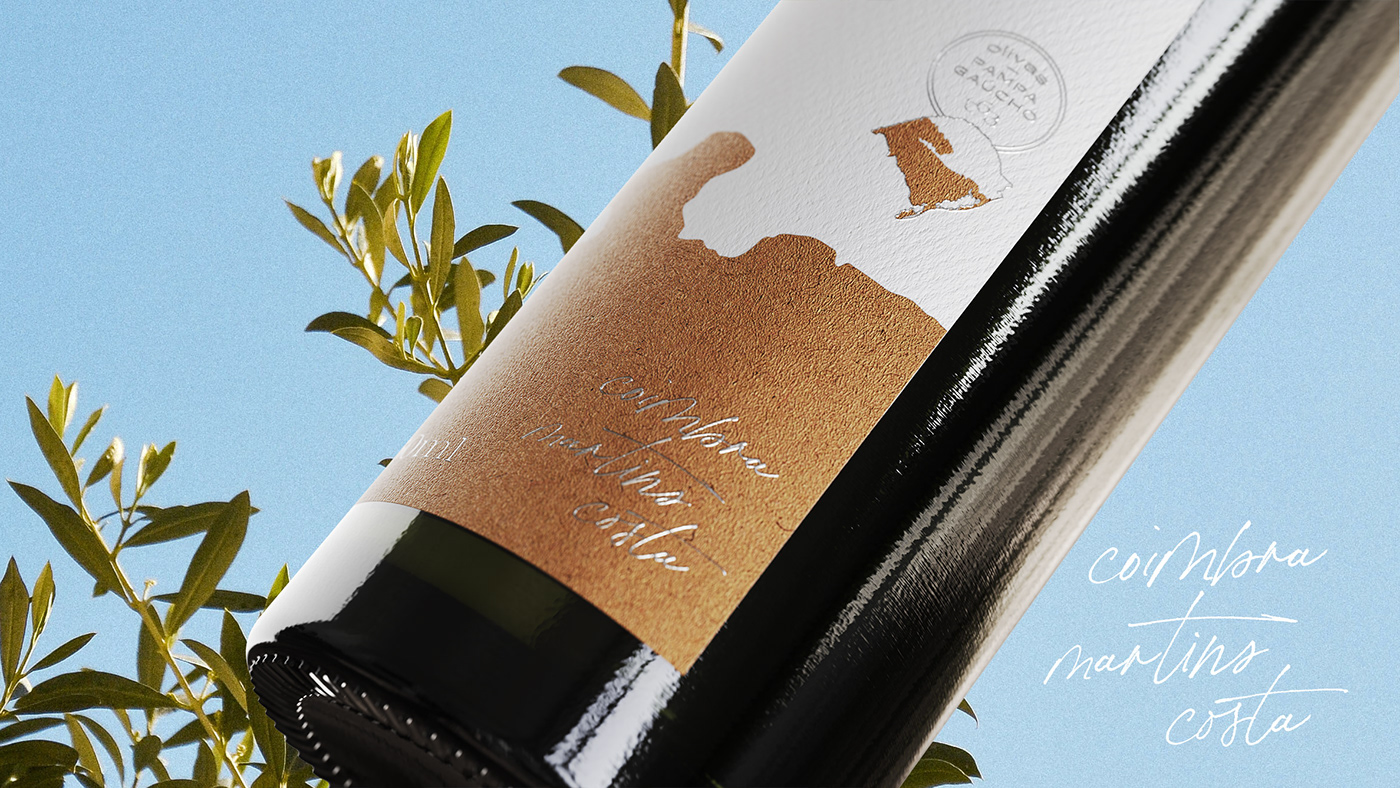
EN The work gave rise to a new visual system, with color orientation and proprietary elements (such as stamps and signatures), as well as images that rescue the Portuguese cultural heritage and the passion dedicated to planting and harvesting olive trees in the Pampas. The the packaging creative process, in turn, was based on the strong connection between the owners and the Brazilian Pampa region, connecting and bringing the freshness, aroma and vitality of the territory where the plantation is grown to the customers' table. . The result brings a consistent graphic design, with proprietary colors and visual elements, such as stamps and signatures, and a hierarchy of information that helps to highlight important information in this type of product, such as producer, farm location, acidity and harvest.
PT O trabalho deu origem a um novo sistema visual, com orientação de cores e elementos proprietários (como selos e assinaturas), assim como imagens que resgatam a herança cultural portuguesa e a paixão dedicada ao plantio e colheita de oliveiras nos Pampas. O processo de criação da embalagem, por sua vez, foi pautado na forte conexão existente entre os proprietários e a região do Pampa brasileiro, conectando e trazendo o frescor, aroma e vitalidade do território onde a plantação é cultivada, para a mesa dos clientes. O resultado traz um projeto gráfico consistente, com cores e elementos visuais proprietários, como selos e assinaturas e uma hierarquia de informações que auxilia a destacar informações importantes nesse tipo de produto, tais como produtor, localização da fazenda, acidez e safra.


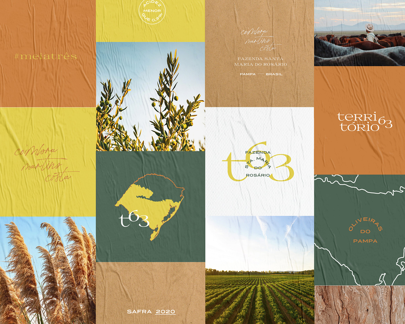
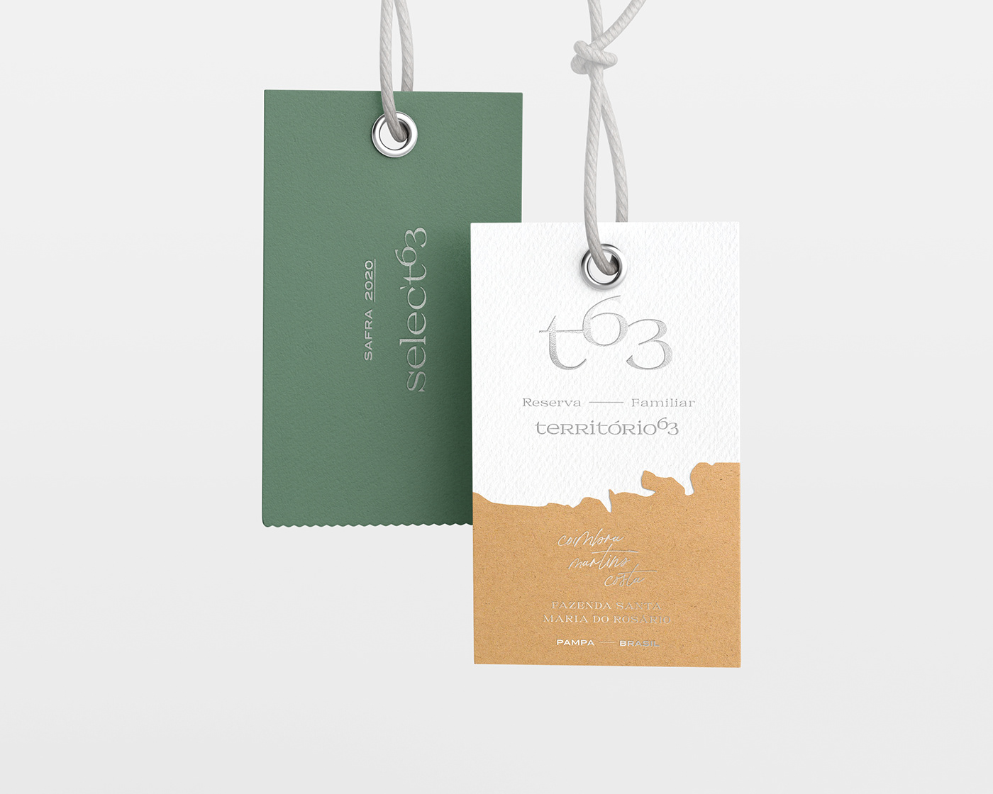
EN The project was motivated by the client's need to establish a visual presentation that matches the unique properties of their product. When immersed in the customer's universe, it became clear how differentiated is the production of its olive oil formula, which has full control over the term Extra Virgin, certifying its purity at 10/10, that is, 100% flawless. The packaging design focuses on a minimalist and refined approach, translating Pampa traits through the color palette, textures and the use of territorial lines for graphic composition. In this way, the attributes of the product and the brand are transmitted, supported by a graphic design that can be easily deployed in new products in the future.
PT O projeto foi motivado pela necessidade do cliente de estabelecer uma apresentação visual à altura das propriedades ímpares do seu produto. Ao imergir no universo do cliente, ficou claro o quanto diferenciado é a produção da sua fórmula de azeite, que possui total controle sobre o termo Extra Virgem, certificando sua pureza em 10/10, ou seja, 100% sem falhas. O design da embalagem foca em uma abordagem minimalista e refinada, traduzindo traços do Pampa através da paleta de cores, texturas e o uso das linhas territoriais para composição gráfica. Dessa maneira, são transmitidos os atributos do produto e da marca, sustentados por um projeto gráfico que pode ser facilmente desdobrado em novos produtos no futuro.

EN In addition to a new packaging, the project was important for the maturing process of the olive oil business at the Coimbra Martins Costa family's ranch, which until then produced batches only for their own consumption or for friends.
The new graphic design of the olive oil inspired the renovation of the company from a new visual language. Thus, typography, colors, images and the new visual elements created were used in the communication of the product. Website, social networks and other materials were renewed based on this graphic project, which captivates people and draws attention for the sophistication and exclusivity of the lots. The new packaging made it possible for the family business to connect with its target audience and expand its share of the premium olive oil market.
PT Além de uma nova embalagem, o projeto foi importante para o processo de amadurecimento do negócio de azeites da estância da família Coimbra Martins Costa, que até então produzia lotes somente para consumo próprio ou para amigos.
O novo design gráfico do azeite inspirou a renovação da empresa a partir de uma nova linguagem visual. Assim, a tipografia, as cores, as imagens e os novos elementos visuais criados foram utilizados na comunicação do produto. Website, redes sociais e outros materiais foram renovados a partir desse projeto gráfico, que cativa as pessoas e chama atenção pela sofisticação e exclusividade dos lotes. As novas embalagens possibilitaram à empresa familiar se conectar com seu público-alvo e ampliar a sua participação no mercado de azeites premium.
VLK TEAM
Matheus Pinto, Moises Hansen,
Beatriz Janoni, Rodrigo Martins Costa
DELIVERABLES
Packaging & Visual Identity
To view everything we can do for you:
ola@valkiriaic.com.br