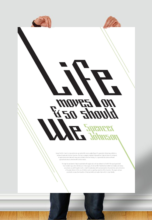
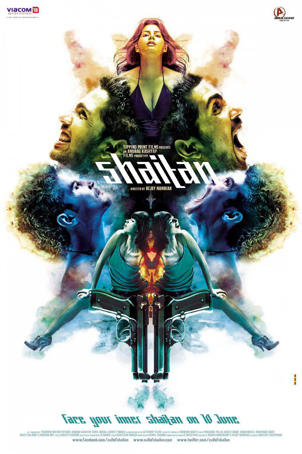
Vyang, hindi for 'irony', is a type where one can explore the reverse angle of type. It's a geometric display type, which is a mixture of quirky and informal characters. This type is primarily intended to be used from 14 pt and above. It is designed for applications which deal with irony, action and out of the box thinking. It's a type which talks about a different approach and attracts attention with smallest details. This type has an element of surprise and deals with angular cuts, with an inclination to the left.
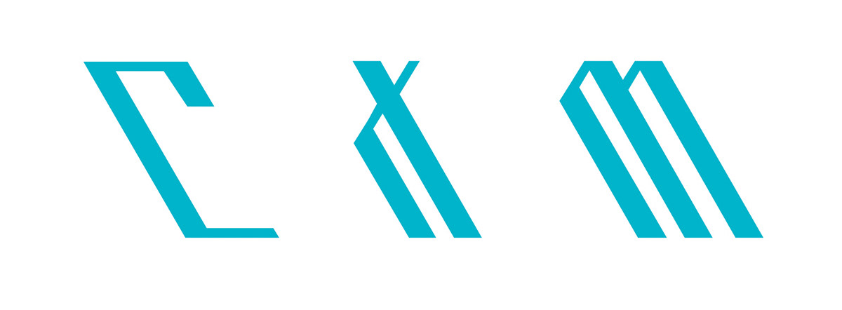
This type is generated from Isometric type, where the lines are in three angles, 30, 60 and 180. The letterforms which look modular and chunky, are actually very well thought of and is a result of explorations with maximum number of permutations and combinations of the given strokes. In this case, limitations works as a guiding source for all the characters. The angular cuts are provided to increase the interaction of black and white and create a form which is more friendly.


The Grid

Grid defining the character
Work in Progress


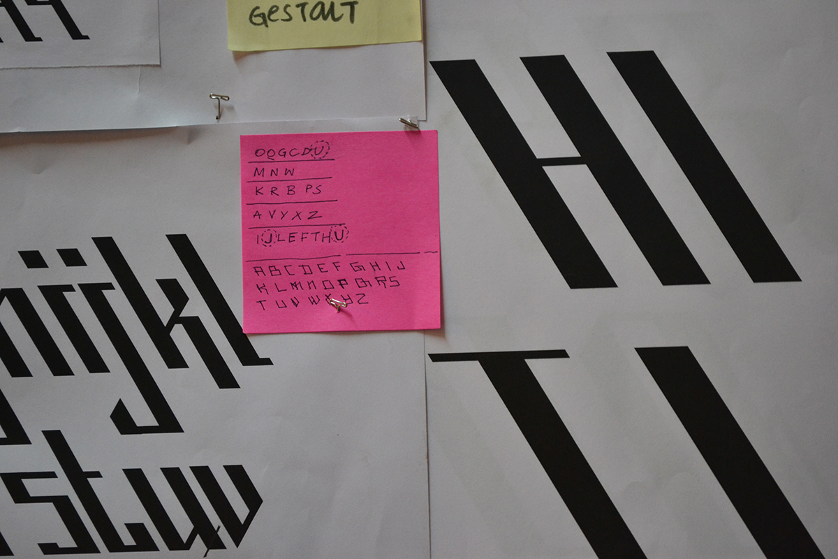

Capital and Lower Case Alphabet

Characters,Ligatures & Numericals


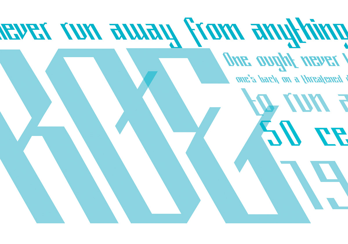
Understanding the Usage through Posters.
These posters were also used to introduce the type.