
We created the name, identity and brand assets for the new popular children's party room in Monterrey, Mexico.
STRATEGY
Branding
Brand name creation
Logo and identity design
Identity and brand book
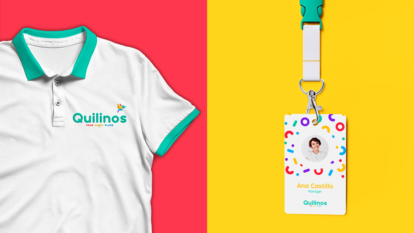
Brand assets design

Naming
This proposal is inspired by the troquilinos: a subfamily of birds of the trochilidae family, commonly known as hummingbirds. The hummingbird is a fairly familiar and identifiable bird for the brand’s market. In addition to being small and having energy compared to a child, it is considered a very elegant animal and functions as a mascot for the brand.

Branding
Inspired by it’s name, a representative icon of a hummingbird was designed, which was created from geometric figures to allude to the art of origami, which within Japanese culture is practiced mostly by children and has a meaning of respect and prosperity. The style used represents the duality of our brand, the drawing lines convey a friendly image for children's events and a more elegant one for adult events with the icon in outline, paired with a contrasting color palette, they work together to communicate fun and innovation.


PROJECT CREDITS
Naming
Francisco Garza
Cesar Carranza
Branding
Mariana Ortega
Diego Carrión
Art Direction
Elizabeth Contreras
MORE
Done by kiwis 🐥 with ⚡️
Thank you for your appreciation ❤️


