IKEA Visual Identity
I was set the task of creating a visual identity for the company of my choice - I chose the Swedish furniture & lifestyle brand IKEA. The identity is designed to show IKEAs playful, contemporary, and colourful side, and also to represent the idea of self assembly, which is associated with IKEA's furniture.
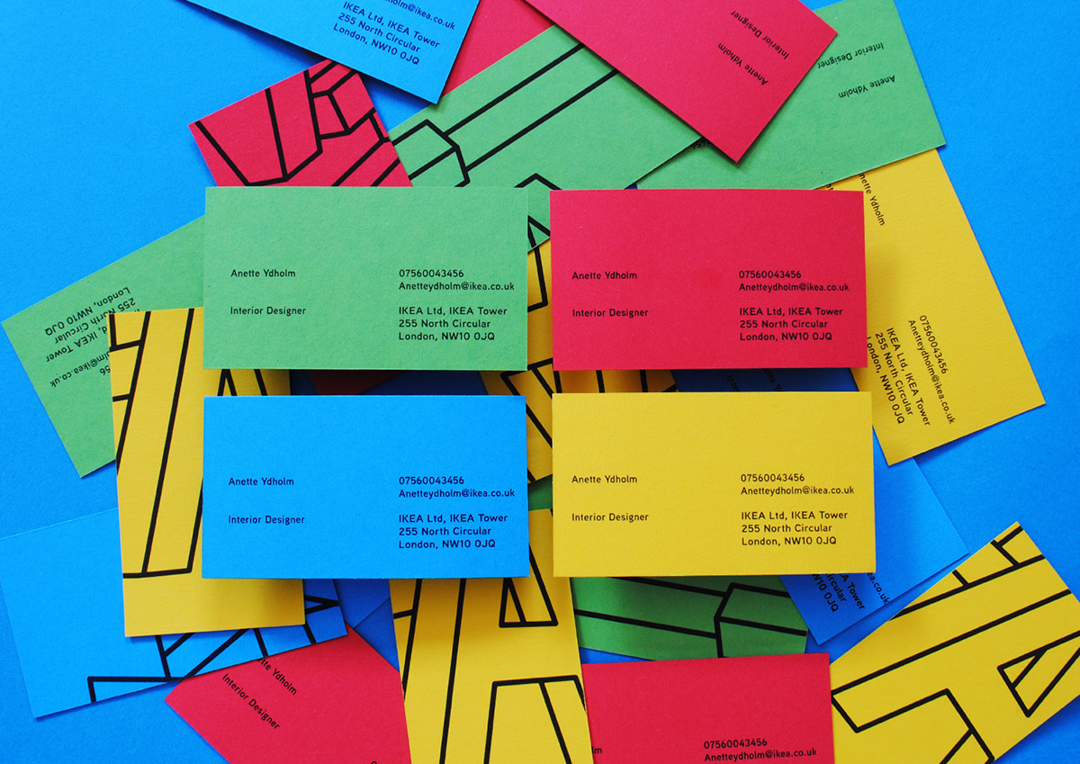
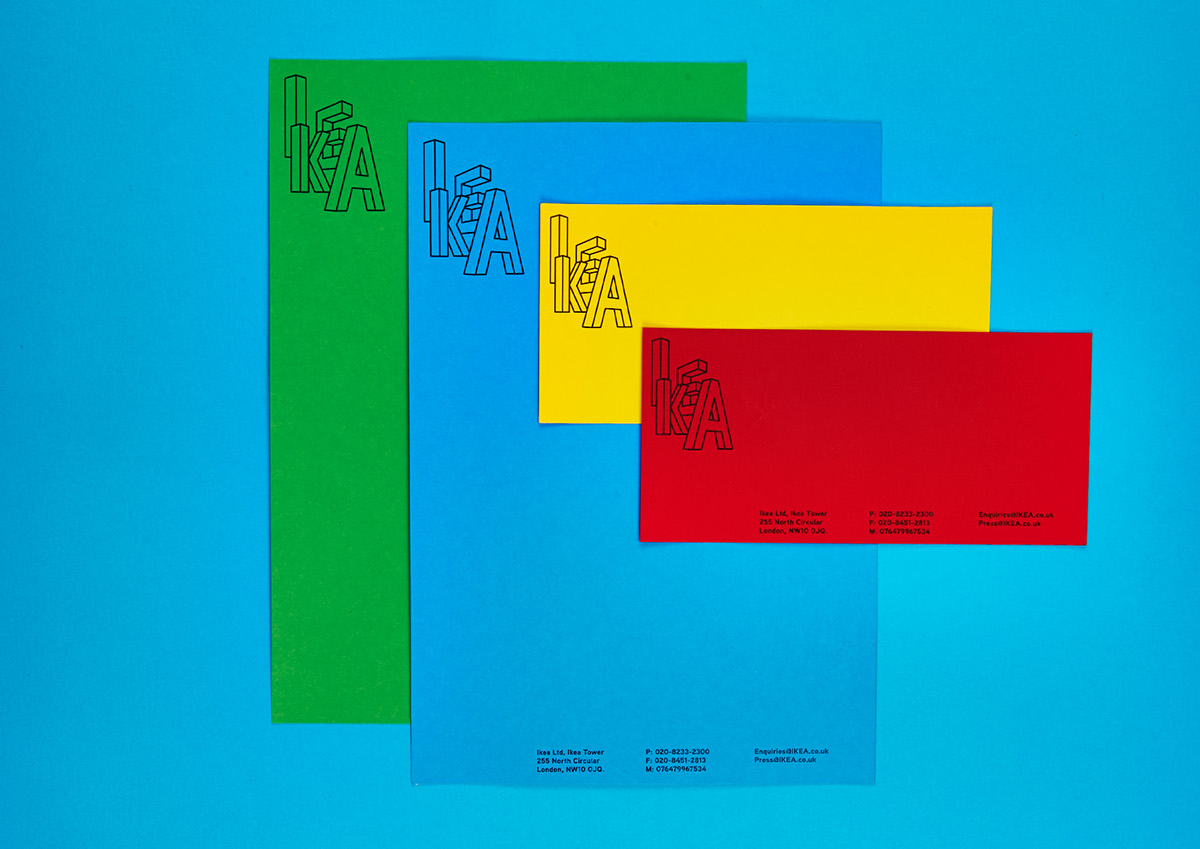
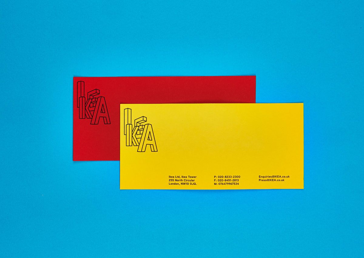
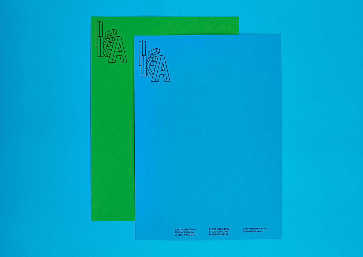
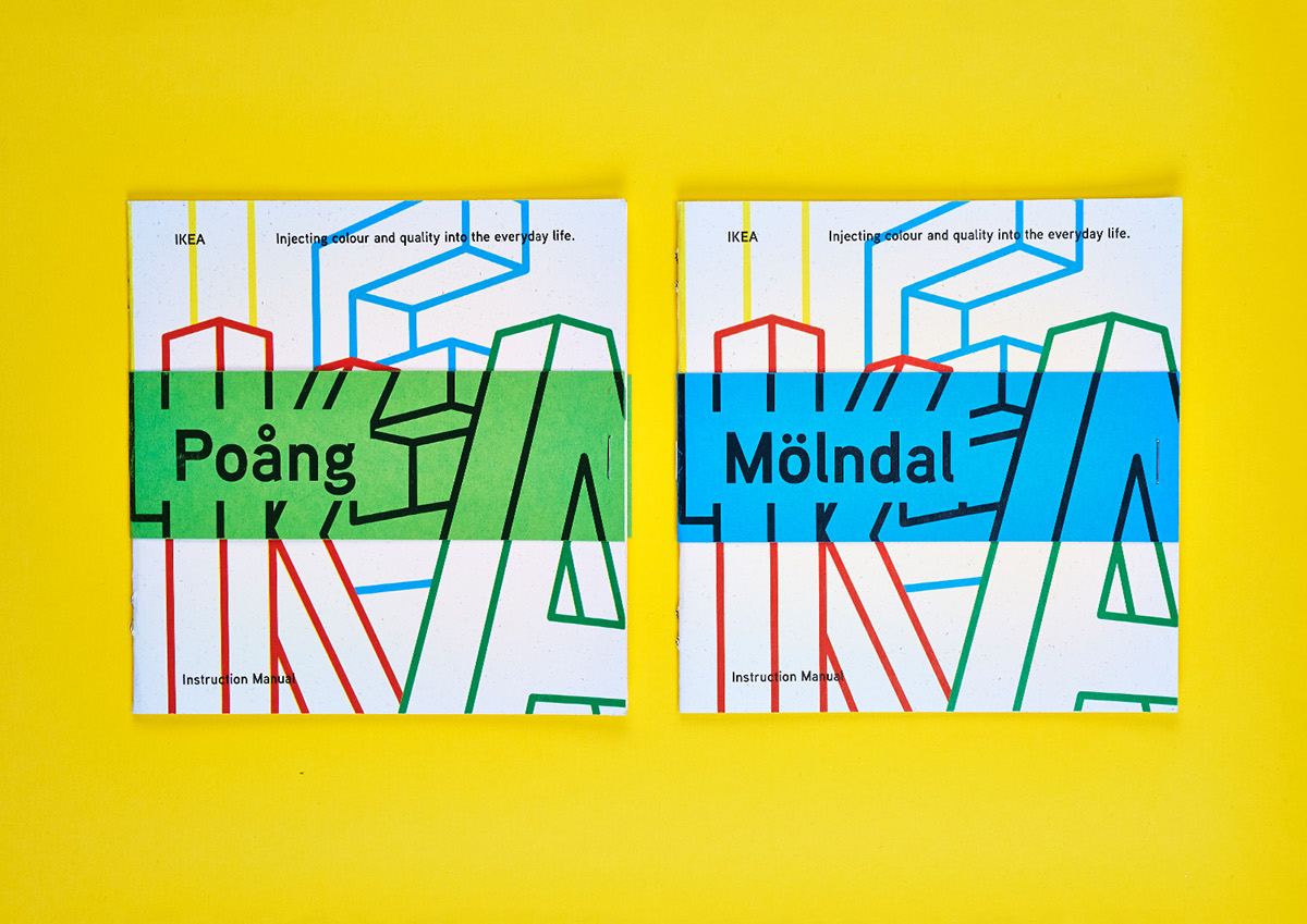
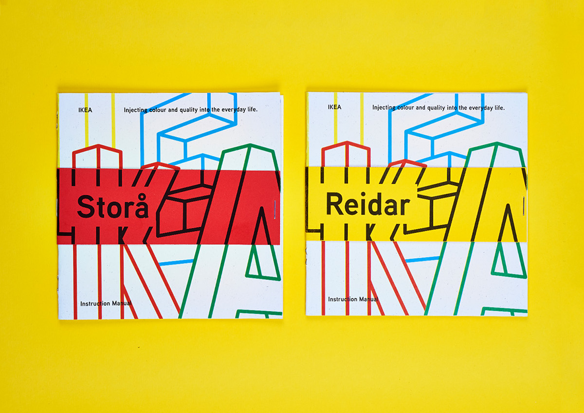
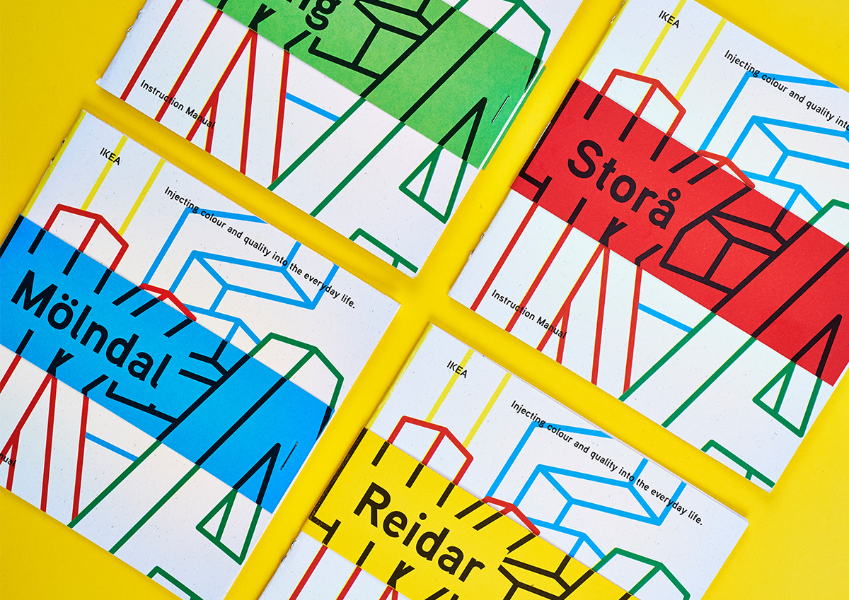
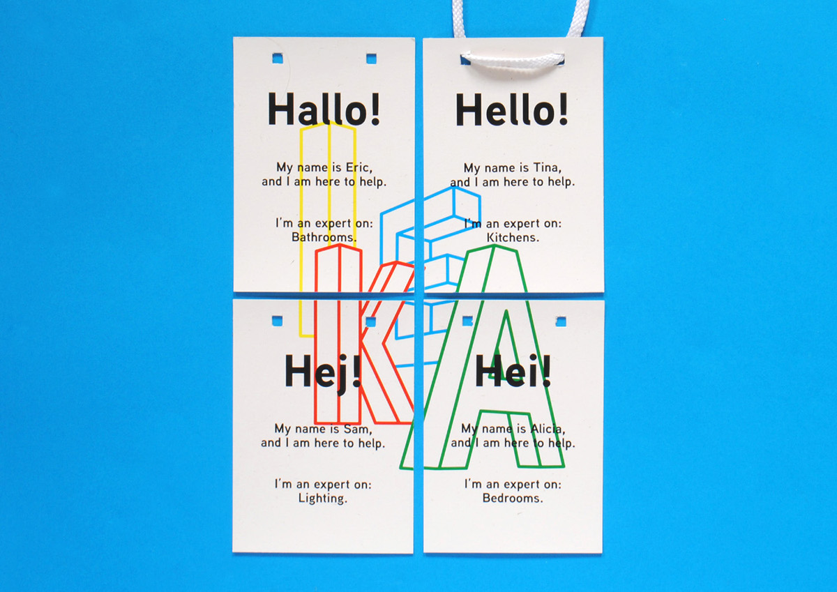
The logo is four letterforms drawn from two different perspectives. The letters are freestanding forms designed to represent IKEA's furniture in a room, showing the ability to mix and match with different angles, styles, and perspectives. The logo is organic, just like IKEA, it changes from a black line to a coloured one to fit its context.
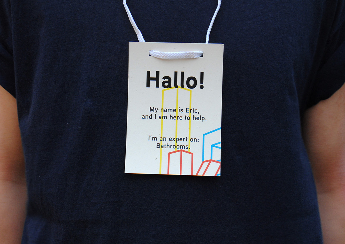
The rest of the identity is based around the four primary colours (all sampled from current IKEA ranges) and the idea of assembly. The logo is often split up across several different elements (business card, and lanyard) which requires interaction to assemble and create the logo - exactly what IKEA is all about.