Oven Interface Redesign
Assignment for both our Presentation and User Centred Design classes: to redesign the interface of an oven to make it more user-friendly, with a sleek and stylish look. An interface should be a path, a trajectory that can easily be followed if the user applies simple logic. It should in no way scare the user, and therefore the amount of objects should not be overwhelming.
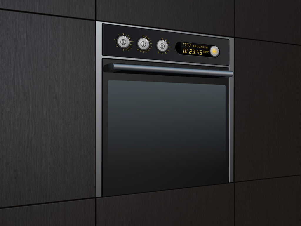
The interface________________________________________________________
Logically, a person will read things from left to right. I have anticipated this by placing three rotary buttons to the left of the screen. The user starts by setting up the time, then defines the desired degrees and finally chooses the oven mode. This order has been chosen because on packaging, instructions mostly say "x minutes on x degrees".
When everything is set up, the user can review the settings on the LCD screen and confirm by pressing the start button that has intentionally been placed all the way to the right.


Actions to use the oven from left to right: set up time, temperature and mode, doublecheck on screen and confirm with the "start" button which will ignite to show when the oven is on.
Details_____________________________________________________________
For each button, a simple yet recognizable icon was designed: an hourglass for the time, a thermometer for the temperature and cutlery for mode, accompanied by the standard icons for the various modes.

Visualisation ________________________________________________________
Interface created in Photoshop, oven created as a vector in Illustrator.
______________________________________________________________________________________________


