
Postcard 1

Postcard 2

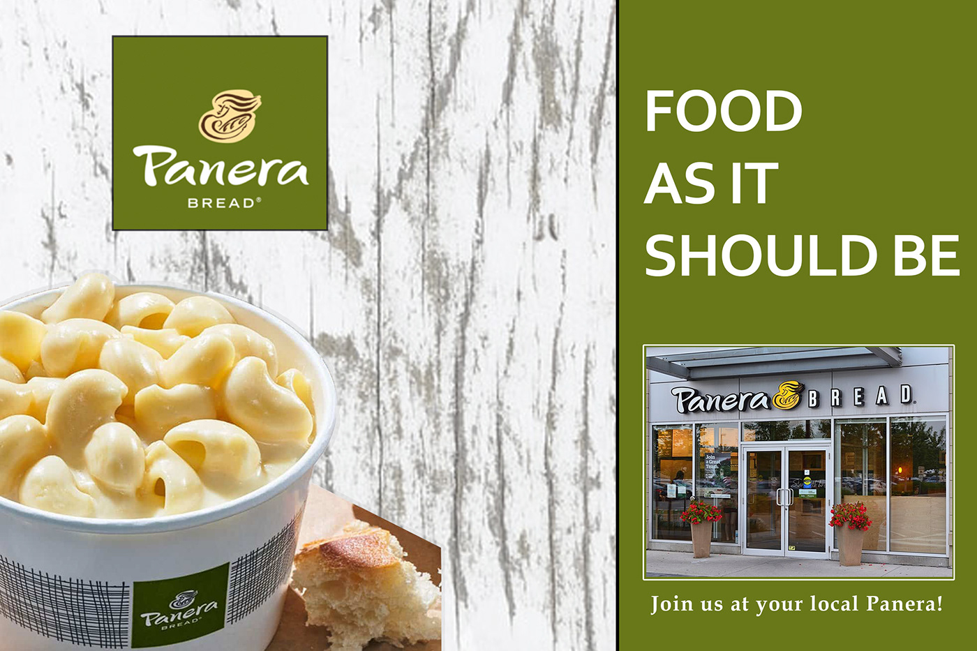
Postcard 3

Sketches
For this case study, I chose to make postcards for Panera Bread. Panera seems to have many web advertisements and not as many mail advertisements. So, I chose to make postcards for the older target audience of 50 to 60 years old. I chose to use Panera's green logo color alongside white, black, and pops of red. The pops of color will catch the viewer's eye and draw them in. I showcase food in every postcard so the viewer will know what they could possibly get at Panera Bread.

