
INFINITY HAUS - FITNESS CENTRE
Logo, Brand Identity, Type Design, Icon Design
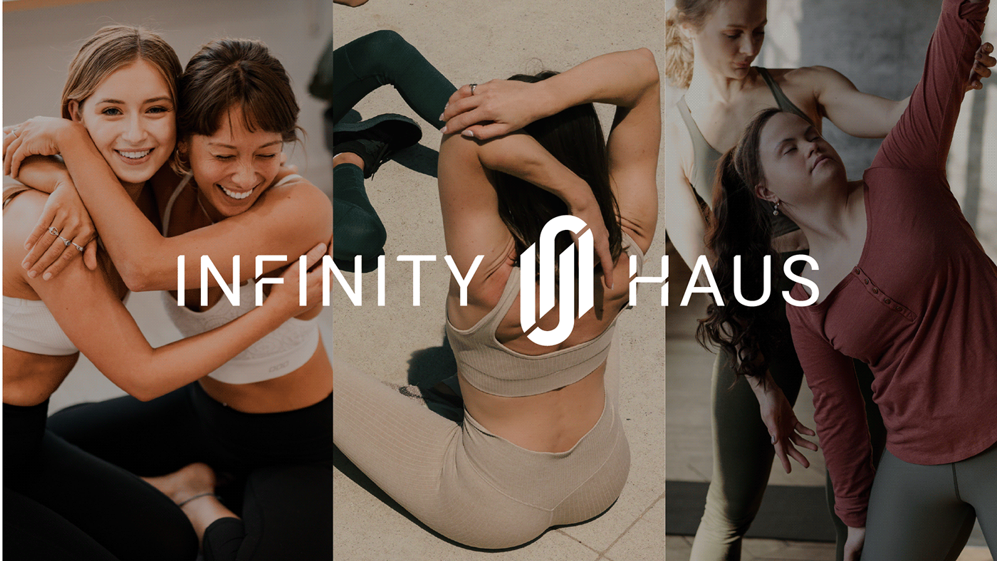
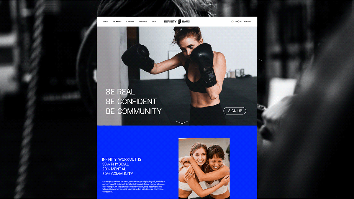
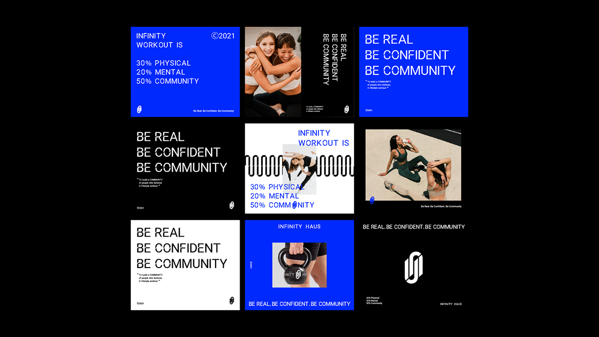
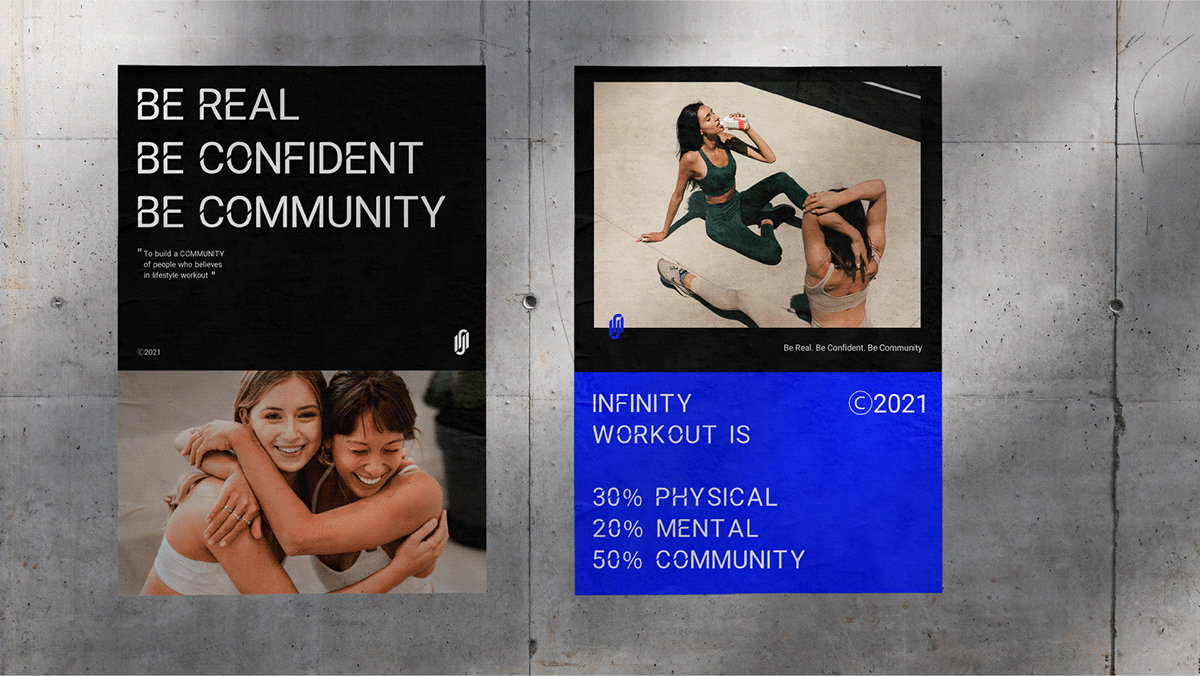
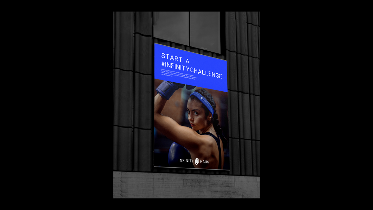
As a “public” workout centre, community should be the key of letting people through the doors to feel comfortable and a sense of belonging. Hence, in order to drive traffics into the fitness centre, Infinity Haus reflect their position in the fitness centre scene as a community driven space.
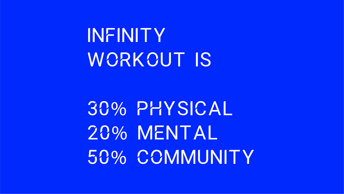
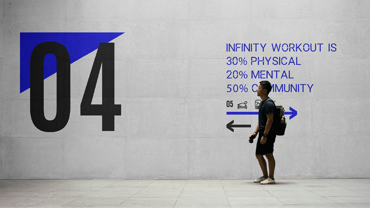
The vision is to build a community of people who believes in lifestyle workout. Making workout/exercise more fun to be in and allowing customer to have a good time.
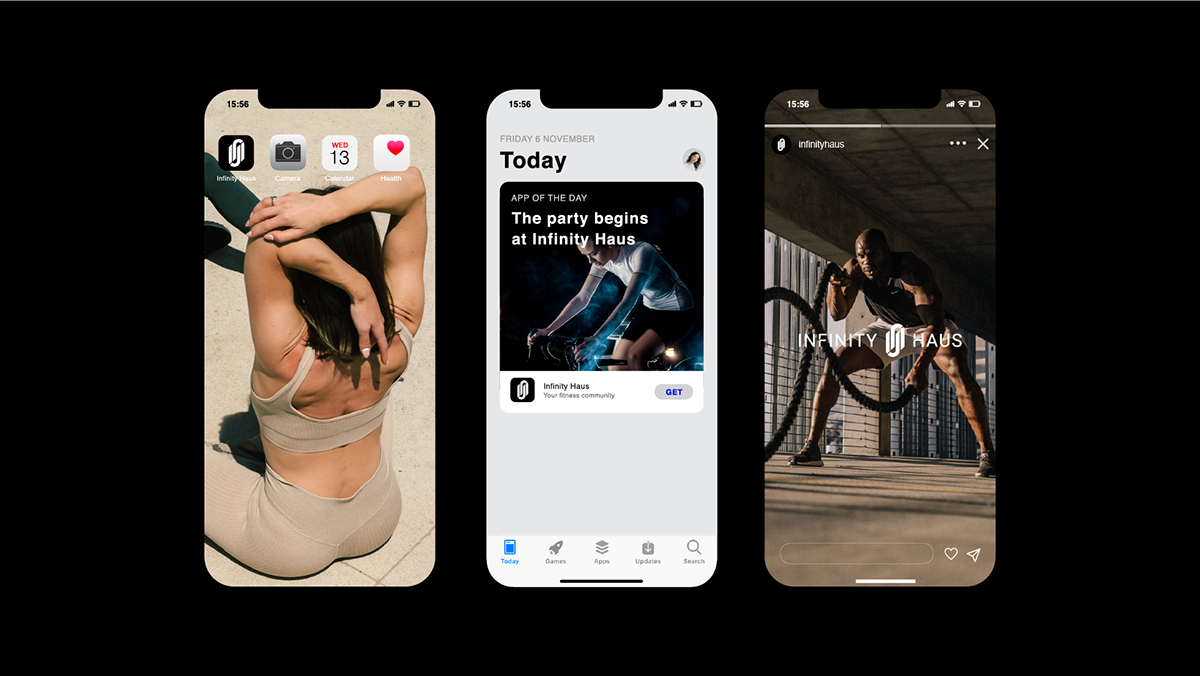
We created an identity in response to their visions, a coherent and clear identity. The resulting visual language seeks to convey a sense of community, energy & passion; building a distinct and sleek style that represents the company's core values.
Design Director | Vinsze Design | Vinsze, Julius
Contact Us
Instagram : @diffstudio.my
Email : diffstudiomy@gmail.com
Website : https://diffstudiomy.com/


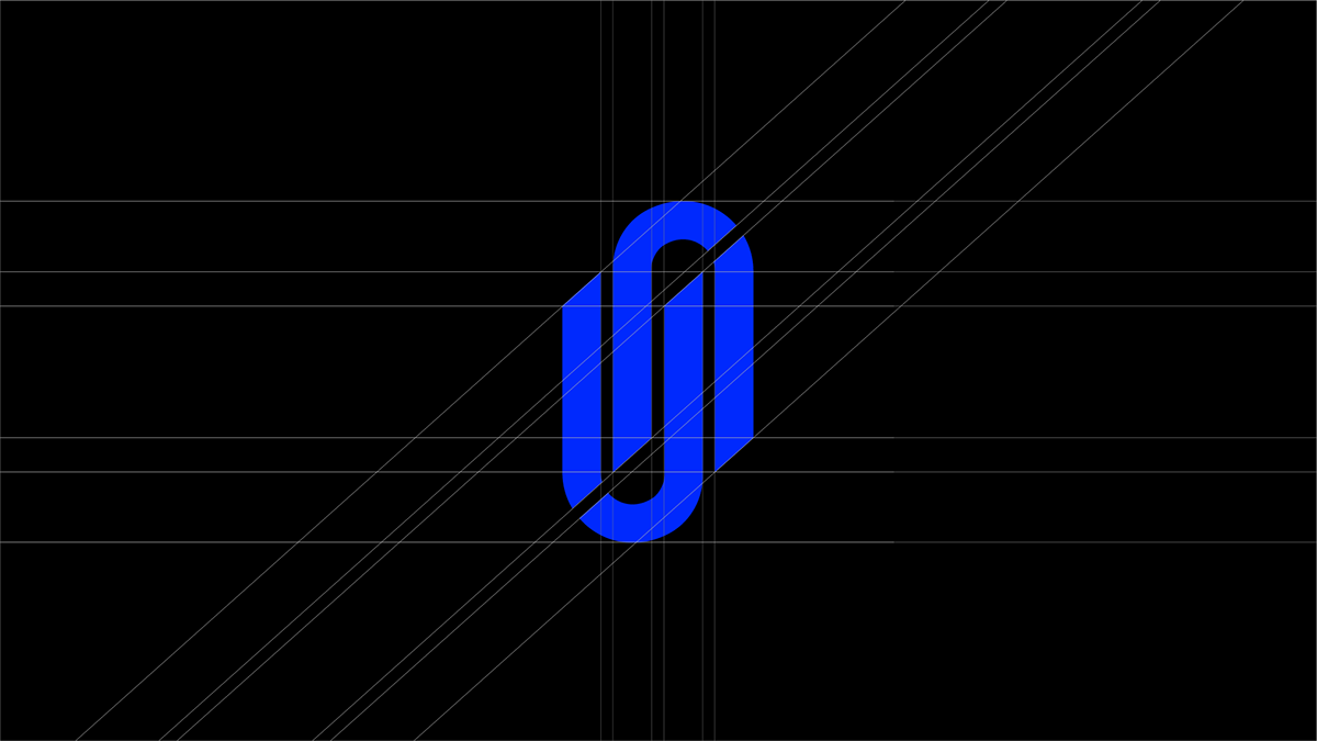
The idea initiated by the idea of the bike handle + infinity. Connection between spin bike and it's rider, it's a form of unity. The rider provides movement to the bike; the bike provides its resistance, grip and unity.
The logo is dissected from a geometric form, giving it versatility. to evolve into repetitive monograms and the angulated cutline are further elaborated into the type design.
The logo is dissected from a geometric form, giving it versatility. to evolve into repetitive monograms and the angulated cutline are further elaborated into the type design.


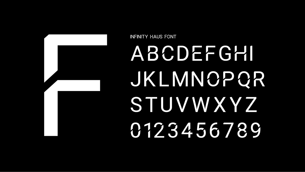
Custom Type Design
Specially designed for the brand, the type are designed with the specific angle that are exactly fount in the logo. It is also the typeface that forms the logotype.


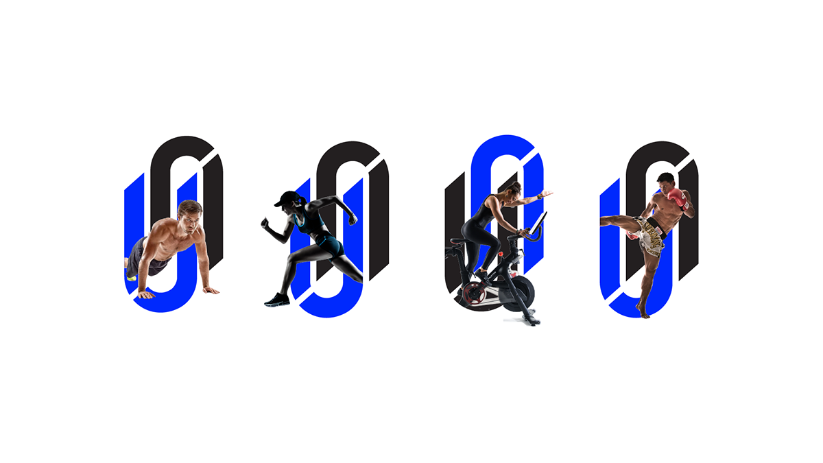
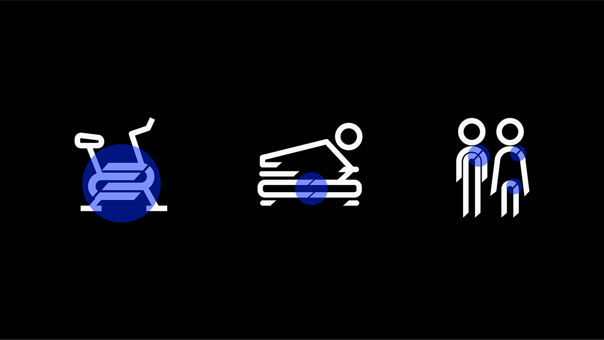
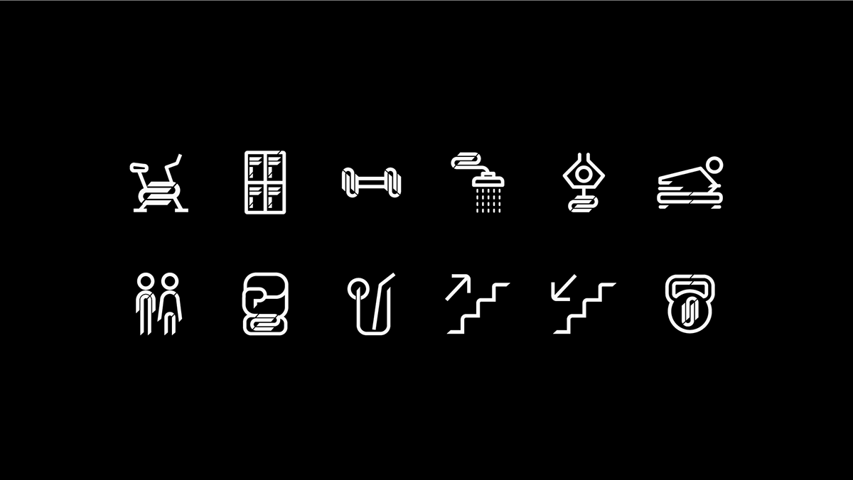
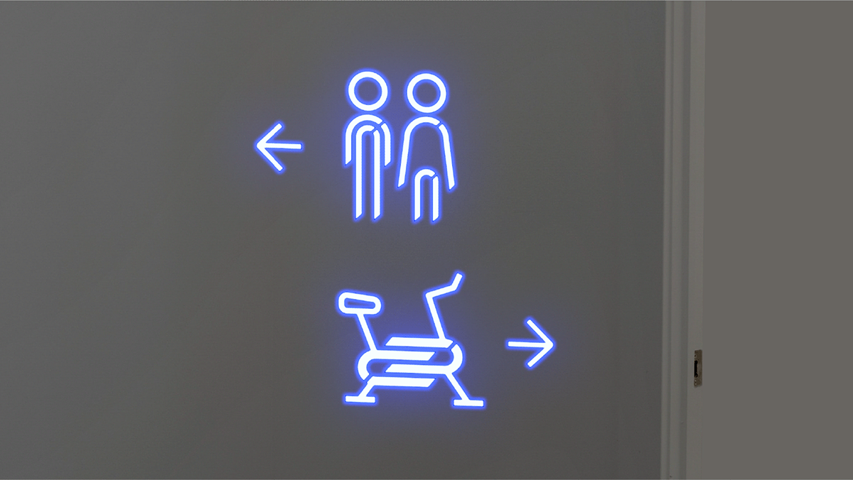
Custom Icon Design
Element such as the angles for cut, arch and even the joints of the logo are implemented in the construction of icons.

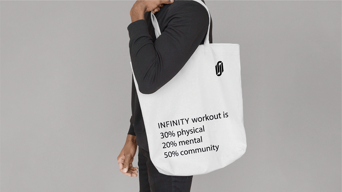
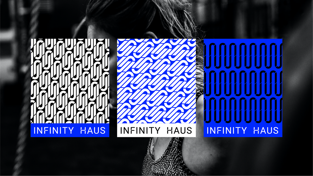
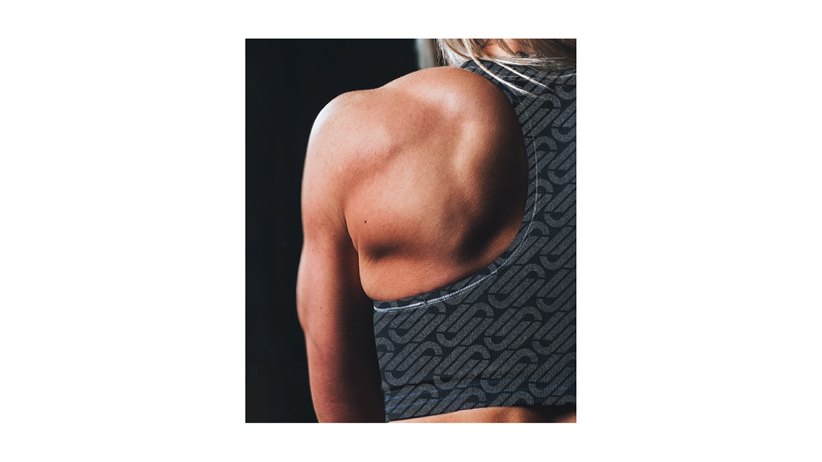
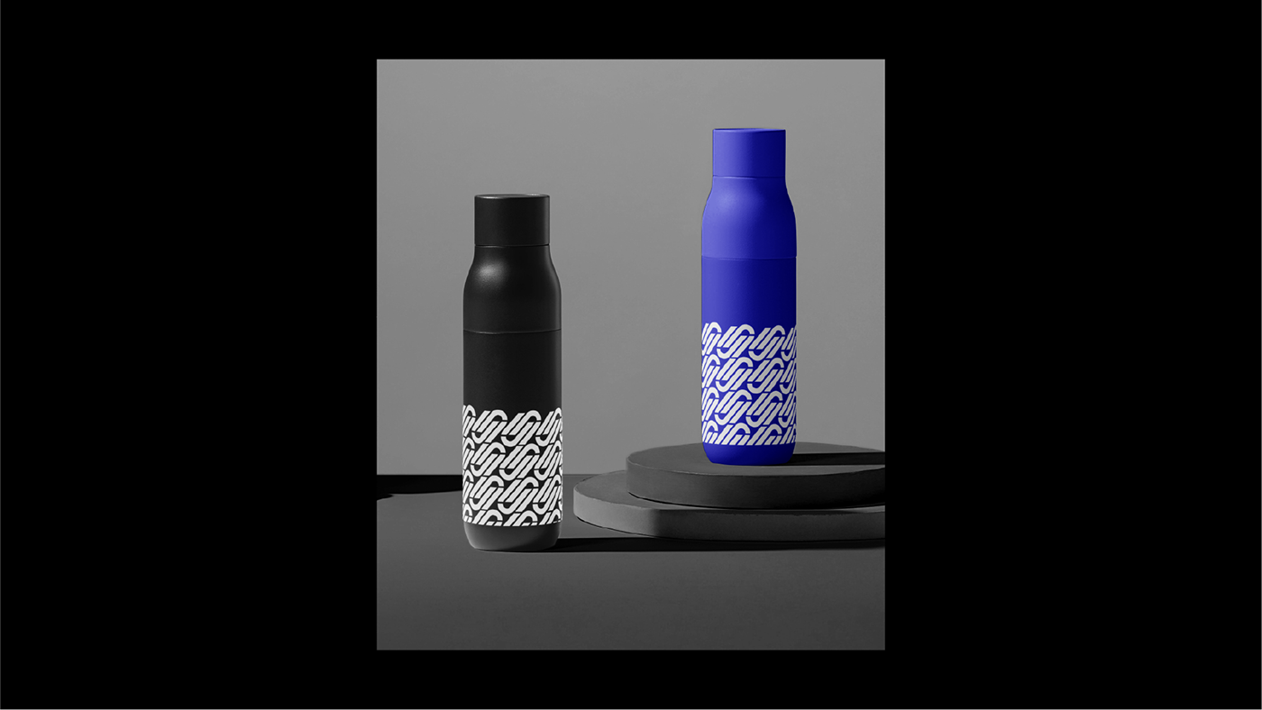
Custom Monogram / Pattern
A set of monogram / pattern developed from the logo ready to be applied in mediums such as merchandises, space, etc.
diff studio
Instagram : @diffstudio.my
Email : diffstudiomy@gmail.com
Website : https://diffstudiomy.com/


