Maki-San マキさん
Agency: Kinetic Singapore
Creative director: Pann Lim
Art director: Esther Goh, Astri Nursalim, Gian Jonathan, Jack Tan, Pann Lim
Copywriter: Eugene Tan, Joseph Davies
Illustrator: Esther Goh
Account Director: Dennis Lim
–
A fresh take on sushi
The client wanted to launch Singapore’s first ever fully customizable sushi store. Being offered a wide selection of fresh ingredients, diners could pick and choose precisely what went into their hand-rolls.
"Maki-San"
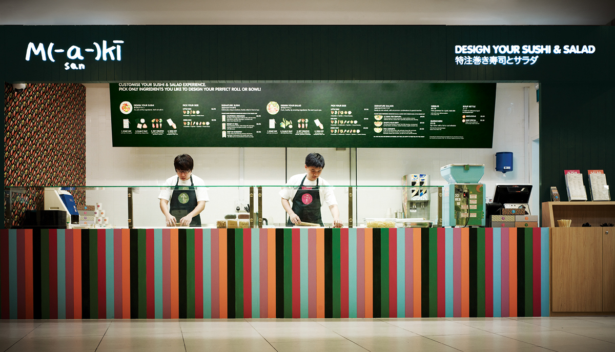
We proposed naming the store “Maki-San” for one simple reason: the word “-San” roughly translates as “mister” or “missus” in Japanese, and by using this suffix, each Maki could be uniquely personified. This idea also extends to operations: customers can name their own rolls however they choose to. The logo is made up of emoticons commonly used in Japanese pop culture.
We proposed naming the store “Maki-San” for one simple reason: the word “-San” roughly translates as “mister” or “missus” in Japanese, and by using this suffix, each Maki could be uniquely personified. This idea also extends to operations: customers can name their own rolls however they choose to. The logo is made up of emoticons commonly used in Japanese pop culture.
Endless possibilities
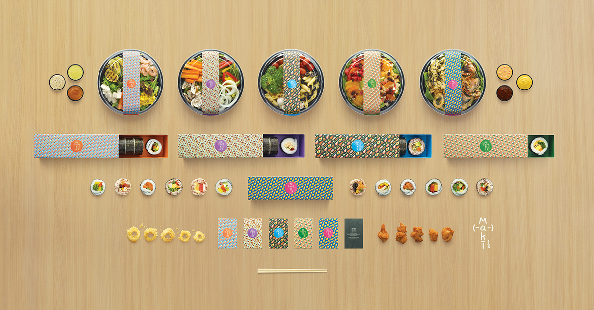
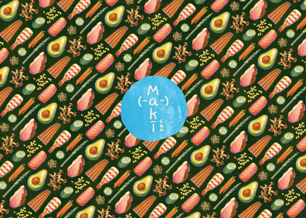
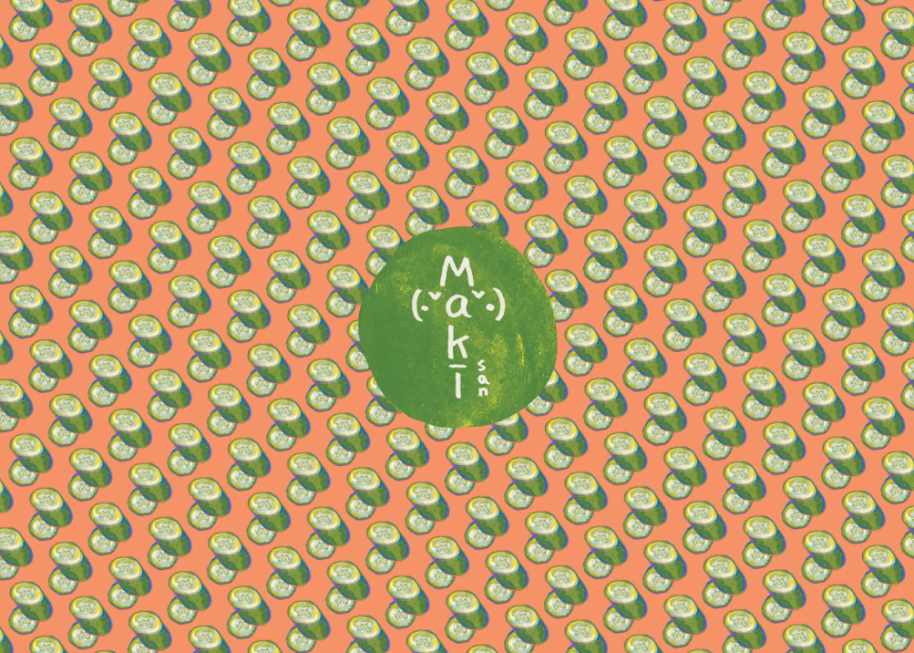
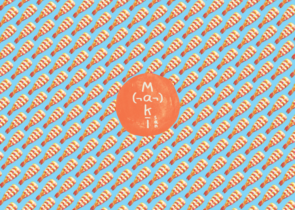
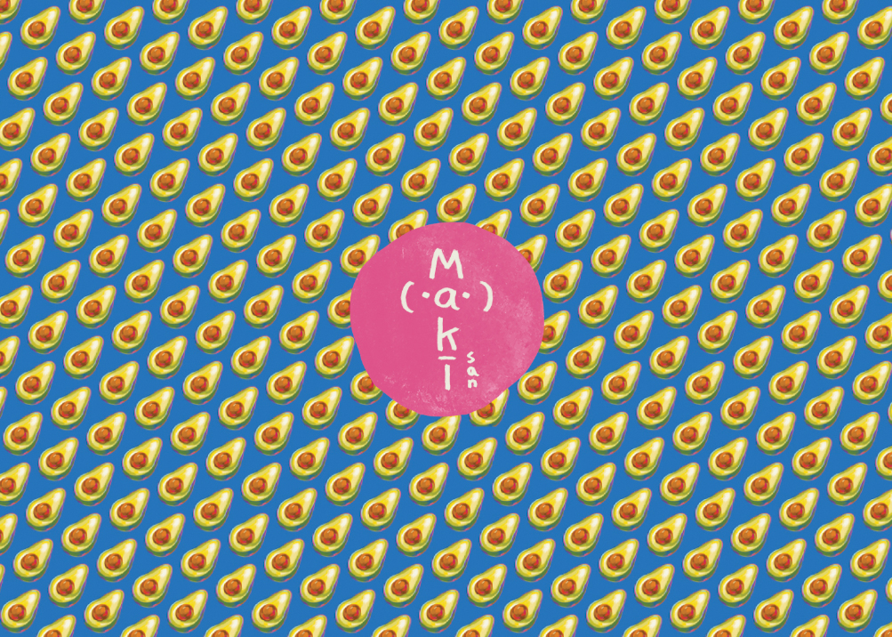
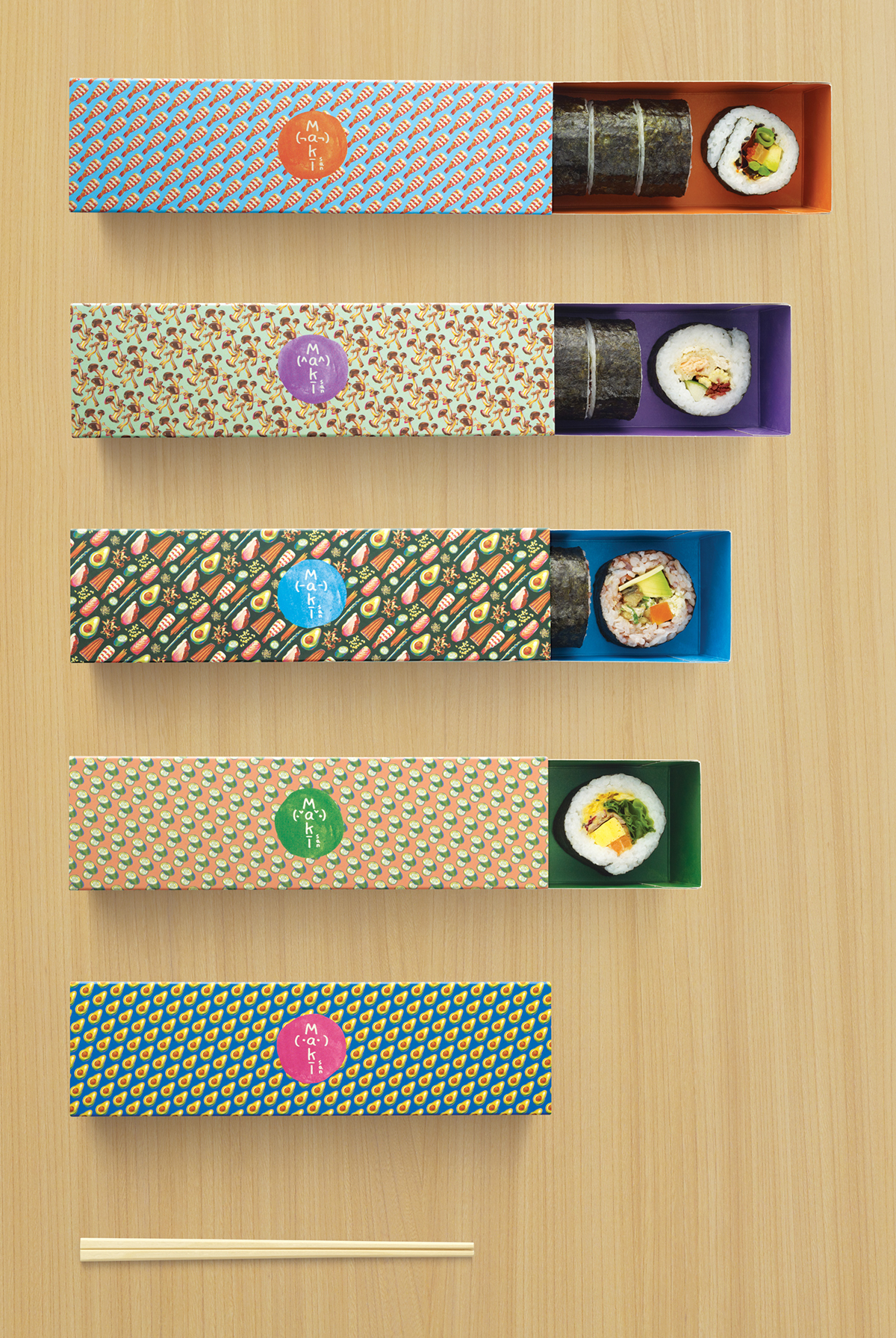
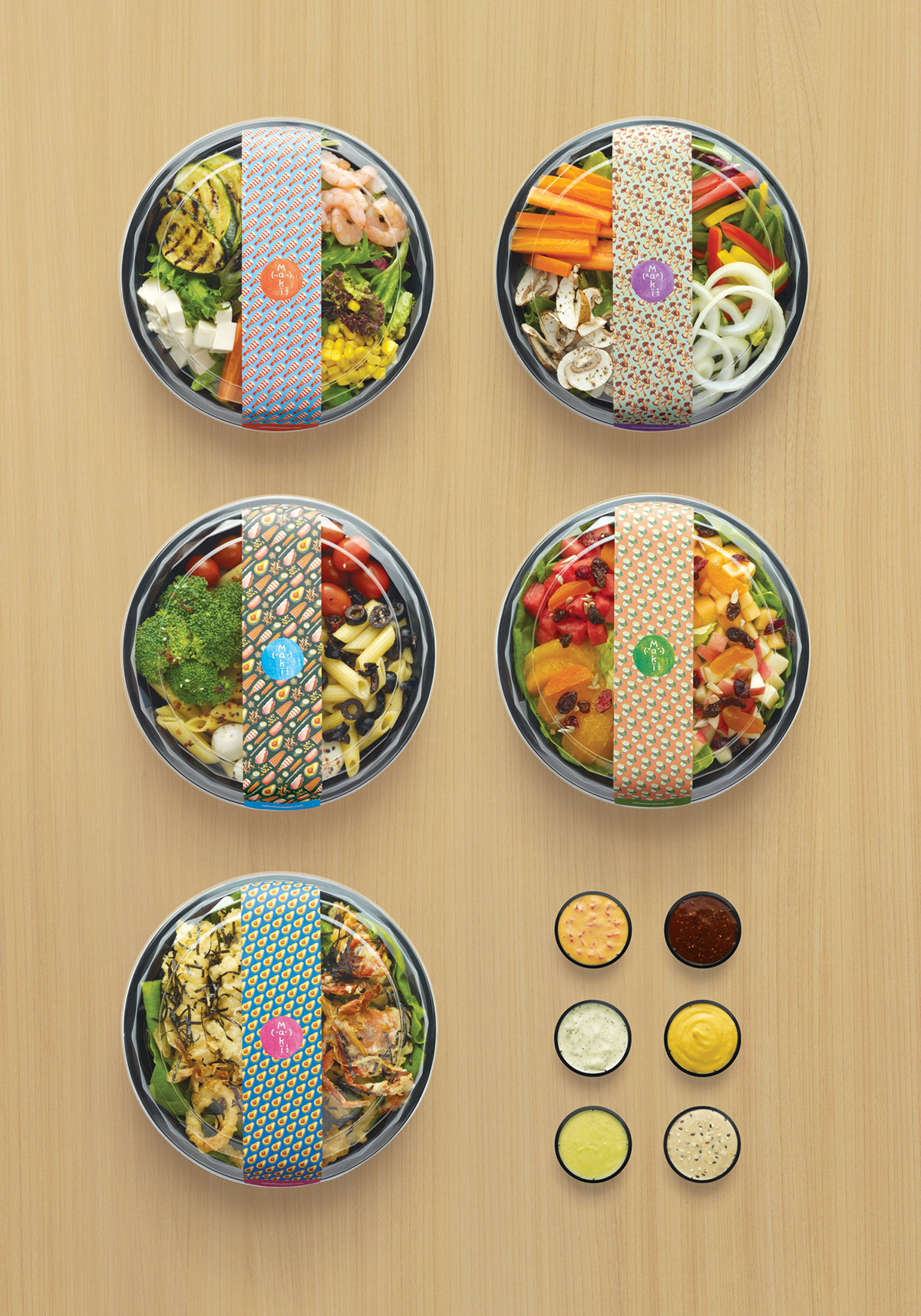
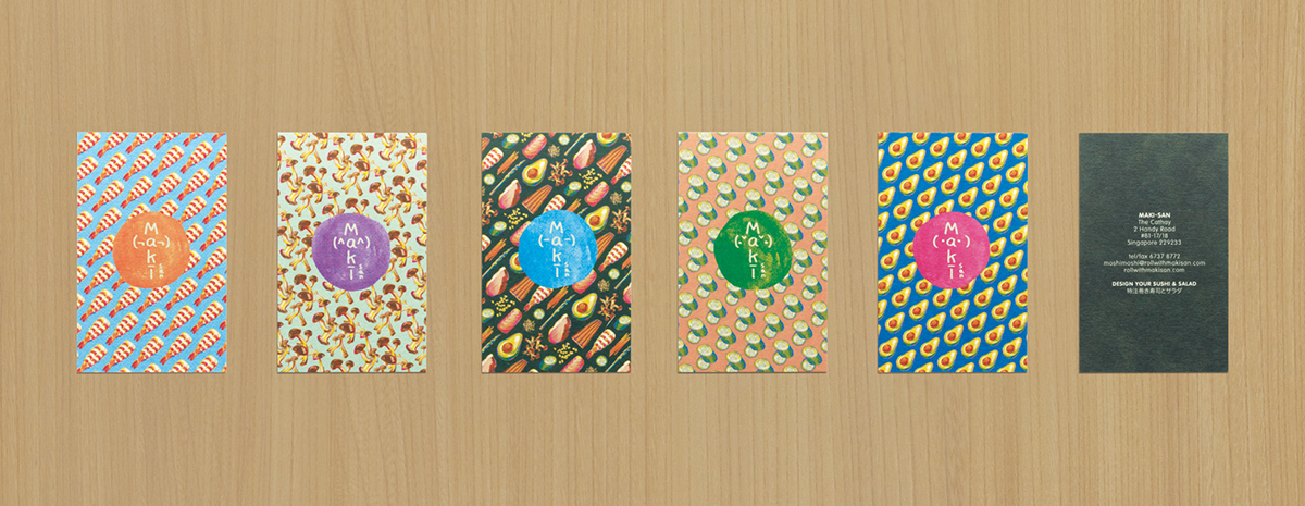
Using hand-drawn illustrations of mushrooms, avocados, cucumbers, and other ingredients, we designed a myriad of patterns which became Maki-San’s main visual identity. These motifs were applied throughout the consumer experience - right down to the packaging - to play up the endless, fun options available for diners.
Using hand-drawn illustrations of mushrooms, avocados, cucumbers, and other ingredients, we designed a myriad of patterns which became Maki-San’s main visual identity. These motifs were applied throughout the consumer experience - right down to the packaging - to play up the endless, fun options available for diners.

What's in a name?
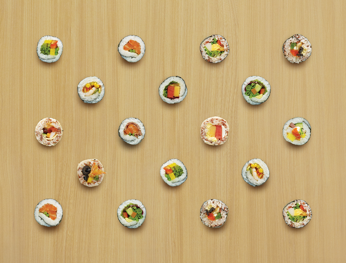
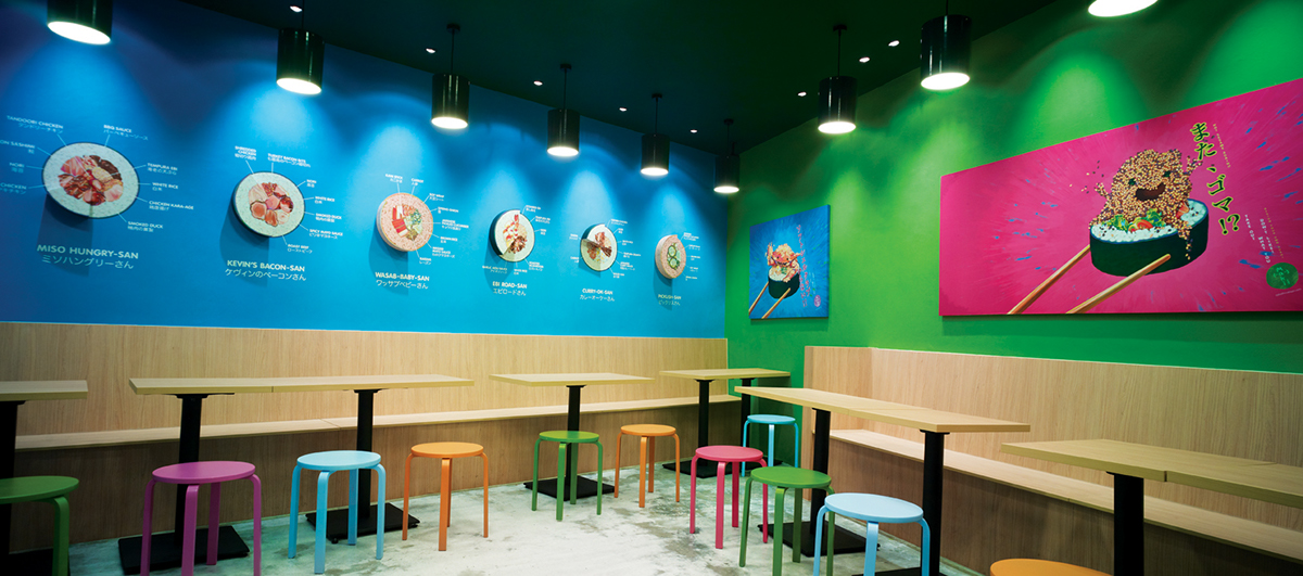
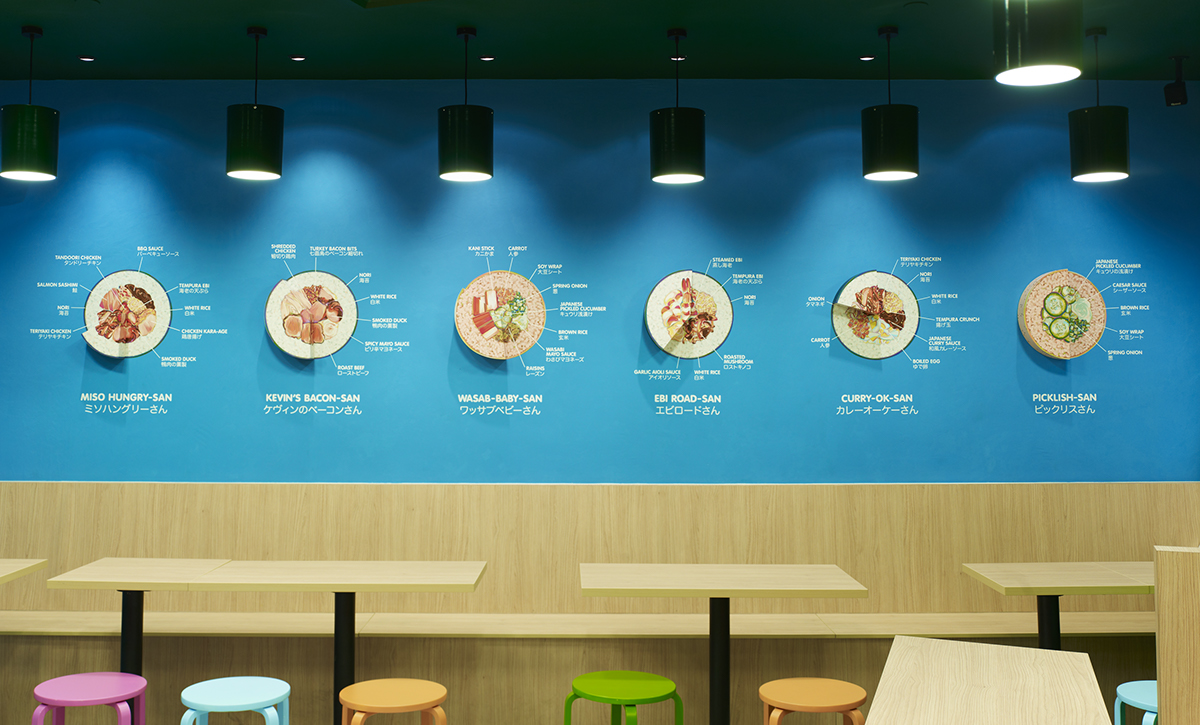
To inspire customers in their Maki creations, we created amusing combinations such as “Kevin’s Bacon”, “Ebi Road”, and “Curry-OK”. The illustrated Maki rolls were extruded to reveal their ingredients.
To inspire customers in their Maki creations, we created amusing combinations such as “Kevin’s Bacon”, “Ebi Road”, and “Curry-OK”. The illustrated Maki rolls were extruded to reveal their ingredients.
Only your favourites
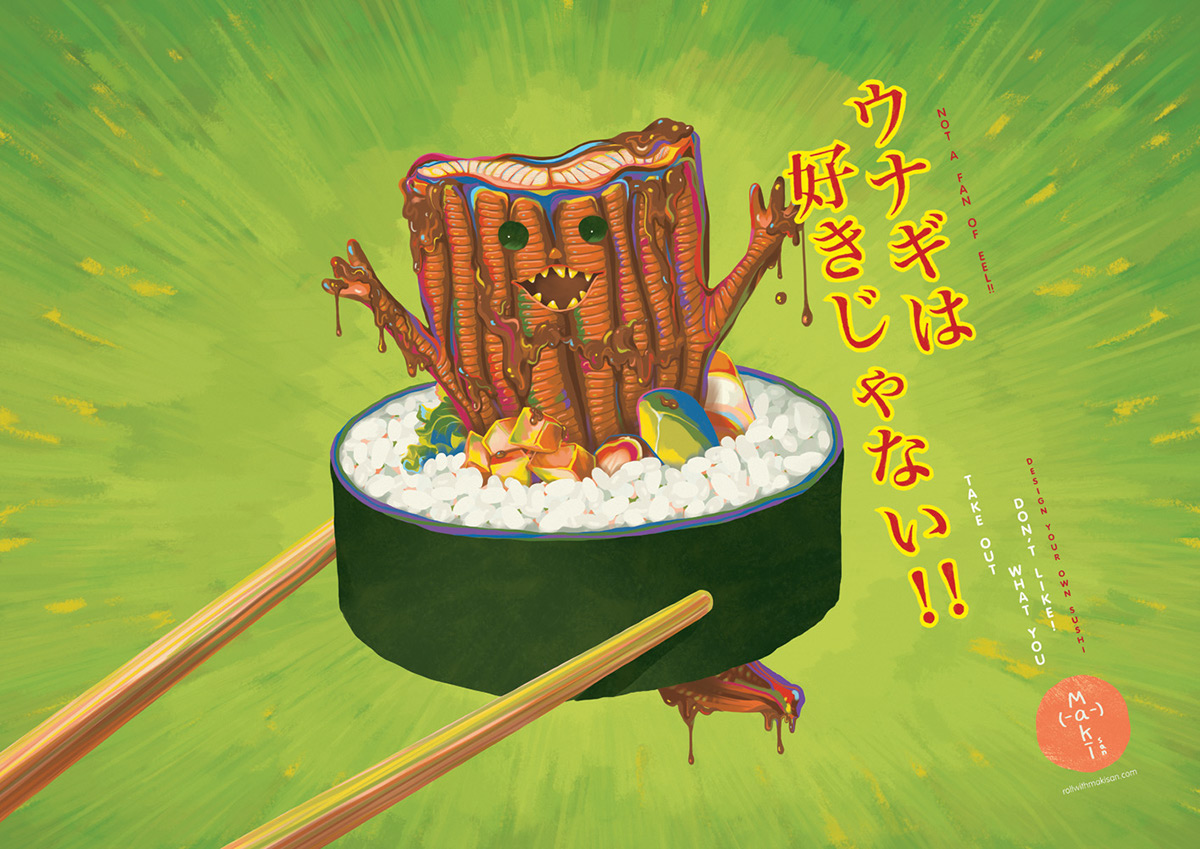
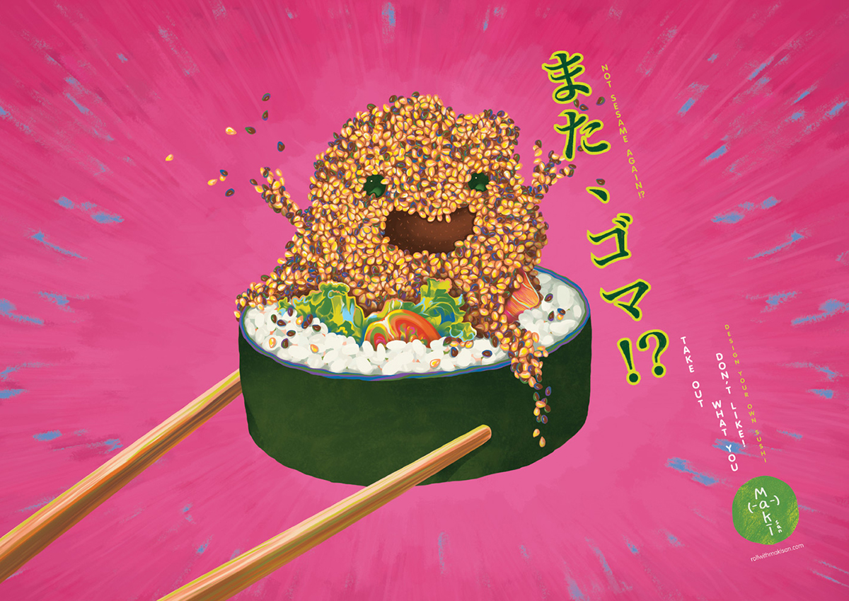
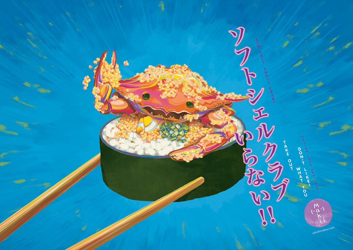
At Maki-San, customers have the ability to exclude any ingredient they don’t fancy. This preposition is amplified with a series of posters which hang vibrantly on the walls. Some usual culprits are personified into villains straight out of a Japanese manga comic.
At Maki-San, customers have the ability to exclude any ingredient they don’t fancy. This preposition is amplified with a series of posters which hang vibrantly on the walls. Some usual culprits are personified into villains straight out of a Japanese manga comic.
