
This a UX redesign project for an app called 'AirFlow'. It stores in the cloud different types of files which you would normally receive via mail/sms, only to be sent again later to another recipient. Sort of like Dropbox, but more socially enabled.
In this presentation I'll focus on the main screen only, as it was the most challenging to rethink and redesign.
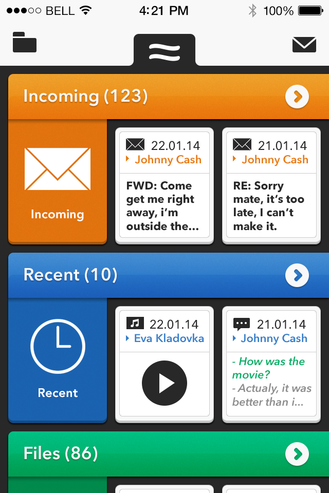
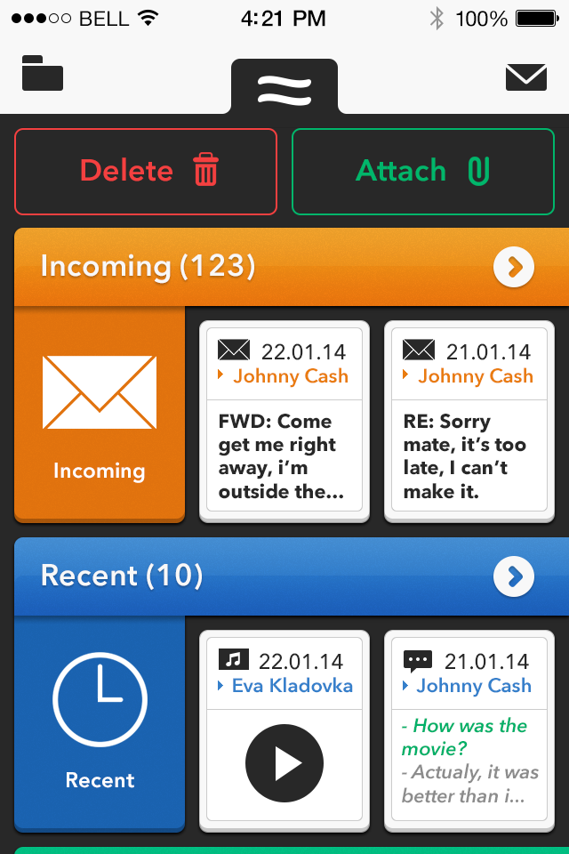
The Mockup:
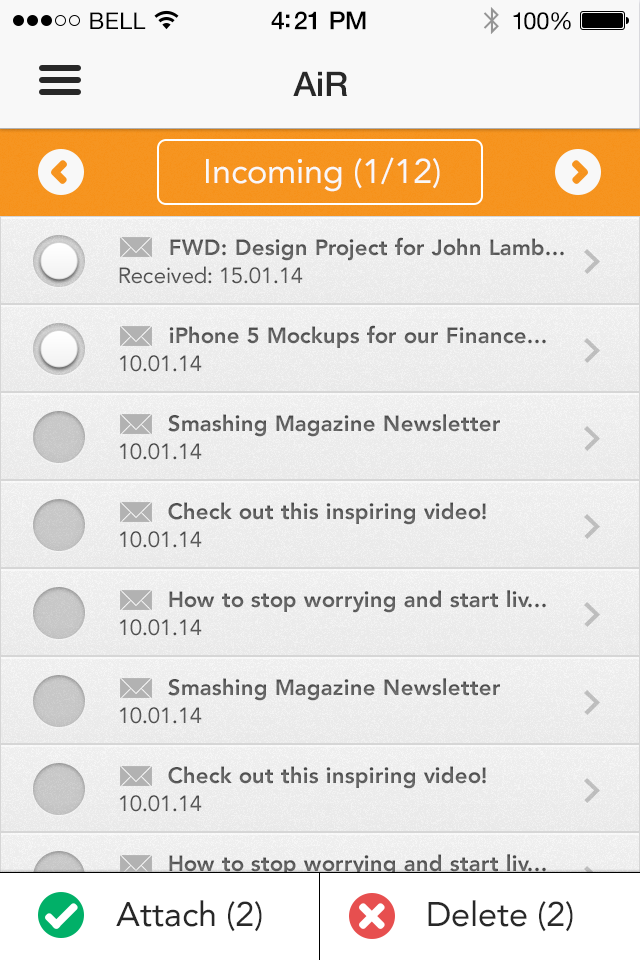
In the beginning the client had some mockups that they wanted to develop (image below). Suddenly everyone on the team got worried, because it was clear from the beginning that it's not going to be an easy job. Especially because the client really wanted to develop "it" as it is. So, I had to get involved.
Basically, what the client had in mind is that a user would manage the objects (tiles) by tapping + holding on one of them and then moving it to that "air symbol" menu at the top, which would open and give the user another "air logo", where they would release the selected object, attaching it to a potential mail/sms. Sounds, complicated, right? We can agree on that. Alternatively the same user can delete an object by dragging it at the bottom, where another menu will pop up. One at a time. One. At. A. Time. It was definitely a challenge from the start, and that's why we have quickly decided with the team to propose a complete redesign and improve the overall UX.

Dirty Sketches:
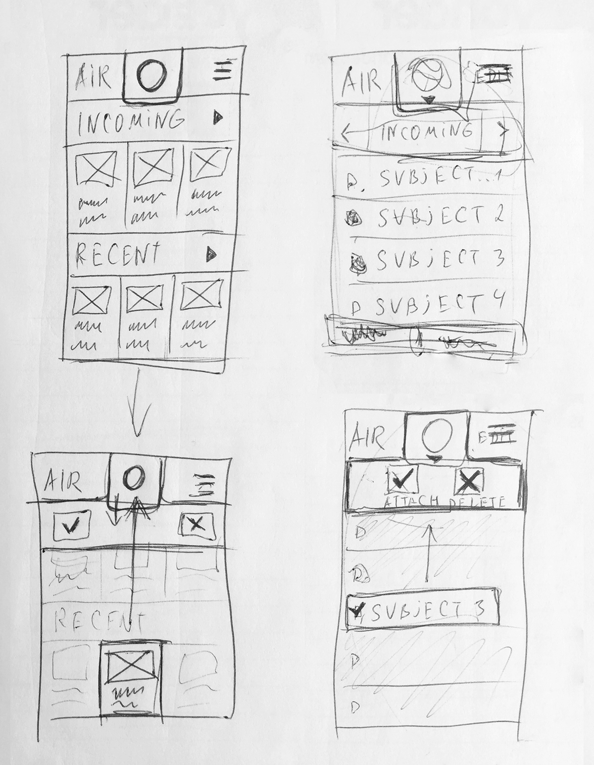
First Proposal:
After a little research, I figured that using tiles for text is not only inefficient, but also there's a big chance that some words will not fit into a line and break, making it very hard to read. Images on the other hand, love to be put into tiles. So the conclusion was, that I would decide the layout based on the type of file. Great!
Second Proposal:
The client insisted that we didn't change the layout. Ok...

Third Proposal:
After a couple of back and forth with the client - we still couldn't come to an agreement. So I made a follow-up proposal with a more 'polished' UI, showcasing some of Apple's GUI guidelines, in order to prove that those first mockups couldn't be turned into an usable app.

Conclusion:
So in the end, our effort was futile, but at least I got a quick exercise out of it, which I can (legally) showcase here. The client still wasn't impressed and insisted that we stick to their mockups. So, in the end, it was ruled out as a misunderstanding between both sides, and all the proposals were dismissed. Those poor developers had to slice and implement the application from actual PDF documents that the client sent. As the result of that, it took double the amount of time to develop, and the client, of course lost money in the process. And it could have gone so much better if only the client took some time to listen to an UX Designer, who's only concern is to help in creating a better experience for the user. Isn't that what all clients should want?
I hope that you can take a lesson from this, whether you're a client or designer and do better next time.
Thank you!